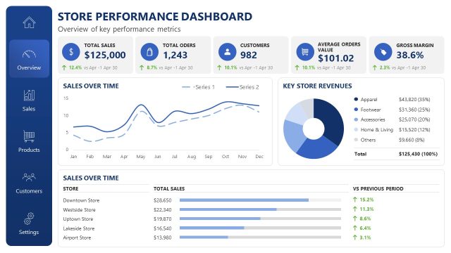
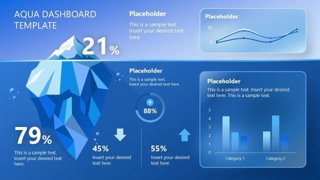
Use multiple data visualizations to communicate the trends and insights about business data with our Business KPI Slide PowerPoint Template. KPIs stand for key performance indicators. Business KPIs are parameters that organizations track to measure their growth and progress. The KPIs convert raw data into actionable insights to help strategy leaders make effective, informed decisions for business growth. Business analysis and strategy consultants use data charts to visually demonstrate patterns, identify trends, and present alternative viewpoints. The slide helps management directors share the performance report during their annual meetings with stakeholders.
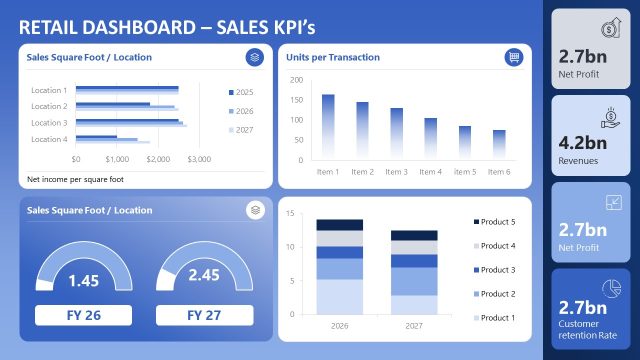
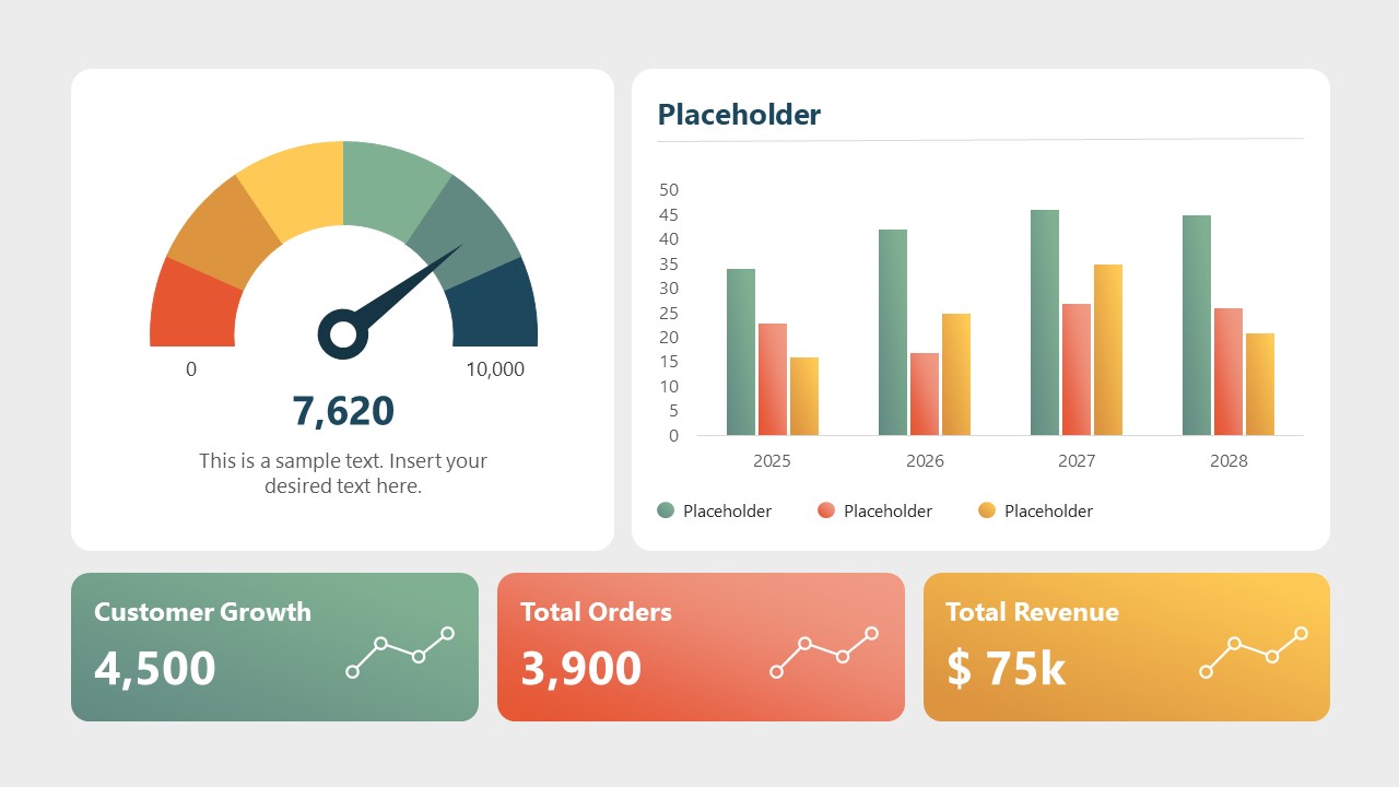
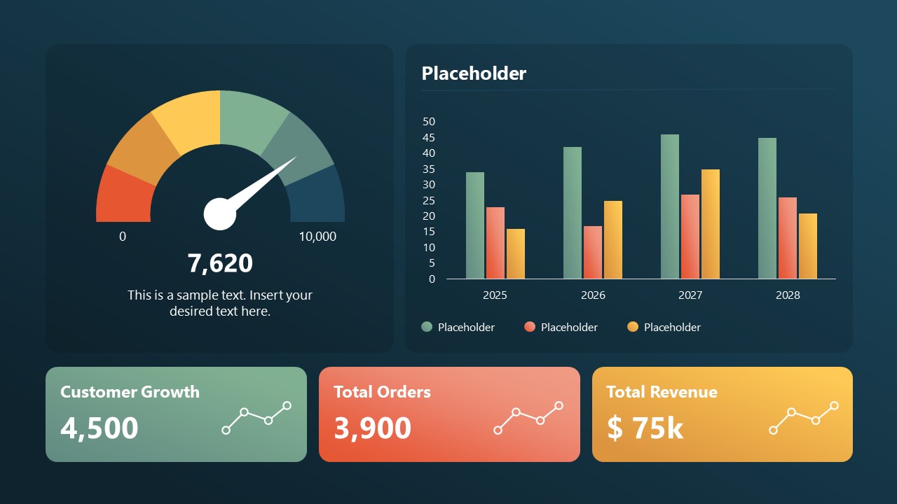
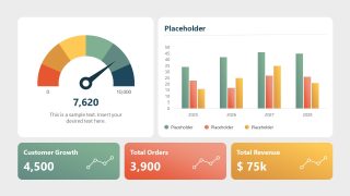
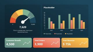
The Business KPI Slide PowerPoint Template has a dashboard-like appearance with a gauge chart on the left and a column chart on the right. At the bottom, analysts can customize the three metric cards with infographics and data to showcase summaries of parameters such as customer growth, total orders, and total revenue. The template layout includes placeholder values such as 4500, 3500, and 75 K, which presenters can easily edit to add their own data. This presentation slide offers two background variations with the same dashboard elements. Consultants can use either cream or dark navy background in their business presentations. Project managers use the business KPIs template in sprint meetings to showcase the team’s progress and highlight the gaps in achieving the goals. This helps team members evaluate their activities and align themselves with the project goals effectively. Moreover, our template is also customizable with Google Slides and other versions of Microsoft PowerPoint.
Users can modify colors, chart types, and data labels to suit their specific company data. Download the business KPIs slide PPT template and share your data-driven insights in the business intelligence presentations.
What’s inside this template
Example presentation scenarios
- A business analyst can use the gauge chart and column chart to explain KPI movement during a monthly performance review with department leaders.
- A project manager can use the three metric cards to summarize sprint progress, order volume, and revenue-related outcomes for a project team meeting.
- A strategy consultant can use the dark dashboard version to present client performance indicators in an executive briefing where the focus is trend comparison and priority metrics.
- A sales operations leader can use the column chart and bottom metric cards to report customer growth, total orders, and revenue in a quarterly sales update.
Features
- 100% editable presentation template
- Compatible with Microsoft PowerPoint and Google Slides
- 16:9 aspect ratio slides
- Scalable vector shapes, icons and illustrations
- AI-Ready for Microsoft Copilot and Claude
- Instant access and download
Frequently asked questions
Q: How should a presenter explain the KPI story with only one dashboard slide?
A: Start with the gauge because it gives the audience an immediate sense of overall status. Then use the column chart to compare the contributing categories or time periods. Close with the three metric cards as the executive takeaway, naming what changed, why it matters, and what decision the audience should make next.
Q: Who is this KPI dashboard best suited for?
A: This template fits managers, analysts, consultants, and project leads who need to report a small set of performance indicators without building a full report deck. It works best when the audience needs a quick read on progress, category comparison, and headline metrics such as customer growth, orders, or revenue.
Q: Why does the design combine a gauge, column chart, and metric cards?
A: The gauge acts as a progress metaphor, helping viewers judge whether the KPI is low, moderate, or strong at a glance. The column chart adds comparison across periods or categories, while the metric cards isolate the most important numbers. This sequence reduces interpretation work for busy decision makers.
Business KPI Slide PowerPoint Template
2-slide KPI dashboard presentation template with gauge chart, column chart, and metric cards
Business KPI Slide PowerPoint Template is a 2-slide data dashboard template for reporting performance indicators in Microsoft PowerPoint and Google Slides. Each 16:9 slide combines a gauge chart, clustered column chart, and three KPI metric cards with sparklines. It suits managers, analysts, consultants, and project leads presenting business performance. Chart data can be edited as an Excel spreadsheet in PowerPoint.
- Category
- Business PowerPoint Templates
- Rating

 Loading...
- Aspect ratio
- 16:9
- Item ID
- 23664-01
- Colors
 Microsoft PowerPoint
  Microsoft Copilot
  Claude for PowerPoint
 Other formats supported
Subscribe today and get immediate
access to download our PowerPoint templates.