Greiner’s Growth Model Curve for PowerPoint is an editable template for constructing a Greiner’s Growth Curve in the form of presentation slides.
Using the sample diagram layouts you can easily create a Greiner’s Growth Model. Editing sample diagrams is a breeze and can be done easily from within PowerPoint. You can also save an enormous amount of time by simply adding text to sample diagrams for displaying different stages of the curve.
What’s inside this template
Example presentation scenarios
- A management consultant can use the curve diagram to show a client where its current leadership, autonomy, control, red tape, or growth crisis fits within Greiner's model.
- A founder can present the phase labels and crisis markers to explain why new management systems are needed as the company moves from early growth to maturity.
- An organizational development leader can use the shaded phase-band slide to teach managers how coordination, collaboration, and alliances appear as the business scales.
- A strategy presenter can use the time and business size axes to compare past growth issues with likely future transition points.
Features
- 100% editable presentation template
- Compatible with Microsoft PowerPoint and Google Slides
- Scalable vector shapes, icons and illustrations
- AI-Ready for Microsoft Copilot and Claude
- Instant access and download
Frequently asked questions
Q: How should a presenter explain the Greiner curve without overloading the audience?
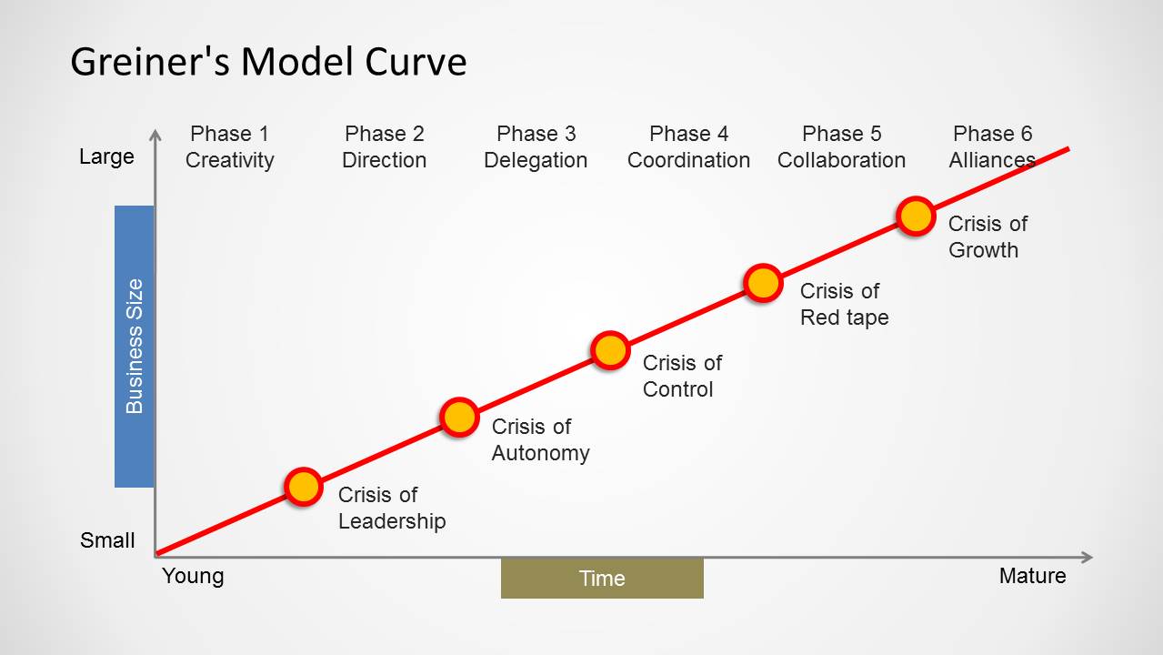
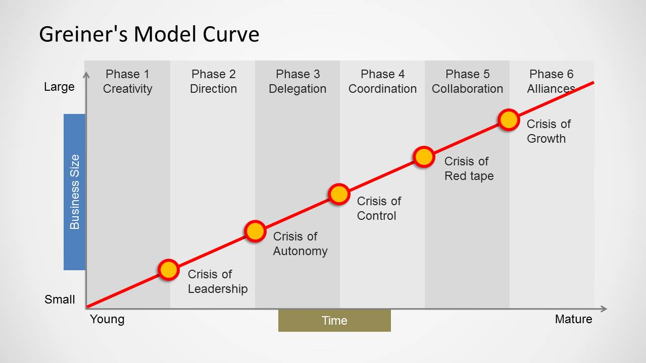
A: Start with the axes: business size increases upward and time moves from young to mature. Then walk through each phase label in order and pause at the yellow crisis markers. Treat the crisis labels as discussion prompts rather than definitions, asking which issue most closely matches the audience's current operating reality.
Q: Who is this template best suited for in a business presentation?
A: This template fits consultants, founders, executives, and organizational development presenters who need to explain growth-stage friction in a simple visual. It works best when the message is about maturity, leadership structure, delegation, coordination, or scaling pressure, not when the audience needs detailed financial metrics or project execution plans.
Q: Why does the curve metaphor help communicate Greiner's model?
A: The rising curve links organizational growth to increasing business size over time, making maturity feel sequential rather than random. Yellow crisis points interrupt the line, which visually signals that progress creates new management problems. The shaded phase bands on the second slide make phase boundaries easier to discuss during workshops or diagnosis sessions.
Greiner’s Growth Model Curve for PowerPoint
2-slide presentation template for Greiner growth curve phases, crisis points, and organizational maturity
Greiner's Growth Model Curve for PowerPoint is a 2-slide diagram template for explaining organizational growth across time and business size. It includes a Greiner curve with six phase labels, crisis markers, axis labels, and a second version with vertical phase bands. It is intended for consultants, executives, founders, and strategy presenters.

 Loading...
 Microsoft PowerPoint
  Microsoft Copilot
  Claude for PowerPoint
 Other formats supported
Subscribe today and get immediate
access to download our PowerPoint templates.