PowerPoint Template Curved Lines for Chart Presentation
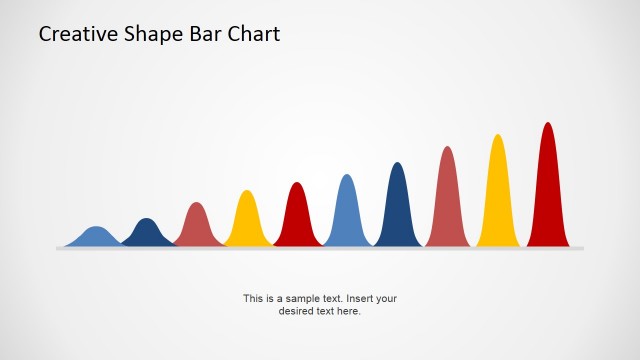
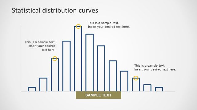
The presentation design contains a PowerPoint template curved line for chart presentation, which may be used to show probability distributions of specific financial and statistical information, such as the amount of sales and number of customers, in order for the key members of the business organization to prepare and plan their objectives and actions accordingly. The presentation of this data is important in reducing risk and opportunity costs.
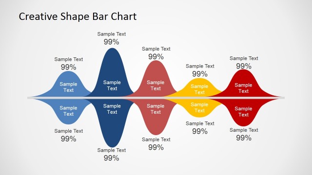
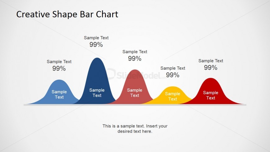
The curved line PowerPoint graphics, all five of them, are bell curves, which represent probability distributions. Each of them overlap the others, and is of different width and height. They are colored in either light blue, dark blue, rose pink, yellow, and red, and have text placeholders both inside and outside where labels may be inserted. The probabilities, in their numeric form, may be placed in the text placeholders found above each bell curve. A summary of the information found on the PowerPoint slide may be inserted in the text placeholder at the bottom of the slide design. All PowerPoint objects are 100% customizable to suit the presenter’s needs and preferences.
Return to Creative Wave PowerPoint Shape.