Slide 1 of 7 from Concept Bar Chart Template for PowerPoint
Equalizer Bar Chart for PowerPoint
3D Bar Chart Comparison Template
- Chart
- Bar Vertical
- Comparison Slide
- 16:9
- 100% Editable
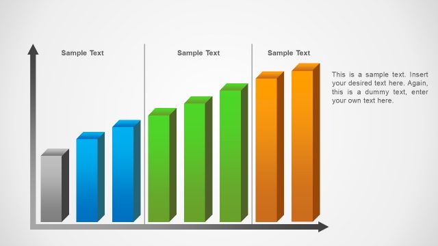
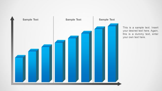
The 3D Bar Chart Comparison slide from the Concept Bar Chart Template for PowerPoint offers a clear visual tool for comparing data across three categories. Designed for business presentations, this slide layout uses editable shapes and vector icons to highlight sales analysis and performance metrics effectively. It integrates seamlessly into slide decks requiring detailed data comparison, making it a practical choice for corporate presentations and pitch deck templates.
About This Slide
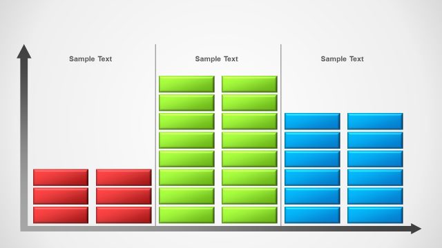
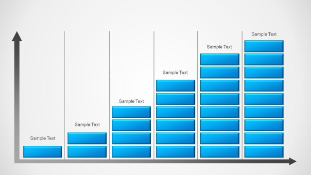
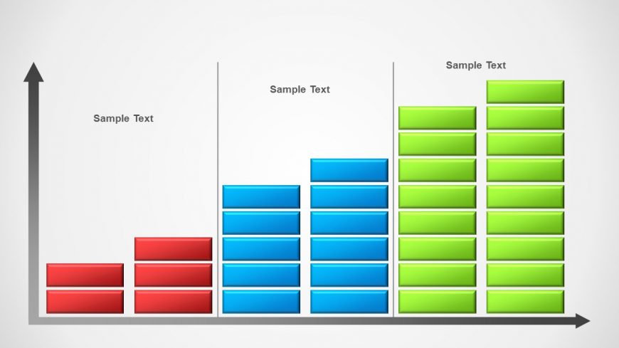
This Equalizer Bar Chart for PowerPoint is a modern and professional PowerPoint Data Chart created using PowerPoint rectangles, with gradient colors, to represent Bar Charts. This chart is fully customizable and the user can be creative in the ways that adapts the design. The colors can be tailored to the presenters theme. The Cartesian Axis are created with PowerPoint arrows. Impress your audience with this outstanding PowerPoint chart design.
What’s on This Slide
The slide features a 3D bar chart arranged in three vertical groups. The leftmost group contains red bars, the middle group has blue bars, and the rightmost group displays green bars. Each group has three bars of equal height. Above each group, there are text placeholders for labels, centered horizontally. The background is light gray, providing contrast to the colored bars. The chart has a vertical axis on the left and a horizontal axis at the bottom, both with arrowheads indicating direction. The overall layout emphasizes the comparison between the groups.
How to Use It
This layout serves as a bar chart comparison, ideal for showcasing data across three categories. It fits well in presentations that require visual data representation, such as sales performance, survey results, or product comparisons. This slide is effective in the early stages of a presentation to introduce key metrics or findings. It can also be used to summarize data trends or highlight differences among groups in a concise manner.
Text Placeholders & Capacity
Keep your copy within these limits so it fits without resizing. Node labels can hold up to 12 characters each, and the chart title can accommodate 30 characters.
| Placeholder | Count | Max characters (approx.) |
|---|---|---|
| Item heading | 3 | 12 |
| Chart title | 1 | 30 |
Slide Keywords
Download unlimited PowerPoint templates, charts and graphics for your presentations with our annual plan.
DOWNLOADReturn to Concept Bar Chart Template for PowerPoint.