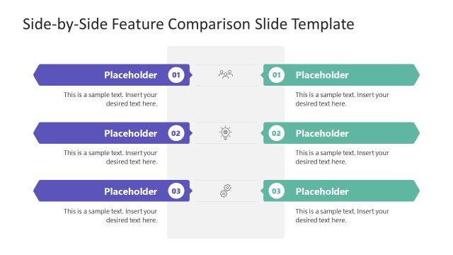
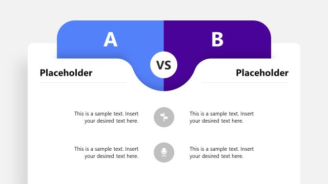
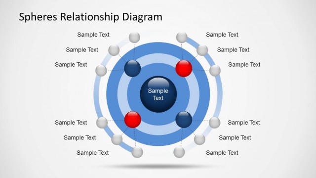
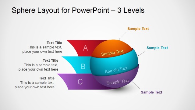
Create comparison slides with a nice clean layout with Comparison Layouts for PowerPoint with Spheres.
This template is among our collection of Comparison PowerPoint Templates. It is highly customizable and you can edit various elements within this template to create comparison slides with precision and elegance.
You can edit the diagram like layouts to accommodate various details within each slide to create comparison slides for anything from different financial quarters to different parts of an argument, differences or similarities tied to a subject, etc.
What’s inside this template
Example presentation scenarios
- A consultant can use the 3-column sphere layout to compare three strategic options and give each option a short text panel plus a clear visual label.
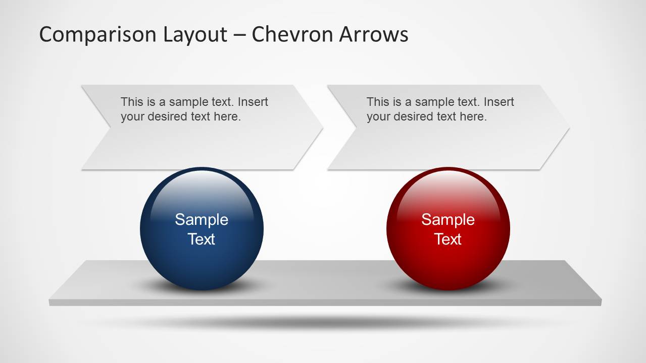
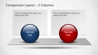
- A product manager can use the 2-column comparison layout to contrast two product versions, pricing choices, or feature sets for an executive review.
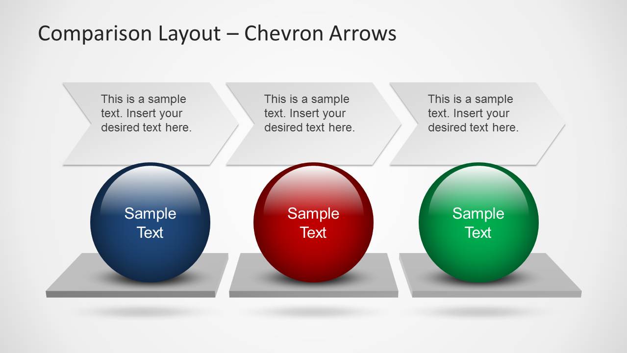
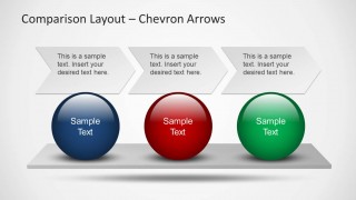
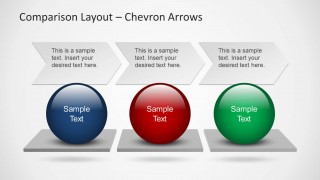
- A project lead can use the chevron arrow layouts to explain a two-step or three-step process while keeping each step tied to a colored sphere.
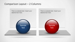
- A sales presenter can use the separate pedestal variations to compare competing offers, packages, or value propositions without placing dense text on one slide.
Features
- 100% editable presentation template
- Compatible with Microsoft PowerPoint and Google Slides
- Scalable vector shapes, icons and illustrations
- AI-Ready for Microsoft Copilot and Claude
- Instant access and download
Frequently asked questions
Q: How should a presenter structure the message with these comparison slides?
A: Start by naming the comparison criteria in the slide title, then use each sphere as the visual anchor for one option or step. Keep the text panels short so the audience can scan differences quickly. The 2-column slides work best for direct trade-offs, while the 3-column slides support alternatives that need equal weight.
Q: Who is this template best suited for?
A: This template fits presenters who need to explain choices without building a dense matrix. Consultants, analysts, sales teams, and project managers can use it to compare proposals, quarters, product bundles, or positions. The sphere labels make each option memorable, while the panels provide enough space for supporting details.
Q: Why use spheres and chevrons instead of a standard comparison table?
A: The spheres act as strong visual anchors, helping the audience separate each option before reading the text. Chevron arrows add direction when the comparison also implies a sequence or process. This is useful when the goal is to explain a small set of choices or steps, not to show a large data grid.
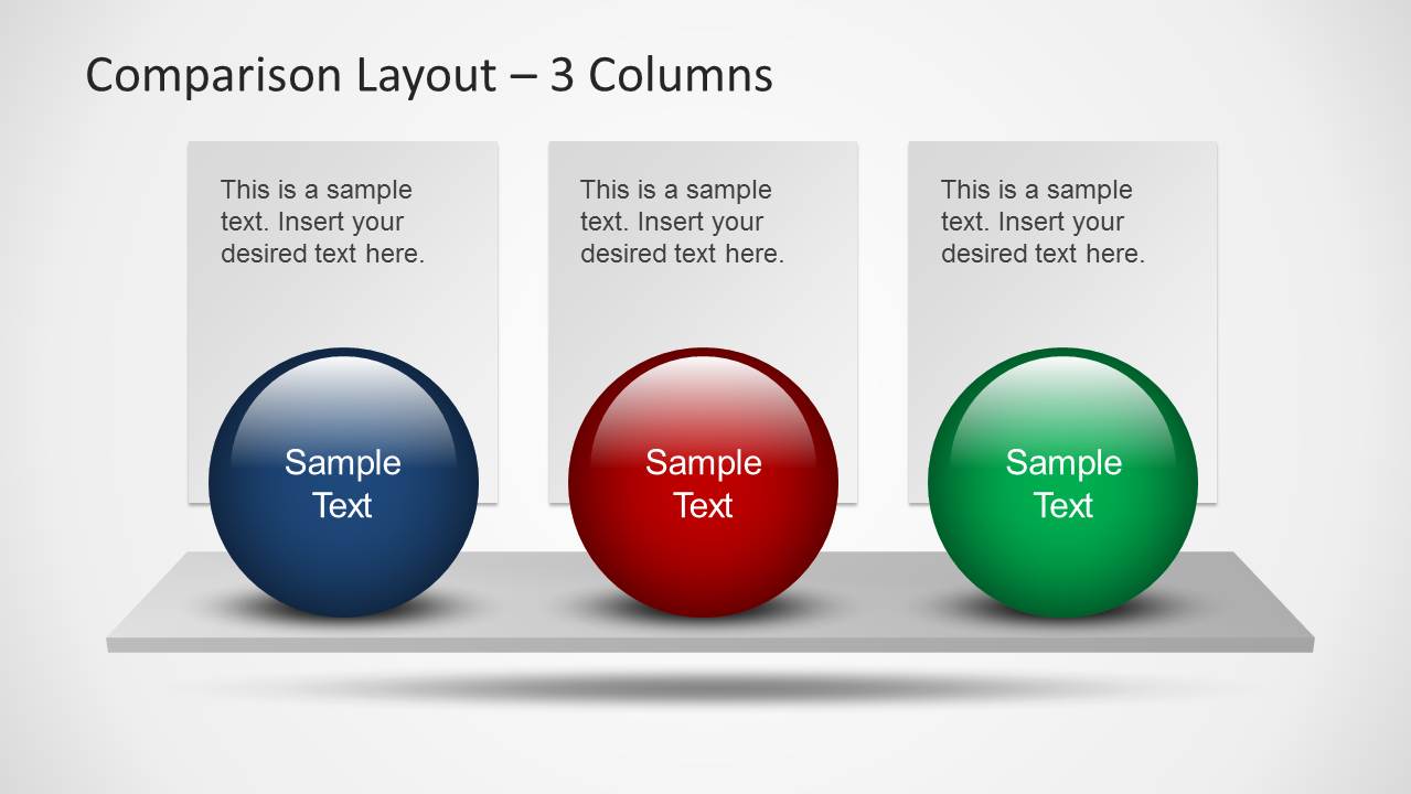
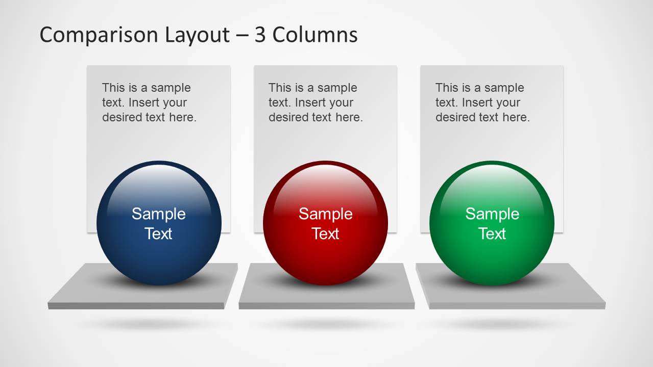
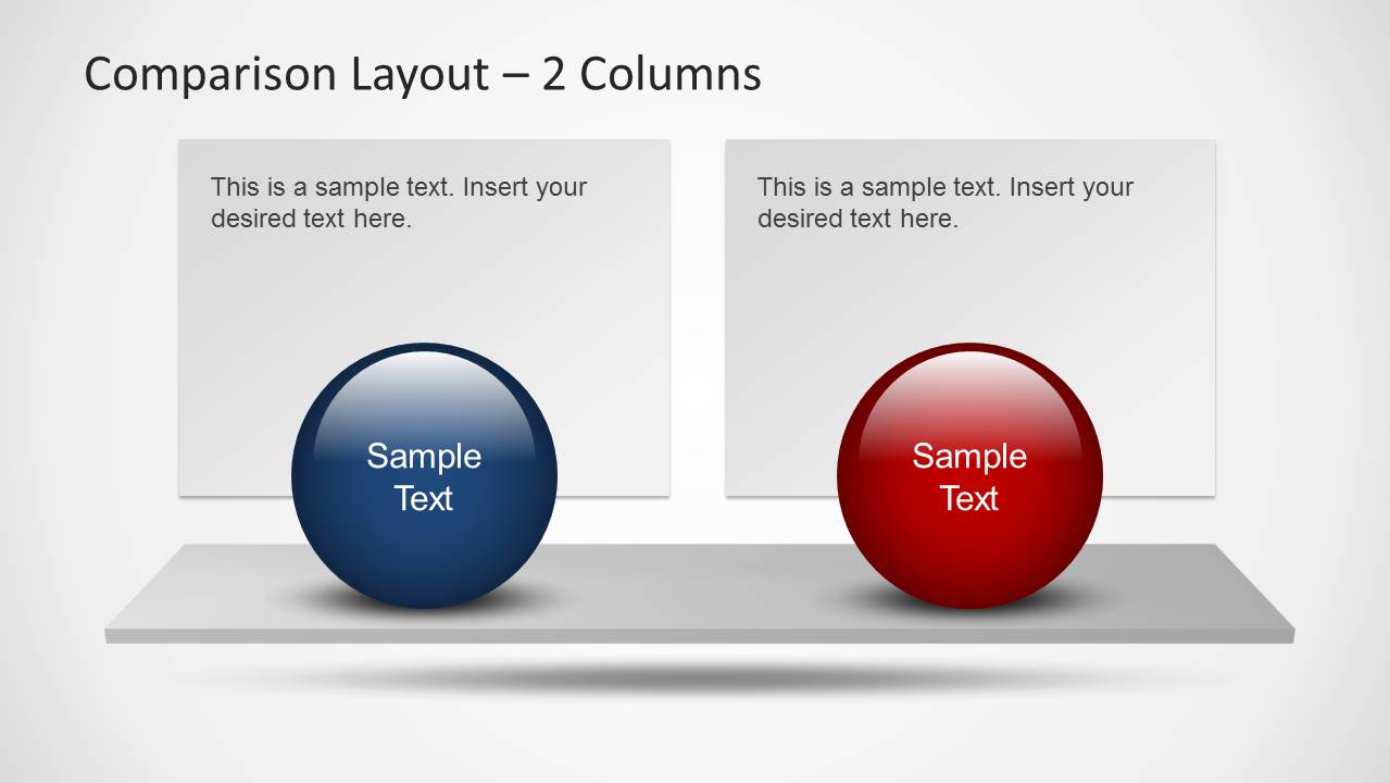
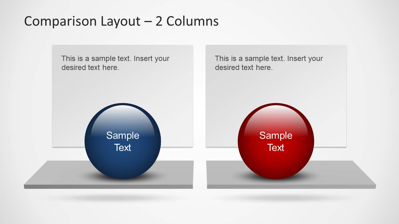
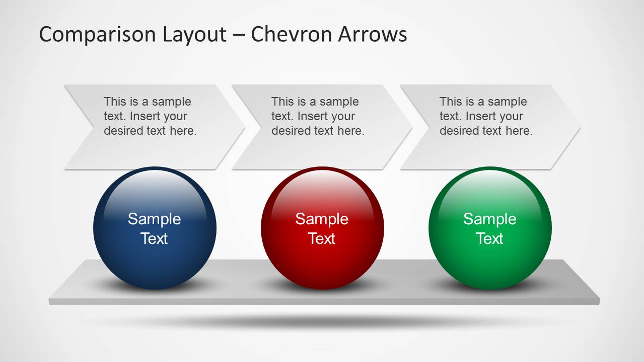

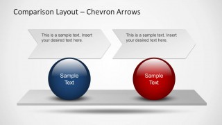
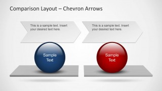
Comparison Layouts for PowerPoint with Spheres
8-slide PowerPoint presentation template for sphere-based comparison layouts, columns, and chevron process flows
Comparison Layouts for PowerPoint with Spheres is an 8-slide template for side-by-side evaluation and process comparison. It includes 2-column layouts, 3-column layouts, chevron arrow sequences, sphere labels, text panels, and pedestal bases. It is intended for business presenters comparing options, arguments, phases, quarters, or categories in PowerPoint.
- Rating


 Loading...
- Item ID
- 6235-01
- Colors
 Microsoft PowerPoint
  Microsoft Copilot
  Claude for PowerPoint
 Other formats supported
Subscribe today and get immediate
access to download our PowerPoint templates.