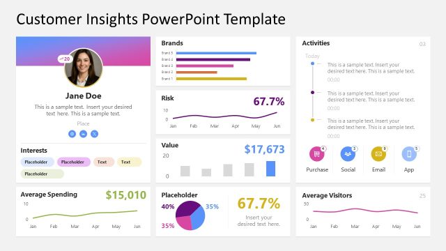
Blue Store Performance Dashboard PowerPoint Template
Present the key insights and trends derived from data analysis and research using our Blue Store Performance Dashboard PowerPoint Template in your review presentations.
In performance analysis presentations, business analysts use multiple data visualizations to summarize large datasets into simple, understandable charts. This helps stakeholders identify patterns and trends in the data, enabling them to make informed business decisions and improve their strategic approach. Business intelligence experts use the dashboard layout in board presentations to communicate their findings effectively. This also helps decision-makers revisit their decisions on business scaling and investment. For instance, if an outlet is underperforming, they can launch an improvement initiative for that specific branch, or double down on inventory in the best-performing outlets or online stores.
Project managers can share their performance report with the clients by editing the data-driven visualization. This also enables the clients to see the overview of the efforts made.
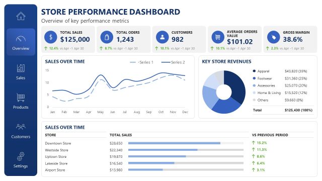
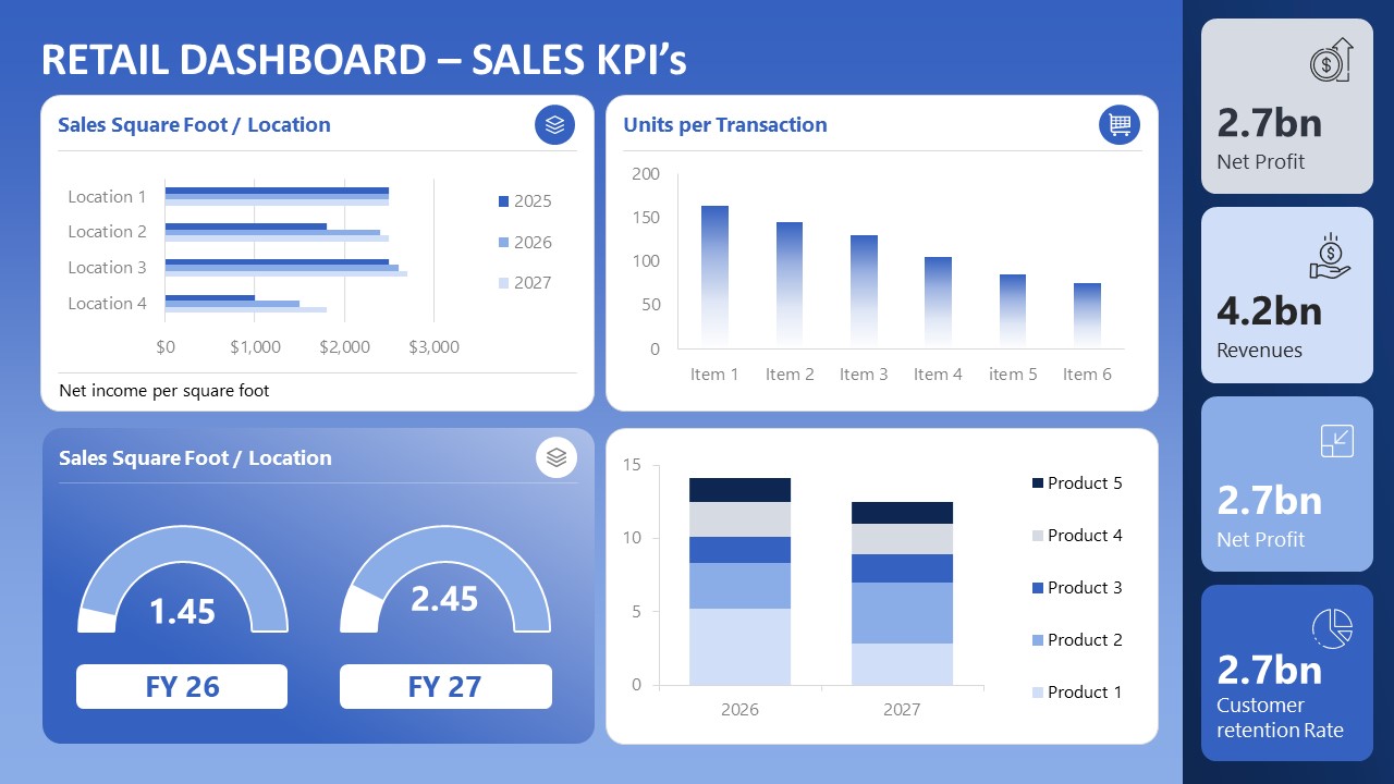
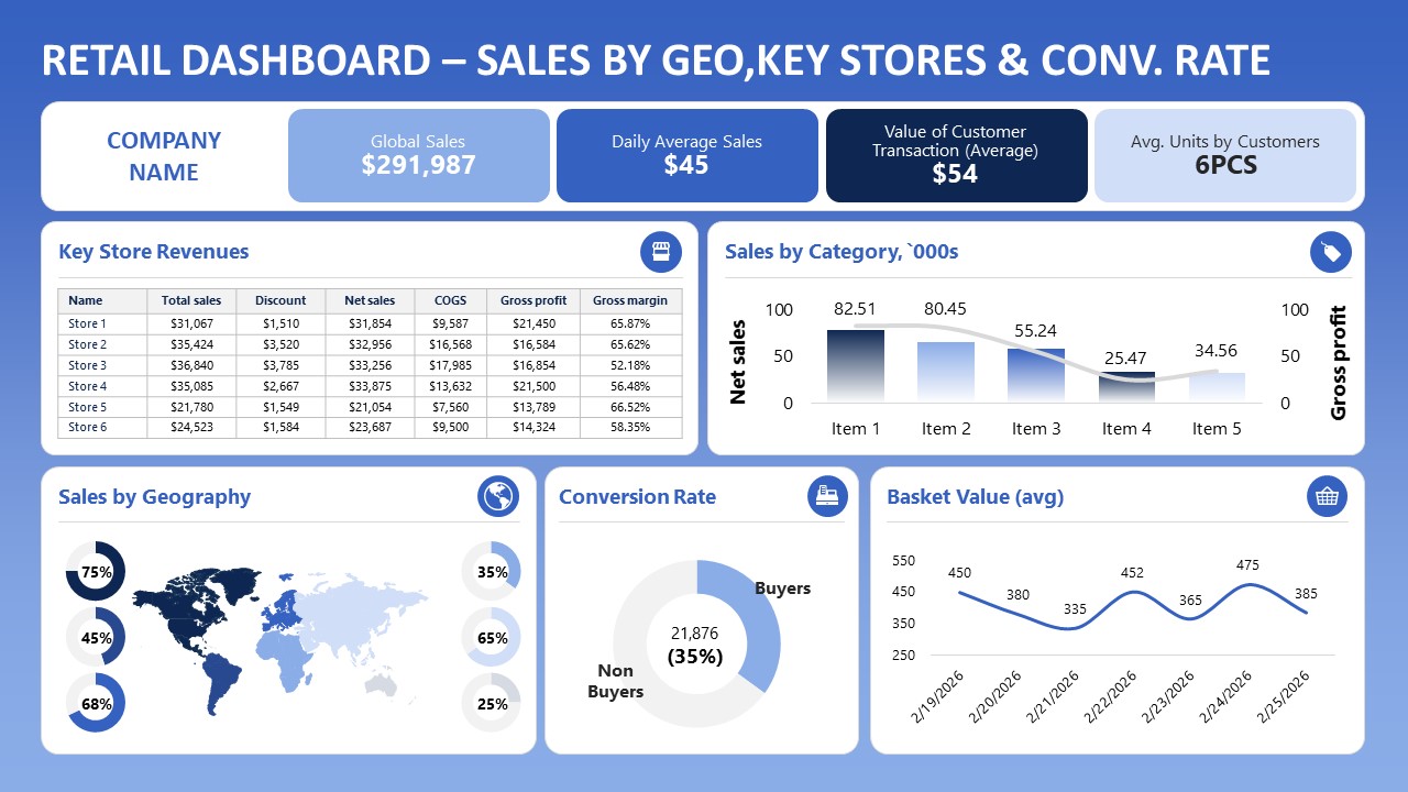
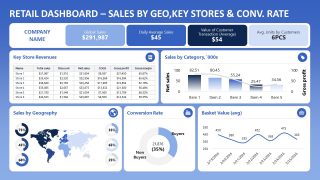
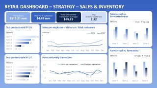
The Blue Store Performance Dashboard PowerPoint Template features a dashboard layout with many charts on a blue background. The blue store performance dashboard features three slides, each containing charts and data visualizations that present the KPIs.
- The first slide is useful for showing various sales KPIs, e.g., which product or outlet performed best and generated the highest profit.
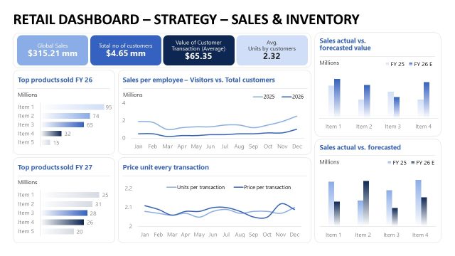
- On the second slide, data analysts highlight key store revenue, category sales, conversion rates, and more.
- The last slide shows total products sold by fiscal year (current and last), sales per employee, and price per unit for each transaction.
Business growth experts can also compare the actual sales with the forecasted sales using our editable dashboard PPT layout. Download the blue store performance dashboard PPT template to summarize business performance analysis effectively.
Alternatively, you can download other presentation dashboard templates, fully compatible with Microsoft PowerPoint & Google Slides.

You must be logged in to download this file.
DOWNLOAD- Category
- Business PowerPoint Templates
- Rating

 Loading...
- Size
- 16x9
- Item ID
- 23669-02
- Colors
Subscribe today and get immediate
access to download our PowerPoint templates.