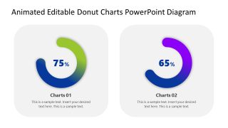
Animated Editable Donut Charts PowerPoint Diagram
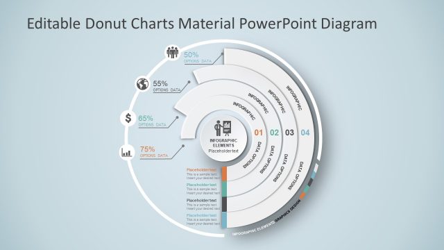
Present your data in a visually appealing style with our Animated Editable Donut Charts PowerPoint Diagram in your stakeholder meetings. Donut charts are a visual representation of statistical data in a comprehensible layout. These are similar to pie charts, but they contain a hole or space in the center, whereas pie chart segments start from the center of the circular shape. This hollow space allows users to enter text, use an icon, or add a label. This editable donut chart template is designed with editable PowerPoint features, allowing users to customize it further with any PowerPoint version. You can customize the chart colors, font styles, and other elements in the template to perfectly fit your needs. The donut chart template features two slides with a similar graphical arrangement but differ in their background colors. The first slide has a white background while the other one has a dark background.
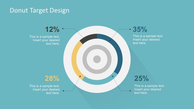
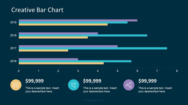
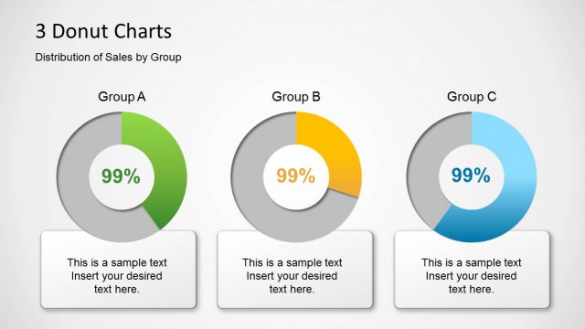
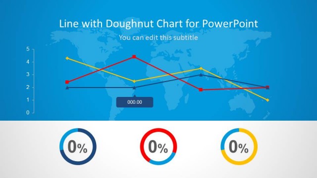
The Animated Editable Donut Charts PowerPoint Diagram shows round-edged square shapes, each with a donut chart. The chart outline is thick and displays a gradient color palette. The donut chart shows a percentage value at its center, with the length of the arc around the circle visually representing the same value. This enables users to understand the percentage or ratio quickly. Moreover, data experts can effectively showcase consumer viewpoints, both positive and negative, and other key points with our donut charts.
Additionally, professionals can effectively display trends in their advertisement campaigns using this diagram. Recruiters and project managers can use this template to discuss the outcomes of talent acquisition or project activities, respectively. Both the donut charts are animated and move in an attractive style when in the slideshow. Download the animated donut chart template and try it today!


You must be logged in to download this file.
DOWNLOAD- Category
- Data & Charts
- Rating

 Loading...
- Size
- 16x9
- Item ID
- 22390-01
- Colors
Subscribe today and get immediate
access to download our PowerPoint templates.