Data Science
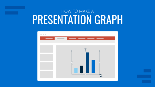
How to Make a Presentation Graph
Detailed step-by-step instructions to master the art of how to make a presentation graph in PowerPoint and Google Slides. Check it out!
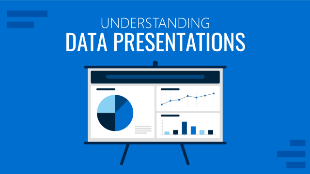
Understanding Data Presentations (Guide + Examples)
Elevate the quality of your message by learning how to work in data presentations effectively. Insights, examples, and PPT templates here.
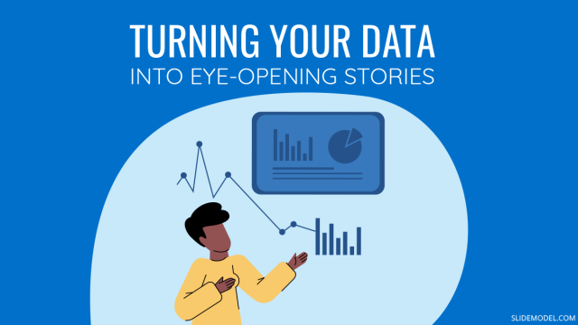
Turning Your Data into Eye-opening Stories
What is Data Storytelling is a question that people are constantly asking now. If you seek to understand how to create a data storytelling ppt that will complete the information for your audience, you should read this blog post.
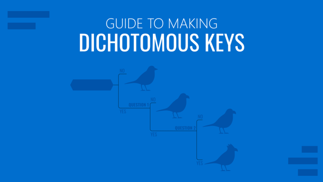
Guide to Making Dichotomous Keys
Master the art of crafting dichotomous keys with this comprehensive guide. Definition, types of dichotomous keys, and real-life examples.
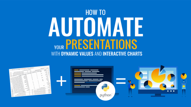
How to Automate your Presentations with Dynamic Values and Interactive Charts
One of the most important reasons we create presentations is to analyze data, get some insights, and share those findings. In some cases, when we analyze the same data numerous times, it helps a lot to automate the process.
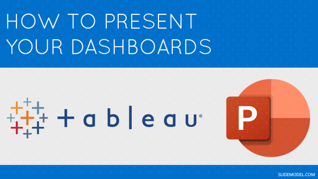
Present Your Tableau Analysis in PowerPoint
Presenting complex data in simple and understandable ways is one of the challenges presenters face when building their own Presentation Dashboards. That’s why, one of the many reasons why PowerPoint is as popular as it is, and that sets PowerPoint apart from its competitors, is the sheer availability of data visualization options that exist within […]