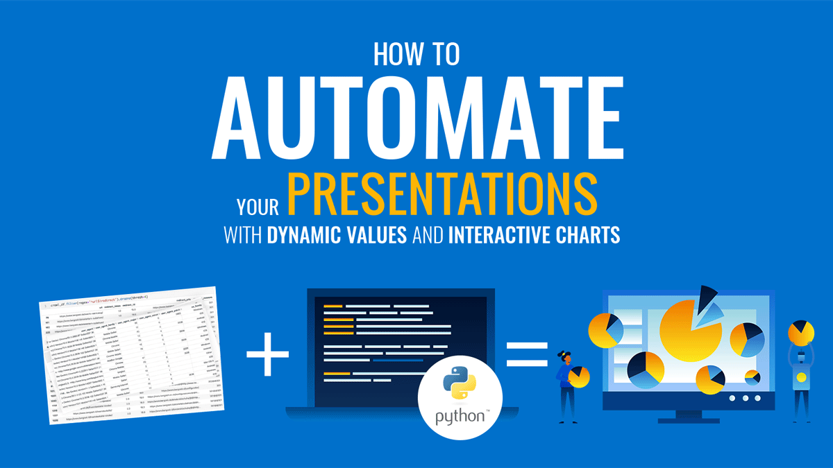
One of the most important reasons we create presentations is to analyze data, get some insights, and share those findings. In some cases, when we are analyzing the same data numerous times, it helps a lot to automate the process.
It would be great if we can take this week’s data, plug it in somewhere, click a button, and have the same presentation updated with the new values and charts.
Here are some situations in which this might be interesting:
- Every morning, in order to start your day, you want to explore the latest bunch of datasets in a customized way that is specific to your needs.
- You have tens of thousands of subscribers, and for each one you want to send a customized presentation, summarizing their account’s data.
- On a weekly basis, you want to analyze and share the same data for your weekly meeting/presentation.
- When you start a new project or work with a new client, you usually start by analyzing a stable dataset, and you have pretty much the same starting analysis.
In this tutorial, we will be working toward building an interactive presentation with dynamic values, analyzing tweets data. You can also plug in a different dataset (with the same format), and update the charts with your data’s values. The presentation will look like this:
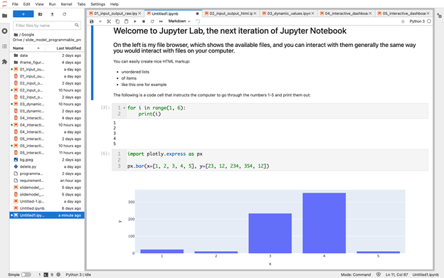
We will be using Jupyter Lab (the latest iteration of Jupyter Notebook) as our development environment, and Python as the programming language.
You can get an interactive version of the code in the article here if you would like to follow along with the coding. [ Project’s source code at GitHub ]
If you are not familiar with the Jupyter Notebook environment, it is a browser-based tool that contains code cells. You write code and run each cell. It evaluates the code and displays the result(s) right underneath the code. This is ideal for all kinds of data analysis tasks:
Let’s now see how programmable presentations are created.
Creating your first programmable presentation
Let’s start by seeing how you can create the simplest presentation in a Jupyter notebook.
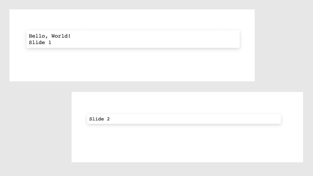
We first create two code cells that instruct Python to print very simple text:
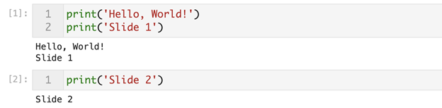
We now have two cells that print simple text as you can see above. Now we need to specify that these code cells should become slides in our presentation. We can do this using the property inspector on the right side of the screen. Once we select a cell (which should now be highlighted with a blue strip on the left), we choose the option from the “Slide type” dropdown:
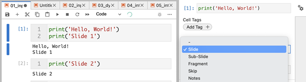
As you can see, there are several options for slides:
- Slide: The highlighted cell should be rendered as an independent slide.
- Sub-slide: This cell should also be rendered as a normal independent slide, but it would belong to the previous slide. This allows readers to navigate down (if they want to see sub-slides), or navigate to the right if they want to skip the sub-slides.
- Fragment: Cells would be rendered as consecutive elements on the same slide. This is similar to rendering each consecutive bullet point in a presentation. If you don’t want to distract the audience with six points at once, you only show the first, then the second, and so on.
- Skip: As the name suggests, this says that we don’t want to include this slide in the presentation. This is really useful for having code that is required to create some data, but should not be presented for example. It’s also good for creating notes for you, or any collaborators working with you on the project.
- Notes: Speaker notes that are visible to you, but not the audience. This requires some additional setup.
Now that we have specified that those two cells should be slides, we can now go on to generate the presentation. We can do this with a command line tool called nbconvert. The command is fairly simple:
$ jupyter nbconvert name_of_file.ipynb --to slides
The --to option allows us to convert to various other formats like html and pdf for example.
Instead of leaving the notebook and running this from the terminal, we can utilize Jupyter’s ability to run command line commands through the code cells. All we have to do is start the cell with the exclamation mark, which causes Jupyter to run this line as a command line command. To do this, we can create a third code cell and simply add the exclamation mark to the beginning:
! jupyter nbconvert name_of_file.ipynb --to slides
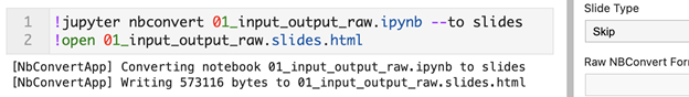
As you can see, it’s also good to assign the type “Skip” to this code cell, because we don’t want the readers to see this command. We also added the open command so we can immediately open it in a new browser window. This is not required and we can simply double click the file’s icon to open it. I just use this while creating presentations because it’s convenient and allows me to immediately generate and open new presentations and check the progress.
As a result of running the last cell, we get our presentation slides in a browser window:
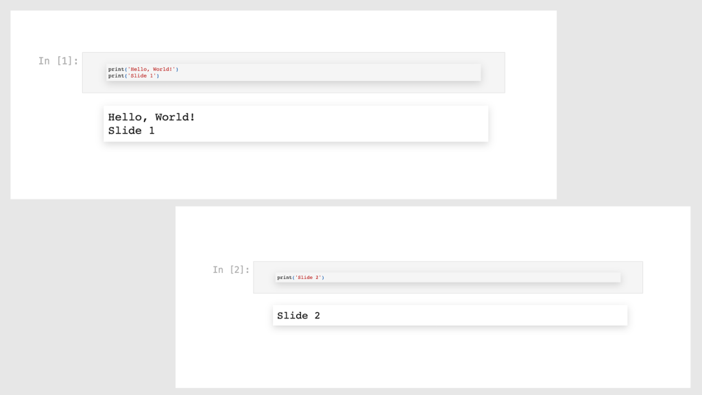
Congratulations on programming your first slideshow!
An important thing now is to remove the code cells (the inputs), because we only want the audience to see the outputs, and not how they were generated.
Actually, in many cases, especially if your audience is technical, they might actually want to see the code, in which case you may want to keep them. But generally if it’s a presentation you can share the notebook later if anyone is interested in the code.
Removing the inputs is very easy, and all we have to do is run the same command with the –no-input option:
!jupyter nbconvert 01_input_output_raw.ipynb --to slides --no-input
Running this code and opening the new presentation would look like this:
Now we have a presentation that was programmed, and with a cleaner interface, and now we know how to generate them easily.
It still doesn’t look that good, and we don’t have dynamic values that would change when our data changes. We will do this now.
Adding HTML and Markdown with dynamic styling to slides
The previous presentation generated plain text, and now we want to use the full richness of HTML in our slides. HTML is what is used to instruct your browser to generate the page you are reading, and we have full access to HTML, in order to render whatever we want in terms of coor, sizes, styling, and so on.
Writing full HTML code is a little tedious however, and might be error prone.
This is why we can also use Markdown, which is a very easy way to write (and read) code that would eventually be rendered as HTML.
For example, if I wanted to list three bullet points with HTML, I’d have to do it like this:
<ul>
  <li>green</li>
  <li>blue</li>
  <li>red</li>
</ul>
With Markdown:
* green
* blue
* red
It’s clear how much easier Markdown is to write and to read as well. I mostly use Markdown, but in some cases, when you want some more customization, it’s good to use full HTML as we will do in the following example.
The main module for creating and rendering rich objects in the Juypter notebook is going to be the display module in the IPython package. “Interactive Python” was (and still is) an alternative Python REPL (read-evaluate-print-loop) that was easier to use than the traditional Python REPL. It is still available, and also evolved into the Jupyter notebook, which we still use under the hood.
We first import it, and start using it right away:
from IPython import display
The display module has various functions and classes, and we start by using the display_markdown function as follows:
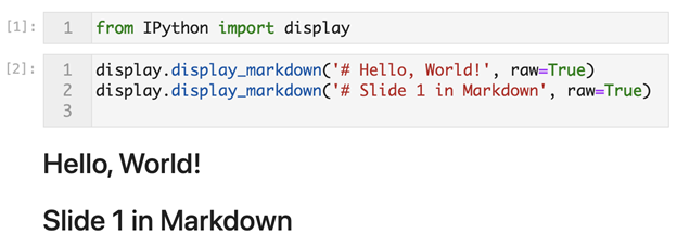
You can see here how easy it was to generate <h1> content. We simply add a # to the beginning of the string that we want to wrap in <h1> tags. Other headings work similarly, ## for <h2>, ### for <h3> and so on. Note that we need to pass raw=True to these functions.
We get the two lines that we wanted to display right underneath the code in the output area.
Let’s now see why we might want to use HTML to write the same text.
We want to give a certain color to the first line, and in the second line we want to only color the word “HTML”. Not only that, the color would be randomly generated from a set of two colors based on a certain probability, so you might see it as blue, or red.
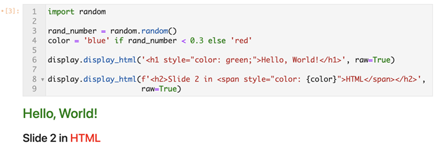
After importing the random module, we ask it to generate a random number, which would be a decimal number varying between zero and one.
Then we create the variable color, which takes the value “blue” if rand_number is less than 0.3, and “red” otherwise. This means that we get blue with a 30% probability and red with 70%.
In the first call to display_html we use full HTML code, and we include the style attribute to color that text in green.
In the second call we also use HTML, and we give the style attribute of the span around the string “HTML” the value “color”, which in this case turned out to be red.
There is more detail involved in writing HTML, and it’s not as easy to read, but it’s definitely worth it when you want those customizations.
Our presentation is a little more complicated now, and it’s a very good thing that everything can exist in one document. The text, the charts (more on this later), and more importantly, the code that generated those outputs. Compare this to the traditional process of dancing between some data file, Microsoft PowerPoint, Excel, and within Excel having to do many side calculations, small tables that have no name, and manually integrating everything in a slideshow that not even you can properly remember how things were created. Also, a good practice is to have a folder where this presentation is created. You would also have a sub-folder for data files, and maybe some images, as well as your Jupyter notebooks.
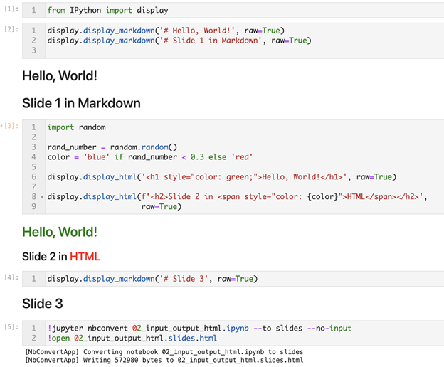
This is how the slides look like after rendering them in a browser using the code above:

A very important thing to note is that the Jupyter notebook has two main types of cells. It’s important to note some points about that.
Types of cells in the Jupyter Notebook
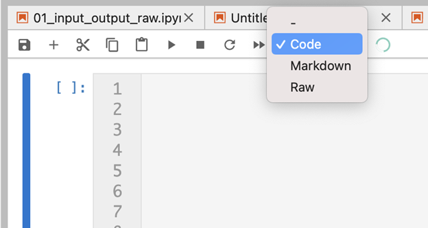
There is an easier way of writing Markdown, and that is by changing the type of the cell from code cell to Markdown cell. Once you select a cell, you can change its type using the dropdown menu showing Code, Markdown, and Raw:
Once you select Markdown, the cell no longer interprets the code as Python code (or any other language), but as Markdown. In this case you don’t need to use the display.display_markdown function, you just start typing Markdown in that cell. Once you run the code it renders it as HTML, and you can’t see the inputs anymore, until you click and start editing again. This is slightly more convenient, but you can’t display dynamic values of variables, and can’t programmatically change the rendered text, at least not yet.
So, my recommendation is that if you don’t have dynamic values, and it’s a one-off presentation, you can use the different types of cells, but if you want the full programmatic presentation, the display_<object_type> functions are your best friends.
Let’s now see how this might be taken a step further with more customization, and a potential real-life use case.
Generating dynamic HTML values for a sales report
Assume we have a target, together with sales figures for our sales department:
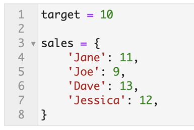
We want to loop through the names and figures, and generate a phrase with dynamic values. The name of the sales representative, the amount they generated, a word that takes the value of “exceeded” or “missed” depending on the difference between their sales figure and the target.
We want to dynamically color the phrase based on hitting/missing the target, and also hyperlink each phrase to the respective sales representative’s page.
Let’s first generate the plain text dynamic phrases:
<IMAGE>
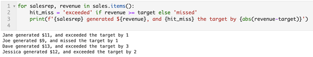
We now have the dynamic text generated, taking on dynamic values for each sales representative. Let’s now use HTML, to dynamically color the lines based on hit/miss and to generate (fake) hyperlinks for each one https://example.com/salesrep/{salesrep_name}:
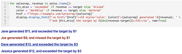
The two additions to the code were simply the color variable, which depends on whether or not the difference between the revenue and target is less than zero, as well as the dynamically generated URL. The text is displayed with the display_html function to give us the full power of HTML.
So far, we have created slides and presentations that take on dynamic values based on the data, we now see how we can have interactive slides, allowing users to explore the data on their own.
We first show a very simple example, and then go on to generate interactive tools for a real-life dataset.
Creating interactive slides and presentations
With static presentations, readers typically consume them in a passive way. They simply read what we wrote. But presentations can be much more engaging, containing massively more information, and allow for discovery and unexpected results.
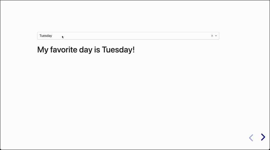
The next presentation will have a single slide that is interactive. It doesn’t do much, but it shows the concept in its simplest form:
Of course the other major value of having interactive presentations is with recurring presentations using the same data with different values every day, week, or month.
I’m using Dash for creating the interactivity in this mini app. Dash is one of several options for creating interactive apps, and a discussion of how it works is beyond the scope of this article, but I’ll give an overview of the code that was used. First the packages and imports:
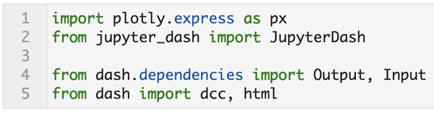
Plotly is the data visualization package. It is also the name of the company that produces Dash. Plotly Express is another package they have for high-level intuitive visualization.
JupyterDash is basically Dash but tailored for work within a Jupyter environment.
From Dash itself we import several modules and functions:
- Input: The interactive component, a dropdown in this case, will serve as an input to our app. It’s value will depend on the selected day. This value will determine what will happen underneath it, in the output area.
- Output: Once we take the value of the Input, we now know what to do with it. In this case we have a simple template “My favorite day is {day}”. The value of the input is inserted here to produce the output.
- dcc: Dash Core Components is the module that contains the interactive components. In this case we used one of them, which is the
Dropdowncomponent. - html: This is the module that contains all the HTML tags, and allows us to generate them using Python only. We use it to format the Output part of the app.
The following code creates the interactive favorite day app that we just saw:
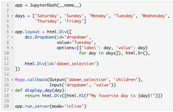
We first created the app variable, which we did using JupyterDash.
Then we created the variable days, which is a list of the seven days of the week.
We also created the layout attribute of the app, which consists of an HTML div, which in turn contains two elements:
dcc.Dropdown: The dropdown component containing the seven days as options, and having the ID of “dropdown”, with a default value of “Tuesday.”html.Div: This is a simple container that has no content, and has the ID “ddown_selection”. The value and format of what ends up showing in the div is determined by the Input, and is created using the callback function in the lower part of the code.
The callback function is where interactivity happens. It takes the Output and Input, and based on the decorated function does something with the Input to produce the Output.
The final line invokes the run_server method to start the app.
I know this description is not complete if you don’t know how Dash works, but that would require a separate discussion. I wrote a book on Dash if you are interested in learning more.
We covered how dynamic content can be generated and formatted, we saw some examples, and we also saw how slides can be made interactive. Let’s now see how you might actually create and use an interactive presentation with real data.
Creating interactive presentations with real data
We now come to the practical use of our topic. We want to end up actually using such presentations in our day to day life.
We will go through the process of creating the presentation that we saw at the beginning, with a very brief description of the code used.
We start with the required imports:
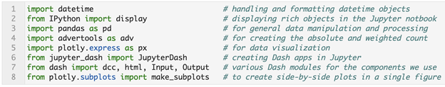
Once we have imported the required packages and functions, we create the main variables, tweets and topic.
These are the only non-automated objects that we create manually.
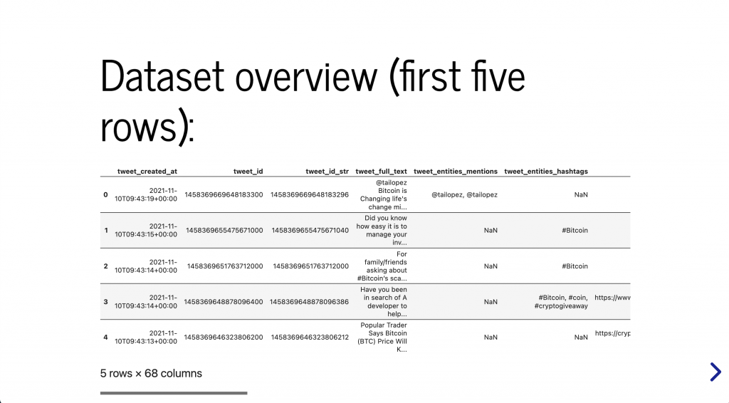
tweets: A simple string showing the location of the data file. In this case it is under our data/ folder and it is called “bitcoin_tweets.csv”.topic: The topic of the tweets that we are analyzing. Those tweets were obtained from the Twitter API, by searching for tweets containing the word “bitcoin”.
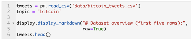
We then use the display_markdown function to say that this is an overview of the dataset. After that we run tweets.head() which displays the first five rows of the dataset.
Once those values are manually entered, we can now run the whole code and explore the presentation.
Let’s now see how the first summary slide is created:
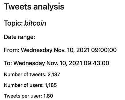
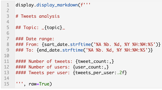
Creating a summary of the dataset
Before diving deep into charts and trends, you probably want to get some metadata about the dataset. As you can see, we have the topic, the date range, the number of tweets, users, and tweets per user.
This gives us a quick indication about some general attributes of our dataset.
Let’s quickly take a look at the code that generated it:
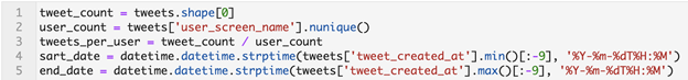
tweet_count: We get this by asking for the “shape” of the DataFrame that we are using, which gives us the number of rows and columns, from which we extract the first element (the rows)user_count: We take the user_screen_name column and get the number of unique values in it using thenuniquemethod.tweets_per_user: This is a simple division of tweets ÷ usersstart_dateandend_date: From thetweet_created_atcolumn we take the minimum and maximum values, which give us an idea on the date range in which those tweets were published. We then have to convert them to Python datetime objects by parsing them.
Now that we have created the variables, we can easily use the display_markdown function to create text that dynamically inserts those variables where they belong and give us an overview of our dataset:
Creating an interactive chart
The next slide shows a dropdown menu, and under it a chart that is generated based on the user’s selection. We give the user three options to choose from: most followed accounts, most retweeted tweets, and most liked tweets. The charts are similar to one another, they display a horizontal bar chart of the top fifteen items based on the selection.
The layout attribute of this app is the same as the one we previously discussed. It has a dropdown menu as well as an empty HTML div underneath it.
Then we have a callback function that generates a chart based on the selection. What it does is it takes the relevant columns and sorts them based on the requested value (number of followers, number of retweets, and number of likes). Some notes on what it does based on each of the selections:
- Most followed accounts: This is straightforward. It simply takes the columns “user_screen_name”, and “user_followers_count”, removes duplicates in screen names, and sorts based on the number of followers. It then displays the top fifteen.
- Most retweeted/liked tweets: These are also straightforward, using a similar logic to the most followed option. There is one difference though. Since we are dealing with tweets, which are long strings of text, it is difficult to display the full tweet text on the Y axis. So after filtering and sorting, we take the first forty characters of each tweet and display them on the Y axis. We then set the hover text to the full tweet. If the user is interested in reading the most retweeted tweet, they can simply mouse over it and do so.
Now that we saw who the most followed users are, and the most popular tweets, we move to see what specific topics were discussed. We do this by counting words in two ways.
Word counting: absolute and weighted frequency
When we count the most used words we get an idea about the topics that were discussed. This view is important to know what content was produced in that time period. But what about what content was most likely consumed?
If one person tweets “bitcoin is going up”, and another tweets, “bitcoin is going down”, we can say that the split between bullish and bearish tweeters is 50:50. But what if you knew that the bullish user had a thousand followers, while the bearish user had three million? The split is now 1,000:3,000,000.
Things are typically split that way on social media. Actually, in our dataset, as you can see below, we have an average number of followers of 5.3k, a minimum of zero, and maximum of 1.37M. The average is of course misleading because of the few extreme values that we have. Looking at the quartiles, we see that 25% of users have less than 36 followers, 50% of users are below 200, and 75% of users have at most 1,186 followers. One tweet from that top account could sway the whole discussion, and would have a much bigger impact than many others combined. Here are some summary statistics about the followers’ counts:
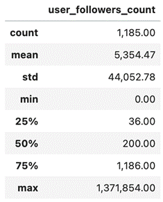
users_followers_count columnIn order to get a perspective on the word counts, we user the word_frequency function from advertools to get this overview, and then visualize the data:
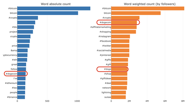
The words and hashtags “bitcoin” and “crypto” are in the top three on both charts. This is normal because by definition, we requested tweets about bitcoin. What is interesting is that dogecoin is the top keyword after bitcoin on a weighted basis, even though it appeared only 139 times. But on a weighted basis (the total number of followers of people tweeting anything containing “#dogecoin” is 2.86 million). That might give us a hint as to where to look for further analysis, and see why this topic is used by some of the most influential users in this dataset. We keep in mind that those tweets were tweeted in a 43 minute period, and the topic is extremely popular, so make your conclusions carefully.
This was a quick overview of how you can automate your presentations and scale the process and make it more efficient. There are many other options to explore like different types of charts, or adding various data sources. The most important skill is understanding your data, and being able to manipulate and visualize it the way you want. Grouping the slides together is straightforward in comparison. You can also add some machine learning techniques for getting other perspectives on your data.