Chart Templates
Learn how to make awesome charts using ready-made chart templates for Microsoft PowerPoint and slide designs to present your data.
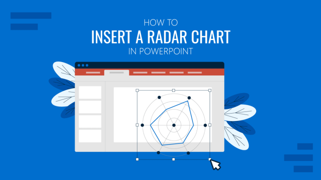
How to Insert a Radar Chart in PowerPoint
Looking for a method to evaluate performance metrics across categories in presentations? Learn how to insert a radar chart in PowerPoint here.
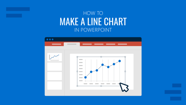
How to Make a Line Chart in PowerPoint
Discover how easy it is to make a line chart in PowerPoint with this detailed tutorial. Instructions to customize data and aesthetics here.
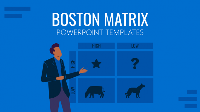
What is the Boston Matrix? (Templates + Examples)
Being a student of business management or an entrepreneur you are likely to encounter various concepts that have stemmed from the Boston Consulting Group, which is a renowned management consulting firm that has operations spread over more than 40 countries.
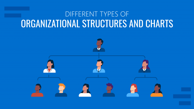
Types of Organizational Structures & Org Charts (with Examples + Templates)
Organizational charts serve as a blueprint for the chain of command of an organization. Different organizations tend to have more basic structures at inception, which become more complex and hierarchical as the organization expands. In what is to follow, we will elaborate upon the different types of organizational structures, organization chart types, and some recommendations […]

How To Prepare a Heat Map Data Visualizations Presentation
In this article, we introduce the concept of heat maps, their different visualization options, how to create and include them in your presentations, and a sequence of suggestions to engage your audience with your heat map analysis.
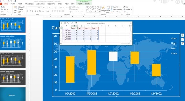
How To Edit the Candlestick Chart PowerPoint Template
The candlestick was introduced in Japan during 17th century and it was widely used for technical analysis to trade rice. The US version was initiated by Charles Dow around 1900, although many of the guiding principles were very similar. Candlestick is a chart that displays the high, low, opening and closing prices for a security. This kind […]
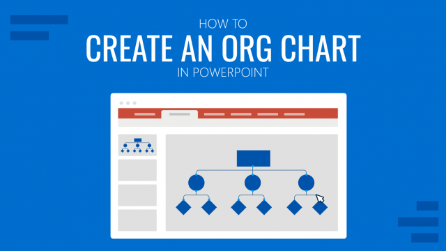
How to Create an Org Chart in PowerPoint
Discover different ways to professionally create an Org Chart in PowerPoint (with templates, examples and a Step-by-Step guide)
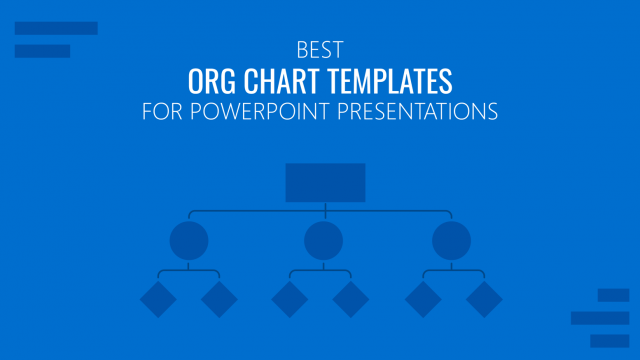
12 Best Org Chart Templates for PowerPoint Presentations
Creating an Org Chart in PowerPoint from scratch is not an easy task. In this article we present you the best 12 Org Chart Templates with a professional and editable design, compatible with PowerPoint and Google Slides.

How To Create a Waterfall Chart in PowerPoint and Excel
What Is a Waterfall Chart? Waterfall Charts are a special representation of Stacked Bar Charts that resemble a waterfall due to its decreasing or increasing values moving from left to right. This kind of chart is usually used to describe cash flow fluctuations. The first bar describes the initial value of the flow (starting point). […]
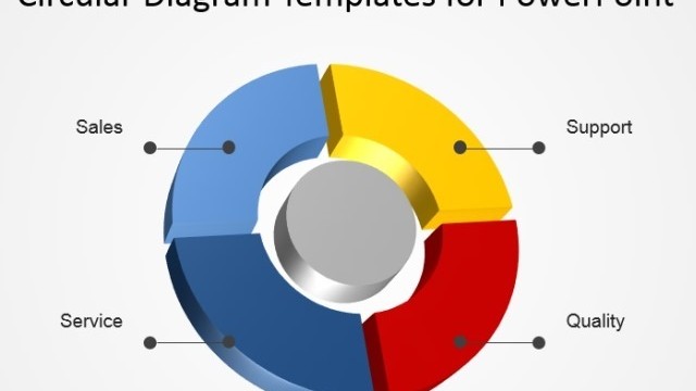
Using Circular Diagrams To Model A Process Cycle in PowerPoint
As important as Circular diagrams are, they aren’t the easiest to create. Trying to make a good looking circular flow diagram can take hours of work and even then it might seem crooked and less than perfect. This can leave you quite embarrassed, as your diagrams can be a make or break during presentations.
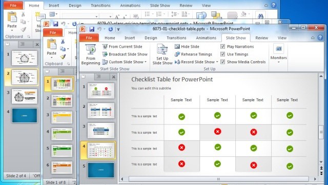
Best Comparison Chart Templates For PowerPoint
Comparison charts have become quite famous across social media nowadays. You might have seen comparison charts for battery time of different smartphones, the sales for different tablet models or the market share of various products or services. While such charts may seem novel for many internet users, the need for comparison charts for a business […]