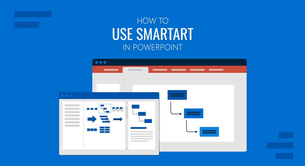
PowerPoint’s SmartArt graphics is one of the most useful time-saving features, thanks to the diagram presets you can use to create different types of professional diagrams. With SmartArt, you can transform text-heavy slides into structured visuals in no time, enabling you to create organizational charts, Venn diagrams, timelines, circular diagrams, and more.
In this tutorial, we will walk you through everything you need to know about SmartArt in PowerPoint, including how to insert, customize, and edit SmartArt graphics to visualize lists, hierarchies, processes, and relationships. You’ll also learn when to use SmartArt vs shapes in PowerPoint, and how to convert SmartArt into editable elements to achieve design flexibility.
What is SmartArt in PowerPoint?
SmartArt is a built-in PowerPoint feature that allows you to create diagrams and visuals from structured text. Instead of drawing shapes manually, you can select from predefined visual presets, such as process flows, hierarchies, or cycles. Furthermore, you can quickly turn information into graphics that communicate relationships and structure. Each SmartArt type is fully customizable, allowing you to change colors, shapes, and layouts to match your brand or presentation theme. This makes SmartArt useful for different types of presentations, such as corporate, educational, and training presentations, where data or workflows need to be summarized visually without spending hours on design.
SmartArt Categories
While several SmartArt graphics can be used for making diagrams, you can sift through the main categories to find a diagram type that suits your needs. The various SmartArt categories include the following:
- Lists: These diagrams represent sequential or bullet-style content with different designs to showcase lists.
- Processes: These diagrams can be used for making step-by-step workflows or timelines.
- Cycles: Circular flows representing ongoing processes. The circular diagrams in SmartArt graphics can be used to create Venn diagrams, represent cycles, and create mind maps, among other uses.
- Hierarchies: When creating diagrams to showcase organizational structures and reporting lines, hierarchical SmartArt can be a handy tool.
- Relationships: These diagrams show dependencies or a cause-and-effect analysis. Making them ideal for representing relationships between different nodes or performing a root cause analysis using a cause and effect diagram.
- Matrices: If you want to show grids showing relationships between elements, the matrix diagrams in SmartArt can be quite valuable.
- Pyramids: Pyramid diagram presets in SmartArt provide ranking or proportional structure-related visualizations.
- Picture Diagrams: If you want to create diagrams with pictures, such as a timeline, roadmap, or Venn diagram, you can use the Picture Diagrams in SmartArt.
Step-by-Step Guide: How to Use SmartArt in PowerPoint
How to Insert SmartArt in PowerPoint
Inserting a SmartArt graphic is easy: just a few steps to create a diagram based on a preset. Here are the steps to insert a SmartArt in PowerPoint:
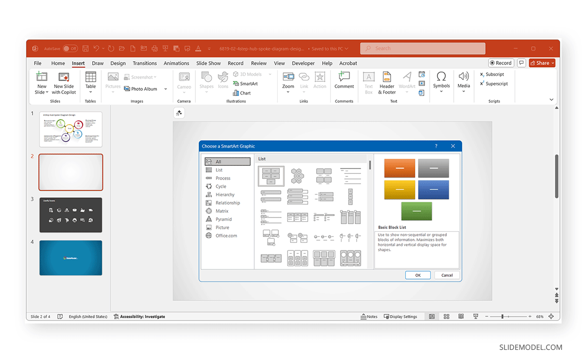
Step 1: Go to the Insert tab on the PowerPoint ribbon and select SmartArt in the Illustrations group.
Step 2: Choose a category (e.g., Process, Cycle, Hierarchy, or another SmartArt graphic type).
Step 3: Select your desired layout to insert into PowerPoint. The SmartArt diagram will appear on your slide, ready for customization.
Pro Tip: If you already have bullet points in a text box, simply select them, right-click, and choose Convert to SmartArt for an instant visual upgrade.
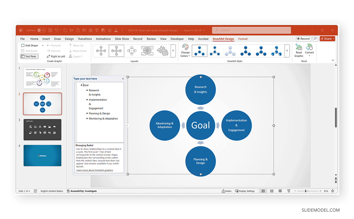
How to Add and Edit Text in SmartArt
Each SmartArt element includes text placeholders. You can type directly inside a shape or use the Text Pane, which opens on the left side of the SmartArt window.
Step 1: Open the Text Pane from the SmartArt Design tab.
Step 2: Add or edit text from the pane. In the Text Pane, each bullet represents one shape.
Step 3: Move the text up or down in the hierarchy as needed via options in the Create Graphic group on the SmartArt Design tab.
Editing Tips:
- Press Enter to create a new shape (a new bullet).
- Press Tab to indent (creating sub-levels in hierarchies).
- From the SmartArt Design tab, you can add shapes and bullets, open the Text Pane, and move shapes (Right to Left and Up or Down).
From the Format text using the Home tab for font, color, and alignment changes, and apply to selected shapes. You can also use the Larger and Smaller buttons from this tab to increase or decrease the size of the selected SmartArt shape.
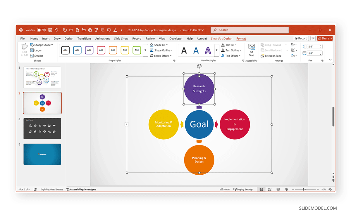
How to Customize SmartArt Graphics
Once your SmartArt graphic is in place, you can adjust its look to fit your presentation theme.
Step 1: Select the SmartArt object, and two new tabs will appear on the Ribbon menu. As explained in the previous section, these tabs provide the following options:
- SmartArt Design: This tab controls layout, color, and overall structure.
- Format: This tab controls shape size, effects, and text formatting.
Step 2: Explore Change Colors to apply prebuilt color palettes.
Step 3: Use SmartArt Styles to add effects like shadows or 3D.
Pro Tip: Choose styles that complement your slide theme rather than ones that might distract the audience, as simple gradients and flat designs work best for professional presentations.
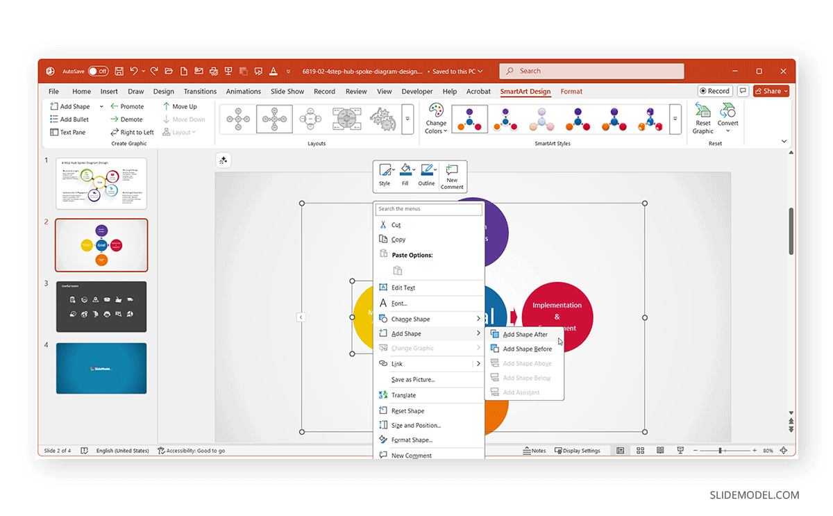
How to Add or Remove Shapes in SmartArt
SmartArt lets presenters expand or simplify graphics based on the added information. You can add or remove shapes to customize your graphics by using the following methods:
To Add a Shape:
- Click the SmartArt graphic, go to the SmartArt Design tab, and select Add Shape, or use the right-click context menu and select Add Shape.
- Select where to add the shape using the Before, After, Above, or Below options.
To Remove a Shape:
- Select the unwanted shape and press Delete.
Pro Tip: Always maintain symmetry in hierarchical or circular layouts. Uneven designs may distort or misalign automatically when exported or resized.
When to Use SmartArt vs. Shapes or Icons
Choosing between SmartArt, PowerPoint Shapes, or Icons depends on your design expertise, the complexity of your content, and the flexibility you need for future slide updates. Each option serves a different purpose within PowerPoint, and understanding when to use one over the other can save hours of design work while maintaining a consistent look for your slides. Here are a few PowerPoint diagram tips to help you choose the best option.
Structure and Automatic Alignment
SmartArt is ideal when your goal is to turn plain text or bullet lists into professional diagrams quickly. PowerPoint handles alignment, spacing, and sizing automatically, which means you don’t need to adjust shapes or connectors manually. For example, if you paste a list of process steps, SmartArt can instantly format them into a clean flowchart or timeline. This makes it perfect for corporate presentations, team updates, or classroom materials where visual clarity matters more than complex design customization.
Your Content Fits Predefined Categories
PowerPoint’s SmartArt library is built around common diagram layouts. If you’re creating a diagram for a reporting structure, a cyclical process, or a step-by-step workflow, there’s likely already a SmartArt layout designed for it. For example, you can use Hierarchy SmartArt to create org charts, Cycle SmartArt for iterative processes, or Process SmartArt to illustrate workflows or timelines.
You Plan to Make Frequent Content Updates
One of SmartArt’s most significant advantages is its dynamic adaptability. When you add or remove items in the Text Pane, PowerPoint automatically reorganizes and realigns the diagram. This means you can update project steps, team members, or milestones, without breaking your layout. For teams that regularly revise decks, such as project managers, educators, or consultants, SmartArt provides a scalable way to keep diagrams current without reformatting them manually.
When to Use Shapes or Icons instead of SmartArt
When You Need Full Creative Control
While SmartArt is structured, Shapes and Icons give you total freedom. You can control every detail, from position and angle to custom gradients, outlines, and layering effects. This is ideal for creative presentations, marketing visuals, or infographic-style slides where originality and brand personality matter as much as clarity. For instance, a marketing team designing a campaign roadmap might prefer custom shapes to integrate brand colors, logos, and non-standard layouts that SmartArt cannot replicate.
To Animate Individual Elements Separately
SmartArt treats most components as grouped elements, which limits detailed animation control. If you need to animate each part of a diagram individually, such as having arrows appearing one at a time or highlighting different stages in sequence, converting SmartArt to Shapes (or building it manually with Shapes) is the better approach. This allows for engaging, cinematic animations in executive briefings, training videos, or digital conferences.
You’re Adapting to Strict Brand Guidelines
While SmartArt provides functional, structured visuals, it has aesthetic limitations. Complex infographics, multi-layered data visuals, or dashboards often require shape-based compositions or icons sourced externally. Using PowerPoint’s Shapes and Icons lets you build visuals that are not confined by preset layouts, such as concentric circles, stylized pyramids, or infographic timelines with branded icons. These designs resonate better in creative, marketing, or data storytelling contexts where visual originality drives engagement. If your organization has strict brand guidelines, such as specific color codes, iconography, or typography, SmartArt may not fully meet those requirements.
Pro Tip: Start with SmartArt to structure your content, then convert to shapes for advanced design freedom. This hybrid workflow combines SmartArt’s simplicity with PowerPoint’s full editing capability. This has been explained in greater detail in the section below about ‘How to Convert SmartArt to Shapes’.
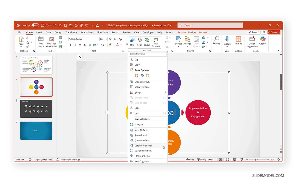
How to Convert SmartArt to Shapes (Advanced Customization)
For advanced design flexibility, PowerPoint lets you convert SmartArt to editable shapes. You can do this by right-clicking the SmartArt object and selecting Convert to Shapes. PowerPoint ungroups each element into individual shapes.
Why do this?
- To animate individual components.
- To recolor or restyle shapes beyond SmartArt presets.
- To integrate visuals into infographic designs or PowerPoint templates.
Warning: Converting breaks SmartArt’s automatic structure. Once converted, edits must be done manually. Always finalize content before conversion, or keep a backup of the slides in case you need to revert to the old design.
When to Move Beyond SmartArt Entirely
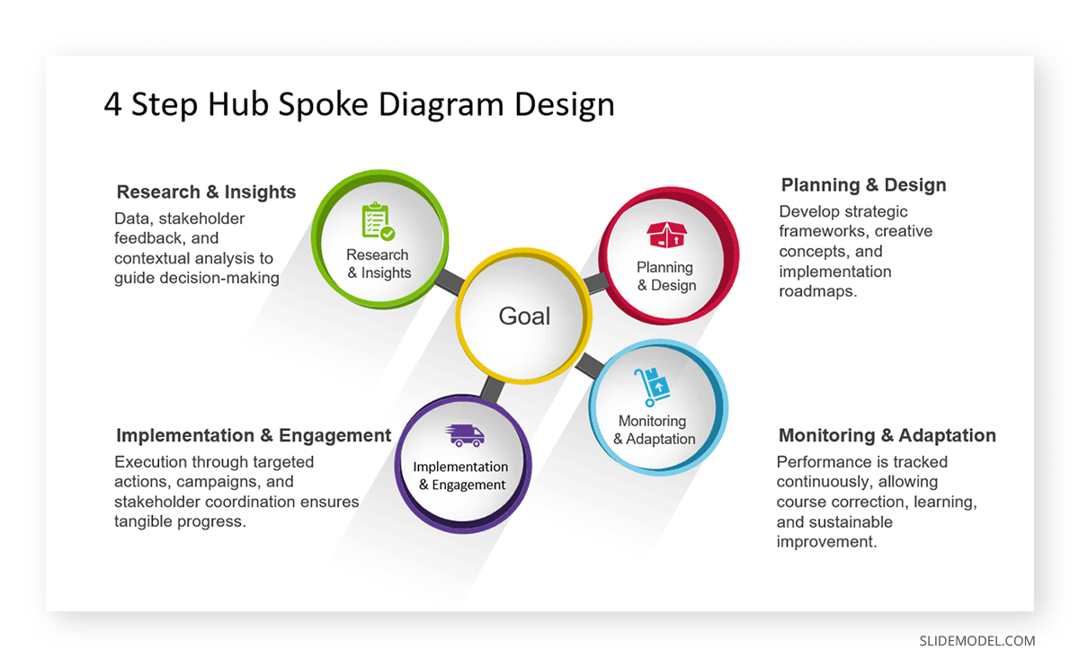
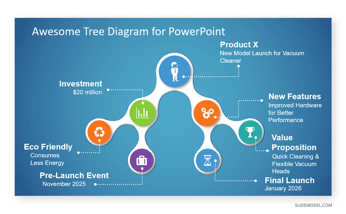
For more complex or design-driven visuals, SmartArt’s built-in templates may not be enough. This is where professional diagram templates become invaluable. If you’re creating high-impact visuals such as executive dashboards, multi-stage roadmaps, or strategy frameworks, you can save time and enhance design quality with these PowerPoint SmartArt templates. These templates expand your options beyond PowerPoint’s defaults, offering creative layouts for timelines, infographics, business models, and data-driven slides that stay consistent with modern corporate design standards. An example is the 4 Step Hub Spoke Diagram Template for PowerPoint that we used to create a diagram we previously created in SmartArt to demonstrate the utility of SmartArt graphics. As you can see from the image below, the template provides greater flexibility than SmartArt graphics, with professionally designed layouts that are easy to edit and adapt for diagrams.
Everyday Use Cases for SmartArt
Below are some of the most common uses of SmartArt by presenters.
1. Project Workflows
SmartArt is useful for depicting project workflows, where teams need to see how tasks progress from one phase to another. The Process category of SmartArt includes layouts such as Basic Process, Chevron List, or Alternating Flow, which visually guide audiences through a series of stages.
Example:
A project manager at a construction firm might use a SmartArt Process Diagram to communicate the lifecycle of a housing project, from planning and design, through procurement, construction, and handover. Each step can include key deliverables or responsible departments.
For projects that require tracking goals or dependencies, SmartArt can help teams avoid confusion by visually connecting items in sequence. For a hands-on guide, see our tutorial: How to Create a Roadmap in PowerPoint with SmartArt. This walkthrough demonstrates how to transform a linear process into a visually engaging roadmap that highlights milestones and critical paths.
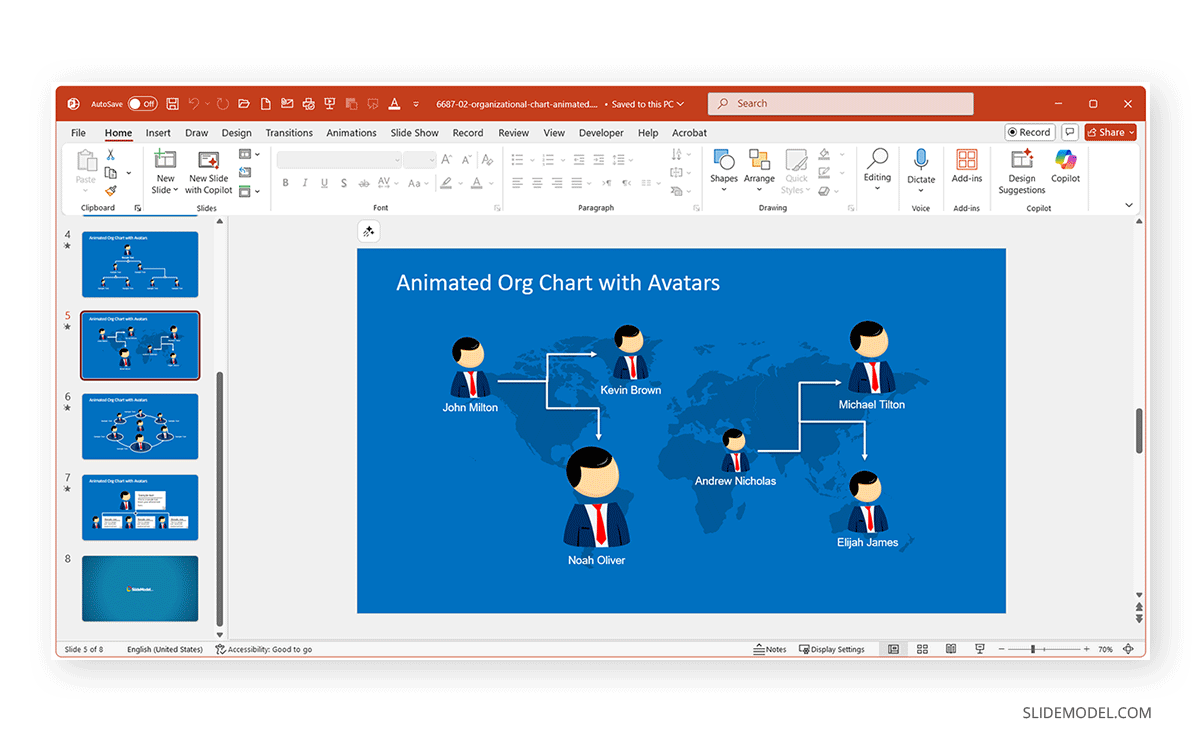
2. Organizational Charts
One of SmartArt’s most frequently used applications is building organizational charts. The Hierarchy category provides templates like Organization Chart and Picture Organization Chart, which are ideal for showing reporting relationships, team structures, and leadership hierarchies.
Example:
An HR manager preparing an onboarding presentation can create a SmartArt org chart to help new employees understand reporting lines. For example, many large companies often include simplified org structures in their internal communications, especially during leadership changes or global team integrations. SmartArt allows similar professional clarity on a smaller scale for any organization.
If you want to build your own chart, explore this step-by-step tutorial: How to Create an Org Chart in PowerPoint. You might also be interested in this Animated Org Chart PowerPoint Template that comes with creative organizational chart designs using avatars.
3. Timelines and Milestones
Another major use case for SmartArt is illustrating timelines, milestones, or project stages. In the Process category, layouts such as Basic Timeline, Continuous Picture List, and Circle Accent Timeline make it easy to show chronological sequences or strategic roadmaps.
Example:
A marketing manager planning an annual campaign can create a SmartArt timeline showing phases such as Market Research, Creative Development, Campaign Launch, Measurement, and Optimization. Each stage can include icons or small images to represent milestones, giving executives a quick, high-level overview of the schedule. Timelines are also common in academic and R&D contexts, where researchers outline the phases of a study or a product development cycle.
You can learn the detailed steps in our tutorial regarding timeline creation using SmartArt graphics: How to Create a Timeline in PowerPoint with SmartArt.
4. Comparisons
SmartArt’s Relationship and Matrix layouts are perfect for comparison diagrams, allowing presenters to contrast two or more alternatives side by side. Layouts like Basic Matrix, Balance, or Horizontal Comparison can be customized to show the pros and cons of different options or to visualize feature comparisons.
Example:
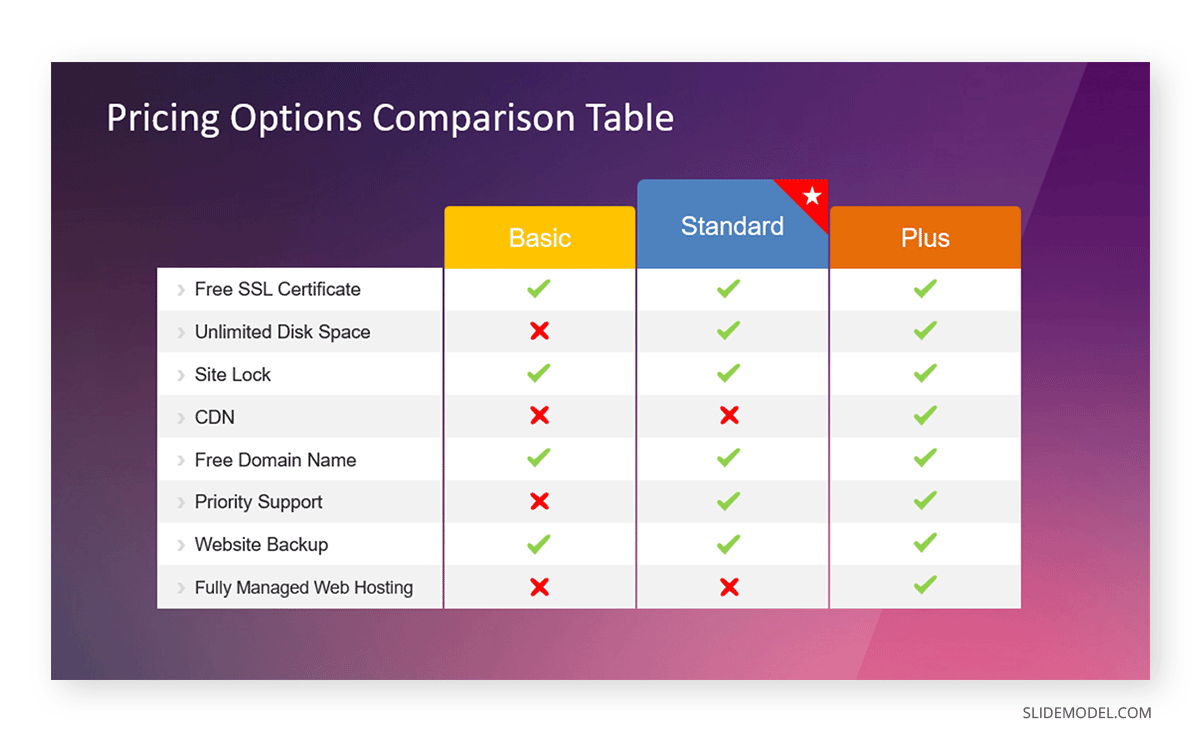
A product manager can use a SmartArt Comparison Diagram to compare two software versions, highlighting performance, security, and cost differences. Each column in the matrix corresponds to a feature area, while the rows represent the two versions. When creating pitch decks, comparison diagrams can quickly convey decision points without lengthy text explanations, making them invaluable in fast-paced business meetings. Other than SmartArt, you can opt for ready-made diagrams, such as this Pricing Options Comparison Table for PowerPoint, which can help create a comparison chart in no time.
5. Cause and Effect Relationships
Many professionals use SmartArt to explain cause-and-effect relationships, where one event or variable influences another. The SmartArt Relationship category provides visual frameworks, such as Basic Chevron Process, Converging Arrows, and Diverging Radial, that help simplify complex systems.
Example:
A healthcare analyst might illustrate how diet, exercise, and stress levels contribute to overall wellness outcomes. Each input (cause) can be represented by arrows feeding into a central circle labeled ‘Health Outcome’. Similarly, in manufacturing or quality management, SmartArt can help explain frameworks like the Fishbone Diagram (Ishikawa) concept, showing causes such as Materials, Methods, Machinery, and Manpower, leading to an effect like Product Defects.
6. Cycles and Loops
SmartArt excels at showing continuous processes, where the end of one stage leads back to the beginning. The Cycle category includes layouts like Basic Cycle, Radial Cycle, and Gear Cycle, all designed to emphasize repetition and interdependence.
Example:
A quality assurance team might use a SmartArt Cycle Diagram to demonstrate the Plan–Do–Check–Act (PDCA) model, a fundamental principle in continuous improvement and Lean Six Sigma. Each stage loops back into the next, reinforcing the concept of iteration. Similarly, in marketing, cycles help illustrate customer journey loops, such as Attract -> Engage -> Convert -> Retain -> Advocate. SmartArt cycles make these models intuitive by showing the perpetual flow of engagement.
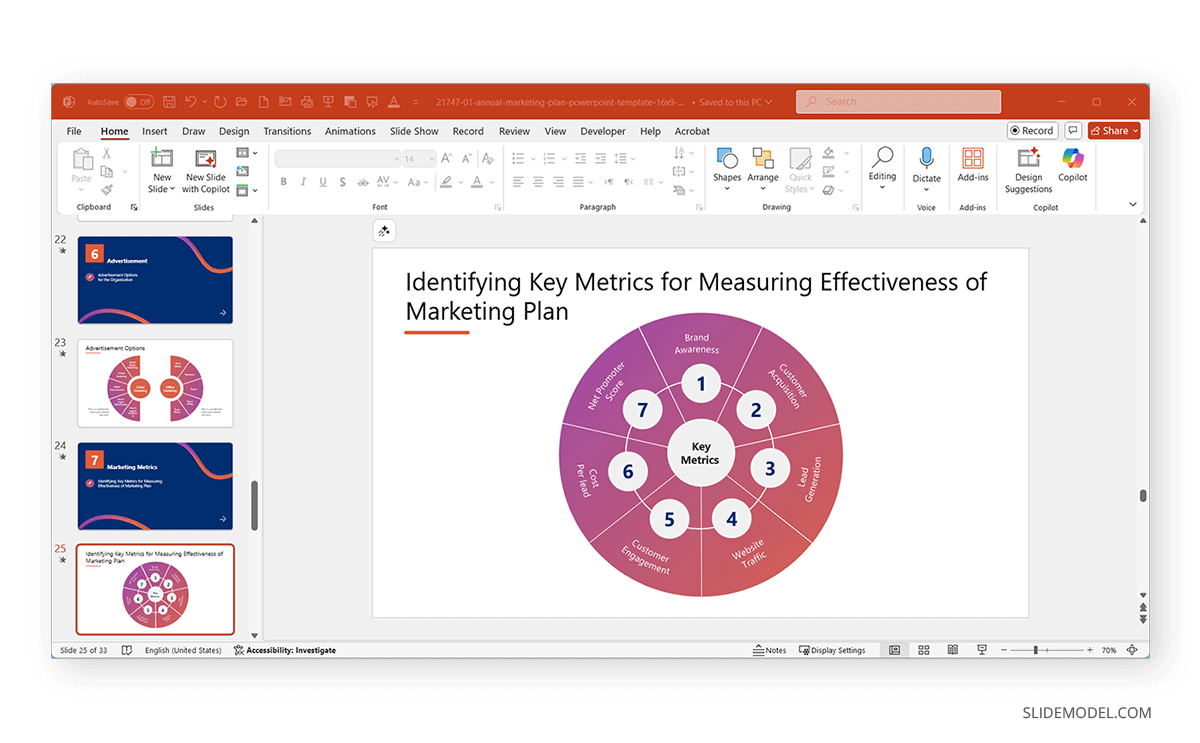
Other than SmartArt, you can also use templates with layouts that help create cycles and loops, such as a diagram similar to the one shown below. This is one of many diagrams in the Annual Marketing Plan PowerPoint Template to show marketing metrics.
7. Matrices and Grids
Though often overlooked, SmartArt’s Matrix category is ideal for displaying multidimensional data, such as a SWOT analysis (Strengths, Weaknesses, Opportunities, and Threats) or a risk-impact grid.
Example:
A strategic planning consultant could use a 4-quadrant SmartArt Matrix to map business risks, plotting likelihood vs. impact. Each quadrant helps executives visually prioritize mitigation strategies. This approach is common in corporate strategy presentations and MBA-level business frameworks, where visual matrices simplify decision-making.
8. Hierarchies and Decision Trees
Beyond organizational charts, hierarchical SmartArt layouts are also effective for decision trees or policy frameworks.
Example:
A compliance officer might use a SmartArt Hierarchy Diagram to outline a decision path for reporting issues from the employee to the supervisor and the compliance officer. This ensures staff clearly understand escalation channels. Hierarchical visuals can also map content structures in proposals, RFPs, or e-learning modules, showing how chapters, modules, or topics connect logically.
9. Training and Onboarding Sequences
SmartArt simplifies training content by turning complex procedures into easy-to-present diagrams.
Example:
An HR trainer might use SmartArt Lists or Process layouts to walk new employees through a five-step onboarding process, covering documentation and orientation, tools and setup, mentorship, and performance reviews. Similarly, educational institutions use SmartArt in academic modules to show how courses progress from Foundations to Advanced Levels within a curriculum.
10. Marketing Funnels and Sales Pipelines
The Pyramid and Funnel categories in SmartArt are often used in marketing and sales contexts to illustrate conversion stages.
Example:
A sales team might create a SmartArt funnel showing how prospects move from Leads to actual clients. Marketers could adapt the same structure to represent a content marketing funnel from awareness through consideration to conversion and loyalty. This clarity helps stakeholders visualize drop-off points and optimize efforts at each funnel stage.
If you need to create sales-related presentations frequently, you might find the Buyer’s Journey vs Sales Funnel PowerPoint Template useful for making sales funnels using easy-to-edit layouts.
Alternatives to SmartArt
While SmartArt is excellent for structuring ideas and relationships, some presentation scenarios call for other PowerPoint tools or professional templates that offer greater flexibility, precision, or data focus. Below are a few alternatives that can complement or replace SmartArt depending on your goals.
Use PowerPoint Tables for Data-Heavy Visuals
When your presentation involves detailed figures, comparisons, or KPIs, tables are often a better choice. They allow you to organize information in structured rows and columns, maintaining numerical accuracy and readability.
Use PowerPoint Chart Tools for Data Visualization
When your goal is to present measurable trends, relationships, or proportions, PowerPoint’s chart tools are a useful option. Charts such as bar graphs, pie charts, and line graphs can be linked directly to Excel, allowing automatic updates and real-time data synchronization. This makes them useful in performance reviews, financial reports, or market research presentations.
Use SlideModel’s Infographic Templates or Pre-Designed Diagrams for Advanced Visuals
When you need high-end visuals that go beyond SmartArt’s default layouts, professionally designed templates from SlideModel can offer creative alternatives. These templates include infographics, process flows, and timelines built with editable shapes, icons, maps, and color schemes that align with modern branding standards. Marketing teams, consultants, and startup founders often use these resources to craft pitch decks, diagrams, or executive summaries without spending hours on design.
Final Words
SmartArt in PowerPoint is an incredible time-saver for professionals who want to communicate complex information clearly. It bridges the gap between structured data and visual storytelling, allowing you to create diagrams, processes, and relationships in minutes.
Knowing when to extend beyond PPT Smart Art, such as when converting to shapes or adopting PowerPoint templates, is key to producing high-impact presentations. You can also mix and match both ideas by incorporating SmartArt with pre-designed slide layouts and shapes to turn your creative ideas into pitch decks, comparisons, organizational charts, sales funnels, Venn diagrams, timelines, etc.