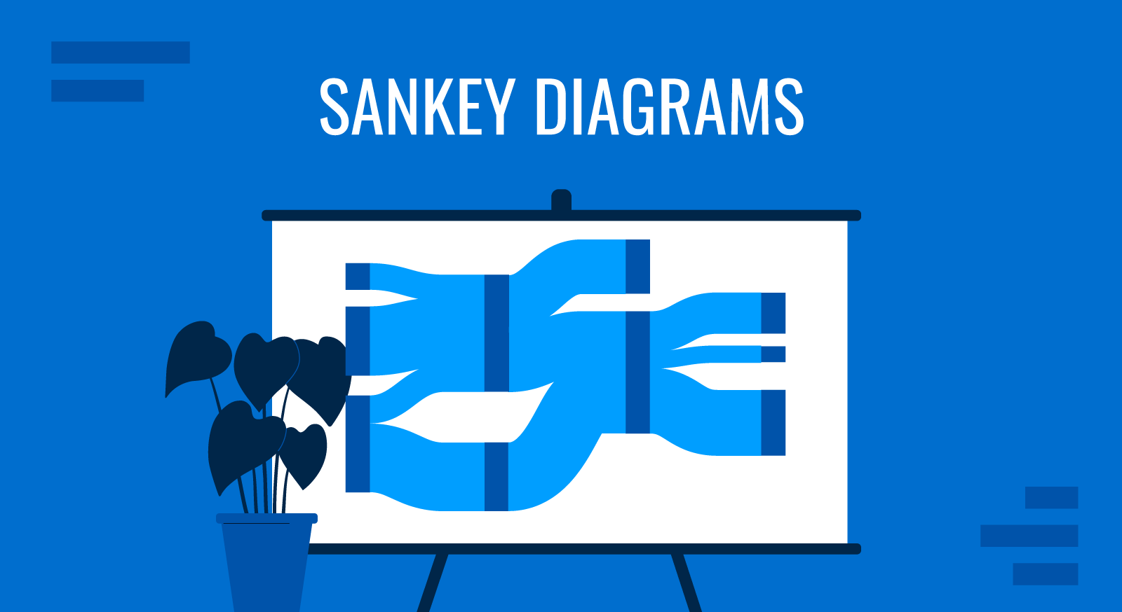
Data visualization is an essential part of creating effective presentations. Whether presenting business processes, financial flows, or energy consumption, clear visuals help communicate complex information efficiently. Sankey Diagrams are a powerful tool for illustrating how resources flow or data move between categories.
While Sankey Diagrams are widely used in dashboards, reports, and Excel spreadsheets, they can also add value to presentations. This guide explores what Sankey Diagrams are, their practical applications in presentations, and how to create them in PowerPoint by drawing them from scratch, using pre-made Sankey PPT templates or by using external tools.
Table of Contents
- What is a Sankey Diagram
- How to Create a Sankey Diagram
- Applications of Sankey Diagrams in Presentations
- Expanded List of Sankey Diagram Examples
- Advantages of Using Sankey Diagrams in Presentations
- Alternative Visualizations to Sankey Diagrams
What is a Sankey Diagram?
A Sankey Diagram is a type of flow diagram that visually represents the movement of quantities between different entities. The key feature of these diagrams is that the width of the arrows (flows or connectors) is proportional to the value they represent, making them an excellent tool for showing distributions.
Anatomy of a Sankey Diagram
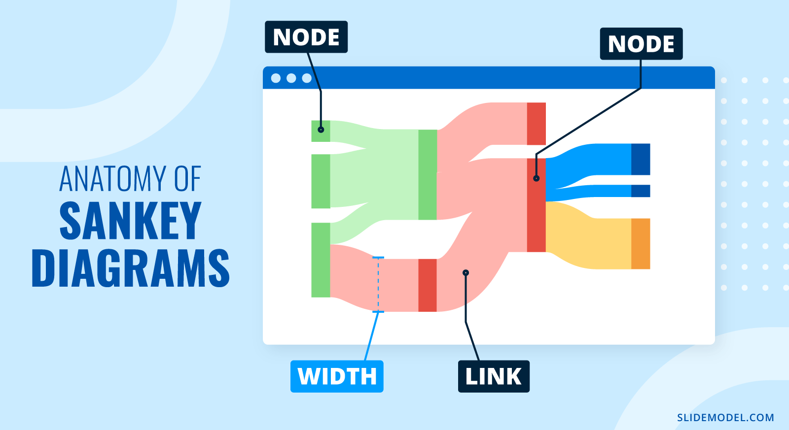
Nodes represent the categories or entities involved in the flow, such as departments, energy sources, or financial accounts.
Flows (links or connectors), represented by arrows, connect the nodes and indicate movement between them.
The width of the arrows corresponds to the quantity being transferred, making it easy to identify where resources are concentrated or dispersed.
Brief History about Sankey Diagrams
Sankey Diagrams are named after Captain Matthew Sankey, who used them in 1898 to illustrate the energy efficiency of steam engines.
One of the earliest known flow diagrams, however, was Charles Minard’s 1869 map, which showed the decline of Napoleon’s army during the Russian campaign.
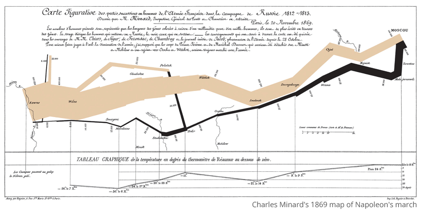
The diagram uses a Sankey-style approach, where the flow’s thickness represents the army’s size at different points in time. How to read this Sankey Diagram? The beige-colored band moving from left to right shows the initial march toward Moscow, starting with 422,000 soldiers. As the army progresses, the width shrinks, indicating troop losses due to battle, exhaustion, and starvation. Upon reaching Moscow, the retreat is depicted in black, moving from right to left, showing further depletion, worsened by the harsh winter. A temperature chart at the bottom correlates extreme cold with severe losses, highlighting the brutal conditions. By the time the army returns to its starting point, only 10,000 soldiers remain. This diagram masterfully integrates geography, temperature, and attrition, making it a powerful early example of data-driven storytelling in historical analysis.
How to Create a Sankey Diagram
Method 1: Manually Designing a Sankey Diagram in PowerPoint
For a custom Sankey Diagram in PowerPoint, follow these steps:
- Insert Shapes
- Go to the Insert tab in PowerPoint.
- Use Rectangles to create nodes and Arrows to represent flows.
- Adjust Flow Widths
- Use Shape Format > Width to adjust arrow thickness based on data values.
- Apply Colors
- Use different colors to distinguish categories.
- Add Labels
- Ensure all nodes and flows are labeled correctly.
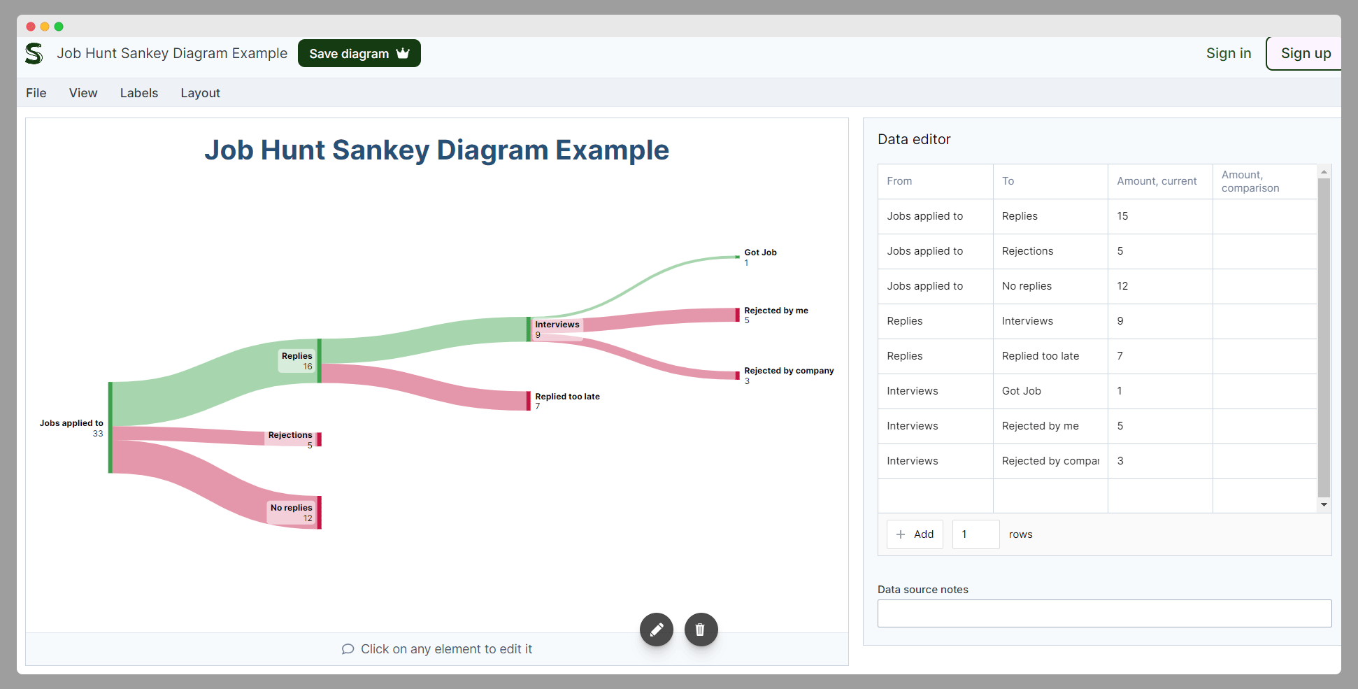
Method 2: Generate the Sankey Diagram using SankeyArt
SankeyArt has a PowerPoint add-in designed to create Sankey Diagrams within PowerPoint. It offers drag-and-drop functionality and customization options.
How to use it?
- Install SankeyArt Diagram Creator from the Microsoft Office Add-in Store, which is available for Microsoft Excel and PowerPoint.
- Insert a Sankey Diagram and customize it with colors, labels, and flow thickness.
Alternatively, you can try the online version of SankeyArt to design a visual representation of the Sankey diagram. The following screenshot shows a Sankey Diagram using the online tool provided by SankeyArt.
The good thing about SankeyArt’s editor is that it supports you by creating a Sankey Diagram and ensures all your nodes are well-balanced. Why is this important? Ensuring that a Sankey Diagram is balanced is essential for data accuracy and credibility. Since Sankey Diagrams represent flows of resources, energy, money, or processes, an unbalanced diagram may misrepresent the data, leading to incorrect conclusions.
A balanced Sankey Diagram ensures that the total input equals the total output within the system. All incoming flows at a node must match the sum of all outgoing flows unless there is a defined accumulation or loss. Flow widths should be proportional to their actual values, maintaining data integrity. The diagram should not artificially add or remove flows unless explicitly intended (e.g., waste, inefficiencies, or energy loss).
If you enter incorrect data in one of the cells, SankeyArt will notify you that the Sankey Diagram is not balanced, and allow you to correct the data
Method 3: Generate the Sankey Diagram using SankeyMATIC
Another alternative is to use SankeyMATIC, a free web-based tool that generates Sankey Diagrams for use in PowerPoint. Despite the fact that you’ll find some advertising while using the tool, it provides a free Sankey Diagram editor that you can use to generate your diagrams and then export the graphics as a PNG image or SVG.
How to use it?
- Visit SankeyMatic.com
- Input data and customize the diagram.
- Export the image as PNG/SVG and insert it into your PowerPoint slide template.
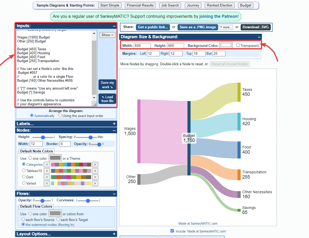
Once you design the Sankey Diagram in SankeyMatic, you export the graphic as an SVG (scalable vector graphic), and insert it into your report or presentation.
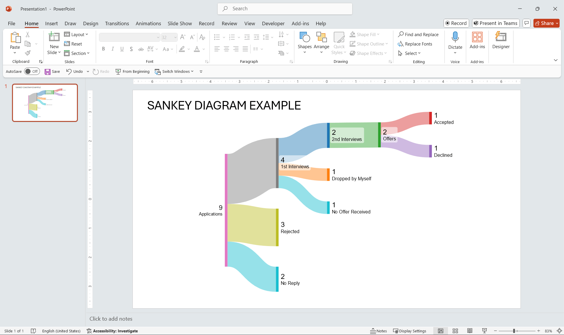
Method 4: Use Sankey Diagram PPT Templates
Another alternative is to use a Sankey Diagram PowerPoint Template. Sankey Diagram PPT templates provide a ready-made solution for integrating these visualizations into presentations. These templates are designed with adjustable shapes, allowing users to modify colors, labels, and flow widths to suit their data without creating the diagram from scratch.
At SlideModel, we have Sankey Diagram PPT templates available for you to use. Here is an example of Sankey Diagram with adjustable shapes.
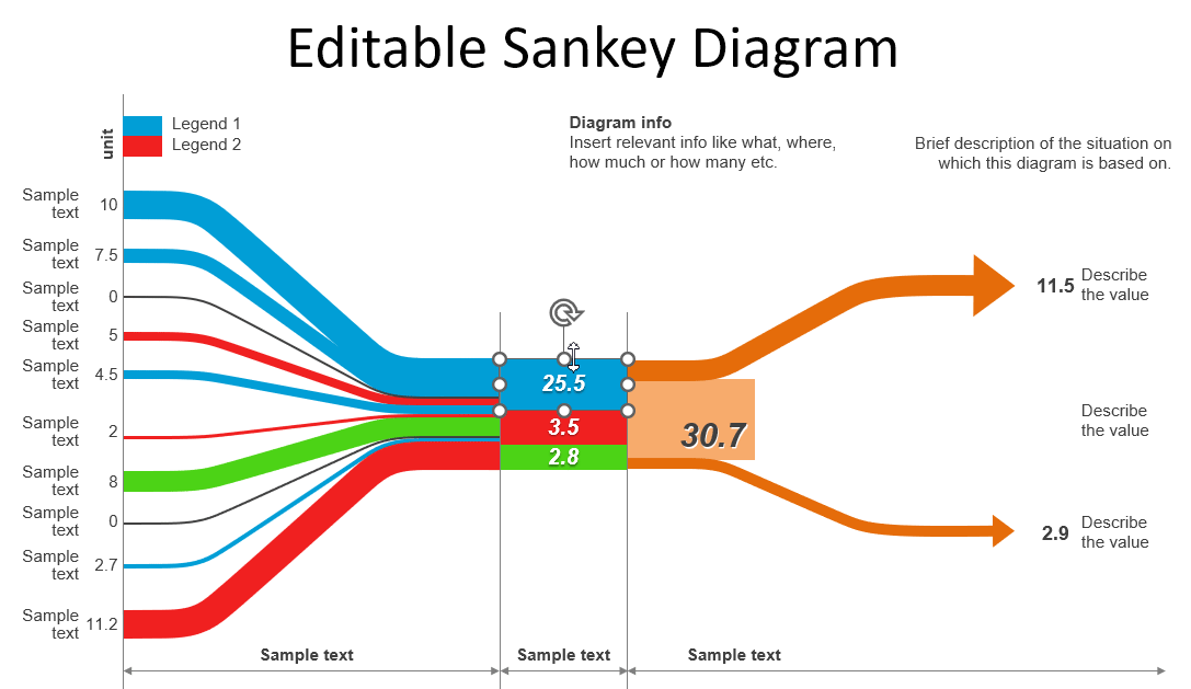
How to Use It? As an active subscriber, you can download the Sankey Diagram PowerPoint template from SlideModel. Then, open the template in PowerPoint and replace placeholder text with relevant data. Customize the diagram by adjusting the thickness of the flows to match your dataset, modifying the colors to align with your branding, and updating labels for clarity. You can also duplicate shapes or remove unneeded shapes, depending on the data you want to model with the diagram.
This PowerPoint-based Sankey Diagram saves time, ensures a polished look, and provides full flexibility for business professionals, educators, and consultants who need visually compelling data presentations. The editable shapes give users complete control over their visualization, making this a valuable alternative to manually creating diagrams.
Applications of Sankey Diagrams in Presentations
Sankey Diagrams are widely used across different industries to visually represent the flow of resources, energy, or financial data. Their ability to highlight proportional relationships makes them a good data visualization for situations where understanding movement and distribution is key. This way, professionals can turn complex data into a compelling visual narrative which is easier to process and understand than just data tables or tabular data.
Below are some common applications and real-life use cases where Sankey Diagrams can be effectively used in presentations.
Academic presentations
Sankey Diagrams can improve business and academic presentations by making relationships between data points more intuitive. A practical example of Sankey diagrams in Higher Education is provided by the ECU Student Success conference, where Sankey Diagrams were used to visualize and understand the student flow and success. A Sankey Diagram can also help to illustrate the journey of students applying for internships, showing how applications flow through different stages, where drop-offs occur, and the outcomes of the process. This visualization can help universities, career centers, and students analyze the efficiency of the application process and improve strategies for securing internships. This shows how Sankey Diagrams fit the needs of today’s higher education institutions.
Energy flow
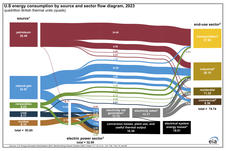
Sankey diagrams are frequently used in environmental and sustainability presentations to help in energy efficiency analysis, visualize energy consumption and losses. They highlight major energy drains and identify opportunities for improvement. A good example for this is the Sankey Diagram used to show the US energy consumption in 2023.
Financial presentations
Financial transactions and budget allocation are another area where Sankey Diagrams add value. By using Sankey Diagrams, you can illustrate cash flow, income distribution, and expense breakdowns, making financial presentations, reports and budget slides more engaging and easier to comprehend by the audience.
Customer Journey
Customer journey and user behavior mapping benefit from Sankey Diagrams as well. In marketing presentations, they show how users navigate a website, understand the flow of traffic through the different sections and pages of the site or analyze the sales funnel & conversions, allowing for a clear analysis of conversion rates and drop-off points.
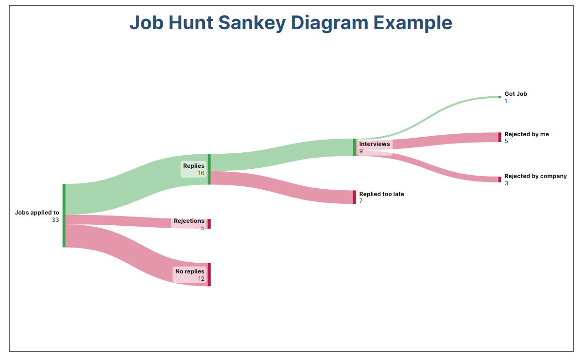
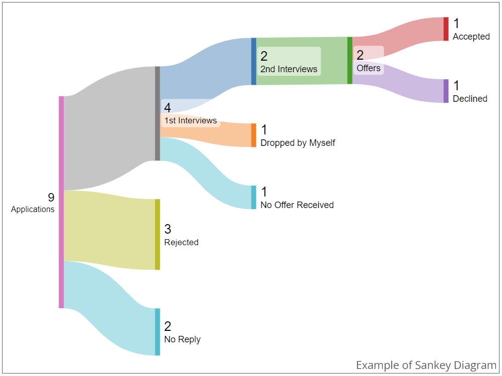
HR & Job Application Process
A Sankey Diagram can be an effective way for HR teams or job seekers to visualize the job application funnel, tracking how applications progress through different stages and where candidates drop off. This can help identify trends, bottlenecks, and success rates at various hiring stages.
Logistics
Sankey diagrams can also effectively visualize supply chain and logistics processes. They provide insights into material flow, supplier dependencies, and distribution bottlenecks, making them useful for manufacturing and logistics reports.
Using Sankey Diagrams in PowerPoint presentations helps professionals turn complex data into a compelling visual narrative.
Expanded List of Sankey Diagram Examples
If you want to see more examples to understand which sectors and industries Sankey Diagrams are used in, here is a long list of them across different industries.
Business & Finance
- Cash Flow Analysis – Visualizing income, expenses, and net profit to track financial health.
- Budget Allocation – Representing how an organization’s budget is distributed across departments.
- Sales Funnel Analysis – Mapping customer drop-off rates at each stage of the sales process.
- Market Share Distribution – Displaying how revenue is split among different product lines or regions.
- Investment Portfolio Breakdown – Showing the allocation of funds across various investment categories.
Energy & Environment
- Energy Consumption Flow – Illustrating how energy is used and lost in a power grid or facility.
- Carbon Footprint Analysis – Tracking greenhouse gas emissions across different sources.
- Sustainability Reports – Mapping resource usage and waste management in environmental studies.
- Water Distribution Networks – Showing water flow from reservoirs to consumers.
- Renewable Energy Integration – Visualizing how renewable sources contribute to total energy consumption.
Healthcare & Science
- Patient Journey Mapping – Analyzing how patients move through a healthcare system from diagnosis to treatment.
- Disease Spread Analysis – Representing infection pathways in epidemiology studies.
- Drug Supply Chain – Tracking the distribution of pharmaceuticals from production to end-users.
- Medical Research Funding – Visualizing the allocation of grants and research spending.
- Healthcare Costs Breakdown – Showing how hospital expenses are distributed among services.
Technology & IT
- Website Traffic Flow – Displaying how users navigate through a website or app.
- Data Processing Pipelines – Mapping data movement through different stages of an IT system.
- Cloud Resource Allocation – Illustrating how computing power is distributed across servers.
- Cybersecurity Threat Analysis – Tracking how security breaches spread within a network.
- Software Development Workflows – Showing resource allocation and bottlenecks in agile development cycles.
Advantages of Using Sankey Diagrams in Presentations
Why use Sankey Diagrams in PowerPoint slides?
- Clear Data Representation—Unlike bar charts or pie charts, Sankey Diagrams effectively showcase flow proportions within a system, making it easy to understand where resources, energy, or money are being allocated.
- Clear Visualization of Complex Systems—Sankey Diagrams are ideal for mapping multi-step processes, such as supply chains, financial transactions, or energy usage, that would be difficult to grasp in a static table or text format.
- Identifying Inefficiencies and Bottlenecks—Sankey Diagrams help pinpoint inefficiencies, waste, or losses in a process by displaying the magnitude of different flows, aiding decision-making.
- Streamlined Communication—Presentations serve as visually engaging tools that capture attention while simplifying complex datasets, leading to better understanding. They also reduce the need for excessive text or tables.
- Customizable for Different Use Cases—Sankey Diagrams can be tailored for various industries, including finance, energy, marketing, and logistics, with flexibility in colors, labels, and flow directions.
Alternative Visualizations to Sankey Diagrams
If a Sankey Diagram isn’t the best fit for your data or presentation, there are some realistic alternatives that you can consider as an alternative visualization method:
- Flowcharts – While Sankey Diagrams focus on quantitative flows, flowcharts are better for illustrating process steps, decision-making paths, or workflows without emphasizing volume.
- Alluvial Diagrams – Similar to Sankey Diagrams but used primarily for categorical changes over time, such as tracking how user groups transition between different states or segments.
- Chord Diagrams – If relationships between different elements need to be highlighted rather than directional flow, chord diagrams provide a circular representation of interconnections between multiple categories.
- Bar Charts – If comparative analysis of values across categories is more important than flow representation, bar charts and column charts might be a simpler alternative.
- Tree Maps – Tree maps and tree diagram templates are useful for representing hierarchical structures, such as budget breakdowns, where different sections are proportionally sized based on their contribution to the whole.
- Gantt Charts – In project management, a Gantt chart might be more useful than a Sankey Diagram if the focus is on task timelines and dependencies rather than resource flow.
The best choice depends on your specific data, audience, and presentation goals. If your objective is to show movement and proportional relationships, Sankey Diagrams remain the most effective option. However, if your focus is on category changes, comparisons, or process steps, one of the alternatives may be better suited.
Conclusion
Sankey diagrams are a powerful tool for presenting complex data in a clear, structured, and visually engaging way. By illustrating proportional flows, they make it easier to understand relationships, identify inefficiencies, and communicate key insights effectively. Whether mapping energy consumption, tracking financial allocations, or analyzing user behavior, these diagrams enhance clarity and impact, helping audiences grasp essential takeaways with minimal effort.
What is a Sankey Diagram used for?
A Sankey Diagram is used to visualize the flow of data, energy, resources, or money between different entities. The width of each flow is proportional to the value it represents, making it useful for identifying distribution trends and inefficiencies.
How do I create a Sankey Diagram in PowerPoint?
You can create a Sankey Diagram in PowerPoint manually by using shapes and arrows, through PowerPoint add-ins or online tools that generate flow charts and images, or by using editable Sankey Diagram PPT templates.
What industries benefit from Sankey Diagrams?
Sankey Diagrams are widely used in business, finance, energy, healthcare, environmental science, technology, and logistics. They help professionals visualize complex data in an easy-to-understand format.
What makes a Sankey Diagram better than a pie chart or bar chart?
Unlike pie charts or bar charts, Sankey Diagrams emphasize flow and movement rather than just comparative values. They show how quantities split and merge between different stages, making them ideal for analyzing processes.
What are the key elements of a Sankey Diagram?
A Sankey Diagram consists of nodes (representing entities or categories) and flows (also known as links or connectors, which are arrows showing the movement between nodes). The width of the arrows corresponds to the amount being transferred.
How can I simplify a complex Sankey Diagram for presentations?
To keep it clear and engaging, limit the number of nodes, group similar categories, use contrasting colors, and add labels to highlight key insights.
Are there alternative diagrams if I don’t want to use a Sankey Diagram?
Yes. Depending on the type of data you need to present, alternatives include flowcharts (for processes), alluvial diagrams (for categorical shifts over time), chord diagrams (for relationships), and bar charts (for direct comparisons). If your data is more associated with a multidimensional data set, consider the Parallel Coordinates chart as an alternative, to analyze patterns and correlations instead of proportional flows and distributions.
How to Animate a Sankey Diagram in PowerPoint?
To animate Sankey Diagrams in PowerPoint, create the diagram using Shapes and then apply animations like Wipe for directional flow, Fade for gradual appearance, or Motion Paths to simulate movement. Use the Animation Pane to control the sequence, adjust timing, and ensure a smooth transition between elements.
Can Sankey Diagrams be used for time-based data?
Yes, they can represent data changes over time, but alluvial diagrams are often better suited for showing how categories evolve across multiple time periods.
How do I export a Sankey Diagram for use in a presentation?
If you create a Sankey Diagram using an external tool, you can export it as a PNG, SVG, or PDF and insert it into PowerPoint. Some tools also allow direct PowerPoint integration.
What are the biggest mistakes to avoid when creating a Sankey Diagram for presentations?
Avoid overcrowding with too many flows, using inconsistent scaling, or selecting colors that make it difficult to distinguish different categories. Ensure clarity by keeping labels readable and flows proportionate.
How do Sankey Diagrams help in decision-making?
By visually mapping the movement of resources or data, Sankey Diagrams highlight inefficiencies, trends, and opportunities, allowing decision-makers to allocate resources more effectively and optimize processes.