Plotting locations on a map slide has always been the tedious part of a territory review or a branch network deck. You drag a pin, nudge it until it sits over the right city, type the address into a table, then repeat that twenty times while the alignment slowly drifts. Most people give up halfway and ship eight representative pins instead of the full footprint.
Agent mode in Copilot changes the arithmetic on that task. Given a map template and a spreadsheet of addresses, it places the pins, writes the labels, and rebuilds the location table in a single pass, and every object it creates stays a native PowerPoint shape you can select, recolor, or drag afterward. This walkthrough covers a real run: the files that went in, the prompt typed word for word, what came back, and the follow-up prompt that fixed what Copilot got wrong on the first attempt.
What Copilot Actually Does to a Map Slide
The useful distinction is between generating a slide and editing one. Early versions of Copilot in PowerPoint focused on generation: you described a deck, it produced a deck, and working from your own design was mostly out of reach. Agent mode, which reached Windows and Mac builds through April 2026, works on the file you already have open. It reads the existing slide, reasons through a sequence of steps, and writes changes back onto the canvas rather than replacing it.
For a map slide, that means Copilot manipulates objects the template already contains. The pin graphic becomes the model for every pin it adds. The placeholder table becomes the table it fills. The map is left alone. When the run finishes, the slide is still your slide: same title treatment, same regional color fills, same legend, same fonts, with placeholder content swapped for real data.
That behavior is why an editable map template is worth starting from instead of asking Copilot to invent a map. A vector map built as grouped shapes gives the model something concrete to position against, and gives you something concrete to adjust afterward. Ask for a map with no template in the file, and you will usually get a picture, which is the one thing on a slide nobody can edit.
What You Need Before You Start
Two things must be in place, and one trips people up more often than the other.
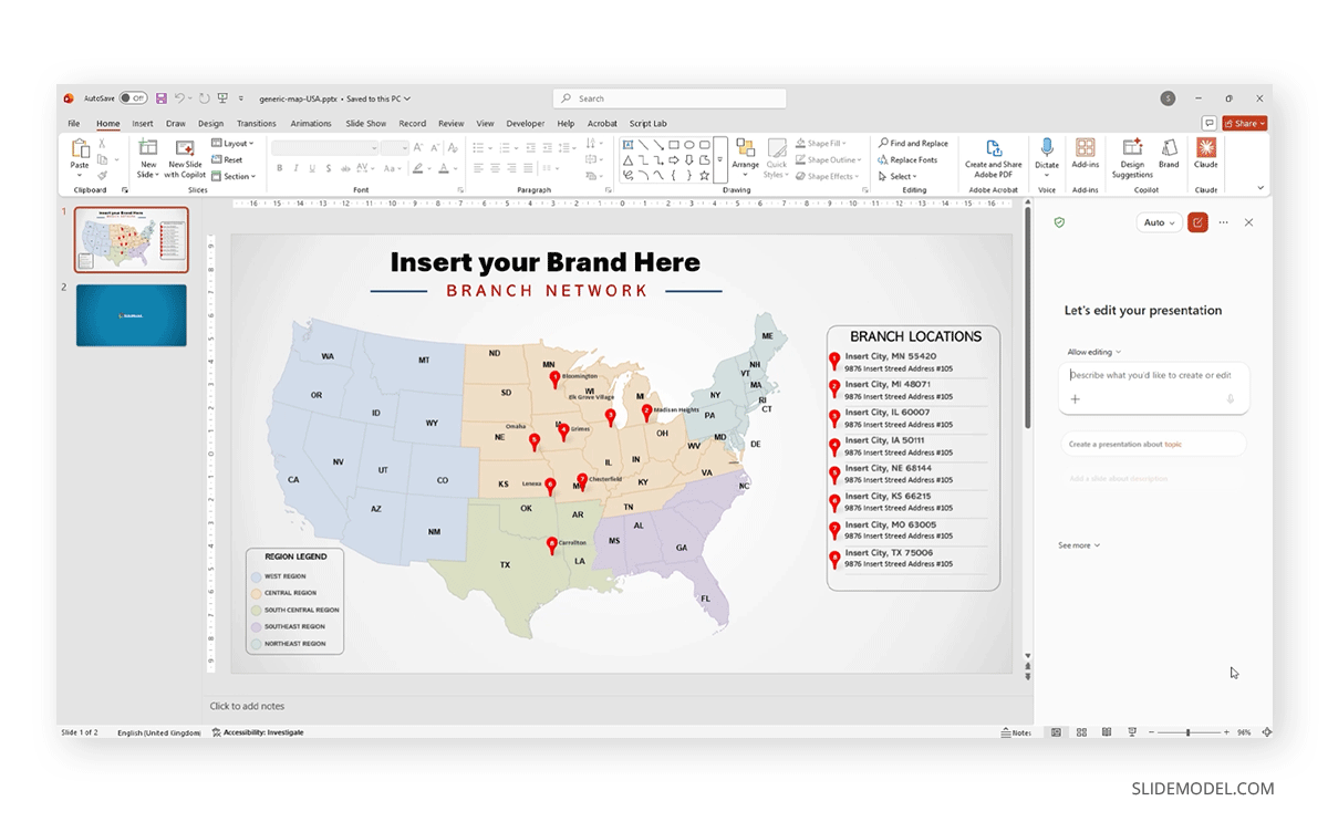
First, a map template with real pin and table objects. The example here is a United States branch network layout: a regional outline map filled in five colors, a legend keyed to those regions, eight numbered placeholder pins, and a side panel headed “Branch Locations” holding two short tables of dummy addresses. Every element is a shape or a table, not a flattened image. If your map is a PNG, Copilot can write a table beside it but cannot place pins meaningfully, so a set of United States outline maps built as vectors is the right starting point.
Second, the address data: one sheet with one row per location. We used an Excel spreadsheet called 7_eleven_us_stores.xlsx holding twenty store records. Keep each address component in its own column, because a single cell reading “1818 Midway Rd, Dallas, TX 75287” forces the model to parse it, and parsing is where inconsistencies appear. Put the header row at the top with nothing above it. Cut columns you do not want on the slide, since Copilot will generally use what it finds, and watch for records outside the outline, since a continental map has nowhere to put a Honolulu store. The same hygiene rules apply as when you move Excel data into slides for any other purpose.
The Prompt, Word for Word
With the template open on the slide you want changed and the workbook attached, this is the prompt that ran:
Modify the slide to include all locations in the spreadsheet. Make tables taller and increase the size of the fonts in the table to be readable, minimum 10 pt. For each pin, add the city as a label at the side.
Four things about that prompt are worth pulling apart, because the structure matters more than the wording.
It names the target. “Modify the slide” tells Copilot to work on the current canvas rather than produce something new, which is the difference between editing your template and receiving an unrelated slide.
It defines scope by reference rather than by count. “All locations in the spreadsheet” means Copilot works out that there are twenty records and places twenty pins. “Add twenty pins” would have worked too, but it breaks the moment the source data changes.
It sets a measurable constraint. “Minimum 10 pt” is checkable, “make the text readable” is not, and vague formatting instructions are the most common reason a Copilot result looks worse than the template did. Numbers and named fields survive the translation into shape properties. Adjectives mostly do not.
It asks for one addition beyond the data. City labels beside each pin aren’t in the template or implied by the spreadsheet, so the prompt says so. Name anything that is neither already there nor obviously derivable.
Notice what the prompt does not do. It doesn’t describe the map or explain the deck’s purpose. Copilot can see the slide, and context about things already visible dilutes the instructions that matter, which holds across most AI presentation workflows rather than being specific to maps.
What Came Back
Copilot reported reasoning through six steps, then wrote the changes onto the canvas.
On the map, twenty numbered pins appeared at their approximate geographic positions, each with a city name in a small box beside it. Dallas sat in north Texas, Seattle and Portland clustered in the Pacific Northwest, and the Northeast picked up the expected pile of pins around New York, Philadelphia, Boston and Jersey City. Honolulu went below the map with its own label, since the outline offered no better option.
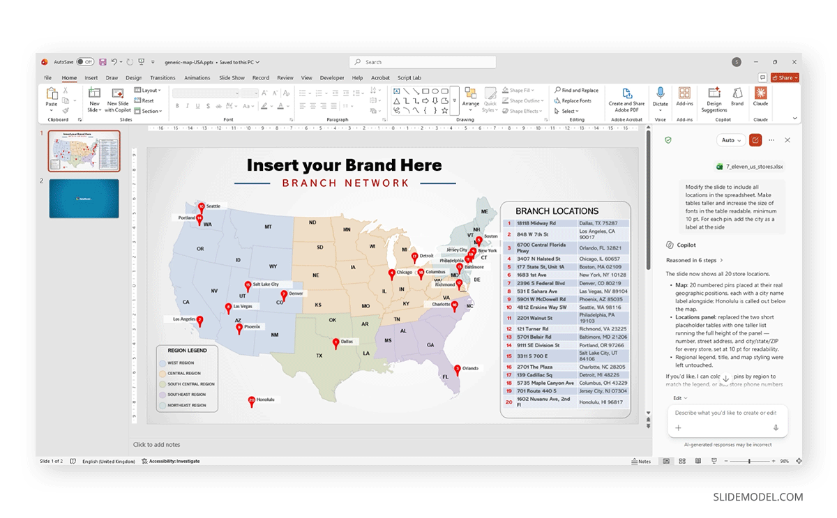
In the side panel, we replaced the two placeholder tables with a single list running the full height of the panel. Each row carried the pin number, street address, and city, state, and ZIP at 10 pt, as requested. The numbering matched the pins, so a reader can trace row 13 to the Baltimore pin without hunting. The legend, the title block, and the map fills were untouched. Copilot then offered two follow-ups: coloring the pins by region to match the legend, or adding store phone numbers to the list.
The first pass was usable but not finished. The table grew taller, as asked, but it grew downward and sat low against the bottom of the panel instead of being centered. The Northeast labels overlapped badly, with Boston, New York, Jersey City, Philadelphia, Baltimore, and Richmond competing for the same few square centimeters. Both problems were positional, which is the error this workflow produces most often. Copilot is reliable about getting the right data onto the slide and less reliable about where it lands.
Fixing the Layout With a Second Prompt
Rather than dragging objects by hand, the follow-up went back through the same pane:
Adjust the table location, as it's placed close to the bottom section of the slide; I want it centered according to the vertical axis. The pin labels don't read well; adjust their position.
Copilot reasoned through five steps and fixed both. The locations panel moved up so the list sits centered vertically on the slide. The city labels were set on solid white chips with a light outline so they read against the colored map fills, and the crowded Northeast group was fanned out so no two labels collide.
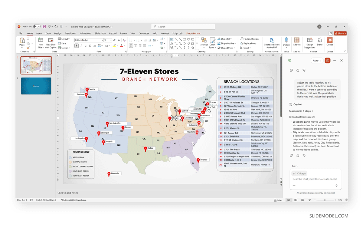
The key takeaway is that layout correction works as a conversation. Agent mode holds context across prompts, so the second request did not need to restate the first. You describe the problem in the terms you would use talking to a colleague, including the reason it bothers you, and let the model work out which objects to move. Where a pin sits off its true position, naming the city is usually faster than clicking into a group of shapes and nudging by keyboard.
There is a limit. Two or three refinement prompts generally converge on something clean. Beyond that, they start to undo each other, and fixing the rest by hand becomes quicker.
Everything Stays Editable
Nothing Copilot produced here is locked. The pins are PowerPoint shapes, so fill, outline, and size controls behave as they always do. The labels are text boxes with standard font properties. The location panel is a real table, so column widths, row heights, cell shading, and borders are available through the usual tools, and everything that applies to formatting tables in PowerPoint applies here.
Brand compliance is the first payoff: if the pin color is wrong, you fix it the way you fix any shape, applying a theme color rather than living with whatever Copilot chose. Precision is the second, since Copilot positions pins approximately, and a territory map with a pin on the wrong side of a state line is worth a manual nudge. Durability counts too, because when a store opens next quarter, you can add a pin and a table row yourself instead of rerunning the prompt.
It also means the slide survives handoff. A colleague without a Copilot license can open the file and edit it normally, because nothing AI-specific remains in the object model. The same is true of accessibility work. Screen readers need alt text on the map group and a logical reading order through the pins and the table, and you set those properties yourself. Copilot does not add them, so build the accessibility pass into your review.
Where This Workflow Breaks Down
Being honest about the failure modes saves more time than any prompt trick.
Geographic precision is approximate. Copilot reasons about where cities sit on the visible outline rather than running coordinates through a projection. For a national overview, that reads fine. Where two pins forty miles apart carry different meanings, check each one. Dense clusters are the worst case, and the Northeast here needed a dedicated prompt to become legible.
Volume has a ceiling. Twenty pins fit on a national map with room for labels. Sixty do not, and asking for sixty produces a slide that is technically correct and practically unreadable. Past roughly thirty locations, group by region, drop the per-pin labels, or split across slides. A prompt cannot solve a density problem the canvas itself creates.
Formatting is the least reliable output. Table proportions, label placement, and spacing regularly need the second pass described above, so budget for it rather than treating it as a defect.
Licensing and file access can cut the workflow off before it starts. Agent mode needs a Microsoft 365 Copilot license, a current build, and the feature enabled by your administrator, and file referencing works against OneDrive and SharePoint rather than local disks. If the agent options don’t appear in your pane, one of those is usually the cause. An overview of Microsoft Copilot in presentation work covers the boundaries you should know before you commit a deadline to it. The data still needs a human too: Copilot will faithfully pin a store that closed last year, because the spreadsheet said so.
FAQs
Does Copilot place pins on a map image, or only on vector maps?
It needs vector shapes to position against. On a flattened image, it can write a table of addresses beside the map, but with no object model to reason about, pin placement is unreliable or absent.
Can I reference a spreadsheet saved on my own computer?
Not directly. File referencing resolves against OneDrive and SharePoint, so a workbook on a local drive will not appear when you attach a file. Upload it first, then attach it in the Copilot pane.
How many locations can one map slide realistically hold?
Around twenty to thirty on a country-level map with labels, fewer if they cluster. The constraint is visual, not technical. Above thirty, group by region or split across slides.
What if a pin lands in the wrong place?
Select and drag it, or tell Copilot which city is misplaced and let it move the shape. Manual correction is faster for one or two errors; prompting is faster when you need to rearrange a whole cluster.
Will Copilot overwrite my template design?
It edits placeholder content and leaves surrounding design elements alone. Here, the title block, regional fills, and legend were untouched while the pins and location table were rebuilt. Adding “keep the existing colors and layout” costs nothing if you are unsure.
Do I need a separate prompt to update the address table?
No. Asking Copilot to include all locations from the spreadsheet covers the map and the table in one run, because both draw on the same source. Formatting instructions belong in that same prompt.
Can Copilot color the pins to match a regional legend?
Yes, and here it volunteered the option unprompted. Ask by naming the grouping field, as in “color the pins by region using the legend colors.” It works best when region is an actual column rather than something inferred from the state.
What happens when the source spreadsheet changes?
Nothing automatic. There is no live link between the workbook and the slide, so new rows do not appear automatically. Rerun the prompt against the updated file, or add the pin and table row by hand.
Is agent mode available in PowerPoint for the web?
The rollout started with the web version in March 2026 and reached Windows and Mac builds by the end of April. Availability still depends on your license and tenant settings, so check the pane in your own build.
Can I use this approach for maps other than the United States?
The workflow is not country-specific. Any vector map with placeable pin shapes works the same way. Sales teams building territory maps are the heaviest users, and the same prompt structure applies to a European footprint.
Final Words
The value here is not that Copilot draws a better map than you would. It is that the mechanical part of the job, reading twenty addresses and turning them into twenty pins and twenty table rows, stops consuming an afternoon. What remains is the work that benefits from judgment: deciding which locations belong on the slide, checking that a cluster reads clearly, and confirming the pin near the state line sits on the correct side.
Treat the first pass as a draft that got the data in place, plan a second prompt for layout, and keep the template editable so the final adjustments stay under your control. If you are building the map slide from scratch, start with the groundwork for inserting maps in PowerPoint, and apply the same principles of clear data presentation you use for charts.