Google Slides has long been a free alternative to PowerPoint. It not only comes with its own native and third-party Google Slides templates, but it also provides support for opening and reusing PowerPoint templates. While Google Slides is easy enough to use, many users might find it hard to make presentations look good using it. See our recommendations below if you are looking for Google Slides tips and tricks to make your slide decks look good.
How to Make Google Slides Look Good
To make Google Slides look good, consider using a Google Slides or PowerPoint template, a dashboard design, high-resolution images, interactive presentations, and third-party add-ons to enhance your slide decks.
Use a Google Slides Template
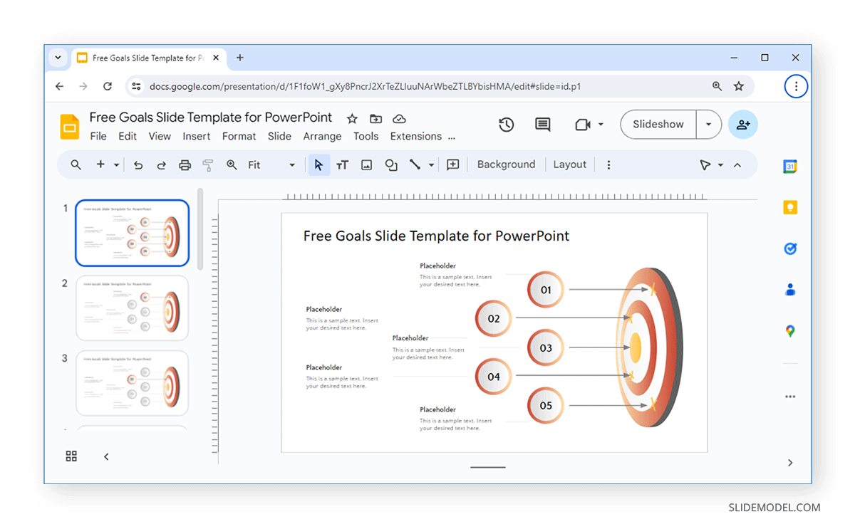
Many Google Slides templates can make your presentations look good. Using a readymade template can save you a lot of time and enable you to customize professional designs to suit your needs quickly. An example is the Free Goals Slide Template for PowerPoint and Google Slides. This template provides a bullseye design with placeholders that can list up to five goals. The title slide shows all five goals, and one specific slide is dedicated to each goal. Each slide dedicated to a particular goal highlights the goal in red, whereas others appear in grey. This makes it easy to visually convey a message using professional slide designs and an easy-to-use layout.
If you are a teacher, you can also use such layouts to help improve your students’ comprehension of information. Research on Google Slides by the State University of Yogyakarta, Indonesia, revealed that using Google Slides can help enhance students’ writing skills. The study shows that using multimedia elements can help spark students’ interest and that Google Slides can be leveraged for this purpose. Hence, Google Slides can improve learning outcomes by making slide decks interesting and adapting them to various classroom environments and teaching methodologies.
If you are new to presentations or Google Slides, see our tutorials about how to download Google Slides templates and how to start a presentation.
Convert a PowerPoint Template to Google Slides
Since Google Slides templates can lack diverse designs as compared to PowerPoint templates, you can upload and convert PowerPoint templates to Google Slides. This can enable you to find different types of valuable templates using various sources such as SlideModel and use them with Google Slides.
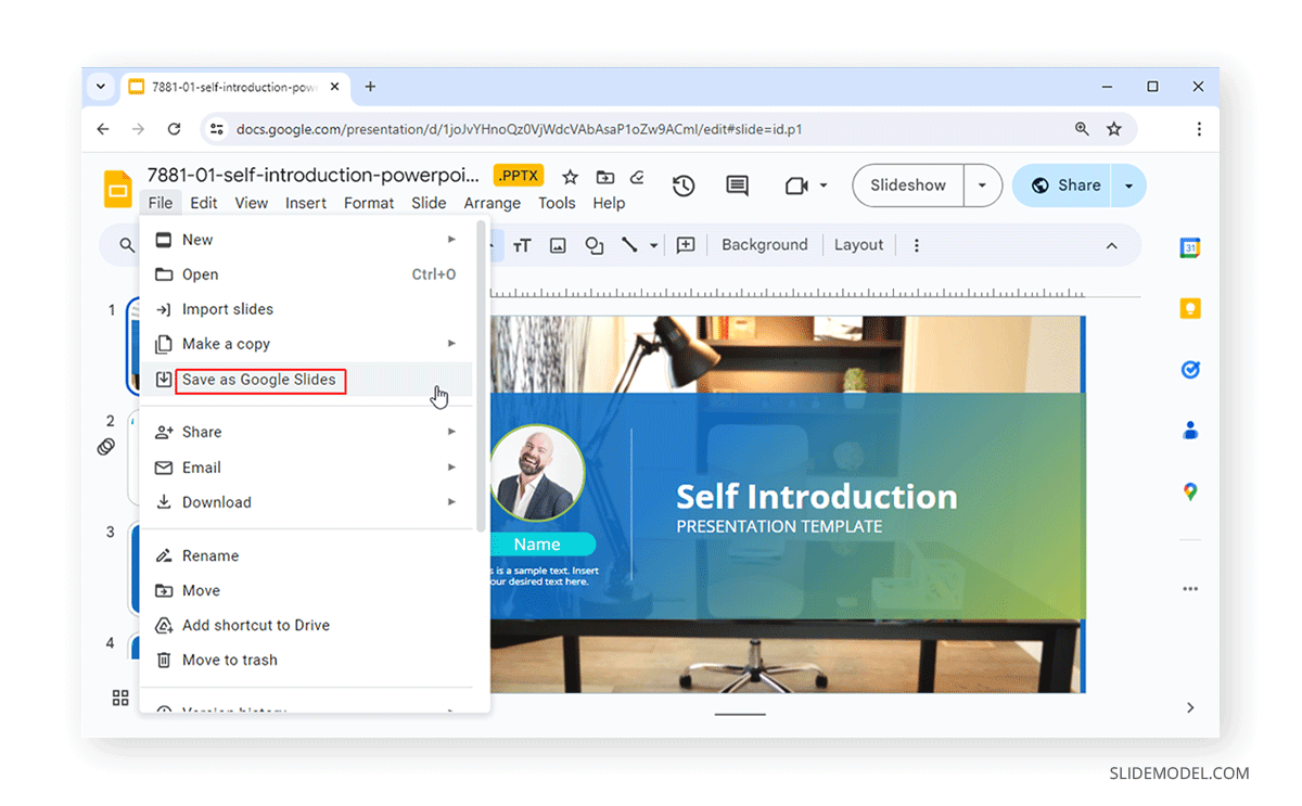
To convert a PowerPoint template to Google Slides, upload and open it in Google Slides and convert it via File -> Save as Google Slides. While you can also upload and edit PowerPoint templates in Google Slides, converting them will help you better use native Google Slides features and adjust the layout, fonts, and objects for better compatibility with Google Slides. You can learn more from our tutorial about how to convert PowerPoint presentations to Google Slides. Also, see our tutorials on how to copy a slide in Google Slides and how to make Google Slides play automatically.
Use a Dashboard Design
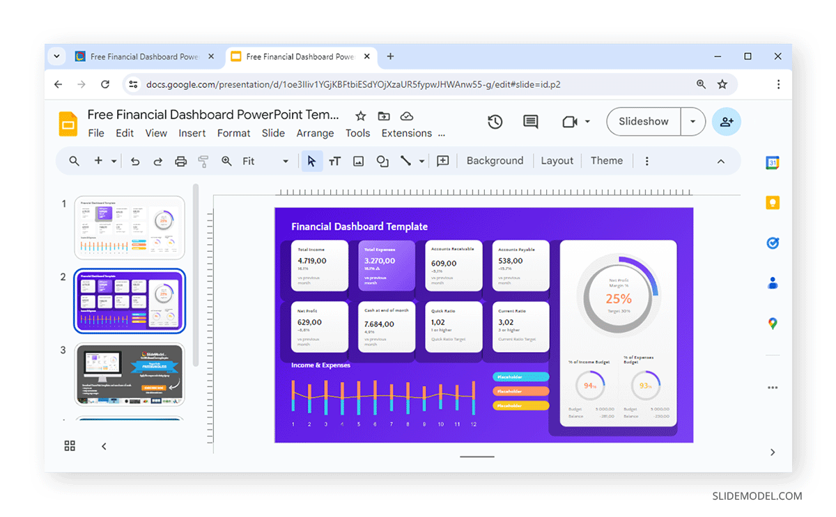
Whether using a readymade template or creating a design from scratch, a dashboard design can help accommodate a lot of information using less space on a slide. The Financial Dashboard PowerPoint Template reflects this design type. This template is also available for Google Slides and provides two editable dashboard layouts, one with a white background and another with a purple background.
The dashboard design allows you to insert charts, tables, and other types of sections with statistical data to create a dashboard that shows information divided into different sections on a single slide.
Keep Slides Easy to Follow with a Simple Design
Another important consideration when making slides in Google Slides is to ensure that your presentation stays on the rails and becomes simple enough. By using simple slide designs, you can maintain consistency and convey your messages through visual aids that are easy to follow.
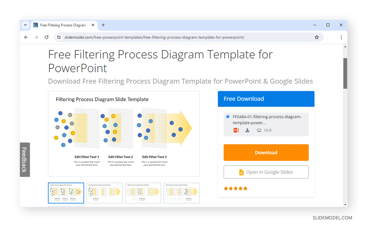
The Filtering Process Diagram Template for PowerPoint and Google Slides shows how content is filtered out for a refined final output. Businesses use this technique during recruitment and data analysis. This concept can be easily reflected using this template. Similarly, using a consistent slide design with simple visuals, you can use either type of appropriate slide design to reflect the ideas you want to convey to an audience.
Use Diagrams to Convey Your Message
By using different types of diagrams, you can convey your message effectively before an audience. For example, a SWOT analysis, Boston Matrix, Fishbone, or generic gear diagram can be a great way to show different processes, issues, and solutions.
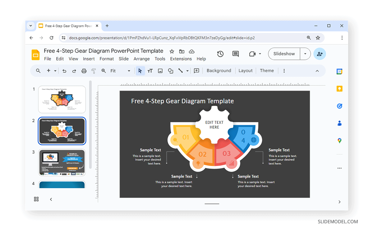
The 4-Step Gear Diagram PowerPoint Template, also available for Google Slides, is an example of how you can use a simple four-step layout to create presentations showcasing information using a few steps. This diagram can help you make your Google Slides look cool and informative at the same time. With easy-to-grasp visuals, this presentation deck comes in two formats of the same gear diagram with placeholders to explain each step in detail.
Use High-Resolution Images
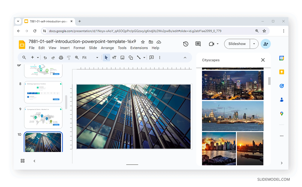
Google Slides enables inserting high-resolution images from various sources. You can upload a photo from your device, search the web, use GIF animations and stickers provided by Google Slides, get images from Google Drive and Google Photos via URL, and take pictures from your device’s camera. To insert a photo or search for one, go to Insert -> Image in Google Slides.
Insert Diagrams, Charts, Tables, and Shapes in Google Slides
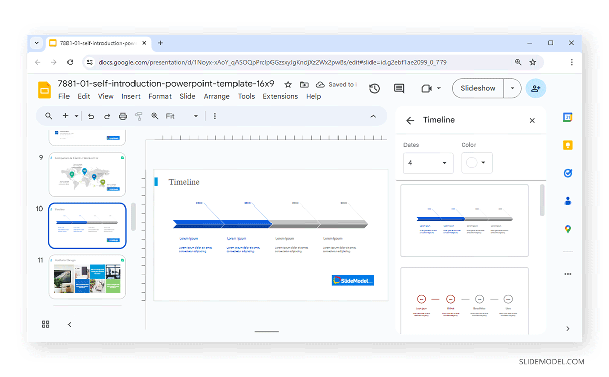
Google Slides provides a number of valuable options for adding visual aids to your slides. This can be an excellent way to quickly add aesthetically pleasing illustrations, charts, tables, and Shapes to your slides. You can look for required aesthetics to add to your slide via the Insert menu. The example below shows a timeline design added to Google Slides via Insert -> Diagram.
Add Animations and Transitions
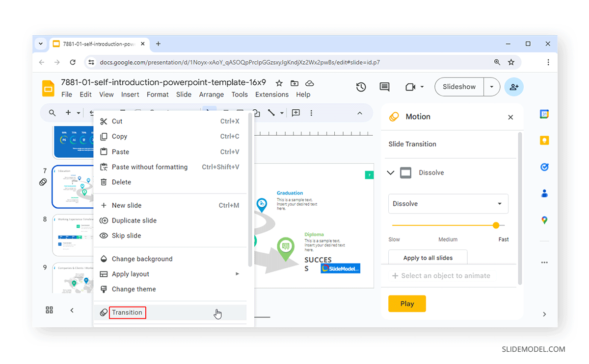
You can add some visual appeal to your static slides using transitions and animations in Google Slides. You can add Transitions via the right-click context menu or Animations via the Insert tab in Google Slides. These transitions enable switching between slides with a visual effect, whereas animations can animate objects to which you apply an animated effect. Using these two features, you can add visual appeal to your slides and make them more eye-catching for your audience.
Add a Video to Google Slides
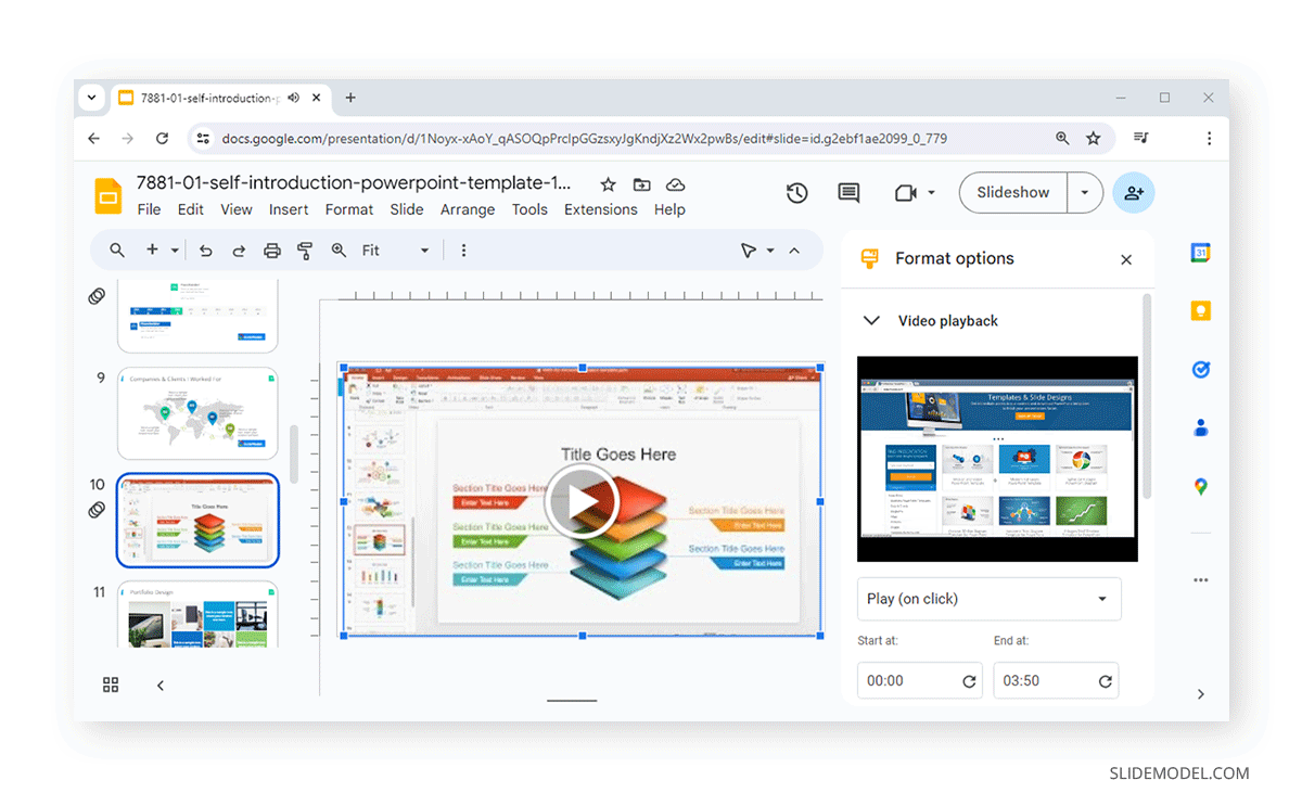
Instead of explaining a concept in detail using your presentation skills, you can make your job much easier by adding a video to Google Slides. You can add videos via the Insert tab. Videos can be added via Google Drive or searched and embedded from YouTube. Once added, you can select the start and end point of the video and whether the video plays on click, automatically, or manually. Other options include the ability to mute audio, adjust the size, rotate video, add Alt text, adjust the position of the video on screen, and give a drop shadow to the video player.
Use Third-Party Add-ons to Create Interactive Presentations
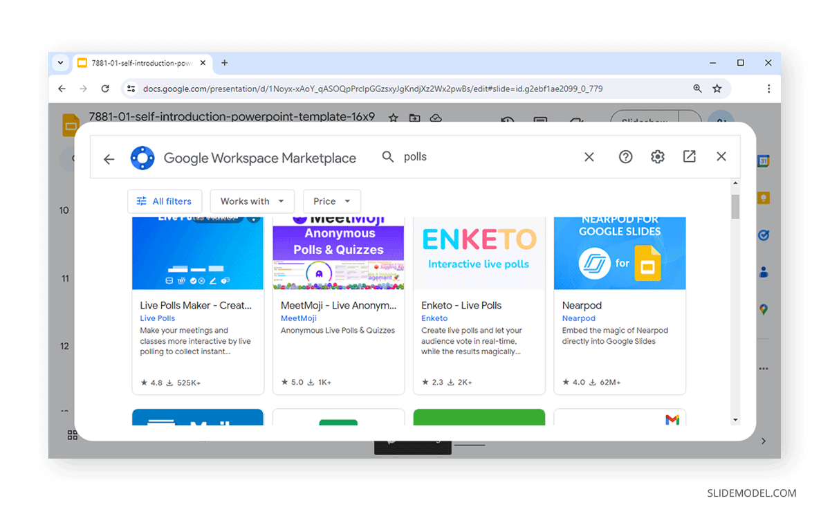
Google Slides provides a variety of add-ons that can supercharge your presentations. You can use various add-ons to make your Google Slides presentation interactive by adding polls, surveys, quizzes, maps, interactive diagrams, etc. To find add-ons, go to Extensions -> Add-ons -> Get add-ons and search for an add-on type. There are various interactive add-ons that you can use from the Google Workspace Marketplace, including Live Polls Maker, MeetMoji, Nearpod, Figma, etc.
Bonus Tip: Ensure Consistency in Slide Designs
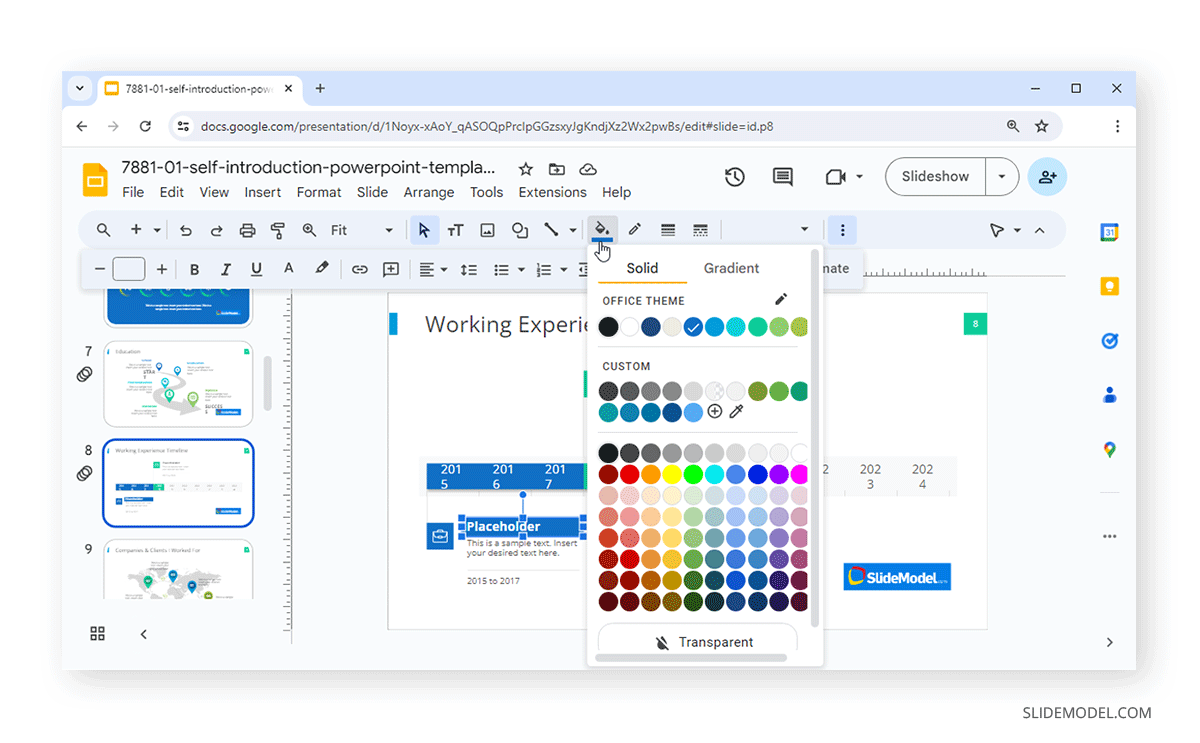
Using colors for placeholders and text, and working with efficient pairings in font size and style should be a significant consideration when designing your presentations. The same rule can also be applied to animations, transitions, shapes, tables, diagrams, and images you use when making your slides.
Slides with a consistent look and well-formatted content can appear neat and easy to follow, provided the slides aren’t cluttered with too many elements that don’t match properly. If you’re worried about clutter, a design like the Dashboard design mentioned earlier might be a better fit than elements littered across the slide. You can also use infographics and illustrations to visually give such information a logical visual outlook. If you are adding a color for placeholder text, it might be a good idea to use it consistently. For different subtopics, you can use other types of color combinations to make them easier to distinguish from one another.
FAQs
What are some tips for designing effective Google Slides?
Utilize white space, maintain a consistent color scheme, and ensure your slides are visually balanced.
How do I choose the right font for my Google Slides?
Select easy-to-read, sans serif fonts like Arial or Verdana. Stick to two or three fonts to keep your slides cohesive.
What is the best way to organize content in Google Slides?
Structure your presentation with a clear introduction, body, and conclusion. Use headings and subheadings to guide the audience.
How can I make my Google Slides more interactive?
Add hyperlinks, interactive elements like polls or quizzes, and use the Q&A feature to engage your audience.
What color schemes work well for Google Slides?
Use complementary colors and high contrast to ensure readability. Stick to a color palette that aligns with your brand or theme.
How do I keep my audience engaged with my Google Slides?
Use storytelling techniques, incorporate multimedia elements like videos, and keep slides concise and focused.
How can I improve the readability of text on my Google Slides?
Use large, legible fonts, sufficient line spacing, and ensure there is enough contrast between text and background.
What should I avoid when designing Google Slides?
Avoid overcrowding slides with text or images, using too many different fonts, and excessive use of animations.
How do I incorporate branding into my Google Slides?
Use your brand’s color scheme, fonts, and logo consistently throughout the presentation to reinforce brand identity.
How can I effectively use bullet points in Google Slides?
Keep bullet points concise, use them to highlight key information, and limit the number of points per slide to maintain clarity.
Final Words
Google Slides isn’t as feature-rich as PowerPoint, and while it lacks many options or simply lacks them, it is still one of the most viable free alternatives to PowerPoint. You can make your Google Slides presentations look good by incorporating images, tables, charts, polls, maps, and other visual aids. It’s always helpful to touch up your slides with consistency in color schemes and branding.
By using ready-made templates, your job can be made easier, with the help of professional designs that can save you a lot of time making individual slide objects look good. Additionally, incorporating transitions and animations can further make your content stand out. However, it is not recommended to overuse either of the two to avoid making your slides look unprofessional.
