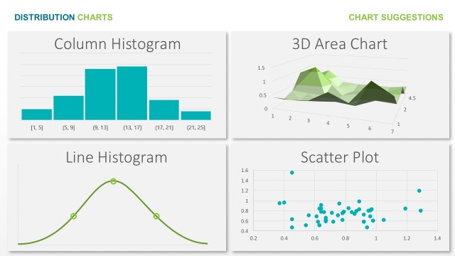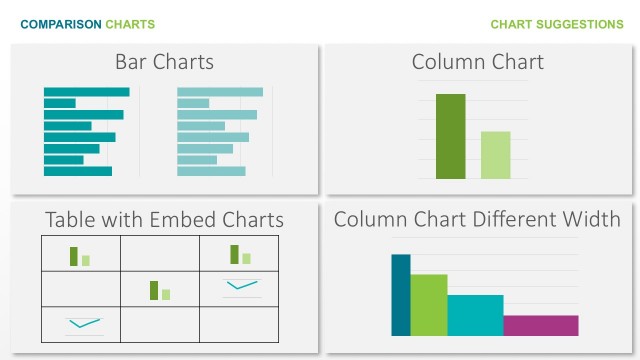
Slide 2 of 8 from Free Abela's Chart Chooser PowerPoint Template
Relationship PowerPoint Charts For Abela’s Chart Chooser
Scatter and Bubble Chart Comparison Slide
- Chart
- Scatter Plot
- Comparison Slide
- 16:9
- 100% Editable
The Scatter and Bubble Chart Comparison slide from the Free Abela's Chart Chooser PowerPoint Template offers a clear visual distinction between two data visualization methods. Designed for business presentations and analytical reports, this slide layout features editable slides with side-by-side scatter and bubble charts, making it easier to compare data distributions effectively within a professional slide deck.
What’s on This Slide
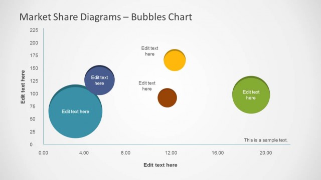
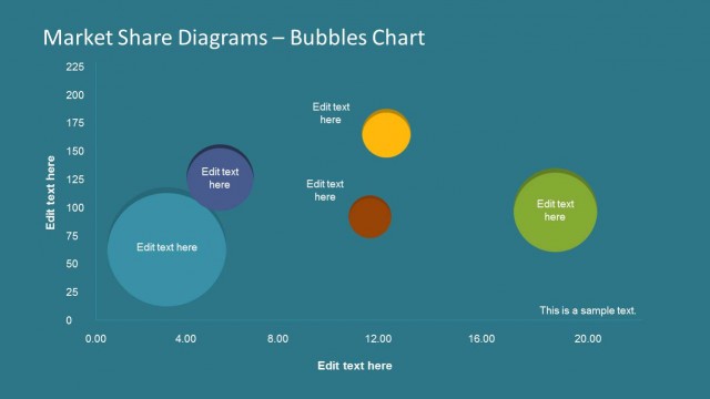
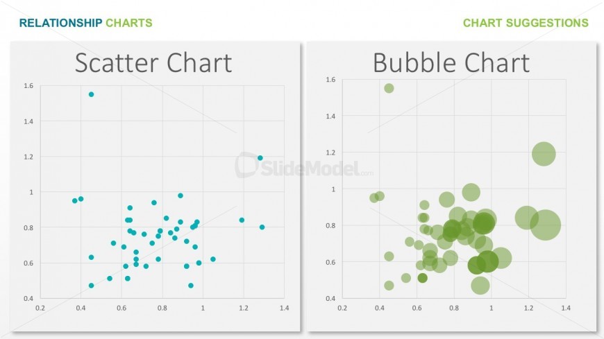
The layout features two distinct chart areas side by side. On the left, a scatter chart displays multiple small blue dots against a white background, indicating data points plotted on a grid. The right section contains a bubble chart with larger green circles of varying sizes, also on a white background. Each chart has a title positioned above it, with 'Scatter Chart' on the left and 'Bubble Chart' on the right. The overall composition is clean and organized, emphasizing the comparison between the two chart types.
How to Use It
This layout serves to compare two different chart types, specifically a scatter chart and a bubble chart. It is suitable for presentations that aim to illustrate relationships in data visually. This slide can be effectively used in business contexts where data visualization is needed, such as in reports or analyses that require a clear comparison of data distributions and relationships. It fits well in a sequence that discusses data representation methods.
Text Placeholders & Capacity
Keep your copy within these limits so it fits without resizing. Title and node labels have moderate character limits, allowing concise text.
| Placeholder | Count | Max characters (approx.) |
|---|---|---|
| Slide title | 1 | 30 |
| Item heading | 2 | 15 |
Slide Keywords
Download unlimited PowerPoint templates, charts and graphics for your presentations with our annual plan.
DOWNLOAD