Free Abela’s Chart Chooser PowerPoint Template
Download Free Abela’s Chart Chooser PowerPoint Template & Google Slides
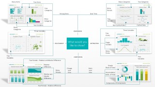
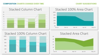
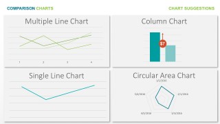
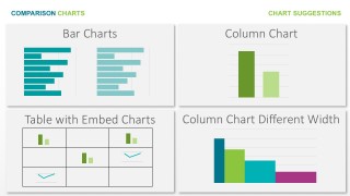
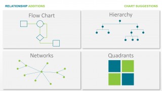
The Free Abela’s Chart Chooser PowerPoint Template is an editable, data driven version, of Andrew Abela’s Chart Chooser cheat sheet, published in his Extreme Presentation Method. The chart chooser provides a guide to users to select a suitable data visualisation based on the purpose of the chart and its variables. The method consists on a starting question, “What would you like to show” and a decision tree determines the path to reach the suggested visualisation.
The four main purposes stated by Andrew Abela are:
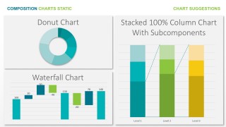
- Composition: You want to show how data is composed.
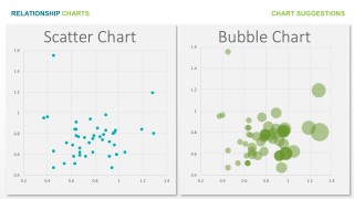
- Relationship: You want to show how variables relate to each other.
- Comparison: You want to show how variable behaves in comparison to others.
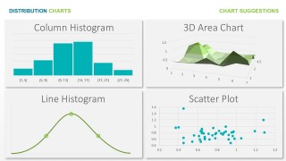
- Distribution: You want to show how data is distributed across dimensions.
Based on this four (4) categories, Abela spreads the branches over the number of variables and the kind of dimensions. For example comparison purposes, you can chose to compare data across time, or compare data across different dimensions (categories and items).
The Free Abela’s Chart Chooser PowerPoint Template provides the user not only the ability to follow Abela’s suggestions but also it provides data driven version of each visualisation for the user to use in its own presentation.
FEATURES
- 100% Editable PowerPoint Templates & Google Slides.
- Compatible with all major Microsoft PowerPoint versions, Keynote and Google Slides.
- Modern 16:9 Aspect Ratio.
- Scalable Vectorial PowerPoint Shapes and PowerPoint Icons.
- Instant Access and Download.
- New Templates every week.


