Slide 5 of 8 from Free Abela's Chart Chooser PowerPoint Template
Composition Over Periods PowerPoint Template
Chart Suggestions Overview for Presentations
- Chart
- Other
- Concept Explanation Slide
- 16:9
- 100% Editable
The Chart Suggestions Overview slide from the Free Abela's Chart Chooser PowerPoint Template offers a clear layout for comparing multiple chart types, supporting effective data visualization. This slide is designed to help users select appropriate charts for performance tracking and trend analysis within business presentations. Its structured grid format and use of editable shapes make it a practical addition to any slide deck focused on data-driven insights.
What’s on This Slide
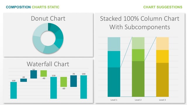
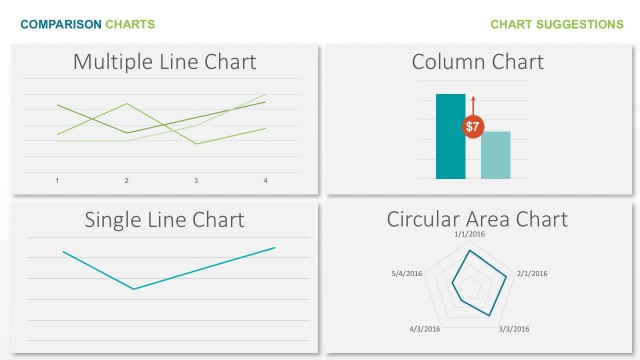
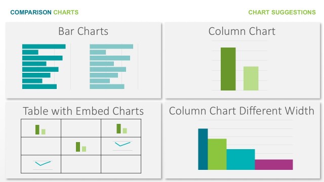
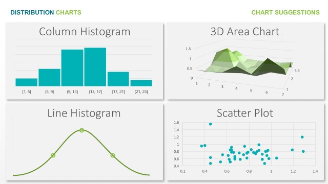
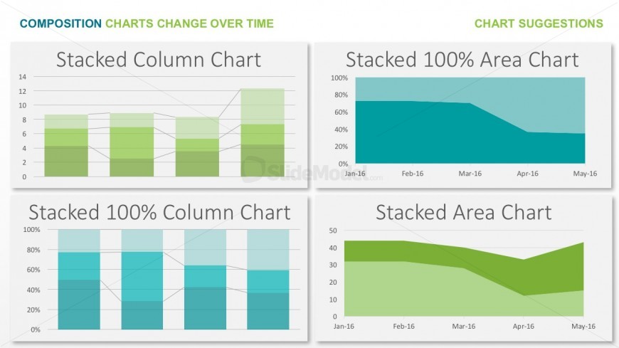
The layout features four distinct chart types arranged in a 2x2 grid. The top left displays a stacked column chart, while the top right shows a stacked 100% area chart. The bottom left contains a stacked 100% column chart, and the bottom right features a stacked area chart. Each chart has a title positioned above it, with a consistent font size. The background is light, and the charts utilize various shades of green and blue. There are no images or media placeholders present, and the overall composition is structured for clarity.
How to Use It
This layout serves as a comparative overview of different chart types, ideal for showcasing data visualization options. It fits well in a presentation sequence after introducing data concepts and before diving into specific analyses. This structure is useful for business scenarios like data reporting, performance tracking, or illustrating trends over time. It allows for quick visual comparisons, making it suitable for discussions on data presentation strategies or selecting appropriate chart types for specific datasets.
Text Placeholders & Capacity
Keep your copy within these limits so it fits without resizing. Chart title slots can hold up to 30 characters each.
| Placeholder | Count | Max characters (approx.) |
|---|---|---|
| Chart title | 4 | 30 |
Slide Keywords
Download unlimited PowerPoint templates, charts and graphics for your presentations with our annual plan.
DOWNLOAD