Comparison slides can have various benefits for a presenter. This might include someone working on a pitch deck, an academic lecture, a sales proposal, an internal report, or a forecast. A well-crafted comparison slide helps your audience quickly understand similarities, differences, advantages, and disadvantages between two or more topics. It can also facilitate historical comparisons and inform forecasts based on past data.
In this guide, we’ll break down why comparison slides are valuable, the different types available, layout and design principles, and how to choose the right style for your message.
Why Comparison Slides Are Useful
Comparison slides are useful in PowerPoint presentations because they condense a lot of information into an easily comparable visual. Rather than having your audience sift through paragraphs of text, you can present two or more options side by side, making differences instantly visible. To create an impactful comparison slide, consider the list of different elements outlined below.
Simplification of Complex Information
Lining up details in parallel columns or rows helps people process similarities and differences faster. This can be helpful not only for audience members who are not well-versed in the topic, but also for experts seeking to understand similarities and differences quickly.
Supporting Decision Making
When you’re weighing the pros and cons of two items, showing trade-offs, or evaluating alternatives, comparisons can help the audience quickly see which choice best meets their needs. This can aid decision-making and help find a way forward during discussions and brainstorming sessions.
Highlighting Competitive Advantage
In sales and marketing contexts, a comparison slide can clearly show where your product or service outperforms competitors. Visualizing the competitive advantage can make key highlights stand out at a glance for further deliberation.
Showing Transformations
Before-and-after layouts make performance, design, or results changes tangible and impactful. Such comparisons are often used to showcase weather patterns, sales forecasts, and even timelines to illustrate transformations over time.
Academic Presentations and Trainings
For academic or training presentations, comparisons help explain contrasting theories, approaches, or outcomes more easily. Similarly, comparing theories, case studies, research findings, or historical periods can be easier using comparison slides.
Pitch Decks and Proposals
Comparing your product to competitors to establish market positioning. Furthermore, outlining different package options, service levels, or project approaches can help you effectively convey the value proposition you are pitching.
Internal Presentations and Reports
Contrasting strategies, timelines, or budget allocations, and reports can be easier to explain using side-by-side comparison slides. This can make lengthy meetings short if the context is explained visually using clear graphical layouts. Such slides also work well in cross-functional settings, such as project reviews or stakeholder meetings, where participants come from diverse backgrounds and require a shared frame of reference.
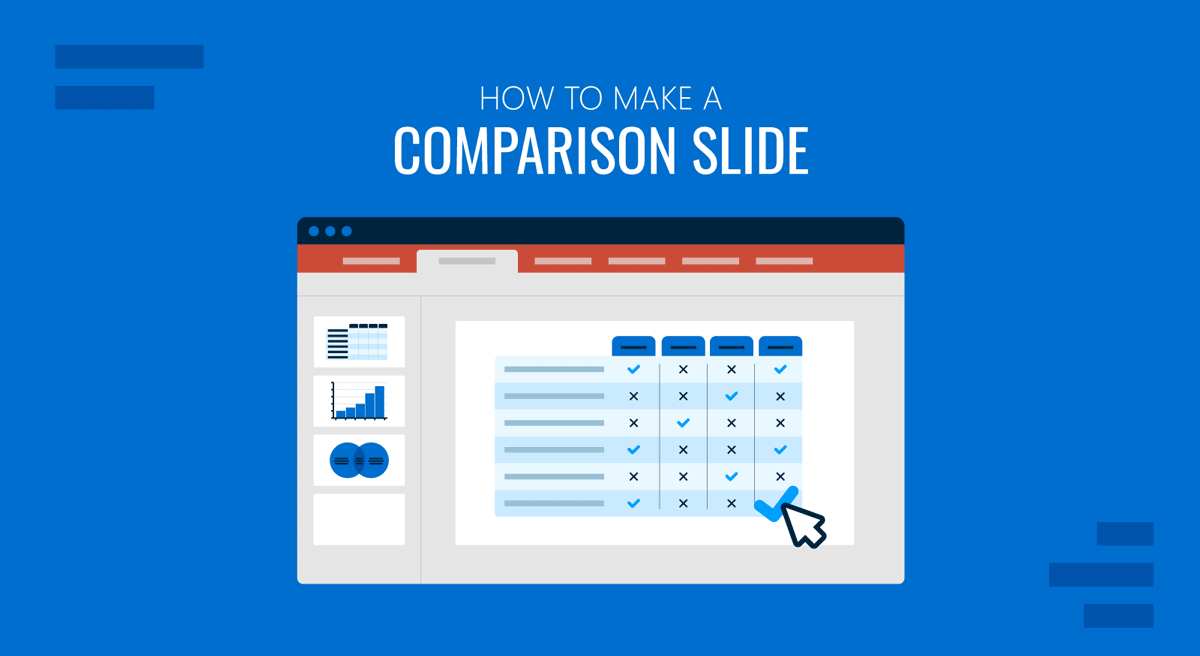
How to Make a Comparison Slide
Types of Comparison Slides, Uses, and Layout Examples
The examples below outline common types of comparison slides and their appropriate uses, along with tips for making each one effective. In the examples below, you will also find PowerPoint template recommendations that can help you create comparison slides using ready-made and easy-to-edit layouts.
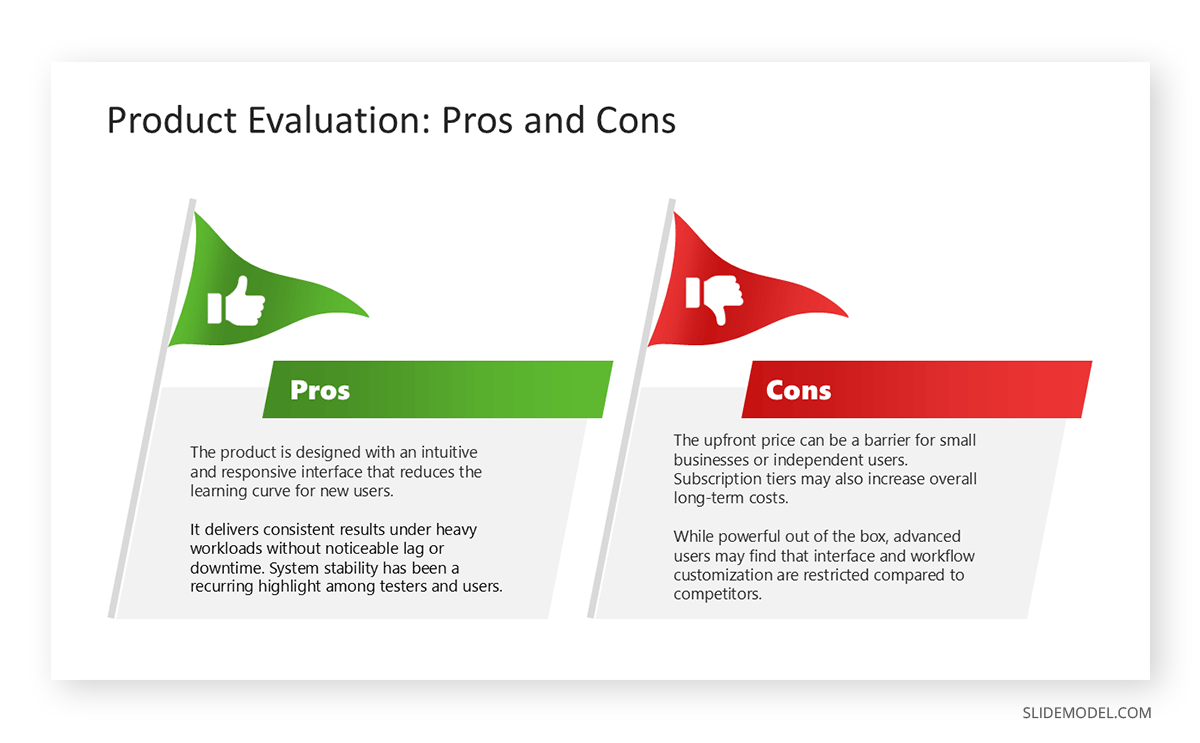
1. Pros vs. Cons
Pros and cons slides evaluate a single idea, option, or decision by presenting its strengths and weaknesses side by side. For such slides, it’s recommended to use balanced columns to keep points concise and use icons to emphasize both positive and negative points.
Example: A pros and cons slide might be used to discuss implementing remote work policies or holding frequent meetings and team check-ins. By using icons to illustrate productivity and cost savings versus communication challenges and concerns, you can create an effective PowerPoint comparison slide for this topic. The template in the example below is part of SlideModel’s collection of Pros vs. Cons PowerPoint Templates, which consists of a wider collection of Comparison Slide PowerPoint Templates that come with unique layouts for making comparison slides.
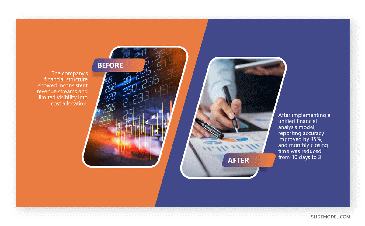
2. Before vs. After
Before vs after slides showcase transformation, progress, or the results of an action; these slides often include visuals like photos, charts, or graphics, so the change is evident at a glance. It is best to use contrasting colors to reinforce the shift for such slides.
Example: A ‘before vs. after’ slide might be created to showcase performance metrics before and after process optimization, featuring side-by-side charts and a bold highlight of the improvement percentage. Similarly, you can show a before vs. after transformation for an old or new project, building, or infrastructure in an area, etc. To find examples of this type of slide, see these Before and After PowerPoint Templates.
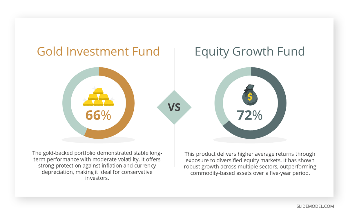
3. Feature A vs. Feature B
If you want to create slides to compare two products, services, or options, you can use a feature called an A vs. B comparison PPT slide. For this type of slide, you can use a mirrored column layout with clear headers for each option. Incorporate checkmarks, cross symbols, or icons to indicate the presence or absence of a feature.
Example: A feature-based comparison slide can be used to compare two smartphone models by their specifications, such as battery life, camera quality, and price. Another example is comparing gold to currency notes in terms of liquidity and investor confidence. Such examples can also be used as visual metaphors, with checkboxes, ticks, or crosses to show comparisons. Below is an example of a slide deck from SlideModel’s Product Comparison PowerPoint Templates with layouts for the comparison of two options with replaceable slide images.
4. Pricing Tier Comparison
Many brands use pricing tier comparisons in their ads, sales presentations, and websites to highlight the differences between product or service tiers, helping customers choose the right fit. One of the best ways to make such a slide in PowerPoint is to use a table or card layout, with one tier subtly highlighted to indicate the recommended or most popular choice.
Example: Basic vs. Pro vs. Enterprise packages with features listed per tier, highlighting the “Pro” package with a different background color. The image below shows how you can create comparison slides that highlight price and feature differences for products. You can find layouts of this type via these Pricing Comparison PowerPoint Templates.

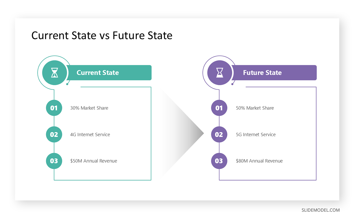
5. Present vs. Future
When a business wants to assess its growth potential, it often needs to examine its current state and identify areas for improvement. This illustrates a contrast between the current state and a proposed future state, emphasizing change or vision. For such slides, you should use language that clearly distinguishes timeframes (“Now” vs. “Next”) and visuals that imply progress or innovation.
Example: Such a slide might include the current manual workflow versus an automated system to be implemented in the next quarter, as well as the business’s market share and plans for future expansion. These Current vs. Future State PowerPoint Templates provide examples of how you can create such a slide by using side-by-side comparisons of the current and future state.
6. Multi-Option Comparison
A multi-option comparison slide compares three or more options across consistent criteria. You can create a multi-option slide by using a grid or table format to keep the comparison organized. You should avoid overloading each cell with text to maintain a clean and easy-to-compare layout.
Example: Create a slide that evaluates multiple vendors across criteria such as price, delivery time, quality rating, and customer service scores. For such a purpose, you can create a multi-comparison slide. Similarly, slides that showcase the features of different options can also be made using this method, such as the SEO, AEO, and GEO PowerPoint comparison slide template shown below. You might also want to see our guide on making a comparison chart and these Multi-Option Powerpoint Templates to understand how to make multi-option slides best.
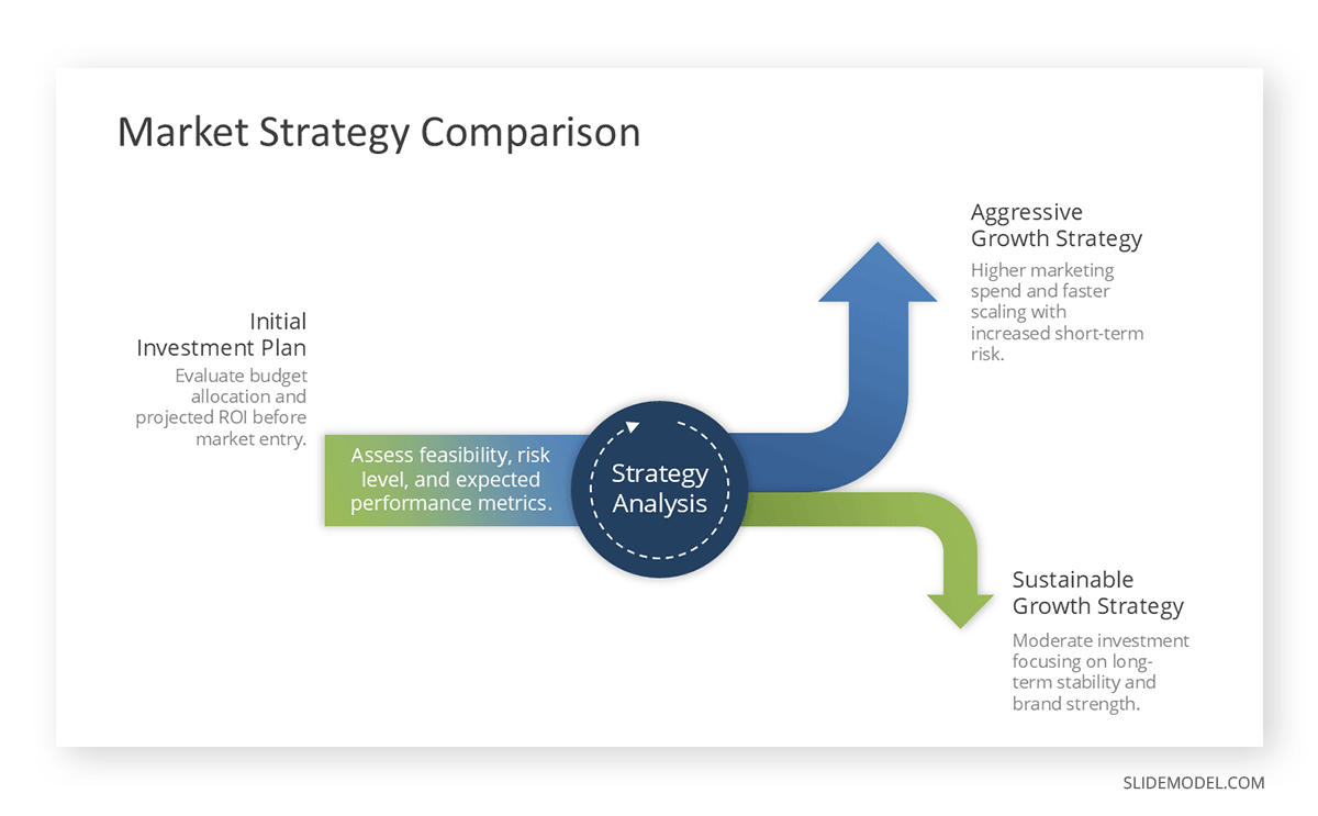
Choosing the Right Comparison Format
Selecting the proper comparison format isn’t just about fitting your content into a template, as it is about choosing a style that makes your point clear and easy to understand for your audience. Consider factors like the number of items you’re comparing, the complexity of the data, and the story you want to tell.
- Pros vs. Cons: For quick decision support, a pros vs. cons comparison can quickly show the merits and drawbacks of a single idea or proposal. This format simplifies complex considerations into two straightforward lists.
- Present vs. Future: This type of comparison is particularly beneficial for strategic planning, roadmapping, and vision-setting. It helps stakeholders visualize change and buy into the proposed direction.
- Before and After: Making a before-and-after comparison helps show transformations or progress over time. This is especially impactful when you have tangible results to show, like improved metrics, design changes, or case study outcomes.
- Binary (A vs. B): This comparison is best for simple, two-option comparisons such as two products, two strategies, or two time periods. This format works well when your goal is to emphasize contrasts or highlight a clear winner among two options.
- Multi-option (3+): This option is excellent for product lineups, pricing tiers, or ranking multiple candidates against a standard set of criteria. Use a grid or table to organize and make information easy to scan.
Tips for Designing Effective Comparison Slides
When creating a comparison slide, both layout and design choices play a critical role in clarity and impact. Here are a few tips to make the most out of your comparison slides:
- Use Symmetry for Clarity: Balance both sides or sections to make the comparison feel organized and fair. Limit each comparison point to a short phrase.
- Horizontal vs. Vertical Layouts: Horizontal is ideal for A vs. B or before-and-after formats, while vertical works well for multi-option or tiered comparisons.
- Alignment and White Space: Keep text and icons aligned for easy scanning, and use adequate white space so slides don’t feel cluttered. Avoid overwhelming the slide with too many points.
- Icons and Color Coding for Easy Scanning: Assign consistent colors to each option or category, and use icons to identify features or outcomes quickly. Maintain consistency in colors, typography, and icon styles throughout your presentation.
- Typography for Visual Hierarchy: Use larger, bolder headings for categories, with smaller, consistent text for details.
- Contrast and Font: Maintain high contrast between the background and text, and pair fonts to clearly differentiate headings from content. Highlight the key takeaway for emphasis.
Final Words
Comparison slides can effectively convey important information to an audience without requiring multiple slides. This can enhance the presentation’s clarity and persuasiveness, primarily when you aim to demonstrate the difference between two strategies, compare product features, or highlight progress over time. The right format, layout, and design will make your point quickly and clearly.
When designing comparison slides, avoid cluttering the slide with too many points or large chunks of text. Keep the slides easy to scan with minimum information. You can explain different parts of the comparison in detail during the presentation to avoid making slides look cramped. It’s best to highlight key information and use color-coding to make your slides easier to follow. Another important consideration is to ensure you select the most appropriate comparison format, such as pros vs. cons, before-and-after, present vs. future, A vs. B, or multi-option.