When concluding a presentation, it’s essential to prompt attendees to take action. This is where a specific slide type, the call-to-action slide or CTA slide, comes into play. Depending on your context, this slide can incorporate various graphical elements, such as compelling images, charts, or diagrams, to evoke emotions or simply be attractive with information on how to contact the presenter.
In our experience, a call-to-action slide is an element that has one-third of the influence factor for decision-making, especially in contexts of business pitch or sales presentation. For this reason, this article will guide you through the essentials of creating powerful, attention-grabbing call-to-action slides for presentations. We will illustrate each point with examples and include a list of eye-catching PPT templates that can make the job easier.
Table of Contents
- What is a Call to Action Slide?
- What are the Elements of a Call to Action Slide?
- How to Write a Call to Action Slide
- Recommended CTA Templates for PowerPoint and Google Slides
- Final Words
What is a Call to Action Slide?
A call to action slide is a presentation slide type designed to prompt an immediate response or encourage the audience to take a specific action (purchase, connect, sign-up, etc.). Typically, call-to-action slides are placed at the end of a presentation, as they capitalize on the audience’s interest in the presented topic and the expectations built up throughout the presentation.
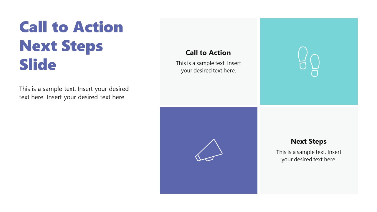
The same guidelines applied in marketing for call-to-action features in e-commerce are valid for call-to-action slides, as they must be clear, concise, and focus on an actionable verb to instruct the audience what to do next. Bold colors and strong contrast indicate what action to take, and in some cases, visual elements like buttons, arrows, or even animations help guide the audience to that specific keyword.
What are the Elements of a Call to Action Slide?
Let’s analyze the contents of a call to action slide through this infographic.

The Visuals
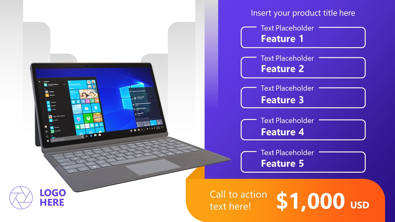
All call-to-action slides ought to include an image. This can be a vector graphics illustration, a photo displaying the desired typical scenario (for example, for an e-commerce brand, the call to action is a computer placed on top of a desktop with the website opened), or a product image.
The visuals must be prominent and in high-quality format—meaning no pixelation and clear-to-understand imagery. In terms of importance inside the slide, they can take up to a third of the layout.
The Container
This is the area where the written call to action is placed. We have to work with a box format (although it can feature organic shapes if the context requires it) where the information is displayed. Gradients are particularly helpful as we create smooth transitions between sections of the container and don’t induce sharp contrast between text, icons, and the container’s background.
The Text
Besides the specific verb that incites to take action, we have to include a concise text that gives the call-to-action a context. What’s the reason for that? Picture it this way: you want your call to action to be actionable, regardless of when that’s bound to happen. If attendees of your presentation get a copy of the slide deck, they can share it with colleagues or friends, boosting the reach of your call to action slide. But what if your call to action doesn’t give any context? People who didn’t connect with the presentation or didn’t attend the event may not feel prompted to take action on something they cannot grasp how it will benefit their lives.
To further illustrate this point, let’s imagine this scenario: You deliver a presentation on cybersecurity for large corporations. Your agency exposes the risks of continuing to operate under the same standards and adds a call to action slide at the end of the presentation to encourage stakeholders to hire your services. Which one of the slides is going to work best?
- Scenario A: A computer screen image with a button that says “Hire Us Now.”
- Scenario B: A minimalistzic slide showcasing a picture of a locked computer due to ransomware with a text box that states, “54,000 customer accounts can be leaked at any minute. Protect their assets now” – and a button with the text “Secure Your Data.”
Yes, scenario B is a well-thought case of a call-to-action slide.

Visual Cues
If your slide is cluttered with multiple visual elements, as in webinars, you can use arrows, icons, or eye-catching buttons to highlight the area where the CTA is placed. Use bold colors to contrast with the container’s background, but be mindful of your selected color palette.
You can learn more about the importance of colors in presentations in our color theory for presentations article.
A Clear Directive
The call to action doesn’t have to be lengthy. Your best approach is a clear and direct command that tells the audience exactly what to do. Consider the following list of call-to-action examples to guide you:
- Register Now
- Download Now
- Visit Us
- Let’s Connect
- Start Your Free Trial Today!
- Schedule Your Free Demo!
Urgency or Incentive
Sometimes, your message might not be perceived as imperative as you expect. In highly competitive niches, marketers work with taglines that add an extra incentive, inciting a sense of urgency to acquire the product or service. Examples of these are:
- Limited Time Offer
- Only 10 Units Left
- (Timeclock) Minutes Left
- Unlock Premium Features Now
How to Write a Call to Action Slide
Follow this step-by-step instruction to create your call to action slide, regardless of your presentation’s niche.
Identify the Objective
The approach you need to take depends on the topic of your presentation. If you aim to sell a product, the call to action slide can invite the audience to try a demo or to become one of the first buyers and receive an exclusive 40% discount.
If, on the other hand, you promote a service, you can invite them to connect, discover customer success stories, or schedule a meeting to discuss a custom-made offer.
Craft a Compelling Message
Your call to action slide must be written in an active language tone to ensure audience engagement. It is important to use strong verbs that connect your message and the value your product or service brings to the potential buyer’s life. For that purpose, you should personalize the message to be directed to the audience attending your presentation on that specific day. How can you do that? Bring in relevant facts that interest your attendees and use recent factual information about your offer.
The CTA has to be concise yet powerful. Font size matters on this behalf, so you need to test the readability from several distance rows or opt for a complementary speech CTA. Technically speaking, use no less than 24pt as font size to write the text for the CTA button and 18pt for the contextual text.

The Emotional Value
Storytelling in presentations is an excellent aid when you need to create a CTA without making the slide look self-promotional. You can articulate the graphics and the presentation’s speech as different chapters of a narrative, where the CTA is the epilogue of your story. This approach requires aligning all the graphics to your narrative, avoiding technical jargon that might distract the audience from your story’s core value, and creating a summary slide that exposes the benefits of taking action now.
General Recommendations for High-Quality CTA Slides
We want to conclude this section with tips from our experience creating effective call-to-action slides. First and foremost, you can only add one CTA per slide. If your presentation has multiple objectives requiring a CTA, something is not working. Less is more, and you dilute the message if you distract the audience with multiple options to choose from.
That being said, the layout for the call to action slide has to be minimalistic. All elements must direct attention to the CTA section, and ample white space is extremely important so the audience focuses on that key point.
This is not an extra slide on your deck. It has to remain consistent with the slide deck’s style regarding color palette, font pairing options, and graphics; otherwise, it feels disconnected. Visual hierarchy principles indicate that the human eye scans content from left to right, top to bottom in the Western culture (languages that are read right to the left invert the horizontal axis but preserve the vertical one). Place your content accordingly, making the CTA the final element that attracts the user. You can test the correct placement of your call to action by checking the slides across different devices.

Recommended CTA Templates for PowerPoint and Google Slides
In this section, you can find our selection of Google Slides and PowerPoint templates that are fit to create call to action slides in just a couple of minutes. Download and customize them for any kind of presentation topic.
Final Words
Creating persuasive CTAs can transform your presentations from informative to persuasive content, even when you don’t feel such a transition is forced. Your audience is inspired to act because of the quality of your presentation, making the CTA slide the final touch to convince them of your expertise on the matter.
