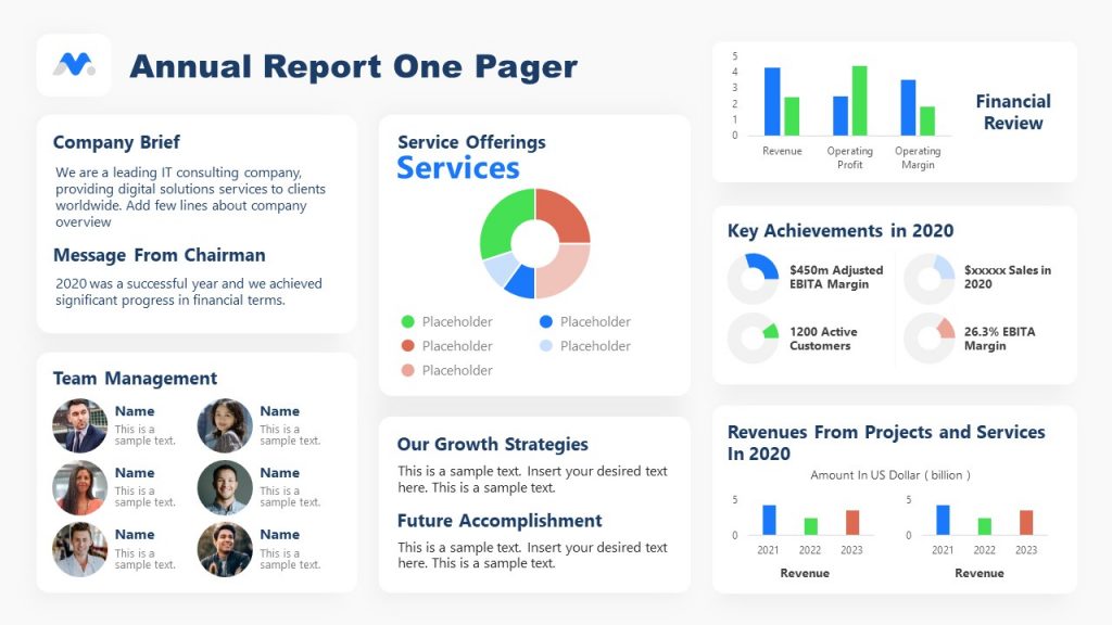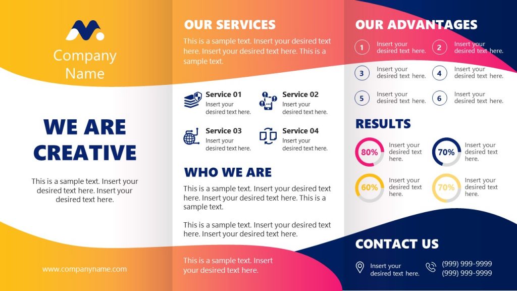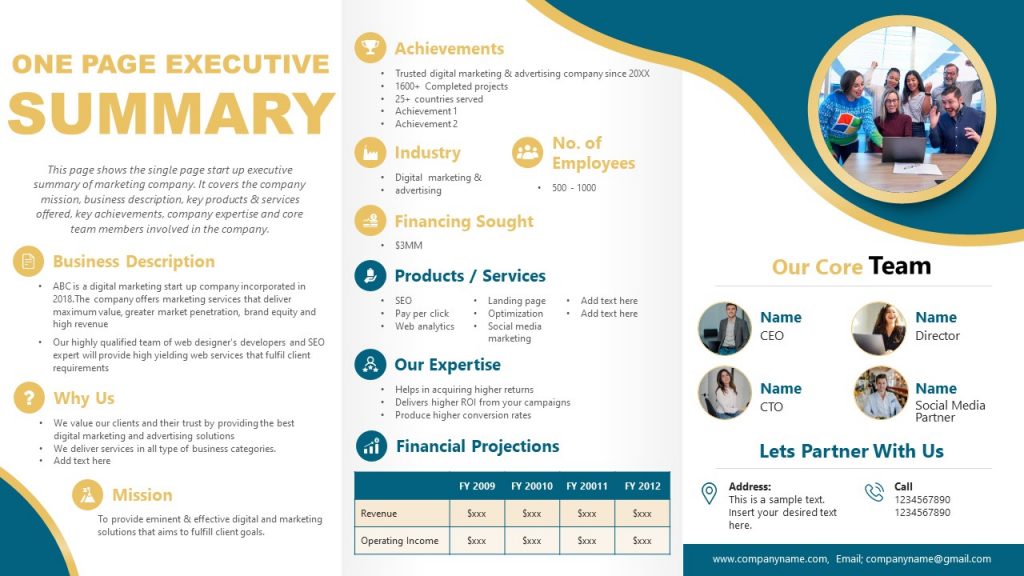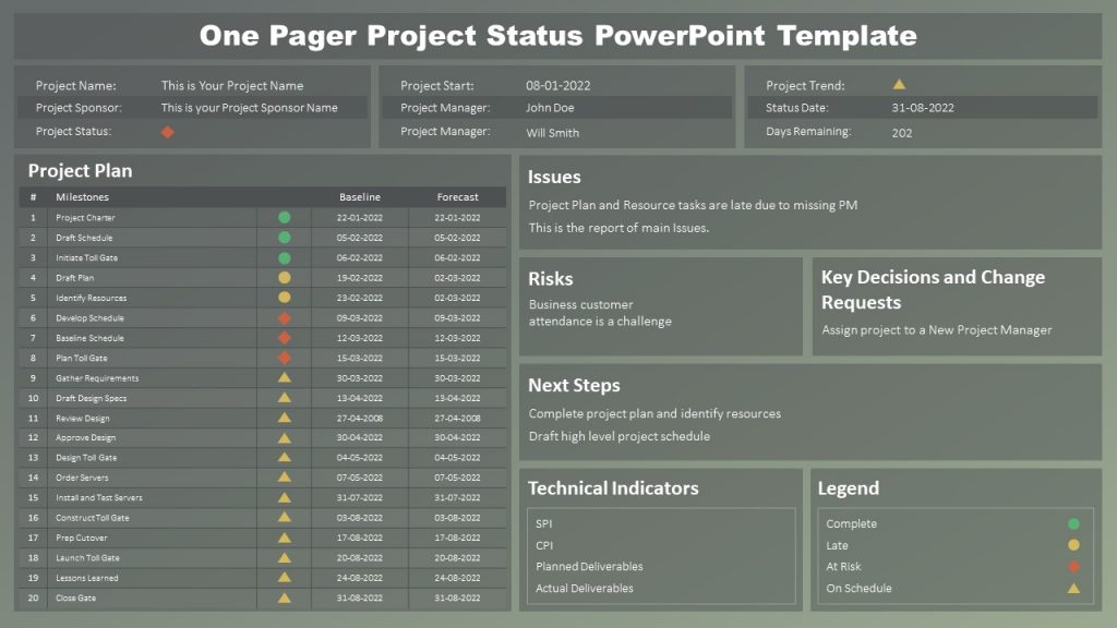
A one page document containing cohesive information helps make communication easy and delivers essential information in just a few lines of text. Businesses use one-pagers to consolidate knowledge and make it available in a palatable form. But how do they make the most out of one-pager? Let us show you how!
Table of Contents
- What is a One Pager?
- Why is a Business One Pager so important?
- Tips for Creating a Professional One-Pager
- Content Standards
- Mistakes to Avoid When Creating a One-Pager
- Final Words
- One Pager examples
What is a One Pager?
By definition, a one-pager is a single page containing an overview of important information. Managers and executives use one-pagers for summary reports, project rationale, shorter versions of forecasts, official policies, executive summaries, and other corporate informational assets. What are one pagers? Structurally, a business one pager has critical points laid out in a few lines of text and with high visual impact. The use of one pagers for formal communication is virtually endless. You can use it for various purposes. Your supervisor can ask to produce one pagers from everything from project summaries, financial reports, projections, and forecasts to product manuals, official policies, concept notes, etc.
While one pagers often come in the form of documents created in word processing applications like Microsoft Word, they are also adapted for use in PowerPoint presentations. Using the simplified version of the information, you can create slides that spell out detailed information cohesively. Many presentations, by default, are meant for just that. For those looking to optimize their content and measure its impact, leveraging tools for rank tracking can provide insights into how well your one-pagers are performing regarding visibility and engagement.
Why is a Business One Pager so important?
For anyone who has been doing formal paperwork for a few years, the benefits of one pagers are apparent. However, people new to the concept of one-pagers might want to know their relevance and what makes them essential. You will be able to read the instructions that will help you understand all the details and nuances. Let’s see some of the reasons one pagers are so important.
One Pagers Summarises Information
A one pager document that contains a summary of lengthy information can help explain the basic details associated with the content alluded to in a manner that is easy to grasp. Resumes are preferred and an essential part of formal communication at different levels. One mode of summaries is to use one page documents to introduce or explain information without sending a bucket load of text-heavy files to the end user.
One Pagers are Easy to Read
One of the reasons that make pager documents a standard within corporate communication is that they are easy to read and understand. The method is often used at the workplace to advertise and market content using flyers, pamphlets, and banners, summarizing information for ease of reading.
One Pager Provide Clarity to the Reader
In a situation where you need to make a decision based on a third-party analysis, would you prefer reading a 20-page document or a one pager? While you might skim through a lengthy document, the summary can help you easily understand the information. Even if you were to read every bit of the verbose version of the paper, a summary presented before or after the text would help you avoid confusion and get some clarity regarding the information you are reading.
One Pagers are Attention Grabbing
It isn’t feasible for businesses to send several information pages to potential clients to advertise their products and services. People in the marketing department looking to promote a fast-food chain or outlet will look to use the shortest route to grab the attention of potential clients.
This might include banner ads, pay-per-click advertisements, social media ads, one page pamphlets, flyers, well-designed banners, and billboards placed at critical locations, or TV ads with a short message. All these are meant to grab the attention of potential customers. All these are meant to grab the attention of potential customers. Each of these methods would use little information to generate a significant impact. Hence, one pagers are attention-grabbing machines used to disseminate information and make it catchy.
Where videos, audio messages, and other forms of multimedia content might not be feasible, a one pager (e.g., in the form of a flyer advertising deals of fast food) would do the trick.
Because ‘No One’ Reads Lengthy Documents
One pagers are essential for formal communication and can also help rationalize it. While organizations produce tons of paperwork, it isn’t often humanly possible to even read the amount of content made in manuals, reports, and forecasts. This information might be essential to cater to legal and official needs, such as taxation, fulfilling customer requirements, and complying with national laws. However, the content being produced is more like a haystack that is getting bigger, and finding the needle requires a signpost. That signpost is often a one pager.
Tips for Creating a Professional One-Pager
A one-pager can be created using several content standards. The following recommendations are a summary of the most commonly used criteria, providing insights into how to create a one pager effectively.
Format Standards: Physical Rules of a One Pager
The formatting of a one pager follows a few standard rules used in most formal communication documents, guiding you in creating a one pager effectively.
A4 Format or Equivalent
Using A4 size or equivalent (e.g., US letter size) for one pagers is common for most documents. This might differ if the one pager is for a pamphlet or flyer, although these two are also often printed in A4 format. Where text is smaller and saves space and cost, some companies might use a different size for their flyers. Similarly, a one pager printed on a banner or used in a billboard would incur more cost in terms of printing but might have more value if placed in a pivotal location.
While the format for the one pager might differ, depending upon the purpose, organization, and region, A4 size one pagers are the gold standard for formal one page communication.
Printable
One pagers are often printable due to multiple reasons. People usually print them to read them with concentration, but even in marketing, the need to publish a one page advertisement that has to be physically distributed is obvious. Even if your one pager is digitally distributed, using a printer-friendly format would be a good idea. The most common form used for this purpose is often PDF, MS Word, or Open Office-supported formats.
One Side Only
If you are printing more than one document, including one or more pagers, it is recommended not to print on both sides since it might compromise readability. If your one page document stretches due to formatting and printer setting issues, you might want to adjust that by editing the page orientation or printer setting to ensure it prints only on a single page.
Good On Page Content Distribution
A one pager is meant to be easy to read, and however, cramming text in a poorly formatted document would defeat that purpose. Depending on the one-pager type, you can distribute content using columns, reasonable space between paragraphs, parts of text in bold, subheadings or highlights, etc.
Content Standards
Like the physical orientation, the content standards can differ according to the content requirements for a one-page document. The below-mentioned content standards are commonly used in organizations for formal communication. Be it for internal communication with teams and management or to reach out to external stakeholders such as clients, shareholders, government officials, project partners, suppliers, etc.
Logo
Businesses, non-profits, or even service providers, including freelance marketers, often have a logo. Therefore, a logo design is an essential part of one pagers to help the reader understand the source of information. If you don’t have a company logo yet, a logo maker tool can help to get one without hassle.
Tagline
One pagers often accompany taglines. Although this isn’t always the case, especially during internal communication, many organizations set a standard for formal communication with templates containing the organization’s logo and tagline. There are, however, exceptions to this rule. Businesses working under private-public partnership agreements might need to strictly adhere to branding guidelines given by a government department, ministry, or organization. They allow the company only to use their logo and official logos under certain circumstances.
Company Profile or Introduction
While a one pager cannot burden heavy text, a company profile or introduction is typical in one page documents. Many times, it’s in the form of 1-2 lines of text explaining the name and purpose of the business. The company profile might also include information about services and the team. As an example, you can check out a company profile template or learn how to make a company profile presentation.
Metrics
For fast food listing rates for their burgers, metrics might not be significant, which would change for a one pager advertising a service. Cellular companies often mention metrics such as subscribers to show a substantial and satisfied user base. Similarly, a real estate company reaching out to customers or a business looking to attract investment might include metrics to reassure the reader of the business’s success and capability. Even in formal communication, metrics might be necessary when making one page reports, forecasts, and trends analysis reports.
Problem / Solution
In different forms of communication, be it a project proposal, business case, or executive summary, the most common information included is a problem and a solution. Similarly, in different forms of presenting and producing content, be it the pyramid principle or SCQA, the writing style entails the same. One pagers often involves explaining the problem, no matter how briefly, and elaborating upon the potential solution. When used for marketing and sales purposes, this would also come with a call to action.
Business Model
A business model might be necessary for a project proposal or to attract users and subscribers to use a service. A business model in a one-pager might also be used where the business is looking to establish itself as a responsible and trustworthy organization, such as when talking about corporate social responsibility or customer needs. Two real-life examples of one-pagers for business models are the Business Model Canvas and the Lean Canvas.
Strategy
If you are making a one page project proposal or content to attract investors, you need to incorporate some strategy to make your content informative and persuasive.
Timeline & Roadmap
Some one-pagers also require a timeline or roadmap, at the very least, the information presented in a similar sequence. Project progress, financial reports, and persuasive content to reassure external stakeholders, such as customers and shareholders, of the business’s success might include such information. You can use the timeline templates and roadmap slide templates we provide at SlideModel to make visual appealing one-pagers with timelines.
Unique Selling Proposition
The Unique Selling Proposition (USP) is commonly added to one pagers. When discussing how the USP impacts sales or ensuring employees live and breathe the USP when producing content. It is part of the corporate culture to ensure all employees are aware and become brand ambassadors.
Contact Information
Contact information is one of those details often included in one pagers. From one pagers meant for advertisement purposes to internal and external formal communication, some contact information (e.g., the address of the business or chain of the outlet(s) in the city) is almost always necessary.
Mistakes to Avoid When Creating a One-Pager
Creating an effective one-pager can be a powerful tool for communication and presentation purposes. However, to ensure your one-pager serves its purpose, you should avoid these common mistakes:
Overloading with Information
- Mistake: Trying to include too much information on a single page, making it cluttered and difficult to read.
- Solution: Focus on key points and avoid overwhelming the reader with details. Keep it concise and to the point.
Lack of Visual Appeal
- Mistake: Neglecting the visual aspect of your one-pager, resulting in a bland and unattractive document.
- Solution: Use visual elements such as graphics, images, and a well-thought-out layout to make the one-pager visually appealing and engaging.
Ignoring the Target Audience
- Mistake: Not considering the preferences and needs of your target audience when creating the one-pager.
- Solution: Tailor the content and design to resonate with your specific audience, addressing their interests and concerns.
Neglecting Proofreading
- Mistake: Publishing a one-pager with grammatical errors, typos, or inconsistencies.
- Solution: Carefully proofread the content and seek feedback from others to ensure it is error-free and professionally presented.
Inadequate Contact Information
- Mistake: Failing to include complete and up-to-date contact information, making it difficult for readers to get in touch.
- Solution: Double-check that all contact details are accurate and easily accessible on the one-pager.
Lack of Clear Call-to-Action (CTA)
- Mistake: Omitting a clear CTA, leaving readers unsure of the next steps.
- Solution: Include a specific CTA that guides readers on what action to take after reviewing the one-pager, whether it’s contacting you, making a purchase, or requesting more information.
Failure to Update
- Mistake: Using outdated information or neglecting to update the one-pager when necessary.
- Solution: Regularly review and update your one-pagers to ensure they reflect current information and remain relevant.
Inconsistent Branding
- Mistake: Not maintaining a consistent brand image throughout the one-pager.
- Solution: Use consistent colors, fonts, and branding elements to reinforce your brand identity.
Overcomplicating the Design
- Mistake: Creating a complex and confusing design that distracts from the core message.
- Solution: Keep the design simple and focused, allowing the content to shine without unnecessary distractions.
Neglecting Mobile Compatibility
- Mistake: Designing a one-pager that doesn’t display well on mobile devices.
- Solution: Ensure that your one-pager is responsive and can be easily viewed and navigated on smartphones and tablets.
By avoiding these common mistakes, you can create a one-pager that effectively conveys your message, engages your audience, and achieves its intended goals.
Final Words
One pagers are frequently used to make the content easy to understand and inform the reader regarding the information’s basic details. One pagers is often a starting point or allude to further information for further reading. They can also come with a call-to-action to encourage the reader to seek additional details from a sales representative, or agent, or visit business premises. The user does not require reading further information but can talk to someone to seek more information regarding the content mentioned in the one-pager.
You can use ready-made One Pager templates to make them engaging or incorporate the one-pager in a presentation. These can be particularly helpful for people new to producing summarized information and help others use one pager examples to save time when working with tight deadlines.
