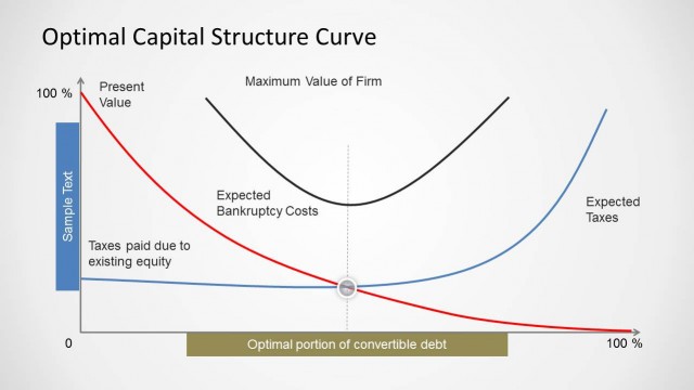
Display your finding about how much debt and equity finance to use with the Trade Off Theory of Capital Structure Curve for PowerPoint.
This PowerPoint Template comes with an editable Trade Off Theory of Capital Structure Curve for PowerPoint which can be rearranged and customized to create your own diagrams. The sample diagrams have been laid out in such a manner than you can create professional diagrams by simply adding text to slides.
Alternatively, you can also make good use of the adaptability that this template offers by customizing diagrams by changing the color, size and shape of lines, diagram objects and placeholders.
What’s inside this template
Example presentation scenarios
- A finance professor can use the full-width curve diagram to teach MBA students how the value of a levered firm changes as debt increases.
- A CFO can use the curve-plus-notes layout to brief executives on why an optimal debt ratio balances tax benefits against financial distress costs.
- An investment analyst can use the labeled curve to explain capital structure assumptions in a valuation discussion with portfolio managers.
- A consultant can use the annotated firm value and tax shield labels to align a client team around the theory behind financing recommendations.
Features
- 100% editable presentation template
- Compatible with Microsoft PowerPoint and Google Slides
- Scalable vector shapes, icons and illustrations
- AI-Ready for Microsoft Copilot and Claude
- Instant access and download
Frequently asked questions
Q: How should a presenter explain this curve without overwhelming the audience?
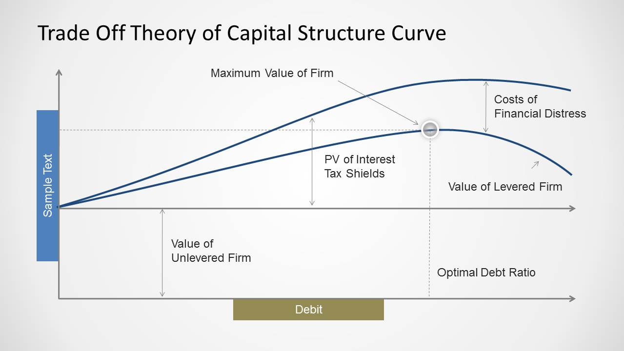
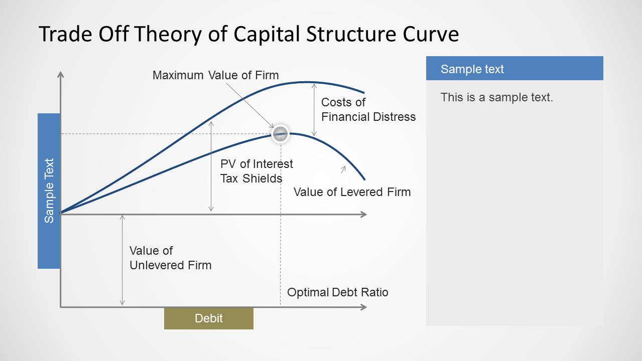
A: Start with the baseline value of the unlevered firm, then add the tax shield benefit as debt increases. After that, introduce the financial distress cost curve and show why the maximum firm value occurs before debt becomes excessive. The slide works best when the presenter builds the logic in stages instead of reading every label at once.
Q: Who is this template best suited for?
A: This template fits presenters who need to teach or defend a capital structure concept, including finance instructors, CFOs, analysts, consultants, and MBA students. It is strongest when the goal is to explain the theory behind an optimal debt ratio, not to show detailed transaction data or full financial statements.
Q: Why does the curve design help communicate trade-off theory?
A: The diagram uses intersecting curves, guide lines, and a highlighted point to turn an abstract finance theory into a visible trade-off. The upward tax shield effect and later decline from distress costs create a clear visual metaphor: more debt can add value, but only up to a point.
Trade Off Theory of Capital Structure Curve for PowerPoint
2-slide PowerPoint diagram template for capital structure curves, debt ratios, and firm value tradeoffs
Trade Off Theory of Capital Structure Curve for PowerPoint is a 2-slide finance diagram template for explaining optimal debt levels. It includes a full-width capital structure curve and a curve-with-notes layout showing debt, tax shields, financial distress costs, levered firm value, unlevered firm value, and optimal debt ratio for finance presentations.


 Loading...
 Microsoft PowerPoint
  Microsoft Copilot
  Claude for PowerPoint
 Other formats supported
Subscribe today and get immediate
access to download our PowerPoint templates.