Outline PPT Templates & Shapes for Presentations
A slide that needs to reference a country, state, or region often ends up built around a screenshot pulled from an atlas, which rarely matches the rest of the deck’s design and can’t be recolored or resized without pixelation. An outline map template solves that by giving presenters the shape as a native PowerPoint object: a traced border that can be filled, outlined, or layered with markers without leaving the software.
Each shape follows the actual geography of the country, state, or continent it represents, so accuracy holds up even after the colors and callouts change to match a brand palette or a specific dataset. The same shapes work for a single-country sales report, a US state breakdown, or a multi-region expansion plan spread across several slides, and they pair naturally with the broader library of editable map templates for teams that need to represent more than one region.
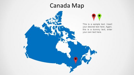
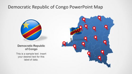
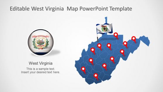
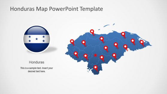
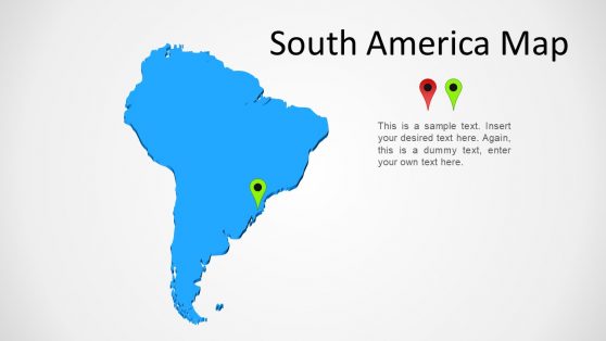
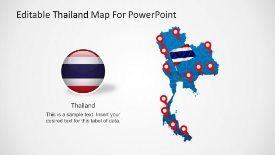
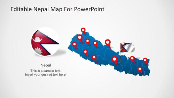
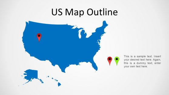
Why Outline Shapes Work Better Than Static Map Images
A raster map dropped into a slide carries its own background, its own color scheme, and often a resolution that breaks down the moment it’s resized for a widescreen deck. An outline shape avoids all three problems at once, since it’s built from vector paths that scale cleanly and accept a fill color or outline weight like any other PowerPoint shape. This matters most for recurring reports, where the same regional map reappears every quarter with new figures.
A vector outline can be recolored to reflect updated data without redrawing the shape, while a screenshot has to be replaced from scratch each time. For teams working from a full country map template, starting with an accurate outline also removes the risk of a border being slightly off, a common problem with hand-traced or freehand shapes.
What an Outline Map Template Provides
An outline map template is a set of country, state, or continent shapes built for direct use in PowerPoint or Google Slides. What’s typically included:
- Editable country outlines with individually selectable regions or provinces
- US state shapes, including versions broken down by county for closer regional detail
- Continent-level outlines for regional overviews
- Marker and pin icons for flagging specific cities, offices, or data points on a map
- Plain outline versions with no fill, suited to a minimal or single-color slide style
Does an outline map include internal borders, or just the outer shape?
It depends on the template. Country-level outlines usually include internal state or province borders as separate, selectable regions, while continent-level outlines are sometimes simplified to the outer coastline for a cleaner look at smaller sizes.
Can the map shapes be recolored to match a brand palette?
Yes. Since each shape is a native PowerPoint object rather than an image, you can change the fill color, outline weight, and transparency the same way you would with any other shape on the slide.
Are individual US states available separately from the full country map?
Yes. States such as West Virginia or Honduras-style single-country maps are included as standalone files, so a presentation focused on one state or country doesn’t need the entire map broken apart first.
Do markers need to be added manually, or are they built into the map?
Markers are separate elements that get placed on top of the map shape. Keeping them separate lets you move a marker to a new city or add several without editing the underlying outline.
Is this the same as an outline for structuring a presentation’s agenda or sections?
No. These are geographic outline shapes, countries, states, and continents, used as map graphics on a slide. For templates that map out the structure of a talk itself, section by section, see this guide to building a presentation outline instead.