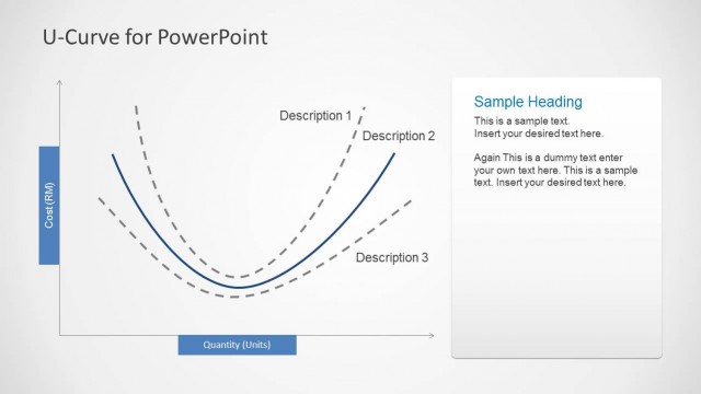
S-Curves for PowerPoint is a presentation template that you can download to model a S-Curve in a slide design.
The sample diagrams in the given slides can be comprehensively edited to adjust the curve to depict and accurate representation of your S-Curve. You can also perform major customizations to your slides by making use of the given placeholders for describing different parts of the curve.
What’s inside this template
Example presentation scenarios
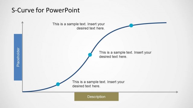
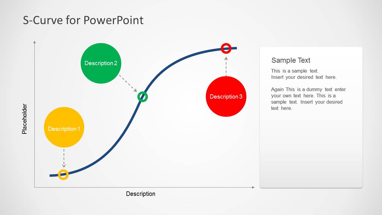
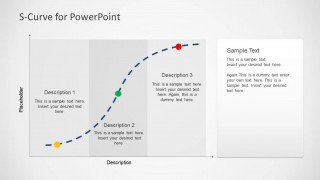
- A product manager can use the annotated S-curve to explain adoption phases and connect each phase to market readiness, user growth, or feature maturity.
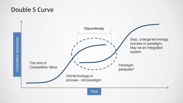
- A strategy consultant can use the segmented curve slide to divide a transformation plan into early, acceleration, and stabilization stages for an executive workshop.
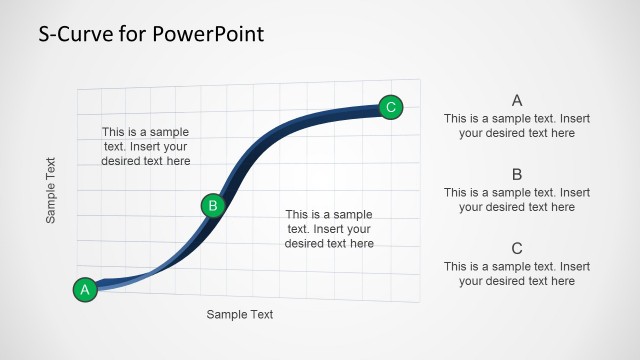
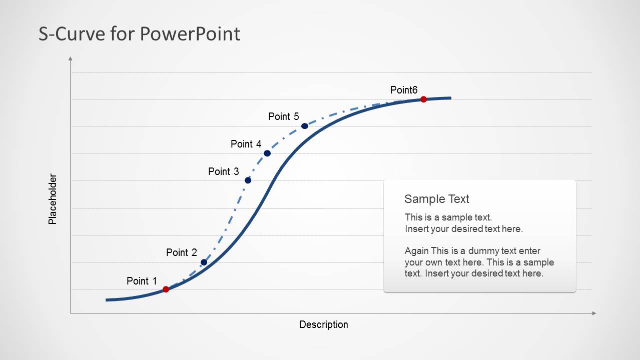
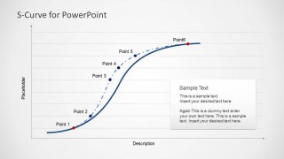
- A project manager can use the gridded point-marker curve to report progress milestones and show where the initiative is moving from ramp-up toward a plateau.
- A business analyst can use the callout circles and right-side text panel to explain assumptions behind a forecast, lifecycle model, or performance trend.
Features
- 100% editable presentation template
- Compatible with Microsoft PowerPoint and Google Slides
- Scalable vector shapes, icons and illustrations
- AI-Ready for Microsoft Copilot and Claude
- Instant access and download
Frequently asked questions
Q: How should a presenter explain the S-curve without making it feel abstract?
A: Start with the visual shape: slow start, steep acceleration, and later plateau. Then place the colored markers at moments the audience recognizes, such as launch, adoption, scale-up, or maturity. Use the right-side text panel for the key interpretation, not for repeating every label on the curve.
Q: Who is this template best suited for in a business presentation?
A: It fits presenters who need to explain change over a lifecycle rather than show a detailed data table. Product leaders, consultants, analysts, and project managers can use the annotated curve, segmented phases, and point labels to make adoption, growth, or maturity patterns easier for stakeholders to discuss.
Q: Why does the S-curve metaphor work well for growth and maturity topics?
A: The S shape gives the audience a familiar mental model for progress that is not linear. The early flat section suggests preparation or slow traction, the steep middle shows acceleration, and the top plateau signals saturation or maturity. The visible markers and shaded phases turn that metaphor into a structured explanation.

S-Curves for PowerPoint
3-slide PowerPoint presentation template for S-curve diagrams, lifecycle stages, and growth points
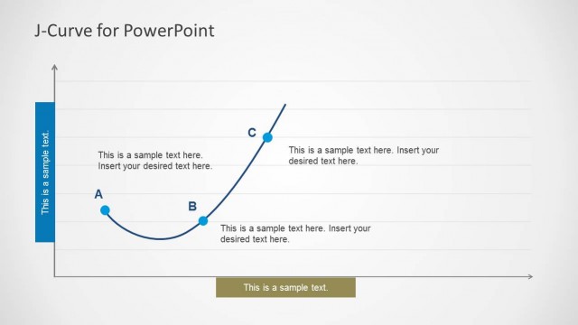
S-Curves for PowerPoint is a 3-slide diagram template for explaining adoption, growth, lifecycle, or performance curves. It includes an annotated S-curve with color callouts, a segmented curve view, and a gridded point-by-point curve. Business presenters can edit the curve shapes, labels, axes, and vector markers in PowerPoint.


 Loading...
 Microsoft PowerPoint
  Microsoft Copilot
  Claude for PowerPoint
 Other formats supported
Subscribe today and get immediate
access to download our PowerPoint templates.