Data Driven PowerPoint Dashboard Web KPI
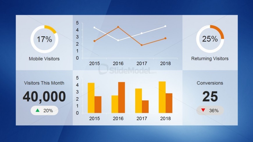
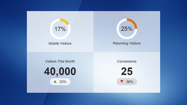
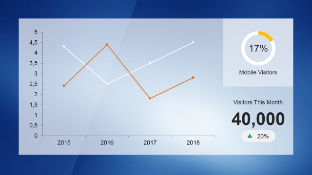
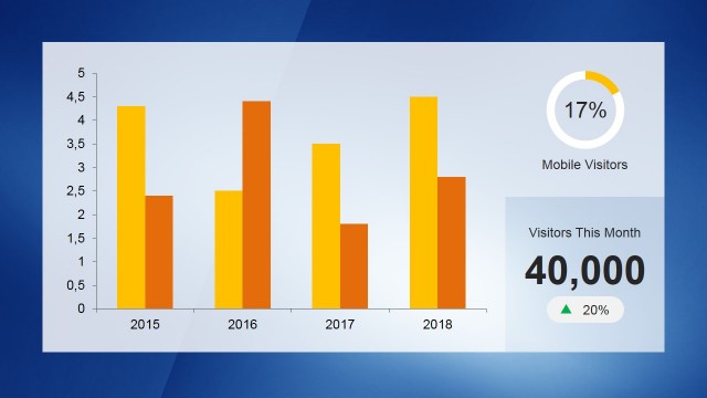
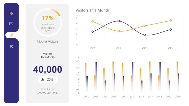
The PowerPoint slide contains a Data Driven PowerPoint Dashboard Web KPI. Here, six key performance indicators (KPIs) are arranged in two parts, each with three columns. The upper portion has a circle graph indicating the percentage of mobile visitors. Next is a line graph with two intersecting lines with numbers and year. Last is a donut chart showing the percentage of returning visitors.
On the lower portion is Visitors for the Month that comes in a black figure placeholder with percentage. It contains a triangular green arrow that indicates increase. Next is a bar graph comparing two sets of data taken per year. The last shows the number of conversions. It comes with a red inverted triangle showing decrease. This PowerPoint slide is an engaging method of presenting KPIs. The presenter can customize the data through MS Excel.
Return to KPI Dashboard Template for PowerPoint.
Download unlimited PowerPoint templates, charts and graphics for your presentations with our annual plan.
DOWNLOADReturn to KPI Dashboard Template for PowerPoint.
