Sales and Marketing Synchronization PowerPoint Diagram
This professional PowerPoint template contains a unique PowerPoint Chart of the relationship between Sales and Marketing Synchronization. This complex topic is given a fascinating approach in presentation so that the audience will be able to grasp the concepts quickly and easily.
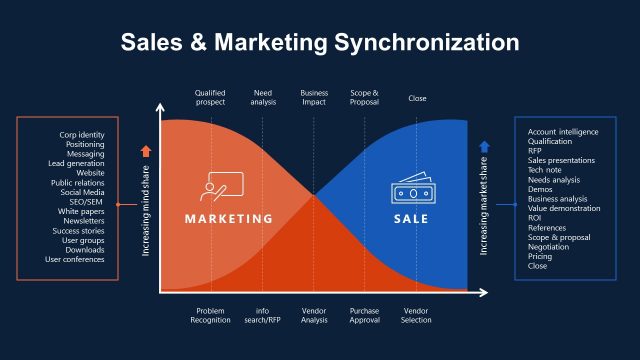
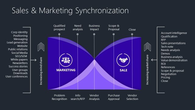
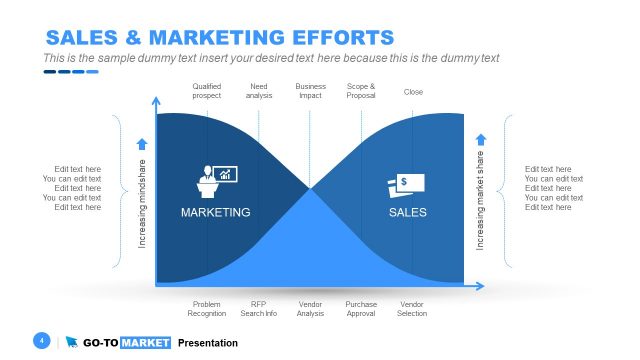
In the primary vertical axis (left) the diagram shows the level of mindshare (customers knowing the product/service and brand). In the secondary vertical axis the chart represents the market share (how much does our product/service is being sold in the target market). The horizontal axis represents the stage of the customer purchase journey. It is divieded in five vertical lanes that include:
- Problem Recognition: The customer becomes a qualified prospect
- Info Search /Request for Proposal (RFP): The customer requires analysis of its needs
- Vendor Analysis: The customer can have business impact
- Purchase Approval: scope and Proposal Defined
- Vendor Selection: Close the Deal
The diagram shows the Marketing Curve and the Sales Curve and their intersections in the vertical lanes, and how each area increases and decreases approaching the the close of the sale.
There is a man in podium icon, as well as an credit card or dollar bill icon in the diagram. With this PowerPoint slide, easy recall of the concepts involved in Sales and Marketing Sync may be expected. The presenter may edit some of the words that are not applicable to his presentation. This will not be difficult at all considering that the icons and text are so easy to adapt. The clipart may even be modified without affecting their graphic resolution.
Return to Go To Market Strategy PowerPoint Template.
Download unlimited PowerPoint templates, charts and graphics for your presentations with our annual plan.
DOWNLOADReturn to Go To Market Strategy PowerPoint Template.

