Slide 1 of 3 from Data Driven Fan Chart PowerPoint Template
Fan Chart PowerPoint Forecast Diagram
Forecast Diagram for Data Analysis
- Chart
- Line Chart
- Forecast Slide
- 16:9
- 100% Editable
What’s on This Slide
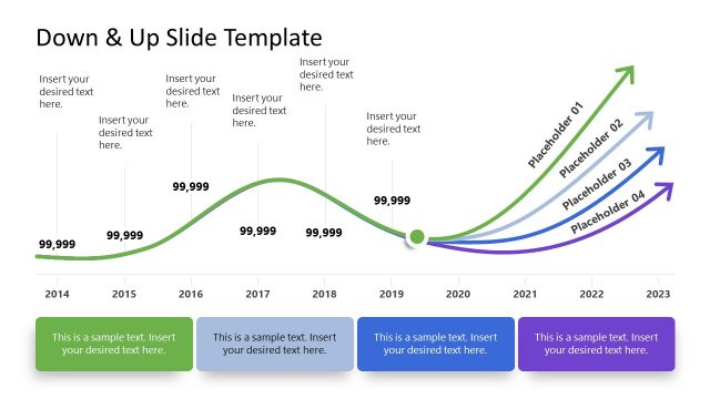
The slide features a line chart with an orange line representing forecast data over time. It includes two orange arrows pointing upwards, indicating areas for text insertion. The horizontal axis is labeled with months from January 2016 to December 2017, while the vertical axis is labeled with numerical values from 500 to 640. The background contains a gradient of purple shades, creating a layered effect beneath the line. Text placeholders are centered below the arrows, indicating where users can insert their desired text. The overall layout is structured to emphasize the forecast trend visually.
How to Use It
This layout serves as a forecast diagram, suitable for presenting data trends over time. It is effective in business contexts such as project status updates, financial forecasts, or performance analysis. The visual structure allows for clear communication of data trends and uncertainties. This slide fits well at the beginning of a presentation, establishing the context for subsequent analysis or discussion. It can be used to highlight key insights or predictions based on the data presented.
Text Placeholders & Capacity
Keep your copy within these limits so it fits without resizing. Text slots can hold roughly 5-6 words each.
| Placeholder | Count | Max characters (approx.) |
|---|---|---|
| Chart title | 1 | 30 |
| Item body | 2 | 30 |
| Item body | 1 | 30 |
Slide Keywords
Download unlimited PowerPoint templates, charts and graphics for your presentations with our annual plan.
DOWNLOADReturn to Data Driven Fan Chart PowerPoint Template.