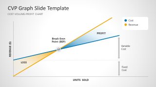
CVP Graph PowerPoint Template
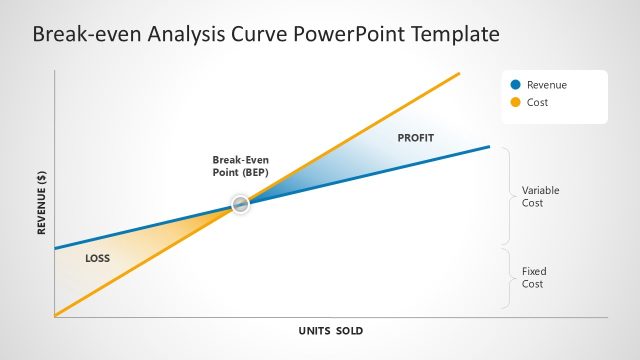
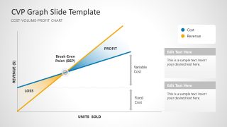
Present your sales performance analysis comprehensively using our CVP Graph PowerPoint Template in the investor sessions. Data visualizations like charts and graphs are the graphical representation of large data sets that make it easier to communicate the information. Complex qualitative or quantitative data sets can be represented by data visualizations. This enables decsion makers to find out the trends and patterns in data and make effective future decisions. The CVP graph refers to the cost-volume-profit chart which presents the overall revenue against the units sold. They can discuss the loss, BEP, and profits easily using our engaging slide template. Professionals can use this slide template in their pitch decks to showcase their great performance to the investors and convince them to give more funds for scaling the business. Moreover, presenters can edit the template design with Keynote, Google Slides, and all versions of Microsft PowerPoint.
The CVP Graph PowerPoint Template has three slides with a CVP graph and certain differences in slides. The first slide shows the revenue on the y-axis and units sold on the x-axis. The blue line has a color label for costs, and the yellow color indicates the revenue line. A color shade also enhances the visuals of the template. Data exports and business analysts can discuss the following five major things using our CVP graph template:
- Fixed Cost
- Variable Cost
- Loss
- Break Even Point
- Profit
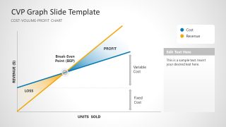
In the second and third slides, the graph is the same, but it has a smaller size, making some space for editable text boxes. Professionals can also change the type of data visualization charts based on their data types. You can edit the color labels, graph colors, text labels, and other PowerPoint elements like fonts and shapes to fit your needs perfectly. Alternatively, you can check out our collection of engaging PPT curve templates and choose a different design. Download our CVP graph slide template for presentation and edit it for your executive meetings!


You must be logged in to download this file.
DOWNLOAD- Category
- Curves & Lines
- Rating

 Loading...
- Size
- 16x9
- Item ID
- 22853-01
- Colors
Subscribe today and get immediate
access to download our PowerPoint templates.