Comparative Analysis Dashboard PowerPoint Template
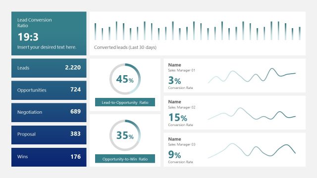
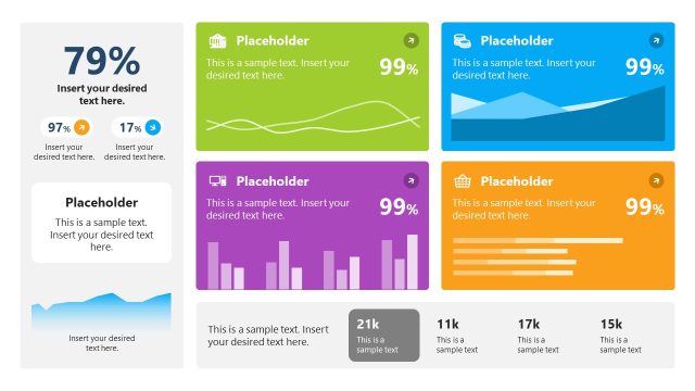
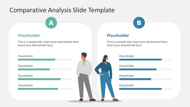
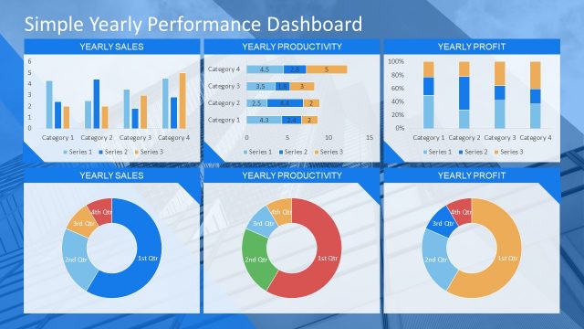
Customize our Comparative Analysis Dashboard PowerPoint Template to showcase the annual and budget sales comparison using this fully editable dashboard. This tool is intended to display the overview of large data sets. Different tables, charts, and graphs are used in the PowerPoint dashboard to present the details visually and track changes in real-time. Professionals, sales managers, associates, and project managers can use this best PPT template to compare key business performance indicators and metrics. Users can edit this comparison template to demonstrate the company’s current sales position and forecast future trends or chances of sales growth. This can help an organization make an informed business decision based on the available data.
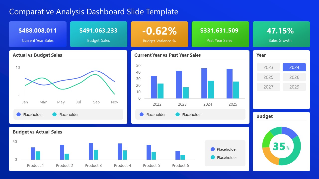
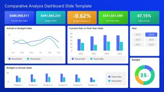
The Comparative Analysis Dashboard PowerPoint Template contains two slides with the same layout but different background colors (white and blue). In the dashboard slide, we provided various sections displaying different analytical data points. The dashboard layout can help users compare data between two data points: annual and budget sales. There are five text boxes at the top of the slide for displaying current year sales, budget sales, budget variance, past year sales, and sales growth. Next, there are different segments containing:
- Line Chart
- Vertical Bar Chart
- Pie Chart
- Dual Bar Chart
We have provided a slicer or year filter to examine the data for different years. Users can do yearly sorting of their data on the dashboard. The legends and labels used in the template make the information understandable and easy to communicate. Professionals can edit this template with all versions of Microsoft PowerPoint, Google Slides, and Keynote. They can change the colors, types of graphs, charts, legends, and labels in the template according to their data and theme. Download this comparative analysis dashboard PPT template to create more powerful business presentations and edit it now!

