Data Driven Column Chart with Period Variation Icon

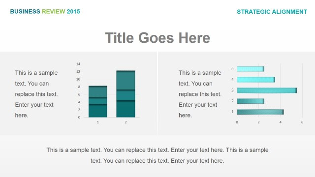
The PowerPoint slide contains a data-driven column chart with period variation icons, which may be used to compare five different sets of data that are used in the business organization, such as profit margins and product sales.
The column chart is shown in different shades of cyan, and contains a circular PowerPoint graphic containing financial values. To the left of the diagram are two text placeholders, one of which is for the title, while the other is for a summary or an explanation of the data to be found on the PowerPoint design. On the right side of the slide design is a text placeholder in cyan text, where other relevant statistical information may be inserted. Below this, a discussion the Office template may be placed. All PowerPoint objects may be modified to suit the presenter’s needs and preferences as they are 100% editable.
Return to Business Review PowerPoint Template.