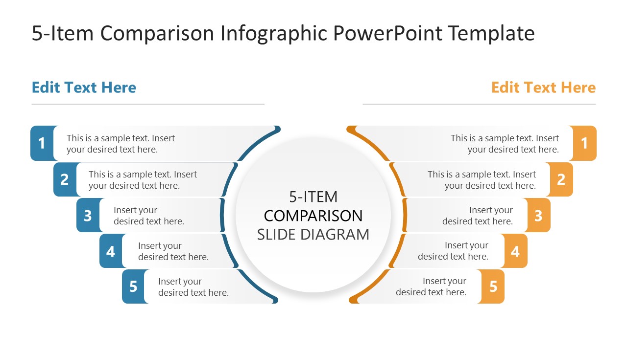
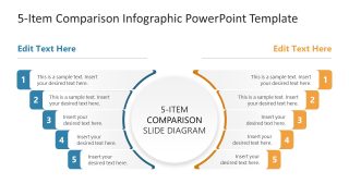
5-Item Comparison Infographic PowerPoint Template
Download our 5-Item Comparison Infographic PowerPoint Template to compare two groups across five parameters. Strategy consultants use the comparison infographics to compare the performance of two executive teams in business presentations. Product managers can edit this PPT layout to showcase how their product is better than the competitor’s product to the investors. In academic training, career counselors clearly distinguish between two career options using this 5-item layout.
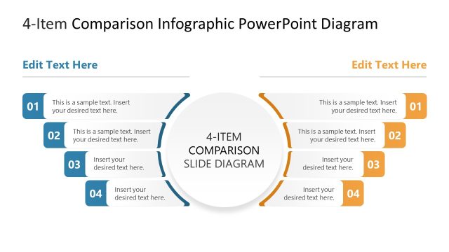
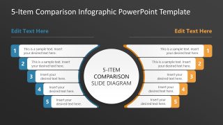
The 5-Item Comparison Infographic PowerPoint Template features a central circular diagram with a title and two arcs flanking it. The one arc is blue on the left and golden yellow on the right. Each arc comprises five numbered boxes that extend outward, forming a mirrored structure for comparing points across different criteria between two groups simultaneously. The audience can quickly understand the key differences regarding each parameter due to the clear visual arrangement. The numbered boxes have enough space for users to outline brief details by adding custom text to the placeholder lines. Digital marketers use the two-column comparison diagram to highlight differences between the best-performing and an underperforming ad. They can use either the dark or the white background slide, depending on the theme or their choice. The marketing team understands the key advantages of the best-performing ad campaign with this clean layout. Further, if you have to visualize six points, you can download and edit the 6-Item Comparison Infographic PowerPoint Template.
Download the 5-item comparison infographic PPT template and display the comparison between two products or scenarios in the product presentations. If you want to try a different theme or pattern layout, then visit our collection of comparison templates to find the most suitable design for your next business presentation.

You must have an active subscription to download this file.
- Category
- Multi-purpose
- Rating
-

 Loading...
 - Size
- 16x9
- Item ID
- 23655-01
- Colors
Subscribe today and get immediate
access to download our PowerPoint templates.