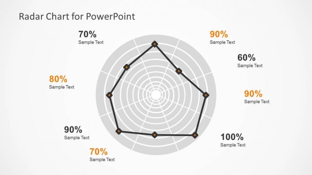
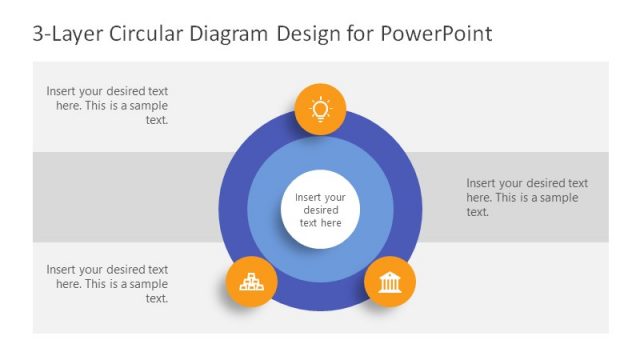
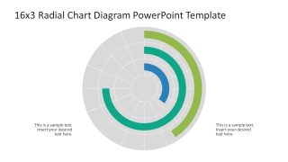
16×3 Radial Chart PowerPoint Template
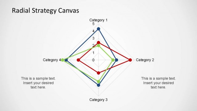
Download our editable 16×3 Radial Chart PowerPoint Template to comprehensively showcase business statistical data to the stakeholders. A radial chart refers to a circular diagram with many radial segments that can help presenters communicate various data points effectively. For instance, project managers can showcase the key performance indicators for multiple departments. In competitive analysis, you can present the proposition of market segments. This radial chart diagram template is also helpful in visualizing revenue distribution, profit and loss margins, and costs or expenditures. Moreover, data analysts can edit this design to showcase the results of a public survey or research outcomes in the business sessions. This simple and engaging slide layout enables project managers to discuss the milestones of a project and highlight risks. Educationists can use our diagram template to break down complex concepts into simpler points and present their lessons in an organized manner.
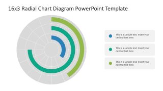
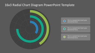
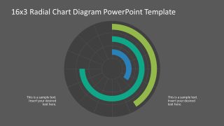
The 16×3 Radial Chart PowerPoint Template has a central diagram showing concentric circles that create many radial segments. The sections and subsections have different color labels that mark the specific points or variables. The first slide has a central diagram with two editable text boxes on the lower sides of the slide. The second slide has a similar diagram, but on the left, we have provided a small table where you can mention the color labels and their corresponding factors. The last two slides are similar to the first one but have a dark background. Additionally, you can try our other templates with engaging radial diagrams to showcase your thoughts comprehensively. You can change the color labels, text regions, fonts, and other features used in the template.
Further, professionals can edit the data visualization tool to effectively showcase their preferred results or data points. Download the 16×3 radial chart presentation template for your business presentations. Try it with Google Slides and Keynote!


You must be logged in to download this file.
DOWNLOAD- Category
- Data & Charts
- Rating

 Loading...
- Size
- 16x9
- Item ID
- 22884-01
- Colors
Subscribe today and get immediate
access to download our PowerPoint templates.