While designing PowerPoint templates, you can take advantage of the Theme Colors feature to create or use pre-defined color palettes for your presentation. Switching the theme color palette during design time lets you easily give your presentation a different look. Since presentation colors are often one of the first considerations when answering the key question about how to start a presentation, knowing how to adjust colors can enable better compliance with branding needs and add visual harmony to your design.
This article will show you how to create and edit a custom color palette to create PowerPoint themes that can be easily edited to match any other color combination.
How to Change Theme Colors in PowerPoint
Changing the presentation color palette can help align the colors to branding needs and enable adjusting them for visual appeal. There are different methods for changing theme colors in PowerPoint, including using presets or a custom color palette.
In this example, we used the Red Project Portfolio PowerPoint template, which you can download from our site. This PowerPoint template was created using the concepts described below so you can easily change the theme colors to match any other color combination or color palette. The method mentioned below can not only be used with PowerPoint templates but also with Google Slides templates downloaded in PowerPoint format.

Create a New Theme Color Palette or Use an Existing One
After opening the presentation or PowerPoint template where you want to apply this technique, go to the Design menu and then look for the Variants section. Click the small arrow icon to open the popup menu and choose Colors.
Now click the Customize colors option to create a new color combination. To edit an existing color combination, right-click over the color set and then click Edit.
The Edit Theme Colors dialog box will appear. Here, you can set up 12 color variants for the same presentation. Each color you configure here will be used for different purposes in your presentation. For example, the Accent colors can help you to highlight areas of your presentation, or you can use them as a color for your PowerPoint graphics or shapes, while the text/background colors are usually applied for Text or PowerPoint background.
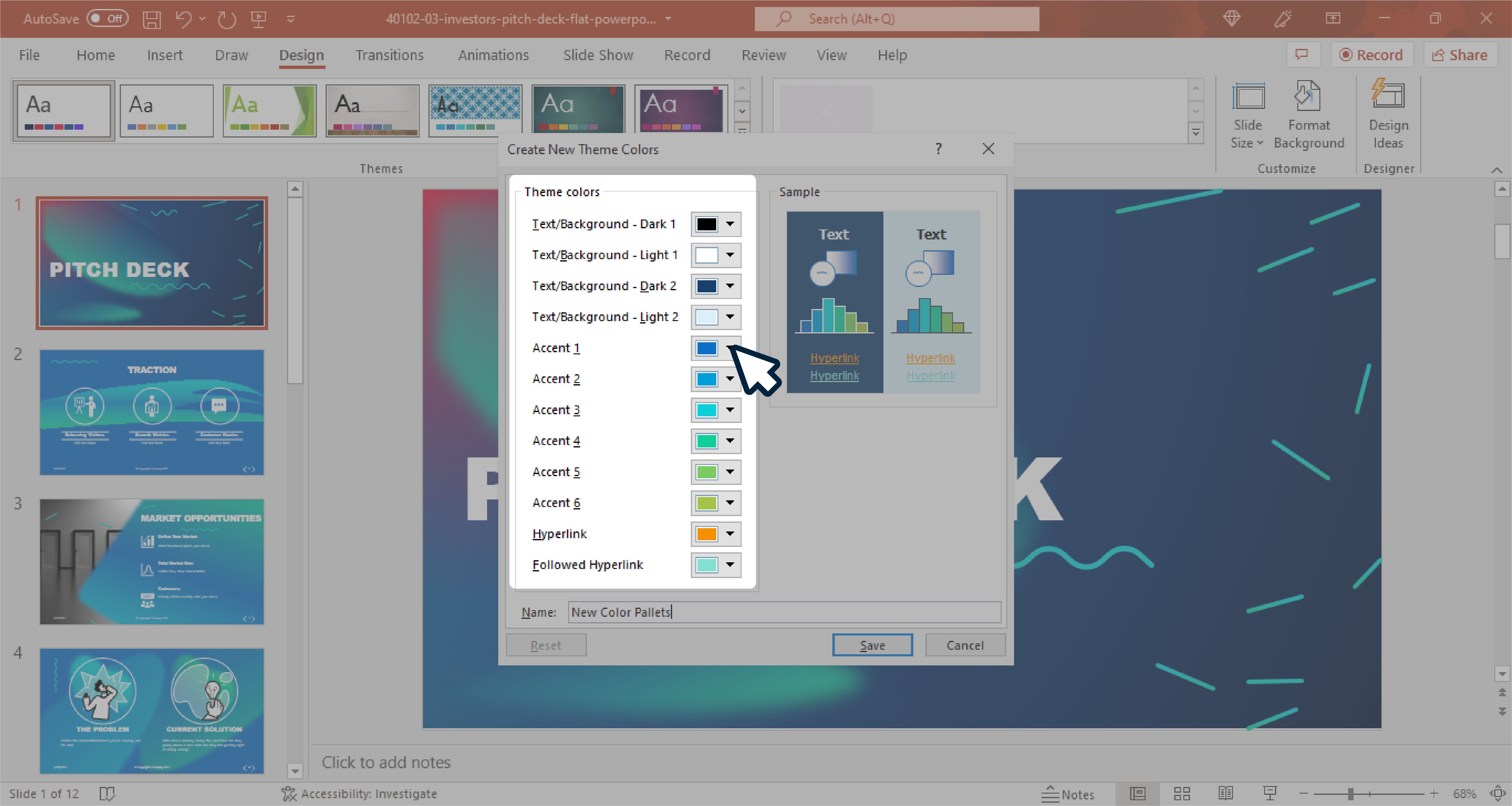
By adjusting the color values for Accent 1..6 entries, you can create awesome presentation template variants with a different set of color combinations.
The Hyperlink and Followed Hyperlink colors are used for hyperlinks added to your slides. Unless you use links in your slides, these two color values are not very useful.
To change a color, click on the color preview and click More Colors to pick one from the palette dialog. In Windows you can see a dialog like the one shown below:
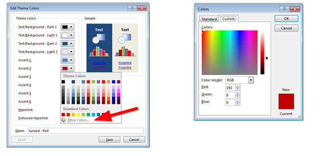
You will notice that some variants have been added to the PPT color palette for each color you pick from the color picker. This will become very useful for adding new hues or tones of the same color to your presentation objects.
Once you have finished editing the color palette, assign a Name to the color theme and click Save to save the changes.
Choosing What Colors to Use in Your PowerPoint Presentation
The next important step in preparing your presentations using Theme Colors in PowerPoint is to pick carefully what colors to use on each PowerPoint presentation object, chart, text, or shape. In this example, we chose the red color from the Theme Colors palette to make a red presentation.
Similarly, you can change the color theme for the presentation to blue warm or use other color variations as needed. This can also help answer the question about how to make a presentation suitable according to certain brand colors or the overall theme of a presentation.

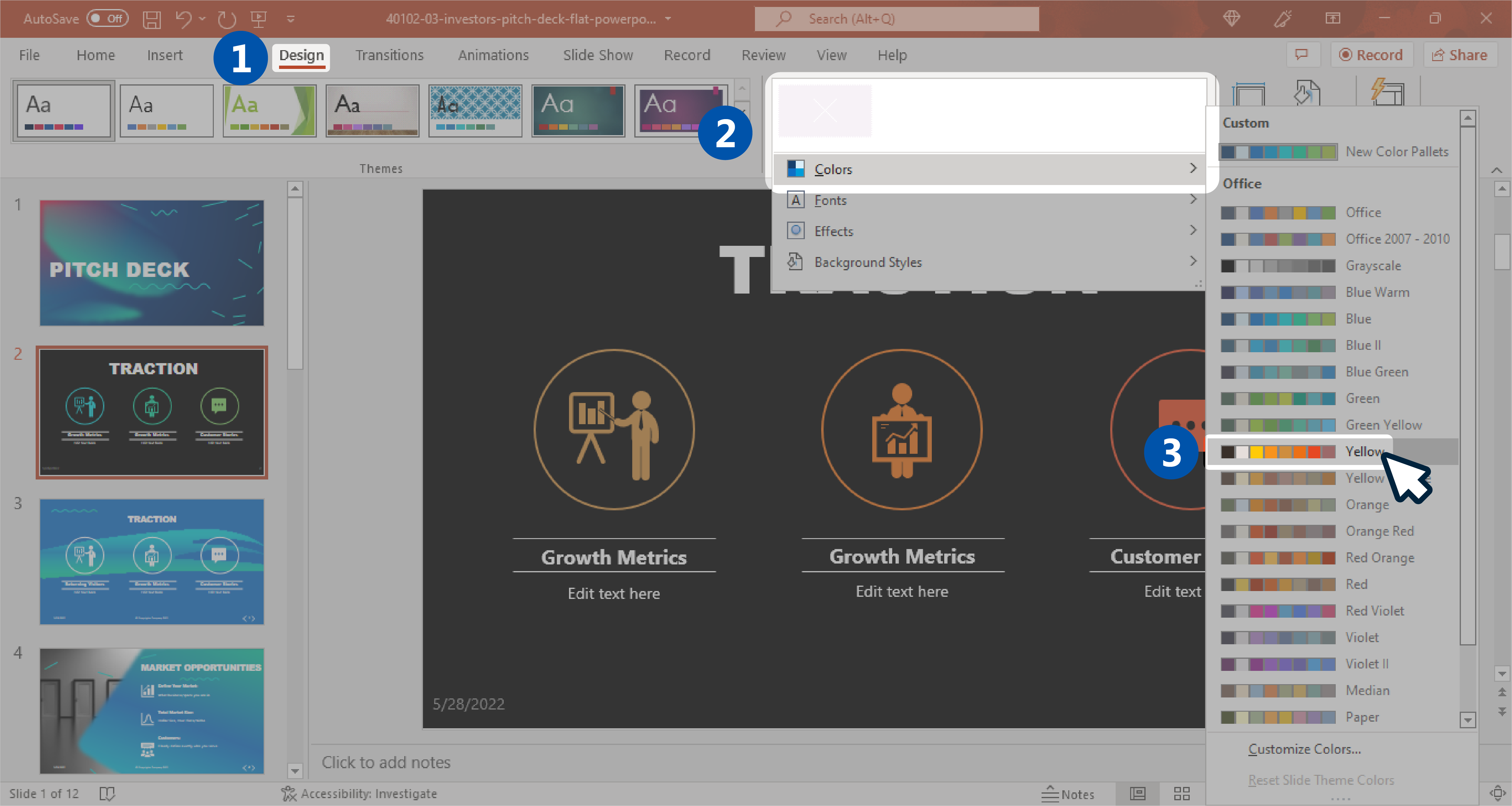
Once you carefully pick and assign all the colors to your PowerPoint objects, you can preview the magic of switching a different Theme Color. For example, suppose you want to switch the current color palette to use a different color set using yellow instead of red. In that case, you can go to the Design menu and then, from the Variants section, choose Colors and pick a different PPT Theme Colors from the predefined color combinations. Here, you can see a real example using a yellow presentation theme.
If you are looking for a way to completely change the template for a presentation, see our guide on how to change PowerPoint template. If you frequently use Google Slides, you might also find our tutorial on how to change theme colors in Google Slides useful.
Customizing Color Palette for Charts
You can also apply custom colors from the Theme Colors palette to PowerPoint charts. The following example shows how to use the color palette in a 3D Pie Chart. Select the chart series you want to update and then find the Fill button in the context menu. Here, you can choose colors from the Theme Colors palette, as shown below.

Importing & Exporting Custom Color Palettes
If you need to share a color palette with other PowerPoint designers or between different members of your team, you can find the custom Theme Colors saved as an XML file in the following folder ~/AppData/Roaming/Microsoft/Templates/Document Themes/Theme Colors. Find the file corresponding to your custom color palette, copy and paste it, or share it online.
Color themes can also be saved as a PowerPoint theme (.thmx file format). To save the current theme, go to the Design menu and then click the small down arrow button under the Themes section. Then click Save Current Theme… to open the Save dialog box.
Tips for Changing Theme Colors
Changing theme colors can be tricky. A theme that deviates from brand guidelines can look visually overpowering or not reflect your brand identity’s true essence. Below are tips for changing theme colors in PowerPoint. You can also learn about presentation colors from our tutorial about color theory for presentations, which guides non-designers on the proper use of colors for presentations.
Know Your Brand Guidelines and Audience
When deciding on a color palette, the first thing to consider are your brand guidelines and the audience you need to address. While maintaining colors and guidelines in line with your brand identity, you should consider the type of audience you will be addressing. For example, an investor pitch deck might require colors to highlight charts, trends, and forecasts.
Maintain Consistency
It is important to maintain consistency throughout your presentations to make them visually balanced. You can do this by using the same color scheme for your slides and ensuring that the colors and design elements align with your brand guidelines.
Consider Legibility in Your Design
Colors that are too dark or too light can result in legibility issues. Ensure your text and slide objects are aligned so that slide colors don’t affect visibility. You can add background elements like a shape behind the text to make it stand out while reducing its opacity to make it gel with the background design.
Stick to Just a Few Colors
Sticking to just a few colors is best to balance your palette. Using no more than four or five colors might be a good way to balance your slide design. You can consider using a dominant color with a combination of light colors. For example, you can use a light background color over dark text or a dominant dark background design over light text. Some presenters use a combination of a black background color over white text to make presentations look focused, whereas others prefer using neutral background colors, with a combination of an accent color.
Use Accent Colors Strategically
Using accent colors for callouts, titles, subtitles, shapes, and graphs can help strategically highlight key areas of your slides. This can enable you to create balanced designs without using too many colors to highlight important parts of the slide. Similarly, using gradients and transparency for slide elements can be a great way to make slides more attention-grabbing and easy on the eyes.
Check for Accessibility
Your presentation might require adjustments for persons with disabilities, such as people who might be color blind. You might want to test accessibility for your presentation by using tools like Contrast Checker to verify compatibility according to Web Content Accessibility Guidelines (WCAG) standards. Other than colors, you might also want to consider your font size and other slide elements to meet WCAG standards.
Conclusions
Using the approach described in this article you can easily change the PowerPoint presentation colors to use the new color palette. Below you can see a real example showing how we have changed the colors affecting the battery cliparts by selecting a pre-defined color palette from Design -> Variants -> Colors.

Using Theme Colors you can easily manipulate your presentation colors and create other variants of your PowerPoint presentations and PPT templates using a different set of color palettes. This way, you can make the presentation match your corporate visual identity or make additional variants for other presentation needs. Also, we recommend you our complete collection of PowerPoint themes for presentations.
Alternatively, check our articles about how to change shape colors in Google Slides and how to change theme color in Google Slides.


