Venn Diagrams are commonly applied in business and academic situations. As we don’t wish to dwell on the technicalities of what a Venn Diagram is in this article, we invite you to discover how to make a Venn Diagram in Google Slides. In case you are looking for this same procedure, but for a different software, please check our guide on how to make a Venn Diagram in PowerPoint.
Tips for Effective Venn Diagram Design on Google Slides
Plan Your Venn Diagram Thoughtfully
Before diving into the design process, take time to plan your Venn diagram. Clearly define the sets and their relationships. Think about what you want to convey and how the sets intersect. Sketch it out on paper or in a digital document to ensure your ideas are well-organized. By having a clear plan, you’ll save time and avoid confusion during the design process.
Simplicity is Key
A common pitfall in Venn diagram design is overcrowding the diagram with too much information. It’s essential to keep your Venn diagram simple and uncluttered. Focus on the most important relationships and intersections. Overcomplicating the diagram can make it challenging for your audience to understand the main points. Emphasize the key overlaps and distinctions rather than trying to include every possible detail.
Use Color and Transparency Strategically
Color can be a valuable tool for differentiating sets and intersections in your Venn diagram. However, it’s crucial to use color and transparency judiciously. Select a color palette that is visually pleasing and provides sufficient contrast. Consider the accessibility of your colors, as some audiences may have color vision deficiencies. Use transparency to highlight overlapping areas, making it clear which elements belong to multiple sets. This technique can make your Venn diagram more informative and visually appealing.
Clear and Informative Labels
Labels are essential in Venn diagrams to provide context and help the audience understand what each set and intersection represents. Use text boxes to add descriptive and clear labels. Ensure that your text is easy to read and appropriately sized. Consider the placement of labels, positioning them near the relevant sections of the diagram. If your labels are too long, consider abbreviations or concise descriptions to maintain clarity.
Maintain Consistency and Alignment
Consistency and alignment are key elements of an effective Venn diagram. Ensure that all circles or shapes are consistent in size and style. Maintain alignment by using Google Slides’ alignment guides and grids. Keeping elements symmetrical and well-organized enhances the visual appeal of your diagram and makes it easier for your audience to interpret. When your Venn diagram is visually cohesive, it reinforces the clarity of your message.
How to Add a Venn Diagram to Google Slides
Google Slides offers many features similar to PowerPoint, such as ‘Diagrams and Shapes.’ The latter is a feature somewhat reminiscent of SmartArt Graphics. Below is an explanation of the various methods you can use to make an editable Venn diagram in Google Slides.
1. Create a Google Slides Venn Diagram using Diagrams
Google Slide has a number of categories for diagrams that you can directly insert into your slides. To find a suitable illustration, go to Diagrams.
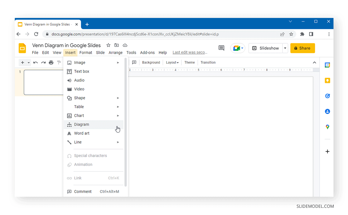
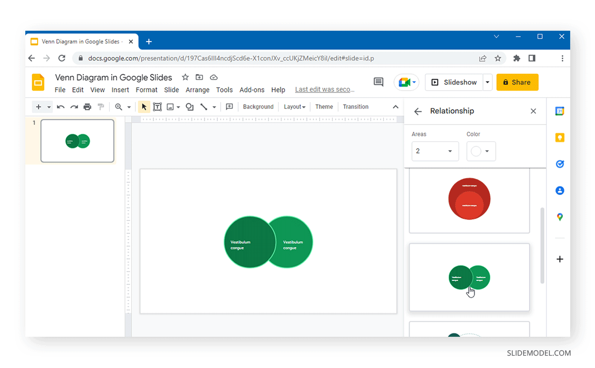
From the menu on the right, select Relationships and pick a layout most suitable for the Venn diagram you intend to create.
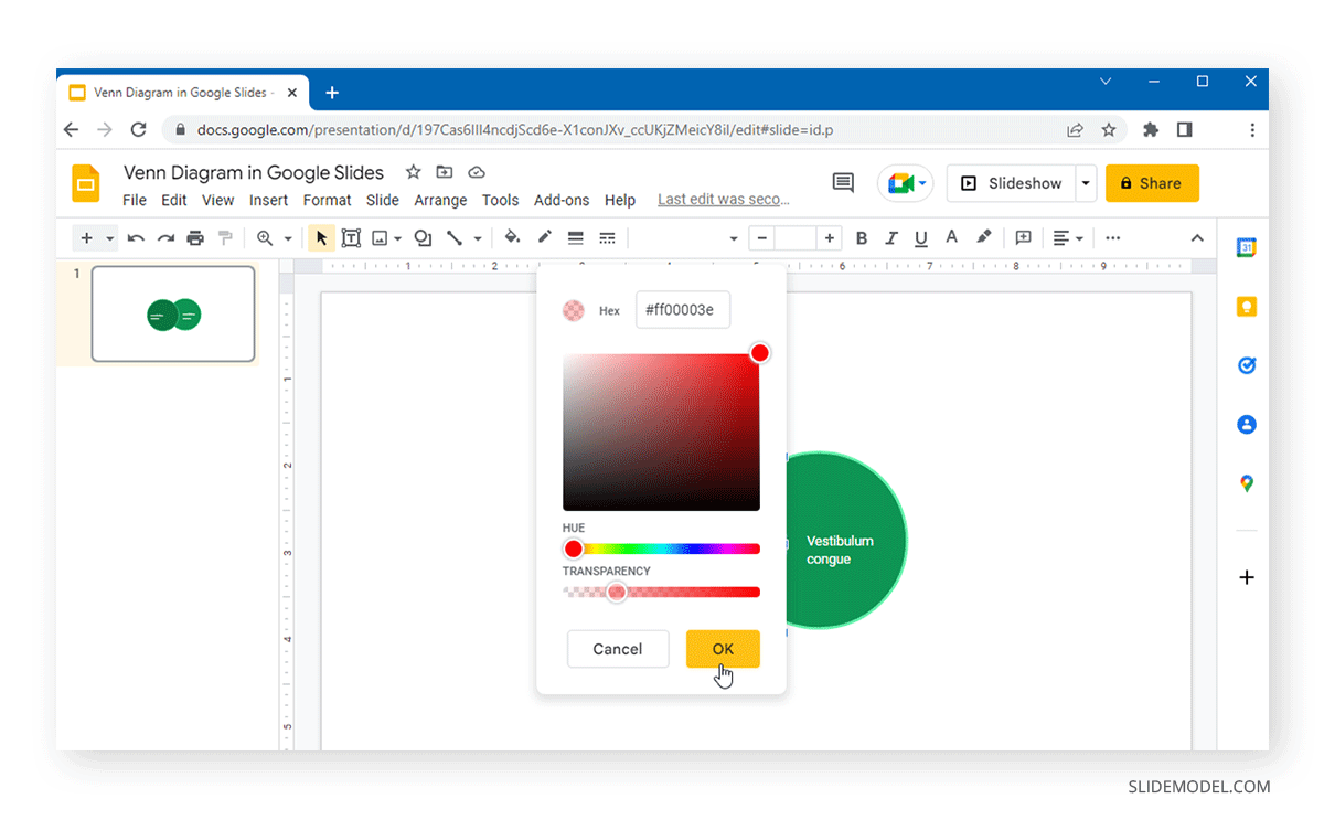
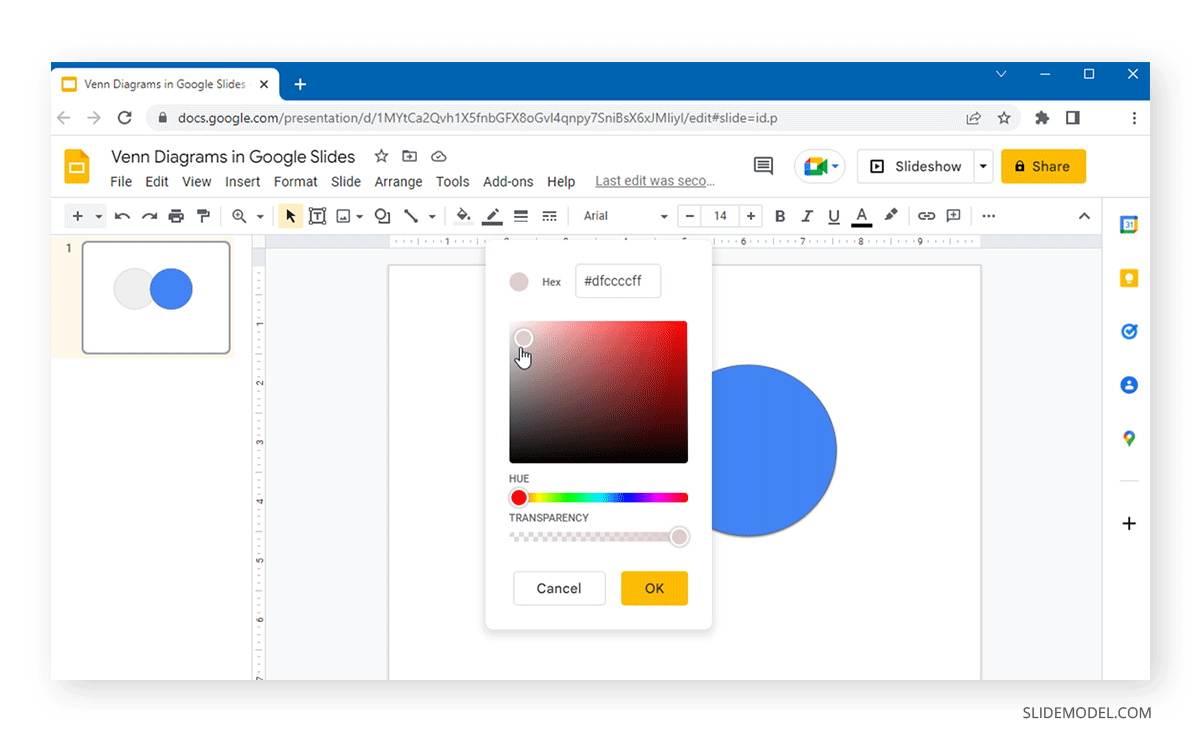
To ensure your Venn diagram can show relationships, adjust the transparency via Fill Color. This can be done either from the Transparent option at the bottom to make the shape completely transparent or via Custom to adjust the transparency and HEX.
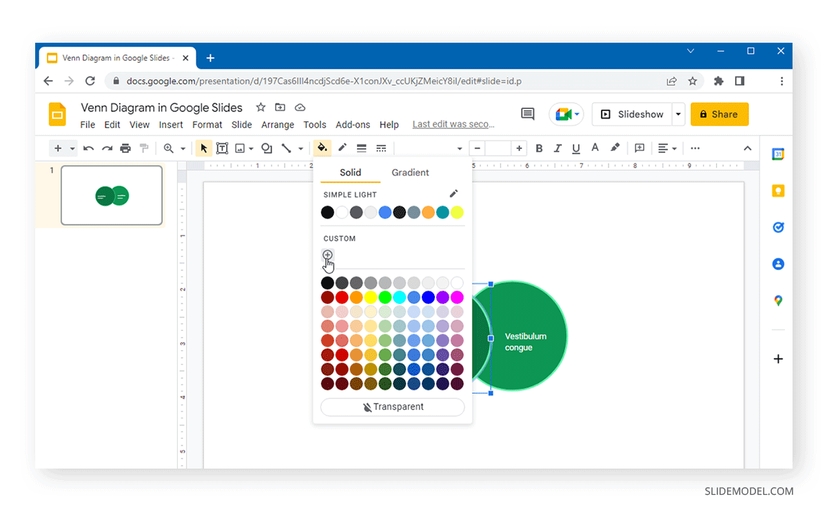
If you use the Custom option, move the slider at the bottom to adjust the transparency.
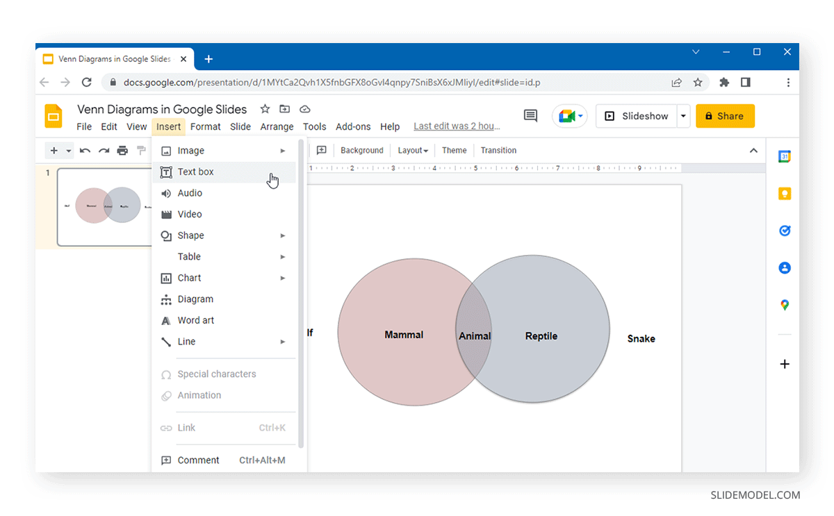
Some of the sample diagrams come with editable text labels. However, you can add additional text via the Insert > Text box and format it to customize the text according to need.
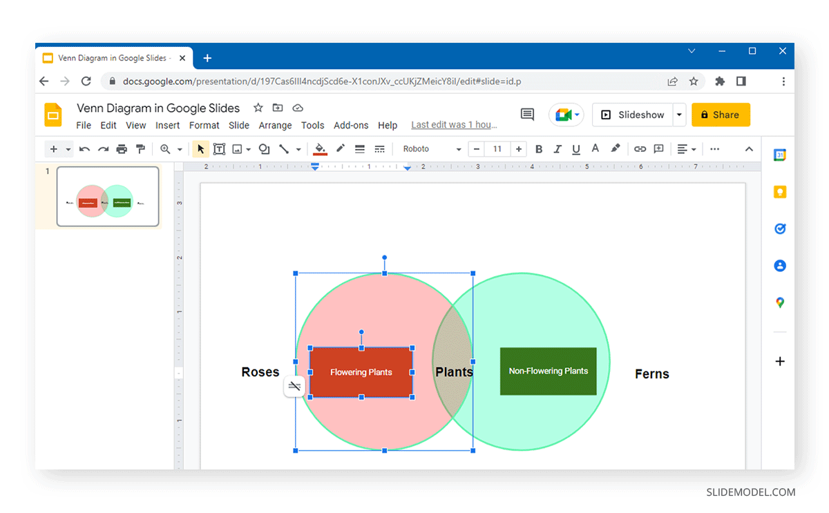
The example below shows a Venn diagram created using a standard diagram layout for a relationship diagram in Google Slides.
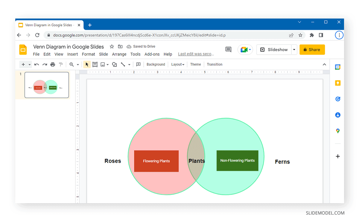
2. Create a Venn Diagram in Google Slides using Shapes
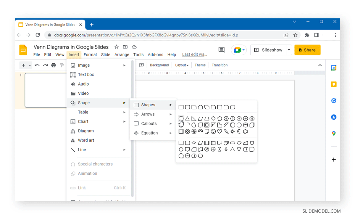
Shapes in Google Slides can help you create diagrams such as a Venn illustration. You can start creating your diagram by selecting a circular shape by going to Insert > Shape> Shapes.
As mentioned earlier, ensuring that the shapes you add are properly formatted is essential. You can format these shapes by selecting them and going to Fill Color to adjust the color and transparency of the shapes. Select Transparent from the bottom of the menu or Custom to customize the transparency and color HEX to create a transparent shape.
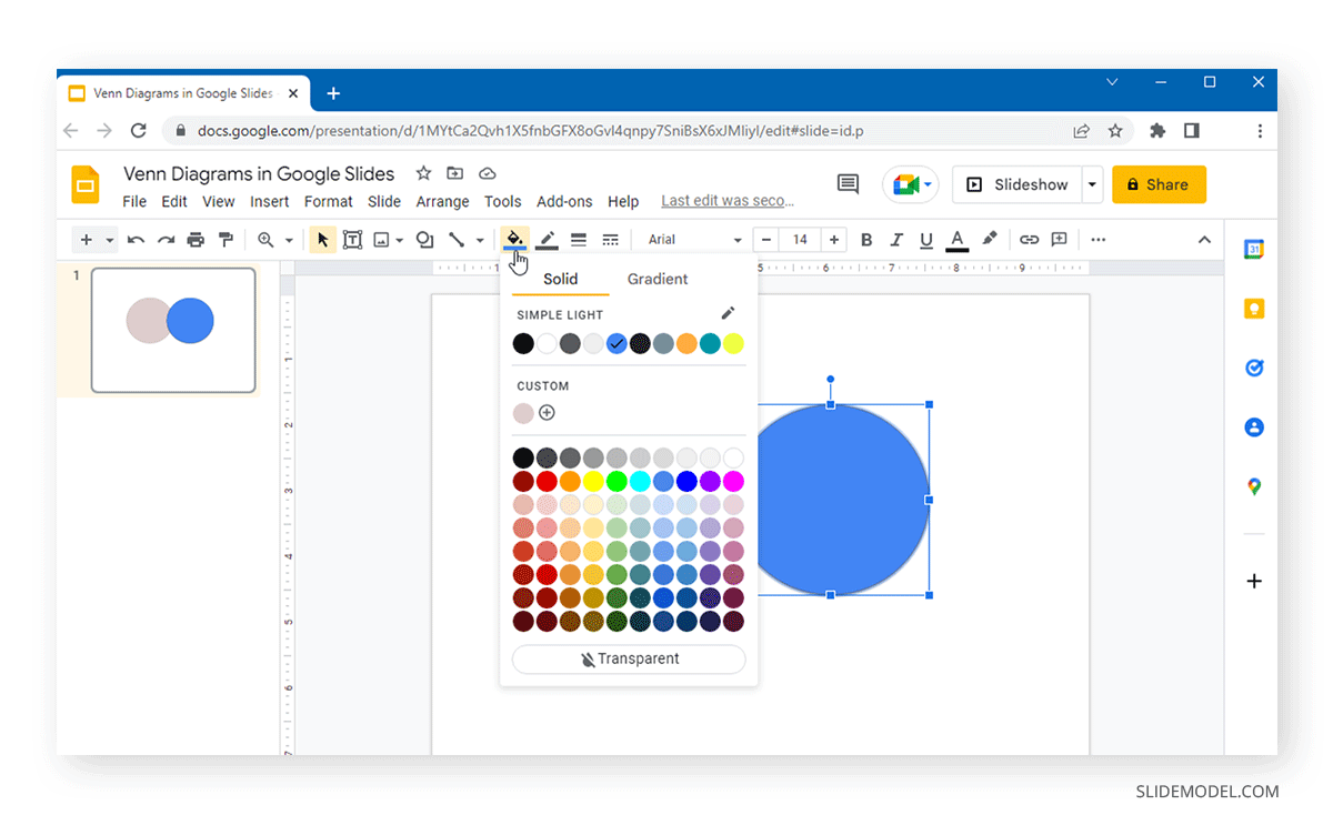
To customize transparency, move the slider at the bottom of the menu for your selected color.
Once you have a transparent shape and the connections are clearly visible in the diagram, you can start adding text via the Insert > Text box to add labels.
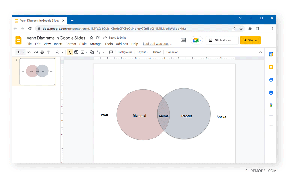
Below is an example of a simple Venn diagram created using Shapes in Google Slides.
3. SlideModel’s Venn Diagram Templates for Google Slides
Readymade templates for presenters are always helpful for saving time in creating basic or even complex illustrations. Venn diagram templates for Google Slides by SlideModel come with editable layouts that can be customized without spending several hours creating your graphics in Google Slides. Also, in our extensive gallery of presentations, you can access our Free Venn Diagram template.
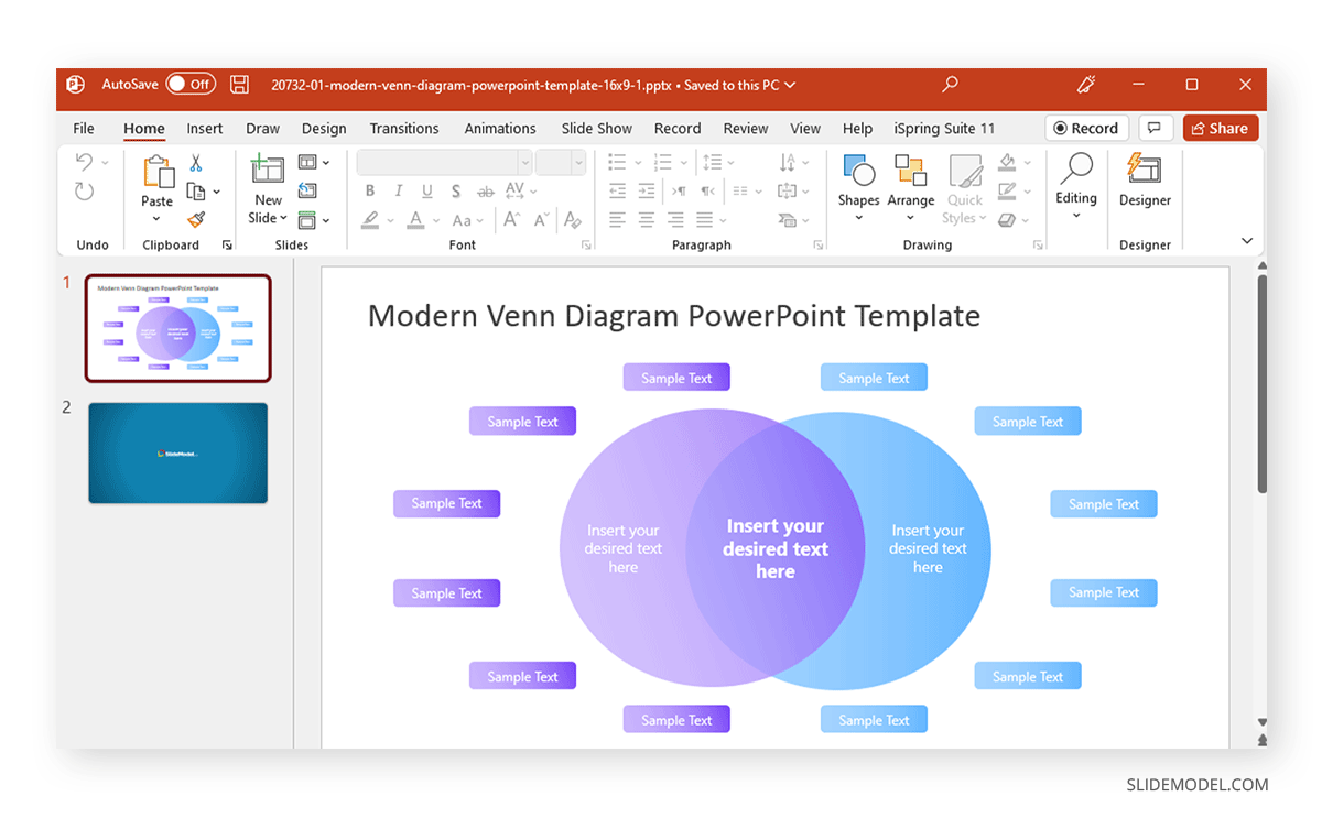
Venn diagrams can become increasingly complicated as new shapes are added to expand the scope of the diagram. This is why using readymade Google Slides templates can help make it easier for presenters to design and adjust their diagram slides quickly. However, presenters who enjoy a more hands-on experience in developing their slides can opt for ‘Diagrams’ or ‘Shapes’ to create Venn diagrams in Google Slides.
FAQ’s
Why use Venn Diagrams in Google Slides?
Venn Diagrams in Google Slides can effectively convey complex relationships and intersections between different sets, making them useful for business presentations, educational content, and analytical discussions.
How do I create a Venn Diagram using Google Slides’ built-in Diagrams feature?
To create a Venn Diagram using the Diagrams feature:
– Go to Insert > Diagram.
– Select the Relationships category from the menu on the right.
– Choose a layout that suits your needs.
– Adjust the transparency of the shapes using the Fill Color option to ensure overlaps are visible.
– Add and format text as necessary using the Insert > Text box.
How can I make a Venn Diagram using shapes in Google Slides?
To create a Venn Diagram using shapes:
– Go to Insert > Shape > Shapes and select a circular shape.
– Format the shape using the Fill Color option to adjust color and transparency.
– Copy and paste the shape to create overlapping circles.
– Adjust the position and size of the circles as needed.
– Add text labels using Insert > Text box.
How do I adjust the transparency of shapes in Google Slides?
To adjust the transparency:
– Select the shape.
– Go to Fill Color.
– Choose Transparent for full transparency or Custom to adjust the transparency slider and set a specific HEX color.
Can I customize the colors of my Venn Diagram in Google Slides?
Yes, you can customize the colors:
– Select the shape.
– Go to Fill Color.
– Choose from the preset colors or use the Custom option to enter a specific HEX color.
How do I add text to a Venn Diagram in Google Slides?
To add text:
– Go to Insert > Text box.
– Click on the slide where you want to add text.
– Type your text and format it as needed using the options in the toolbar.
What are some tips for designing an effective Venn Diagram in Google Slides?
Tips for designing an effective Venn Diagram:
– Plan Thoughtfully: Define the sets and relationships before starting.
– Keep It Simple: Avoid overcrowding with too much information.
– Use Colors Strategically: Differentiate sets with distinct colors and adjust transparency for overlaps.
– Clear Labels: Use descriptive and concise labels.
– Maintain Consistency: Ensure all shapes are consistent in size and style.
Can I use templates to create Venn Diagrams in Google Slides?
Yes, you can use templates:
– SlideModel offers Venn Diagram templates for Google Slides with customizable layouts.
– You can also find free templates in SlideModel’s extensive gallery, such as the Free Venn Diagram template.
How do I use SlideModel’s Venn Diagram templates in Google Slides?
To use SlideModel’s templates:
– Visit SlideModel and select a Venn Diagram template.
– Download the template and open it in Google Slides.
– Customize the template as needed by adjusting colors, text, and other elements.

