A commonly used term when working with presentations is “slide deck,” but what exactly do we mean by that? Should you be familiar with some core terms before making your first presentation?
As we believe continuous education is key for presenters, regardless of their presentation skill level, today, we will talk about presentation deck meaning, how to build a presentation deck, and which elements define success in this process. Additionally, for a broader understanding and skill enhancement in making effective presentations, our section on how to make a presentation offers valuable insights and practical tips. Without further ado, let’s get started!
Table of Contents
- What is a Slide?
- What is a Slide Deck?
- What Should be Included in a PowerPoint Slide Deck?
- How to Create a Slide Deck in PowerPoint
- FAQs
- Recommended Slide Decks for Any Kind of Presentation
What is a Slide?
A PowerPoint slide can be defined as a digital canvas in which we organize information and ideas in a visual format, primarily oriented for professional settings like business presentations, conferences, or academic presentations. People instantly associate slides with PowerPoint due to Microsoft PowerPoint being the industry-leading software in presentation software, offering full compatibility format with free software options like Google Slides.
The starting point of any slide is a blank canvas to which you can add a title, and you’ve got plenty of space to insert images, draw shapes, add videos to your presentations, and more. PowerPoint has a standard layout for its blank slides, as shown below. This layout can be modified by accessing Slide Master in PowerPoint.
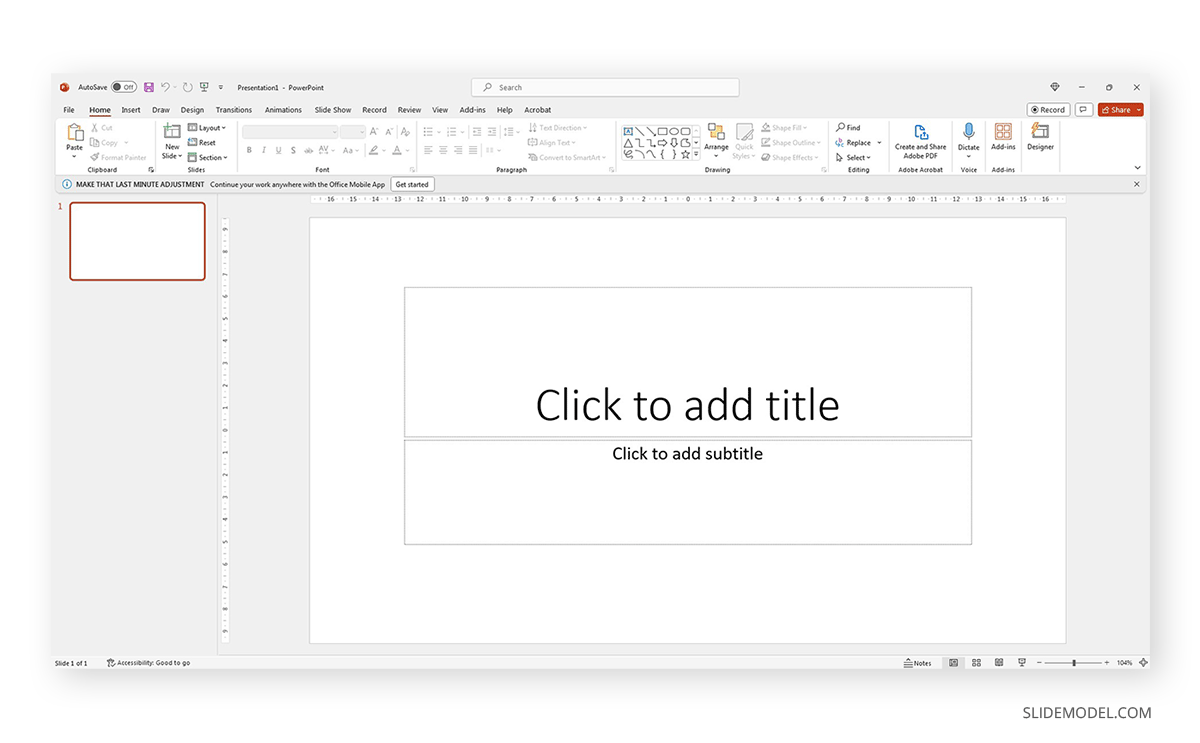
Each slide is a single page of a presentation and can be edited to meet the requirements of any presenter without meaning you alter the following slides. Remember, presentation software tends to work with destructive workflow methodologies – meaning the changes you make cannot be reverted if you save the file and try to access it later. If you want to test multiple design options on a single slide, we highly recommend you create individual slides for each design or even save them as different file names so you can revert to a previous stage without inconvenience.
What is a Slide Deck?
A slide deck or PPT deck is a collection of slides curated for a sole purpose: serving as visual aids for a presentation topic. These slides can contain multiple tools like charts and graphs, placeholder text areas, icons, dashboard display, illustrations (in the format of vector images), and way more depending on three key elements:
- Build quality: How much effort the creator put into crafting the slides.
- Software: Although compatible, PowerPoint decks may offer some effects that aren’t available in Google Slides. For that reason, creators often flag animated slides or slide decks containing complex shadow effects as only PowerPoint-compatible.
- Topic: A presentation deck intended to present a marketing plan won’t contain the same elements as one intended to deliver a motivational talk.
Before deciding how to start a presentation, select a slide deck compatible with the topic your presentation is geared toward.
What Should be Included in a PowerPoint Slide Deck?
We like to work with the method of using one topic per slide. This means not overpopulating your slides with content for the sake of showing content. Such practices affect readability and the overall understanding of your presentation.
Instead, we will teach you how to curate content in your slide decks by taking pitch deck templates as an example.
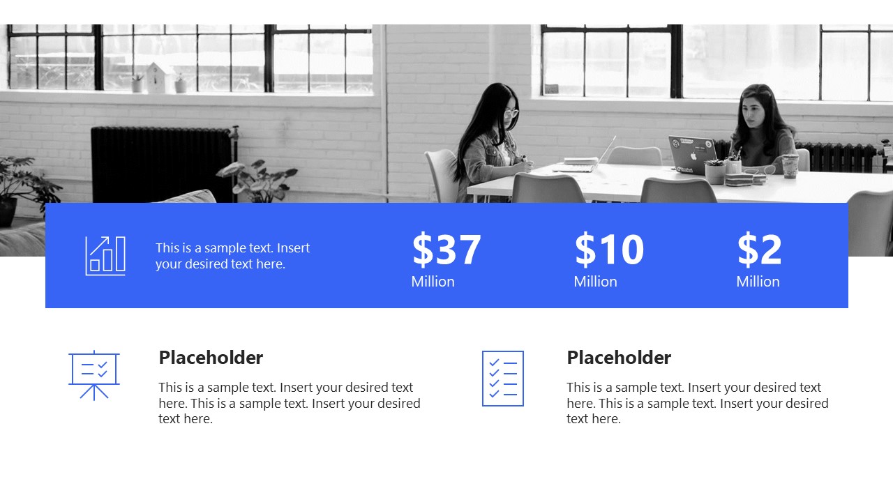
Say we select the Executive Pitch Deck PowerPoint Template. This pitch deck is intended to introduce potential investors to what the business is about.
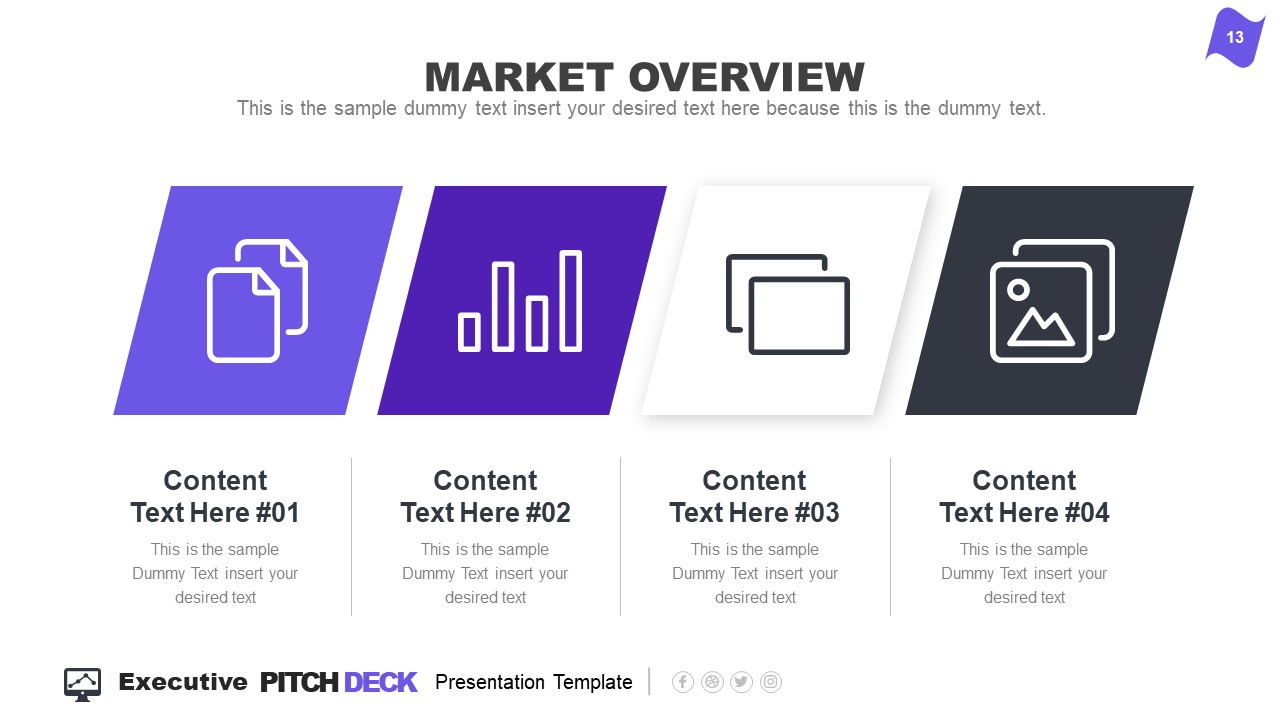
Rather than filling all the data in just 2-3 slides, take it easy and work with the layout this template offers:
- Title Slide: Every single presentation should list a title slide, with quality graphics and the presentation title being clear enough. Additional information can include the presenter’s name, the company’s name, logo, etc.
- About Us Slide: In business environments, companies should always introduce themselves, highlighting key information like the industry they move in, significant milestones, etc. Remember, this is an introduction to the company as an entity, the company profile presentation, not a description or introduction of team members.
- Best Services: Depending on your niche, take this as an opportunity to promote your core activities as a company.
- What We Do: This is complementary to “Best Services.” It is the section where you specify which areas your company covers and why your services stand out against competitors.
- Mission and Vision: Required for any pitch deck presentation.
- Meet the Team: This slide can either be an org chart or be presented through photos for the managers per department (the interaction points between stakeholders and management).
- Our Advantages: Ideal to complement slides 3 and 4, this expresses the competitive advantage of the company and marketing plan, and you should present your flagship product or service.
- Market Opportunity: What led your company to approach its niche, attending to customers’ pain points.
- Timeline: This slide serves to introduce significant milestones, projects, planned strategies, deadlines, etc.
- Market Size: When we have to answer the total addressable market (TAM), we can use a slide representing TAM, SAM, and SOM.
- Competitors: Two slides in this presentation deck talk about a company’s competitors and different approaches to representing that data with visual impact.
- Data Chart: If you intend to discuss a KPI in particular, this chart slide can work to expand the talk over that point.
- Product and Demo: This works either for e-commerce or physical products. Presenters can alter the slide to discuss services rather than products or just keep the “Best Services” slide.
- Pricing Slide: When discussing a business pitch, you must present your current pricing range to potential investors. In this case, the slide resembles the pricing tier format you can find on many websites.
- Thank You Slide: Knowing how to end a presentation with class is critical to securing a business deal. You can include a photo that resembles closing a business deal, a video that further expands your company’s history, products/services, and culture, or leave it with a minimalistic “thank you.”
With just 15 slides, you can create a powerful slide deck communicating your message to your target audience. Keeping a clean layout and following the 1 topic per slide rule ensures your presentation delivers a clean speech.
How to Create a Slide Deck in PowerPoint
Now, we’ll move on to how to make a presentation deck from scratch. We recommend working with PowerPoint templates, as design decisions are already taken for you (font pairing, color schemes, placeholder areas, balance between text and graphs).
Select a Slide Deck
By browsing professional PPT template creators’ websites like SlideModel, you can find a vast selection of products tailored to your needs. It is as easy as to browse for the topic you want via the search bar, locate a product you desire, and download it to your account. You can also explore the available products per category through menu elements.
Insert your Content
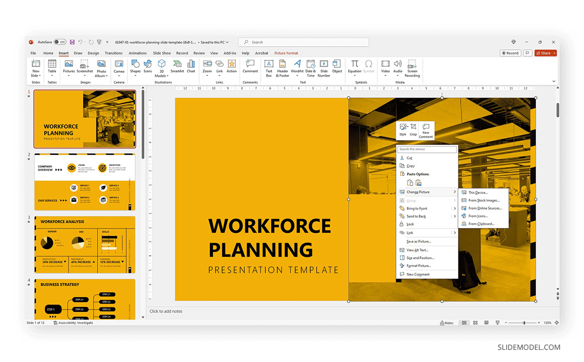
Every single presentation deck available at SlideModel.com is entirely customizable. We can add illustrations by going to Insert > Picture and selecting the origin from which you want to upload your image into the presentation.
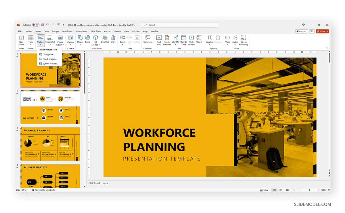
Also, users can customize the template and replace the image in the placeholder area by right-clicking over it and selecting Change Picture.
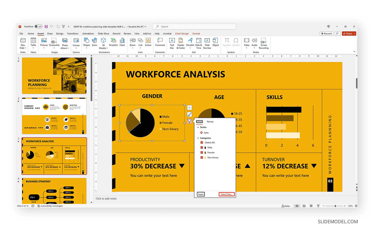
Text content can be edited in the text placeholder areas by clicking over it. Charts and graphs may require some extra steps depending on how they were crafted. To replace the placeholder data, simply select the chart or graph element and click on the Filter option next to it. Seek the Select Data option at the end of the contextual menu.
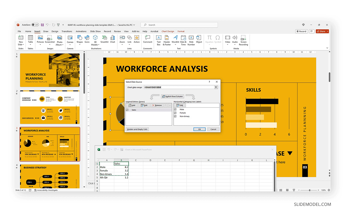
Modify the data used as a sample in the chart with the information pertinent to your company or project. An MS Excel spreadsheet will open up to allow that procedure.
Other Customization Options for Slide Decks
Finally, we recommend you check the following articles to learn more about aspects to edit in slide decks:
- How to change fonts in Slide Decks.
- How to change the theme in Slide Decks.
- Which fonts will make your Slide Deck stand out.
- How to insert 3D models in Slide Decks.
- How to change slide layout in a Slide Deck.
- How to rotate a slide in PowerPoint.
If you need a quick method to create a slide deck presentation, check out our AI presentation maker. A tool in which you add the topic, curate the outline, select a design, and let AI do the work for you.
FAQs
What are the key elements of an effective slide deck?
A clear and cohesive theme, concise and impactful text, and high-quality graphics are all you need to create a powerful slide deck, as long as it follows a logical flow that guides the audience through the presentation.
Can I create a slide deck if I don’t have Microsoft PowerPoint?
Yes, our expertise in this field tells us there are no visible differences between working with PowerPoint and Google Slides or Apple Keynote to create a quality presentation, except for some curved text effects and complex animations. When considering a Slide Deck vs PowerPoint, it’s important to note that all these tools can effectively deliver professional presentations.
What are some tips for choosing a theme or template for my slide deck?
– Select a theme or template that aligns with the presentation’s topic or audience.
– Consider the context and setting of the presentation.
– Opt for a clean and professional design that backs up your speech rather than add distracting elements.
How can I add and format text on my slides?
When working with presentation software, you can format text as you would work with any text editor. Remember to stick to concise and clear language, with no technical jargon. Huge “text walls” deter the audience from your talk, as there’s a natural impulse to read the content. Opt for legible fonts rather than complex script typefaces.
How can I ensure my slides are consistent regarding fonts, colors, and styles?
Using a consistent color scheme is the first step, which can be analogous (easier to work), complementary, or bolder options as long as you stick to recommended color pairings. Avoid harsh contrasts, as they make your slides less legible. Use a maximum of 3 different fonts in your slide, best if 2 only.


