The candlestick was introduced in Japan during 17th century and it was widely used for technical analysis to trade rice. The US version was initiated by Charles Dow around 1900, although many of the guiding principles were very similar.
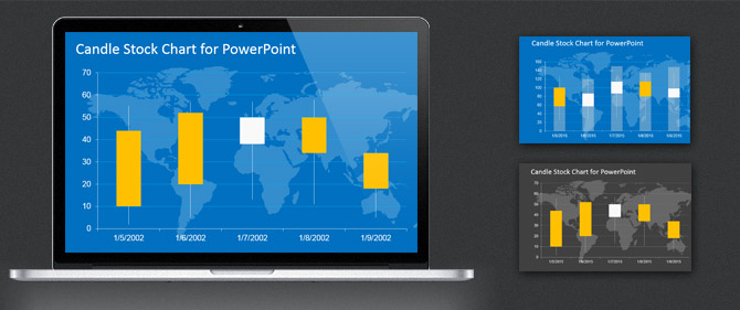
Candlestick is a chart that displays the high, low, opening and closing prices for a security. This kind of chart can tell investors whether the closing price was higher or lower than the opening price. The open and close indicators in the candlestick let the investor understand what was the day’s high and lows and how they compare to the open and close.
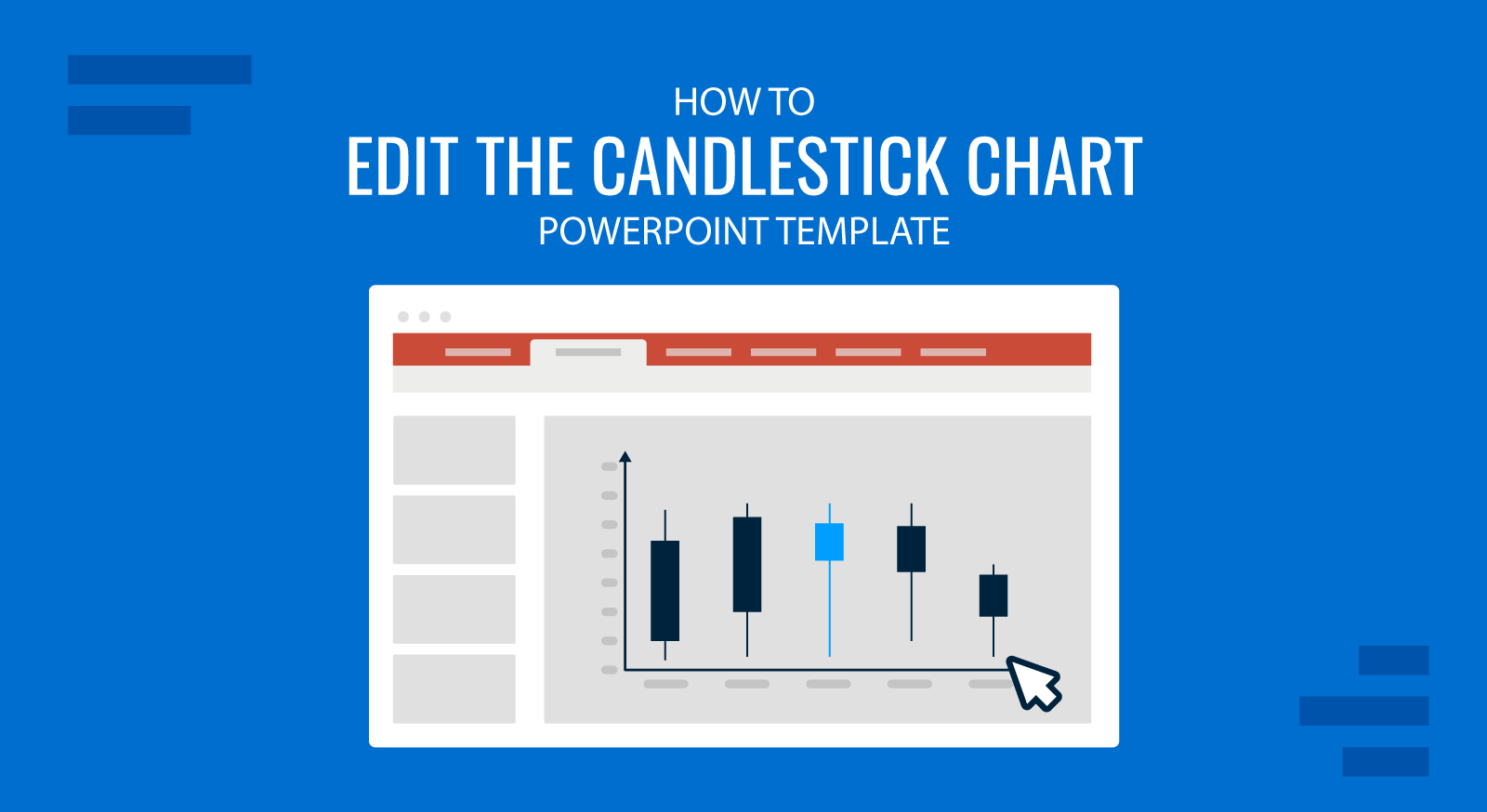
This article will explain how to edit the candlestick chart template for PowerPoint using your own data in order you can customize your presentations and make awesome financial charts.
Edit a Candlestick Chart in PowerPoint
In order to edit the chart in PowerPoint place the mouse cursor over the chart and then right click to open the contextual menu.
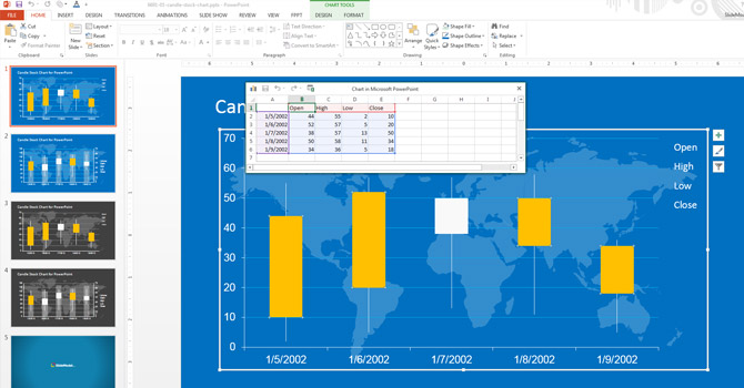
Click Edit Data -> Edit Data to open a lightweight spreadsheet over the PowerPoint editor. This spreadsheet editor is powered by Excel and comes very handy to edit the chart values without opening Excel program. However, as an alternative you can specify to edit the data in Microsoft Excel 2013.
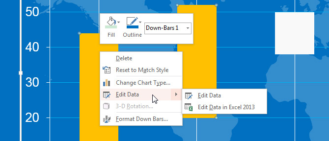
Now you can see the data table showing the chart series. For the candlestick chart used in financial PowerPoint presentations you can see different columns including Open value, High, Low and Close value. You can also specify the date in the first column. This kind of charts can be used to represent the stock market value for historical data.
Finally, close the spreadsheet view and then you can continue editing the presentation.