Sorting information in groups is a practice that has been used to find solutions, group information, and sort data since time immemorial. However, a few decades back, the concept was given a name that has stuck with project managers and the method defined for this very purpose. Commonly known as affinity diagrams, these handy charts can be used for grouping information for a wide array of applications.
What is an Affinity Diagram?
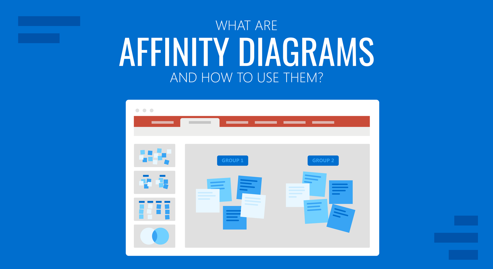
An affinity diagram is used to organize ideas, and opinions, sort through data, and other types of information. This analytical business tool organizes information based on its relationship. An affinity diagram is also known by names such as the K-J method, thematic analysis, affinity chart, and affinity mapping. While sorting information in groups is nothing new, the term affinity diagram was coined by Jiro Kawakita during the 1960s, which is why these diagrams are also known as the K-J method.
Uses of Affinity Diagrams
Affinity diagrams have a variety of uses, including implications for project management and six sigma for improving business processes. A few of the common uses of affinity diagrams are listed below.
Data Analysis
Affinity diagrams are commonly used for analyzing data. The DMAIC and DMADV methodologies in six sigma can incorporate affinity diagrams to define the system or design goals, analyze data or perform analysis to develop and design alternatives, etc.
Improving a Process
One of the steps of the DMAIC methodology in six sigma involves improving and optimizing current processes based on analysis of data. You can incorporate affinity diagrams during the process to help improve them by identifying sets of issues that can be resolved, and wasteful occurrences that can be improved.
Problem Solving
Affinity diagrams can be used to resolve problems by grouping together sets of information to understand the root cause of a problem.
Finding Solutions
If you need a tool to find creative solutions to a problem, affinity diagrams can be a good option. By grouping together sets of information, you can not only perform a cause-and-effect analysis but also find ways to resolve the issue.
Brainstorming
Affinity diagrams are also commonly used during brainstorming sessions and can be a great help in organizing scattered information into logical groups. You can incorporate affinity diagrams into your brainstorming processes.
Engaging Participants
If you are looking to organize participants during a PowerPoint presentation, you might find affinity diagrams useful to conduct an interactive session where you are also able to derive an output based on the discussion during the session.
To Resolve Conflicts
A creative way to resolve conflicts can be to use affinity diagrams to group together information to help resolve conflicts. This can be done by identifying information in groups leading to a conflict and finding ways to resolve it.
How to Create an Affinity Diagram
You can create an affinity diagram by following the three simple steps listed below. This includes recording ideas, looking for relationships, and sorting it into groups.
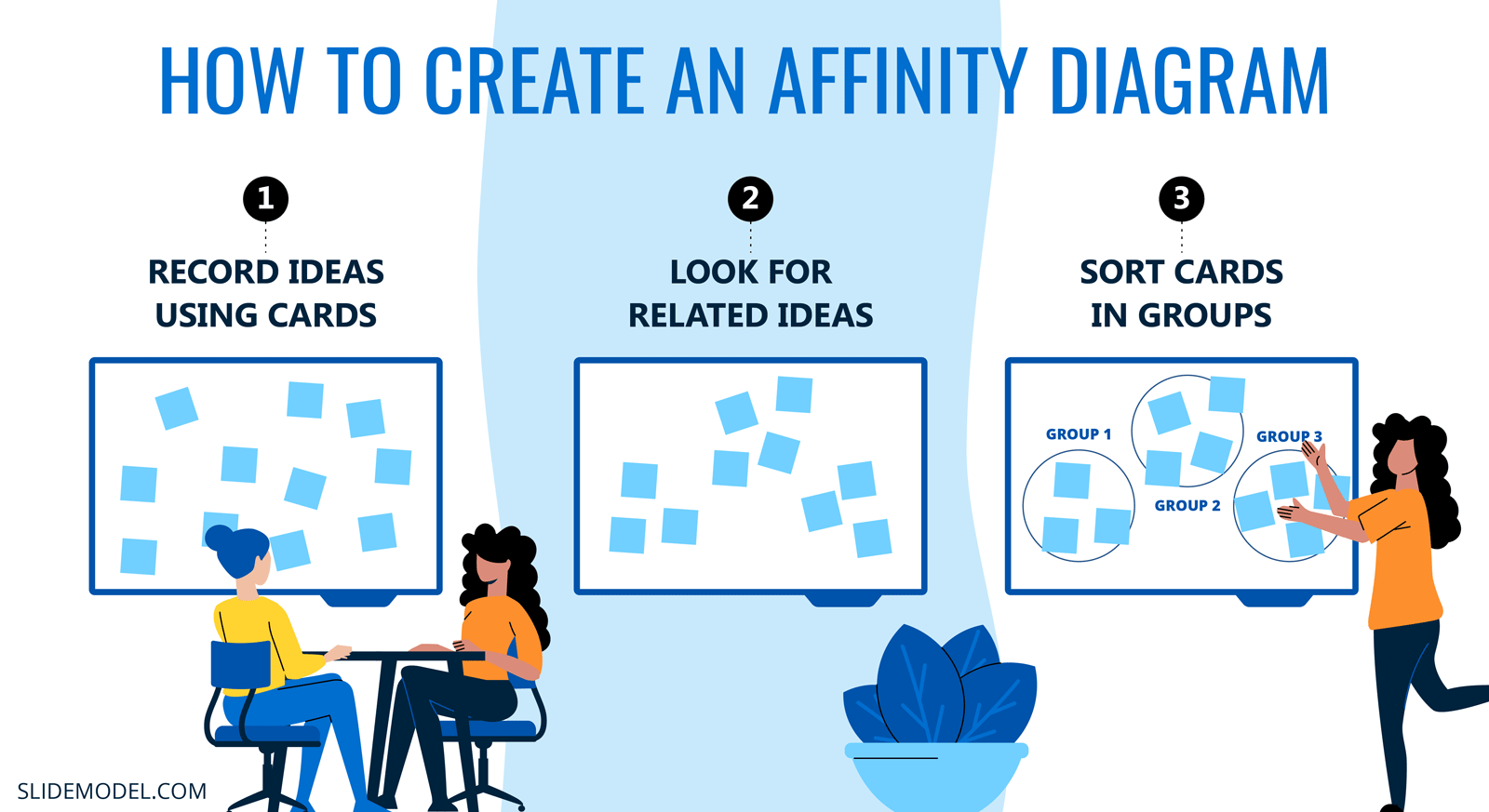
1. Record Ideas Using Cards
Affinity diagrams or the K-J method requires recording ideas in the form of cards. For example, you can ask participants during a brainstorming session to write information on sticky notes and place them on a board. This information can then be used for making affinity diagrams.
2. Look for Related Ideas
The second step in making affinity diagrams is to look for related ideas. Sticking with our example of a brainstorming session where participants used sticky notes for recording ideas, these ideas can be analyzed based on related groups to move the process forward.
3. Sort Cards in Groups
The last part includes sorting information in groups. The cards gathered during your brainstorming session with ideas can be sorted based on related ideas to group them together on the board to create your affinity chart. This is obviously one example of why such a chart might be created. As mentioned earlier, you can also use such charts for a variety of purposes and during different other circumstances for grouping information.
Affinity Diagram Examples
There are different ways by which you can create affinity diagrams. Be it in the form of a board with sticky notes, a PowerPoint slide using shapes, or even a readymade affinity diagram template in PowerPoint to design your own chart using PowerPoint shapes. If you need to further refine your data, you can also add subgroups to the two examples listed below.
How to Create an Affinity Diagram in PowerPoint
Method 1: Creating an Affinity Diagram Using PowerPoint Shapes
One of the easiest methods for creating an affinity diagram is to use PowerPoint shapes and create tables to group together information.
Step 1: Add a shape for recording ideas: You can get started by going to Shapes via the Insert tab in PowerPoint to record ideas. You can use a shape like a rectangle to create a large shape to place cards in them. The cards can be created using smaller shapes with text.
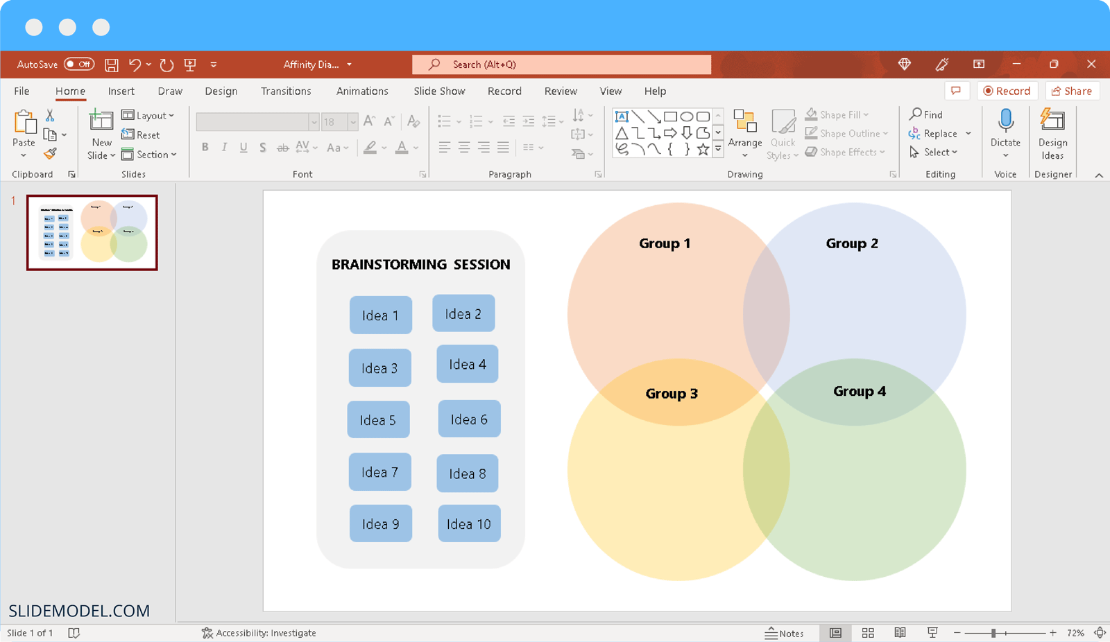
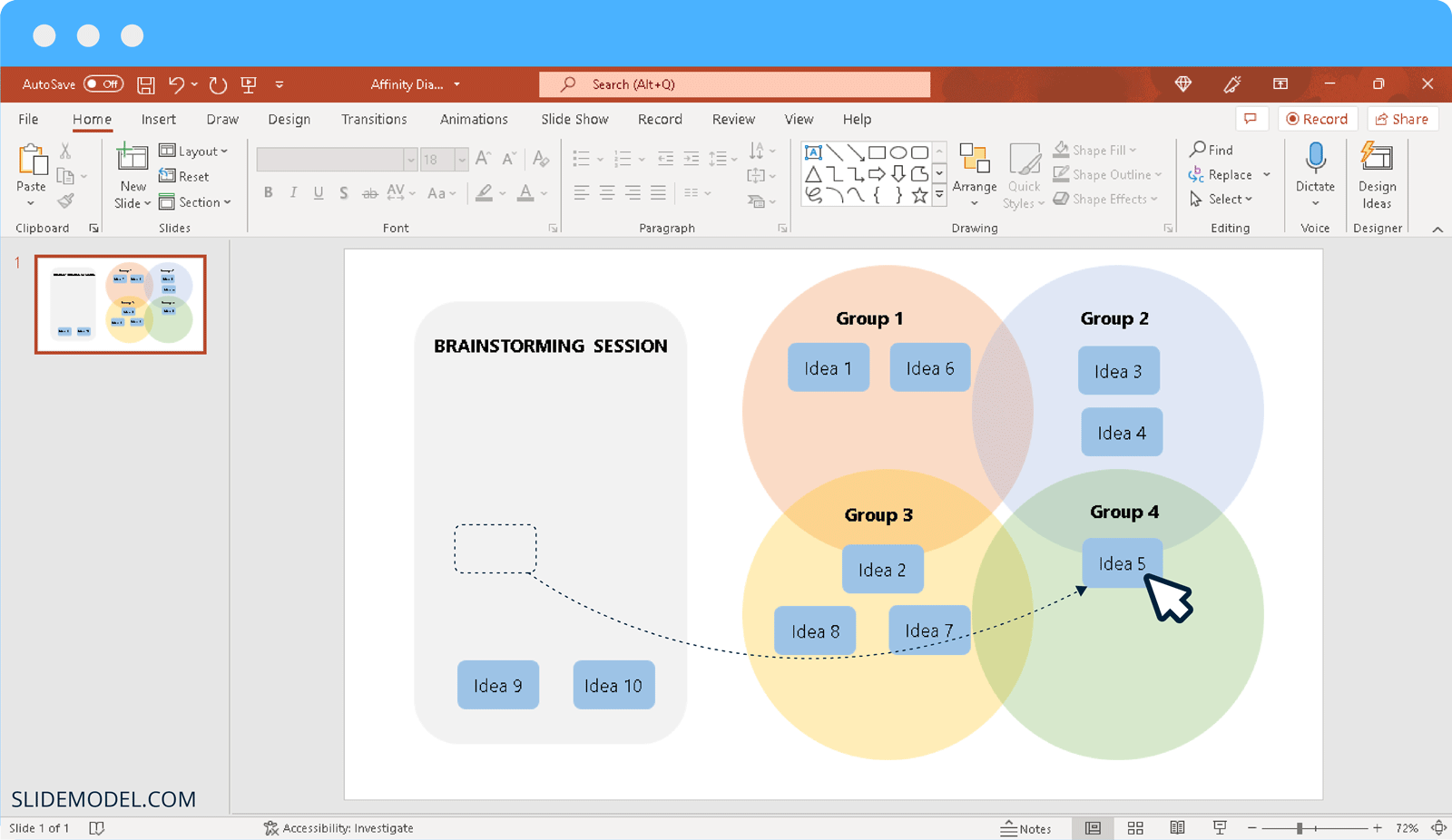
Step 2: Create Groups to sort Ideas: You can create as many groups as you need to for sorting ideas into them. To show a relationship between two or more groups, you can use circles that overlap over each other for grouping information.
Step 3: Sort Ideas in Groups: As shown in the image below, you can sort ideas into logical groups, and even show the relationship of ideas between different groups by placing them in between two overlapping groups. To make sure overlapping ideas are clearly visible, you can make your groups transparent via Format Shape by right-clicking on the group shapes and adjusting the transparency via the Transparency slider.
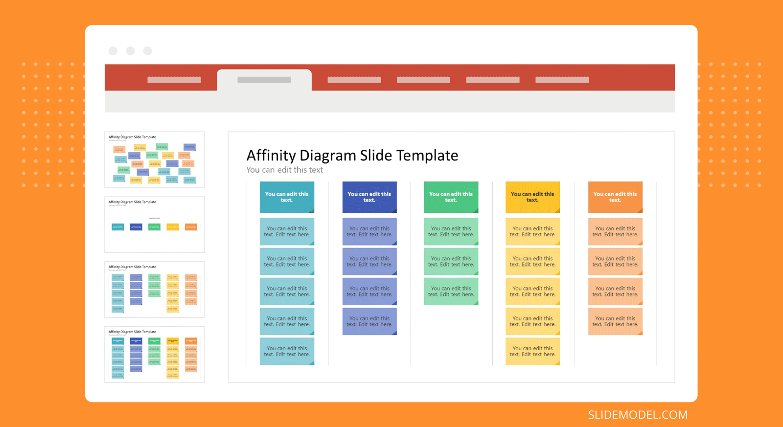
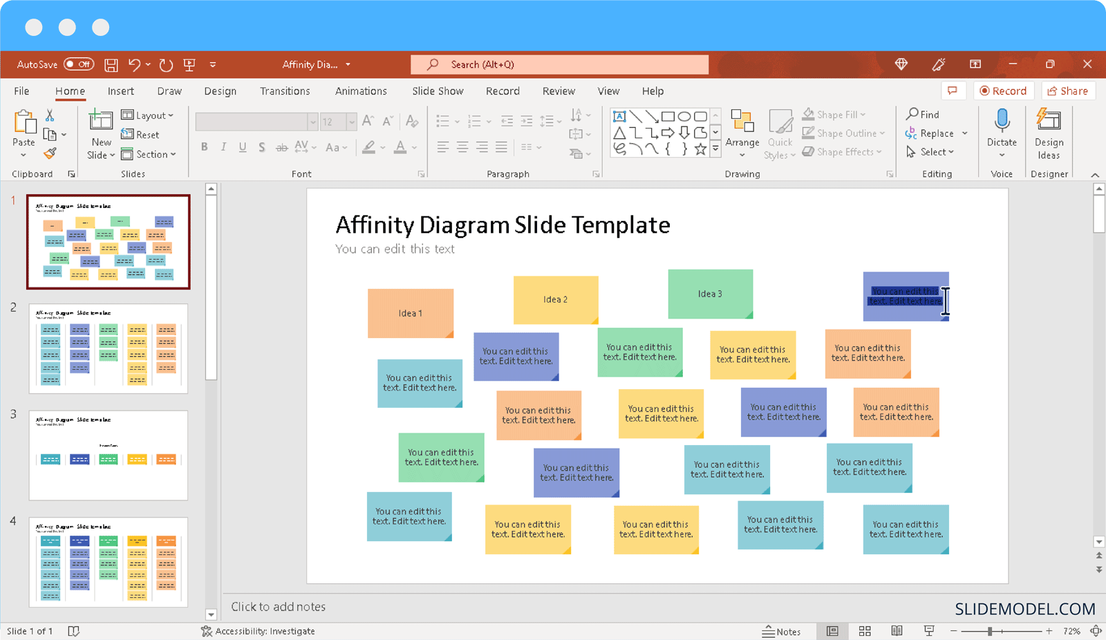
Method 2: Creating an Affinity Diagram Using a PowerPoint Template
You can make your job easy by using an Affinity Diagram PowerPoint Template like the one shown below or even a Concept Map Template.
Step 1: Write ideas on cards: Using the Affinity Diagram PowerPoint Template, we can start by placing ideas on cards. This template provides a variety of colorful cards to sort ideas by groups by color-coding them. You can also change the colors of cards in PowerPoint via Shape Format.
Step 2: Identify relationships: You can start identifying relationships for gathered ideas to sort them into logical groups.
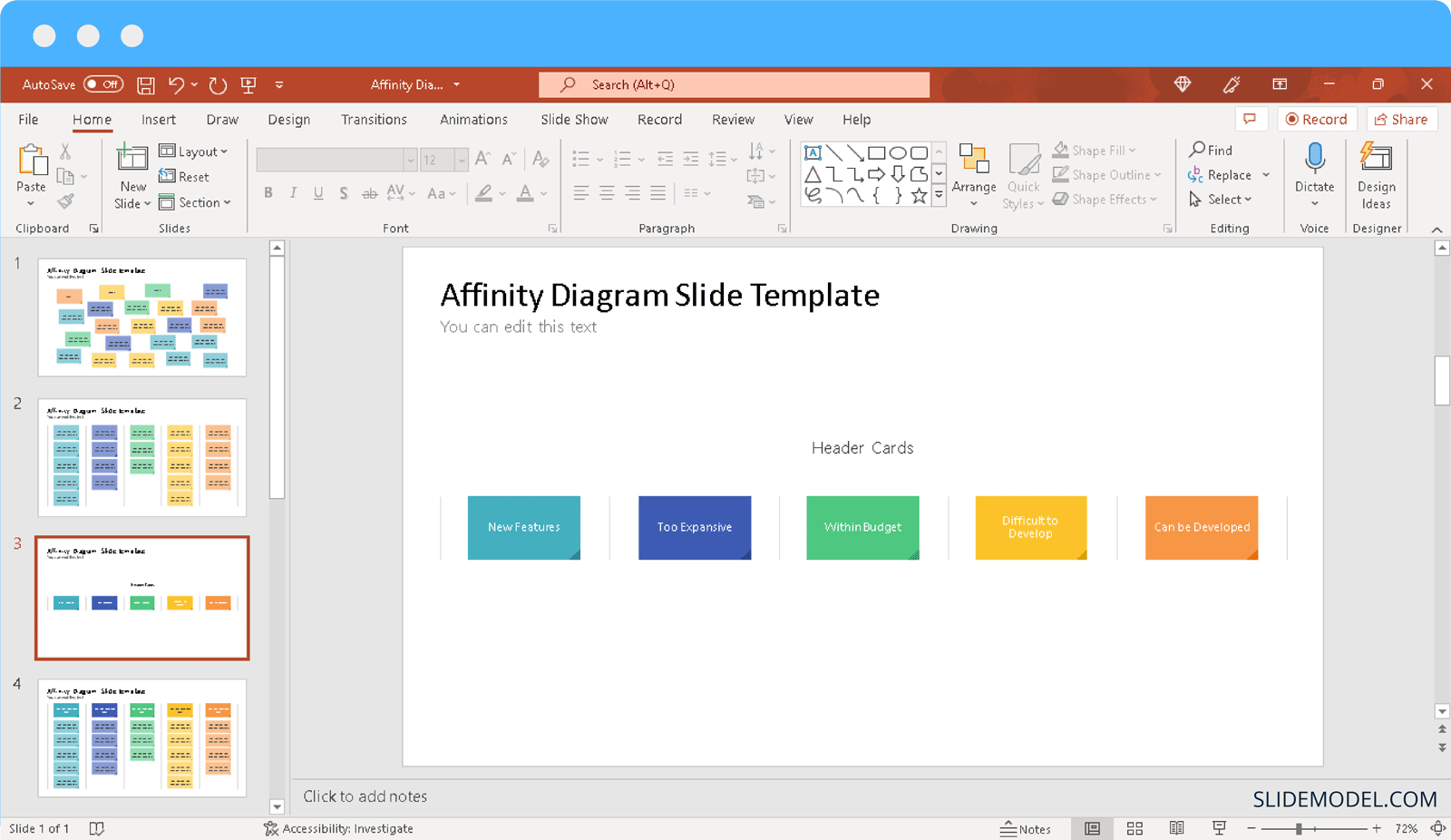
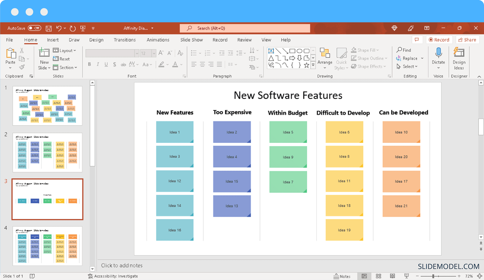
Step 3: Sort cards into groups: The Affinity Diagrams powerPoint Template provides a set of groups with color-coded cards to help you easily sort ideas. You can sort ideas based on different groups and place them in the given affinity chart during a PowerPoint presentation, such as when conducting a brainstorming session.
Final Words
Affinity diagrams make it possible to group data, especially when sorting large chunks of information in groups. Furthermore, affinity charts can be a handy way to conduct result-driven brainstorming sessions, where data is grouped to formulate a plan of action. There are, of course many other applications of such charts, such as finding solutions to problems, improving processes, engaging an audience, etc. For example, some might use a Trello template to prepare affinity diagrams.
There are many different ways you can represent affinity charts, such as in the form of overlapping groups, as shown in our first example, or in the form of a table with parallel groups. You should ensure that your affinity diagram groups have clear and easy-to-understand names. Using color coding can be another useful method to sort information and make it easier to understand at a glance.
Like any other tool, affinity diagrams require careful consideration when using them. One must avoid jumping to conclusions to be hasty in sorting information into groups. As incorrectly sorted data can defeat the purpose of using an affinity chart. Similarly, sorting information under vague groups might make it harder to identify differences and use the sorted data. If your data is a bit complex to sort, you can also use subgroups to refine your information further.