Visually showcase the business performance levels, progress, or status indicators with our Thermostat Infographic PowerPoint Template in your strategy presentations. HR managers can showcase the overall employee engagement score in their review presentations to stakeholders before finalizing next steps. Marketing analysts and strategy officers can use a color-coded thermostat diagram to visualize customer satisfaction rates. This enables them to enhance customer service and improve the score. Also, our PPT template is useful for presentations about smart home technology or energy management. Mechanical engineers or HVAC specialists can discuss office temperature conditions in client meetings to determine whether the air conditioning’s performance is acceptable.
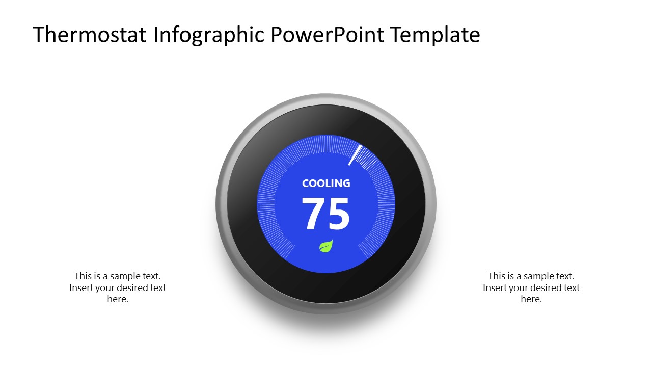
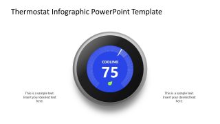
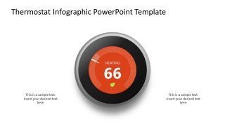
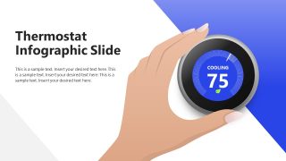
The Thermostat Infographic PowerPoint Template comprises three slides that energy experts can use to detail different thermostat states (cold and hot). The first slide features a circular dial diagram with a black outline, shadow effect, and a color-coded background: blue for cooling and orange for heating. A circular progress ring around the central value displays the intensity level of a specific metric. This slide shows a temperature of 75 degrees, indicated by a blue dial. The second slide shows a placeholder value of 66 for the heating state (in red). Users can add custom text to placeholders to detail energy management or other metrics. The last slide has a large title and an illustration of a human hand moving the thermostat button. Experts may use a small leaf icon, typically representing energy-saving settings.
We have enabled users to change PPT components based on the specific data and points they need to explain in their presentations. Download our thermostat infographic PPT template to present the progress towards a specific business target with visual clarity.
What’s inside this template
Example presentation scenarios
- An HVAC specialist can use the heating thermostat dial to explain whether an office temperature reading is within the acceptable range during a client meeting.
- A facility manager can use the cooling thermostat dial to summarize building comfort or energy performance before recommending operational adjustments.
- An HR manager can adapt the thermostat value to present an employee engagement score and use the side placeholders to note causes and next steps.
- A marketing analyst can use the hand-adjusted thermostat slide to introduce a customer satisfaction metric and frame the desired movement from current state to target state.
Features
- 100% editable presentation template
- Compatible with Microsoft PowerPoint
- 16:9 aspect ratio slides
- Scalable vector shapes, icons and illustrations
- AI-Ready for Microsoft Copilot and Claude
- Instant access and download
Frequently asked questions
Q: How should a presenter frame the thermostat value so the audience understands the message?
A: Treat the large number as the single takeaway and explain what it represents before discussing details. Use the cooling or heating dial to signal the direction of the condition, then place brief context in the side text placeholders. Keep the wording tied to the decision the audience must make, such as approve action, monitor risk, or accept current performance.
Q: Who is this template best suited for in a business presentation?
A: This template fits presenters who need to communicate one measured state at a time, such as energy consultants, HVAC specialists, HR managers, or customer experience analysts. The thermostat dial is strongest when the audience needs a quick read on whether a condition feels cold, warm, safe, risky, improving, or outside target.
Q: Why does the thermostat metaphor help communicate status and performance?
A: A thermostat is a familiar control metaphor, so viewers can interpret level, direction, and adjustment without learning a new chart. The blue cooling dial and red orange heating dial create immediate contrast between states. The hand-adjusted thermostat scene adds the idea that the presenter can recommend an action, not just report a number.


Thermostat Infographic PowerPoint Template
3-slide 16:9 presentation template with cooling and heating thermostat infographic diagrams for status metrics
Thermostat Infographic PowerPoint Template is a 3-slide 16:9 presentation template for showing temperature, progress, or status levels with circular thermostat visuals. It includes a cooling dial, a heating dial, and a hand-adjusted thermostat scene with title and text placeholders for analysts, facility teams, HR managers, and energy presenters in Microsoft PowerPoint.
- Category
- Diagrams
- Rating

 Loading...
- Aspect ratio
- 16:9
- Item ID
- 23620-01
- Colors
 Microsoft PowerPoint
  Microsoft Copilot
  Claude for PowerPoint
 Other formats supported
Subscribe today and get immediate
access to download our PowerPoint templates.