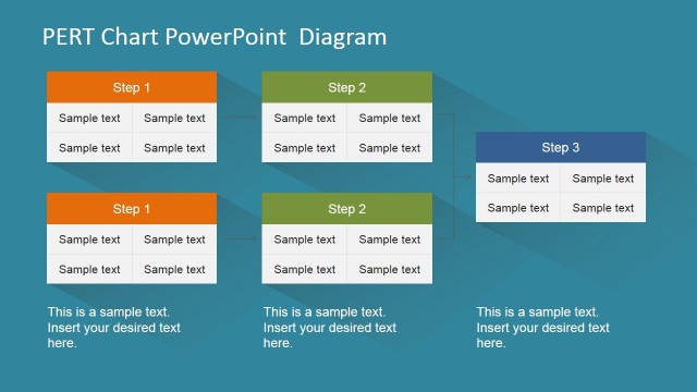
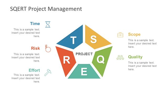
Simple PERT Diagram for PowerPoint
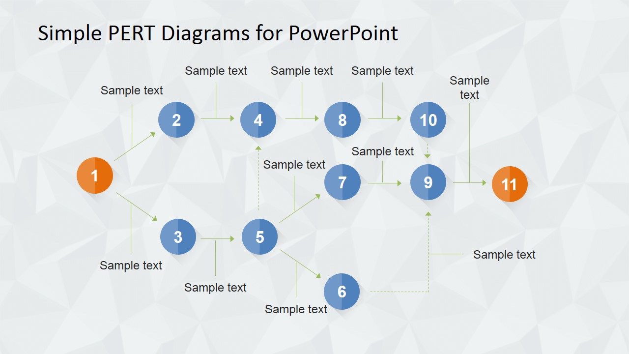
Simple PERT Diagrams for PowerPoint is a fully editable design template designed for professionals needing to deliver notable presentations. The template is intended for summarizing the project’s essential tasks and milestones while straightforwardly presenting all of them. The template allows users to instantly edit them with their project’s data while changing the design elements that fit their preferences.
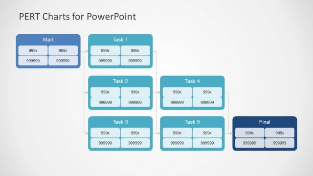
The PERT is a network model, a statistical tool that considers uncertainty in completion times due to various project activities. The program Evaluation and Review Technique, popular by its acronym PERT was created in the late 1950s for the Polaris Project, corresponding to the U.S. Navy fleet with thousands of contractors. A PERT diagram can lessen the time needed to finish a task and thus directly influence the cost of the project.
Fundamentally the PERT planning includes below mentioned steps –
- Identify the particular activities and their respective milestones.
- Determine the best possible succession of the activities.
- Designing the network diagram
- Estimate the time needed for every activity
- Determine the Critical Path.
- Update the PERT diagram as the project advances.
A symbolic quality of PERT (a project management tool) is its capacity to manage randomness in activity completion time. For every project activity, the PERT network model generally incorporates three types of time estimates. Discussed herewith –
- Optimistic Time – Usually the most brief time in which the specific project activity can be done. It is essential practice to point out optimistic times as three standard deviations from the mean so that there is approximately a risk of 1% that the project activity will be done within the measured auspicious time.
- Most likely time – The activity completion time with the highest probability. Point to note that this time is not quite the same as the average expected time.
- Pessimistic time – This refers to the longest time any project activity may entail. Three standard deviations from the mean are usually utilized for calculating the pessimistic time.
Another aspect of time estimate in PERT is through Beta Probability Distribution, wherein the expected time for every project activity can be approximated utilizing the accompanying weighted average –
ET = (OT + 4 * MT + PT)/6
Where – ET (Expected Time), OT (Optimistic Time), MT (Most likely time), and PT (Pessimistic Time)
This expected time may be shown on the PERT chart.
As a matter of preference, you can download other simple-to-use Supply Chain PowerPoint Diagram Flat Designs, 3D Supply Chain Shapes for PowerPoint, Value Chain Diagrams for PowerPoint, etc., and combine them with this fantastic Simple PERT Diagrams for PowerPoint template and project your presentation to the stakeholders and management.
You can browse our PERT PowerPoint Diagrams in our catalog and download PERT chart templates for PowerPoint & Google Slides.


You must be logged in to download this file.
DOWNLOAD- Category
- Diagrams
- Rating


 Loading...
- Size
- 16x94x3
- Item ID
- 6575-02
- Colors
Subscribe today and get immediate
access to download our PowerPoint templates.