Slide 1 of 2 from Simple A vs B PowerPoint Slide Template
Customizable Simple A vs B PowerPoint Design
Simple A vs B Comparison Slide
- Text Layout
- Other
- Comparison Slide
- 16:9
- 100% Editable
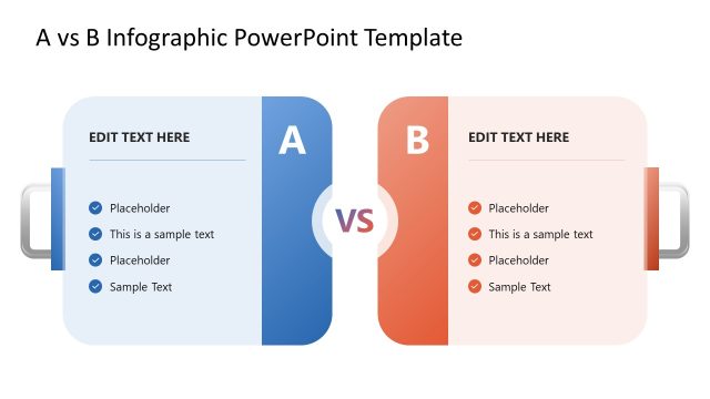
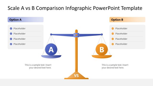
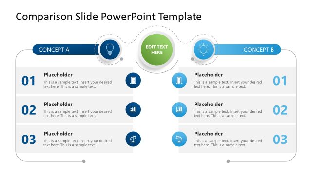
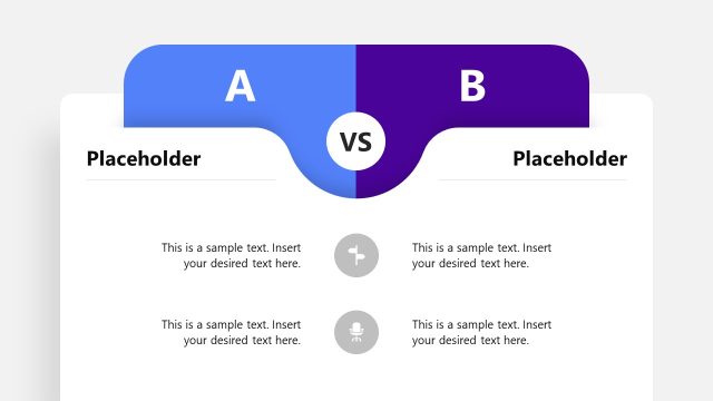
The Comparison of A and B slide layout from the Simple A vs B PowerPoint Slide Template offers a clear two-column design ideal for business presentations. This layout facilitates direct evaluation of product features or performance metrics using editable shapes and vector icons, making it suitable for strategic decision-making and pitch deck templates. Its balanced structure enhances clarity when contrasting benefits and risks in corporate presentations.
What’s on This Slide
The layout features a two-column design with a central 'VS' label. The left column, colored blue, contains a placeholder for text and an upward trend icon representing 'A'. The right column, in green, includes a placeholder for text and a light bulb icon representing 'B'. Both columns are visually balanced, with equal height and width. Text placeholders are aligned to the top and center of each column, allowing for clear differentiation between the two subjects. The overall composition is symmetrical, emphasizing the comparison.
How to Use It
This layout serves as a direct comparison between two options, suitable for highlighting differences or advantages. It fits well in presentations discussing product features, performance metrics, or strategic choices. Use it when presenting two alternatives side by side, making it easy for the audience to evaluate each option. This structure is effective in business contexts, such as product launches or decision-making meetings, where clarity in comparison is essential.
Text Placeholders & Capacity
Keep your copy within these limits so it fits without resizing. Node body slots can accommodate about 30 words each.
| Placeholder | Count | Max characters (approx.) |
|---|---|---|
| Item body | 2 | 150 |
| Slide title | 1 | 50 |
Slide Keywords
Download unlimited PowerPoint templates, charts and graphics for your presentations with our annual plan.
DOWNLOADReturn to Simple A vs B PowerPoint Slide Template.