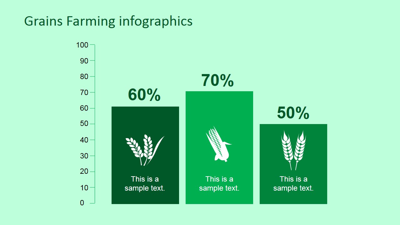
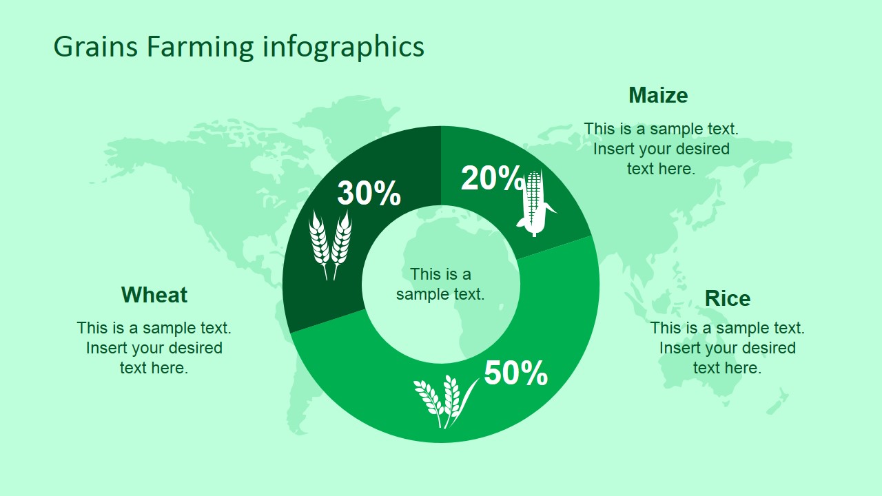
Professional Farming Grains PowerPoint Infographic – Showcase the potential of the grain industry in various levels of geographical settings. This type of presentation assists in creating a highly feasible business decision in the agroindustry. It is designed from the inspirations brought by the benefits of grain farming worldwide. The Farming Grains template for PowerPoint & Google Slides presentations has several sample slides with suggested concepts for the presentation. These slides are highly editable to enhance their existing concepts and accommodate further presentation ideas. It focuses on farming grains such as rice, maize, and wheat. The slides include comparative presentations among the grains using bar graphs, donut graphs, and infographics. The Professional Farming Grains PowerPoint Infographic is perfect for both grain consumption and production reports.
Grains are a major agricultural product consumed worldwide. The type of grains distributed per continent varies, but grains, in general, serve as the main source of carbohydrates in the majority of countries around the world. Wheat is the leading source of flour used in making pasta and bread. European and American countries highly rely on this food group for their daily carb intake. Maize or corn is also a staple part of American breakfast food. It is also a major food source in Latin America. Aside from food products, maize is also used in commercial products such as medicines, batteries, and some plastic products. In Asia, rice grains are the main source of carbohydrates. Rice is consumed in Asian countries daily and as frequently as three times a day.
In relation to the grains consumption rate worldwide, this template is great for presenting the grain production in different region as well as in the worldwide setting. Wheat is generally produced in China and the US. Maize has a large export market coming from the American countries while rice widely comes from Asian countries where they are also mostly consumed.
Alternatively, you can download other presentation templates on farming topics, international trade and nutrition PPT templates.
What’s inside this template
Example presentation scenarios
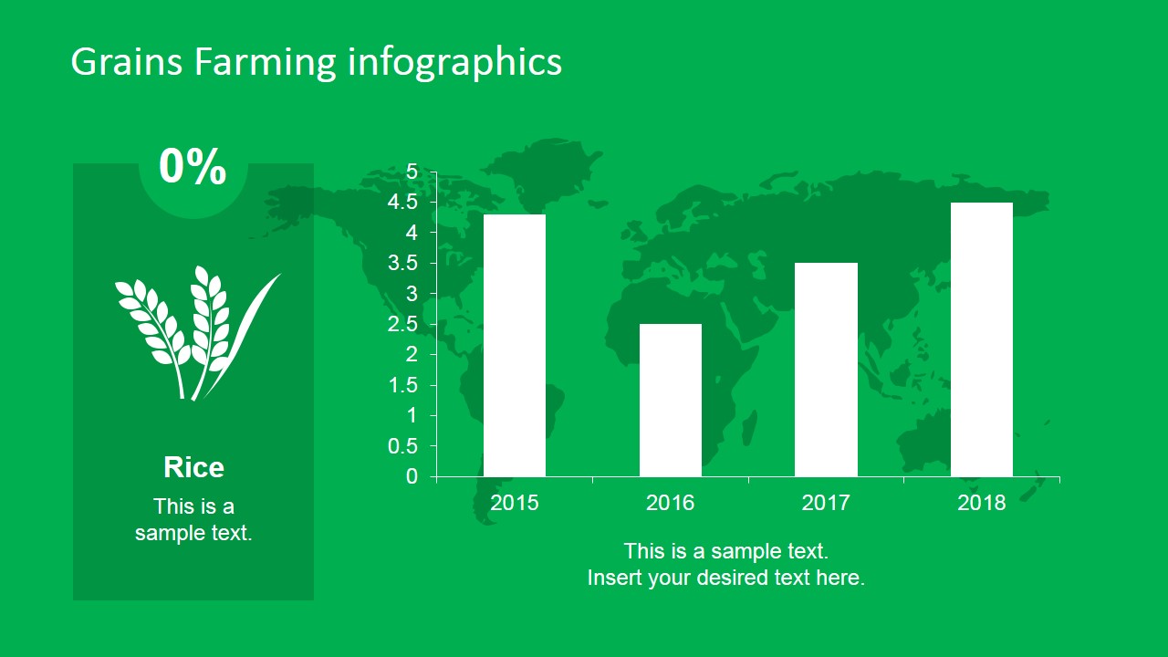
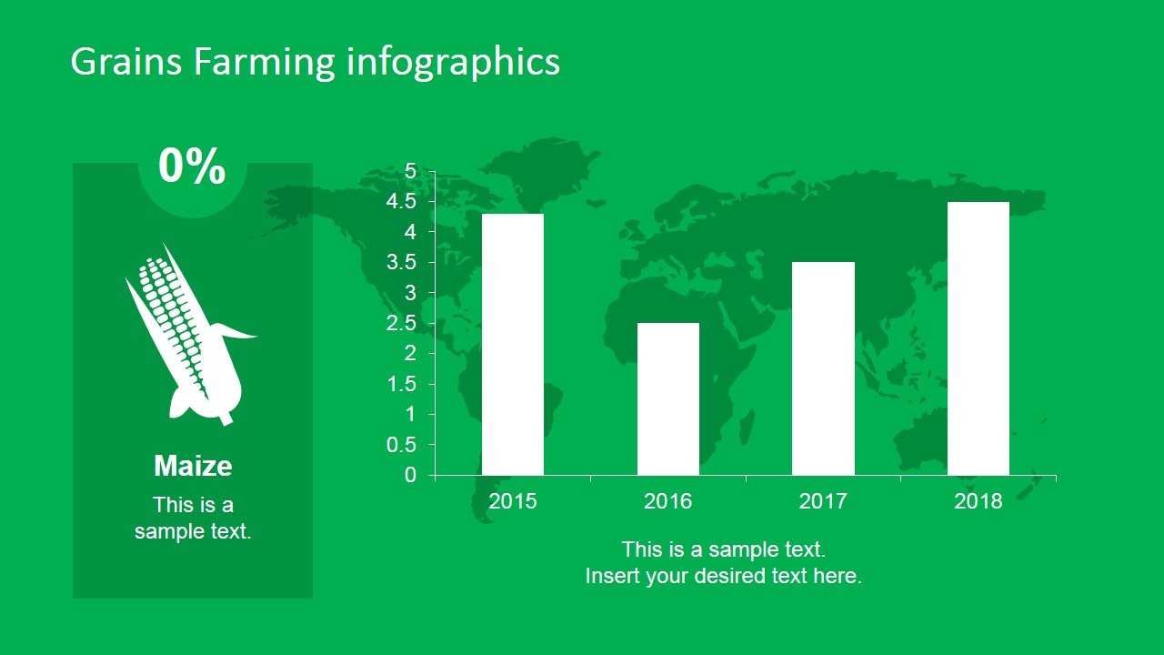
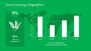
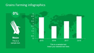
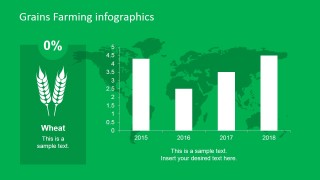
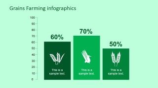
- An agribusiness analyst can use the bar chart slides to report year-by-year rice, maize, or wheat performance to internal decision makers.
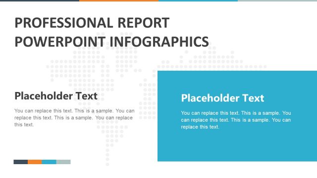
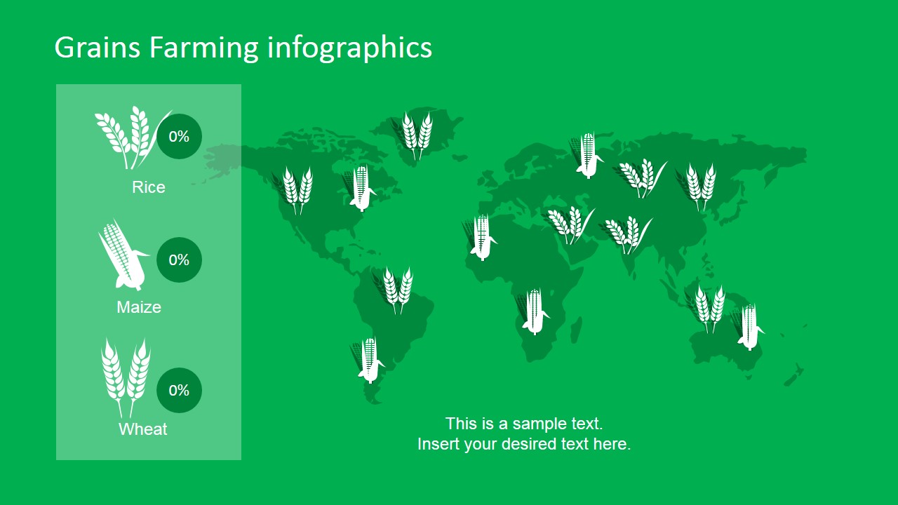
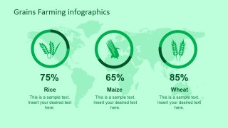
- A government agriculture presenter can use the world map distribution slide to explain where grain activity is concentrated across regions.
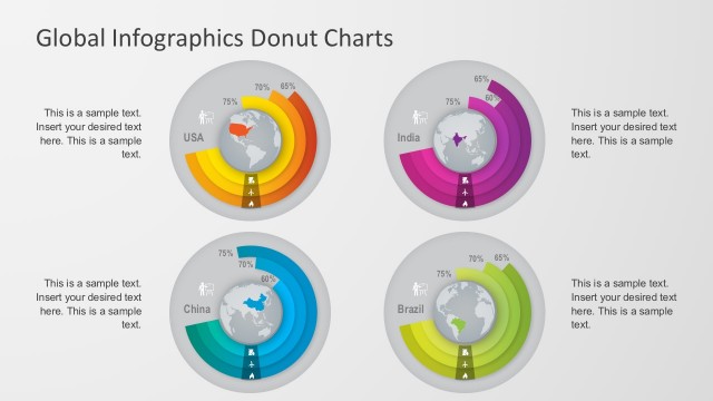
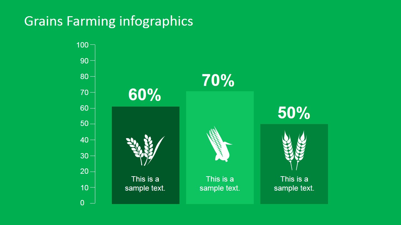
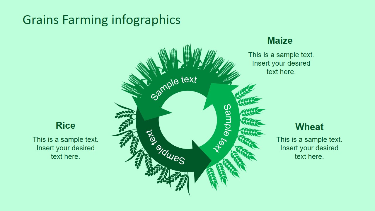
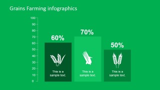
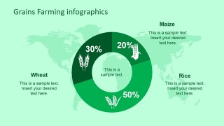
- A food supply consultant can use the donut chart and three-column comparison slides to compare crop shares for wheat, maize, and rice.
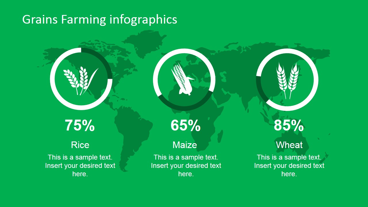
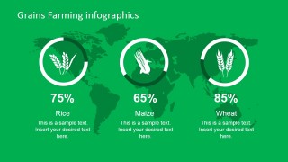
- A nutrition researcher can use the circular percentage indicators to connect staple grain consumption patterns with food system analysis.
Features
- 100% editable presentation template
- Compatible with Microsoft PowerPoint and Google Slides
- 16:9 aspect ratio slides
- Scalable vector shapes, icons and illustrations
- AI-Ready for Microsoft Copilot and Claude
- Instant access and download
Frequently asked questions
Q: How should a presenter structure a clear grain performance story with this template?
A: Start with the three circular indicators to frame the main rice, maize, and wheat comparison. Move to the world map when geography matters, then use the crop-specific bar charts for yearly change. Close with the donut chart when the audience needs a simple share-of-total message.
Q: Who is this template best suited for, and what decision does it support?
A: It fits agriculture analysts, commodity teams, food supply consultants, and public sector presenters who need to explain grain production, consumption, or distribution. The template is strongest when the decision depends on comparing staple crops, identifying regional patterns, or summarizing crop share in a concise visual report.
Q: Why do the map, circle, bar, and donut layouts work well for grain topics?
A: The world map connects crops to geography, the circular indicators create quick crop-by-crop status comparisons, and the bar charts show change over time. The donut chart uses a share metaphor, making it easier for audiences to understand how rice, maize, and wheat relate to a total market or production mix.


Professional Farming Grains PowerPoint Infographic
10-slide farming grains presentation template with world maps, bar charts, and donut infographics
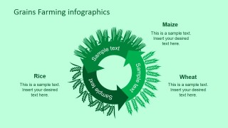
Professional Farming Grains PowerPoint Infographic is a 10-slide agriculture diagram template for grain production and consumption reporting. It includes world map markers, circular percentage indicators, bar charts, a cycle diagram, and donut chart layouts for rice, maize, and wheat. Designed for Microsoft PowerPoint and Google Slides.
- Category
- Diagrams
- Rating


 Loading...
- Aspect ratio
- 16:9, 4:3
- Item ID
- 6704-01
- Colors
 Microsoft PowerPoint
  Microsoft Copilot
  Claude for PowerPoint
 Other formats supported
Subscribe today and get immediate
access to download our PowerPoint templates.