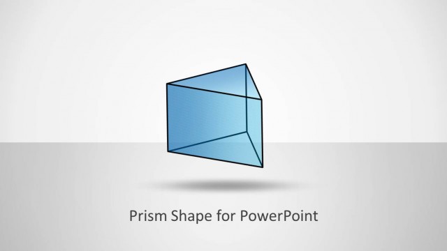
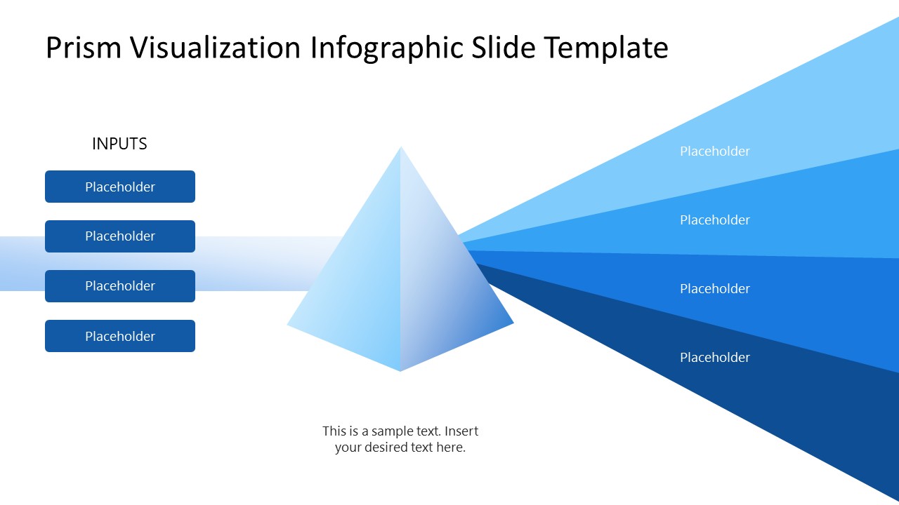
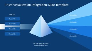
Discuss the convergence mechanism in business presentations with our Prism Visualization Infographic PowerPoint Template. A prism is a 3D glass object that, when light passes through it, diverges into seven rainbow colors. The prism visualization diagram shows a 3D prism centered, with four input items on the left and four on the right. The central bar on the left helps operations managers visualize how multiple inputs converge and feed into the system to generate outputs. The output rays convey the linked outcomes resulting from the combined effect of the input items. Project managers present how multiple activities enable teams to create project deliverables throughout the project lifecycle. We allow users to change the colors and shapes used in this PPT template to communicate ideas accurately.
The Prism Visualization Infographic PowerPoint Template includes two slides that use the same prism input-output diagram, but with different background colors. The first slide has a white background, while the second has a blue background. Users can customize the placeholder text lines to communicate the details effectively. Furthermore, our diagram template is compatible with Google Slides and other versions of Microsoft PowerPoint. Academic presenters, such as scholars or mentors, use this prism diagram in their college presentations to effectively highlight physical light concepts. Supply chain managers use it to communicate how raw inputs result in operational outcomes.
Management consultants create a strategy deck for a client presentation and use input boxes to represent distinct data streams that develop into strategic recommendations. Download the prism visualization infographic template to comprehensively showcase timelines, workflows, or strategic frameworks. In addition, we offer other versions of input-output diagrams that you can edit for your executive presentations.
What’s inside this template
Example presentation scenarios
- An operations manager can explain how raw materials, staffing, systems, and procedures combine into four operational outcomes using the input boxes and output rays.
- A project manager can show how planning tasks, team roles, tools, and milestones feed into project deliverables through the central prism diagram.
- A management consultant can present separate data streams that converge into client recommendations, using the prism as the visual mechanism for synthesis.
- An educator can teach a physical light or refraction concept by labeling the incoming beam, prism, and separated light rays.
Features
- 100% editable presentation template
- Compatible with Microsoft PowerPoint and Google Slides
- 16:9 aspect ratio slides
- Scalable vector shapes, icons and illustrations
- AI-Ready for Microsoft Copilot and Claude
- Instant access and download
Frequently asked questions
Q: How should a presenter explain the prism diagram without making it feel too abstract?
A: Start by naming the shared source or business problem represented by the incoming beam. Then define each left-side input as a specific driver, activity, or resource. Use the prism as the moment of synthesis, and label the output rays as the resulting decisions, deliverables, or impacts. This keeps the metaphor tied to the audience's work.
Q: Who benefits most from using this input-output prism format?
A: The format works best for presenters who need to connect separate drivers to related outcomes in a short concept explanation. Consultants, project leads, operations managers, and educators can use it when a simple list is not enough and the audience needs to see how several contributing factors transform into distinct results.
Q: Why does the prism metaphor help communicate convergence and outcomes?
A: A prism is a familiar visual metaphor for transformation: one incoming beam becomes several visible rays. In this template, the left input boxes establish the contributing factors, the center prism creates a clear transition point, and the right-side rays separate outcomes without losing the idea that they came from one combined process.

Prism Visualization Infographic PowerPoint Template
2-slide presentation template for prism input-output diagrams and light-ray outcome mapping in business presentations
This is a 2-slide prism visualization infographic template for explaining how inputs converge into outcomes. It includes a 3D prism input-output diagram, a four-item input list, radiating output rays, and light or dark background variants. It is built for managers, consultants, educators, and teams using Microsoft PowerPoint or Google Slides.
- Category
- Diagrams
- Rating

 Loading...
- Aspect ratio
- 16:9
- Item ID
- 23718-01
- Colors
 Microsoft PowerPoint
  Microsoft Copilot
  Claude for PowerPoint
 Other formats supported
Subscribe today and get immediate
access to download our PowerPoint templates.