Home PowerPoint Templates Shapes Level Meter Shape for PowerPoint 4 Level Meter Component Slide for Dashboards in PowerPoint
4 Level Meter Component Slide for Dashboards in PowerPoint
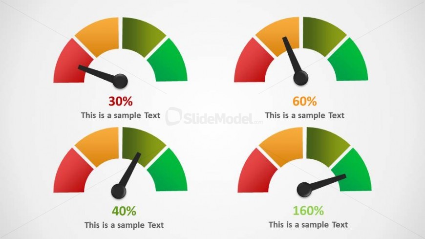
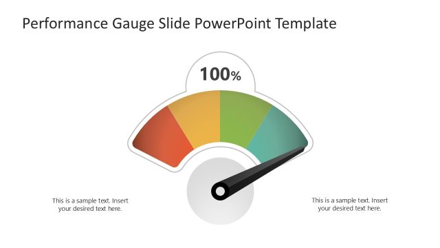
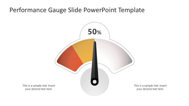
This slide consists of four meters with four identical divisions each. In each meter diagram, the arrow is pointing to a different section showing a bad indication, a normal indication, a good indication, and the best indication. You can fill in text and percentages for each meter.
Return to Level Meter Shape for PowerPoint.
Activate your subscription
Download unlimited PowerPoint templates, charts and graphics for your presentations with our annual plan.
DOWNLOADSlide Tags:
4 Levels
Template Tags:
Supported Versions:
PowerPoint 2007PowerPoint 2010PowerPoint 2013PowerPoint 2011 MacKeynotePowerPoint 2016PowerPoint 2016 MacOffice 365Google Slides
Return to Level Meter Shape for PowerPoint.
