Slide 2 of 5 from Level Meter Shape for PowerPoint
4 Step Editable Level Meter PowerPoint Diagram
Performance Meter Visualization for Presentations
- Chart
- Gauge Meter
- Evaluation Slide
- 16:9
- 100% Editable
About This Slide
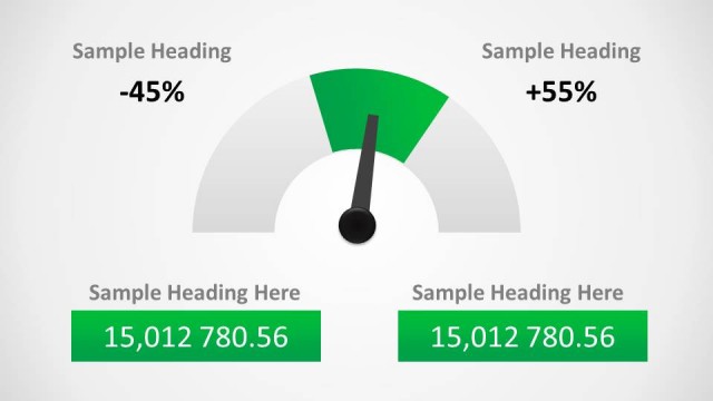
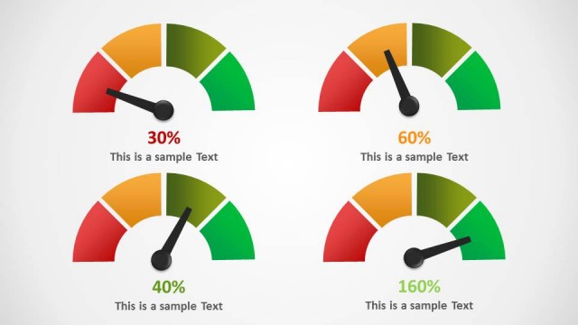
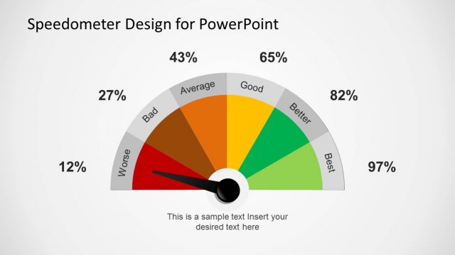
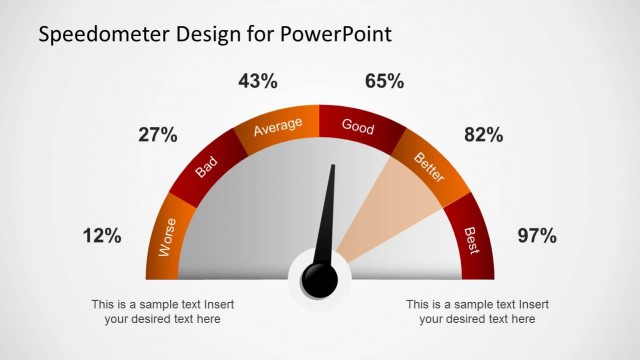
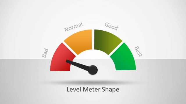
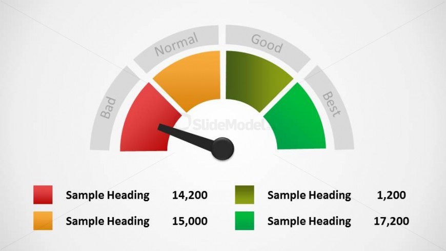
This slide features the same half-circle meter with four sections and an arrow indicating the far left section as before. There is also a key below of what each section of the meter represents, with the color, a text field, and number field.
What’s on This Slide
The slide features a gauge meter design with a semicircular shape at the top. The meter displays four color-coded segments labeled 'Bad,' 'Normal,' 'Good,' and 'Best,' arranged from left to right. A needle points to the current performance level, which is visually centered. Below the meter, there are four text placeholders aligned horizontally, each representing different performance values in red, orange, yellow, and green. The background is light, enhancing the visibility of the meter and its labels, creating a clear visual hierarchy.
How to Use It
This layout serves as a performance meter, ideal for displaying metrics in a dashboard format. It fits well in presentations that require a quick visual assessment of performance levels. This structure is useful for business scenarios such as performance reviews, project updates, or KPI tracking. It can effectively communicate progress or status at a glance, making it suitable for executive summaries or team meetings where concise information is essential.
Text Placeholders & Capacity
Keep your copy within these limits so it fits without resizing. Node labels can hold roughly 10 characters each, allowing for concise text.
| Placeholder | Count | Max characters (approx.) |
|---|---|---|
| Item heading | 4 | 10 |
| Item body | 4 | 10 |
Slide Keywords
Download unlimited PowerPoint templates, charts and graphics for your presentations with our annual plan.
DOWNLOADReturn to Level Meter Shape for PowerPoint.