Human Resources Dashboard PowerPoint Template
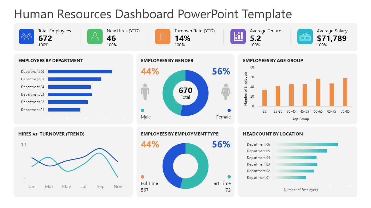
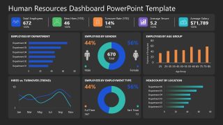
Review the workforce data in the executive presentations using this Human Resources Dashboard PowerPoint Template with multiple data visualizations. Data visualizations help stakeholders examine data points clearly and identify patterns, trends, and other insights. They then use these insights to support data-driven decisions for business growth and development. The dashboard layout features different data charts to showcase the workforce breakdown in multiple cards or segments. At the top, the slide layout uses a horizontal infographic bar to highlight key metrics such as Total Employees, New Hires (YTD), Turnover Rate (YTD), Average Tenure, and Average Salary. Further, business analysts use a six-card 2×3 grid to share the following data points:
- Employees By Department
- Employees By Gender
- Employees By Age Group
- Hires Vs Turnover Trend
- Employees By Employment Type
- Headcount by Location
The Human Resources Dashboard PowerPoint Template contains two slide variants with the same dashboard layout. The only difference between the two slides is the background color(white & dark). The HR team uses this presentation template layout for quarterly HR leadership review presentations. They present the current employee count and news about future hires or improved turnover rates. Strategic leaders use this PPT template to compare age groups with employment type and department distribution. This helps them identify which areas need attention in the next planning cycle. In key partnership presentations, the dashboard slide helps users share the workforce details wth the collaborating party.
We also allow users to change the colors, data visualization types, and text in the template to match their needs. They can also customize the layout with Google Slides. Download the human resources dashboard PPT layout to communicate a recruitment performance report to the leadership, helping them evaluate the staffing strategies.

You must have an active subscription to download this file.
- Category
- Data & Charts
- Rating
-

 Loading...
 - Size
- 16x9
- Item ID
- 23801-01
- Colors
Subscribe today and get immediate
access to download our PowerPoint templates.