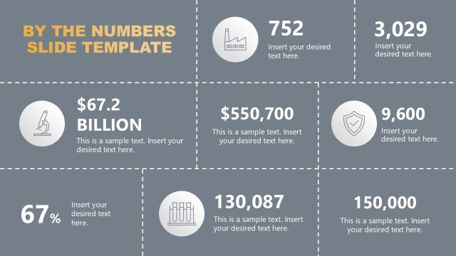
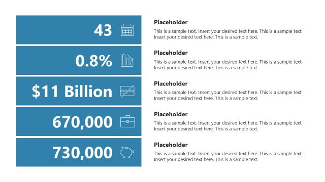
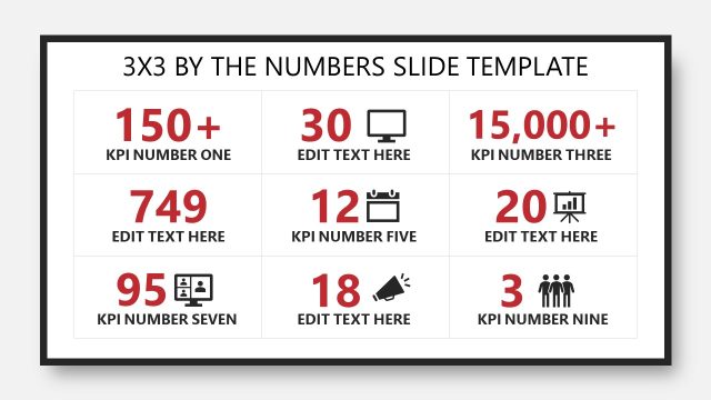
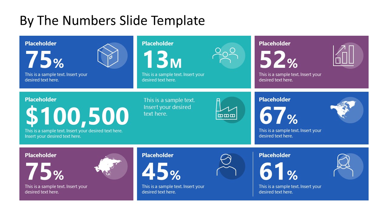
Present statistical or numerical information in the executive sessions using our By The Numbers PowerPoint Template. Data is the new oil of the modern world. It helps companies make informed decisions based on the data-driven insights, trends, or patterns. Before launching a new company, product, outlet, or marketing campaign, organizations see different types of data. This enables them to see the broader picture and work in line with data trends. In this way, data experts can predict whether the product will work. We have created this dashboard-style-by-the-numbers template so that professionals like data analysts and market researchers can visualize their findings effectively. The template includes fully editable elements that users can adjust based on the nature of their datasets. The template contains multiple colored segments, each with a placeholder value, an icon, and description text.
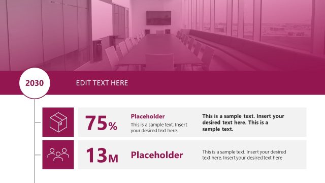
Our By The Numbers PowerPoint Template helps marketers showcase advertising insights and customer data. In government official discussions, this template layout can be used to present demographic data points such as age, gender, race, ethnicity, income, education level, and marital status. The design has about eight segments. The top layer has three segments, while the second and third layers each have two segments. One block in the lower two layers is longer than the other blocks on the slide. Placeholder values include: 75%, 13M, 52%, $100500, 67%, 75%, 45%, 61%. You can change the icons, values, or text placeholders based on your needs. You can also change the number of sections or fonts used in the template. Download our by-the-numbers presentation slide template and personalize it for your stakeholder sessions!
What’s inside this template
Example presentation scenarios
- A marketing analyst can use the metric tiles to report campaign percentages, audience counts, and budget figures to leadership in a short performance update.
- A market researcher can replace the placeholder numbers with survey findings and use the people, map, and growth icons to group demographic and trend data.
- A government or nonprofit analyst can present population, region, income, or service metrics by assigning each statistic to a separate colored number block.
- A consultant can use the wide statistic banner and surrounding KPI cards to open a client readout with the most important numbers before explaining the details.
Features
- 100% editable presentation template
- Compatible with Microsoft PowerPoint and Google Slides
- 16:9 aspect ratio slides
- Scalable vector shapes, icons and illustrations
- AI-Ready for Microsoft Copilot and Claude
- Instant access and download
Frequently asked questions
Q: How should a presenter organize the numbers so the slide is easy to follow?
A: Lead with the most important business metric in the largest central banner, then place supporting percentages around it. Group related measures by icon type, such as audience, geography, operations, or growth. Keep each caption short so the audience reads the big values first and uses the labels only for context.
Q: Who is this by-the-numbers slide best suited for?
A: It fits analysts, marketers, researchers, consultants, and executives who need one slide that compresses several findings into a quick read. It works well for opening an insights discussion, summarizing a campaign, or giving leadership a snapshot before a deeper report, especially when each statistic has a different category.
Q: Why use metric tiles instead of a traditional table?
A: The tile layout turns separate statistics into visual priorities rather than table entries. Large numerals carry the message, color blocks divide categories, and icons act as memory cues. This is useful when the presenter wants the audience to remember a few headline facts, not inspect row-by-row detail.
By The Numbers PowerPoint Template
1-slide presentation template for KPI dashboard metrics, number cards, and icon-based data highlights.
By The Numbers PowerPoint Template is a 1-slide infographic for presenting numerical findings with a KPI dashboard, colored metric tiles, icon callouts, and a wide statistic banner. It is built for analysts, marketers, and executives who need a concise data snapshot in Microsoft PowerPoint or Google Slides.
- Category
- Data & Charts
- Rating

 Loading...
- Aspect ratio
- 16:9
- Item ID
- 23374-01
- Colors
 Microsoft PowerPoint
  Microsoft Copilot
  Claude for PowerPoint
 Other formats supported
Subscribe today and get immediate
access to download our PowerPoint templates.