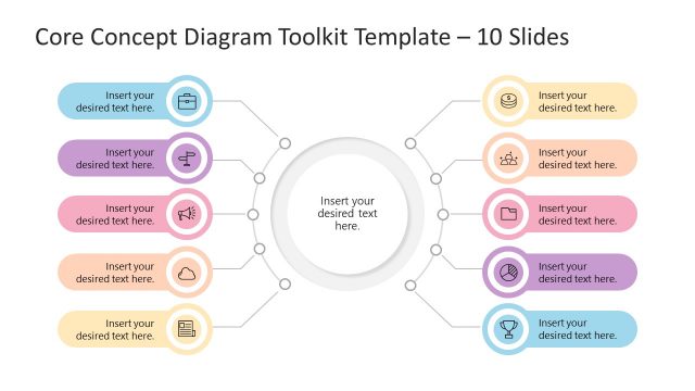
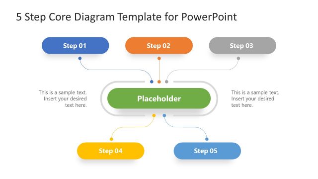
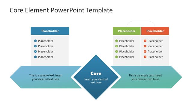
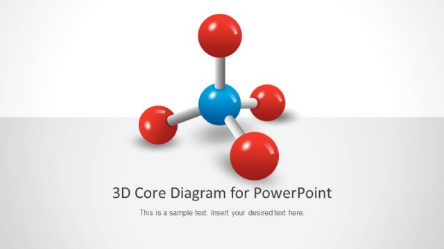
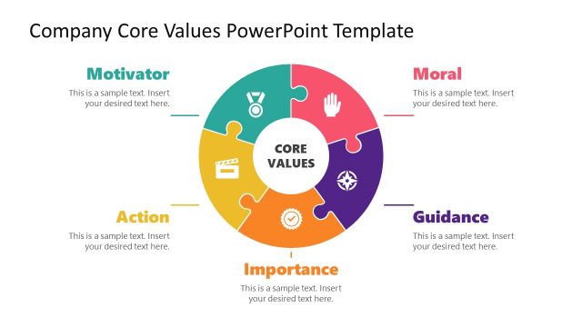
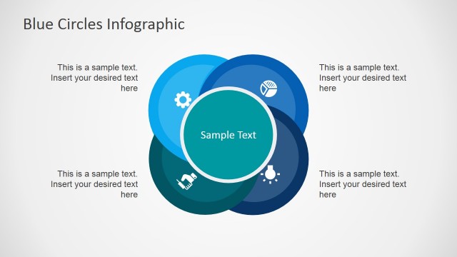
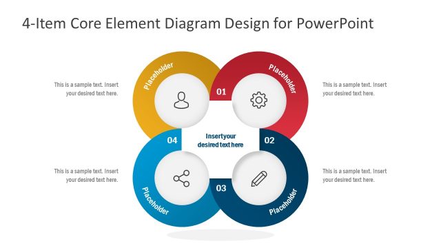
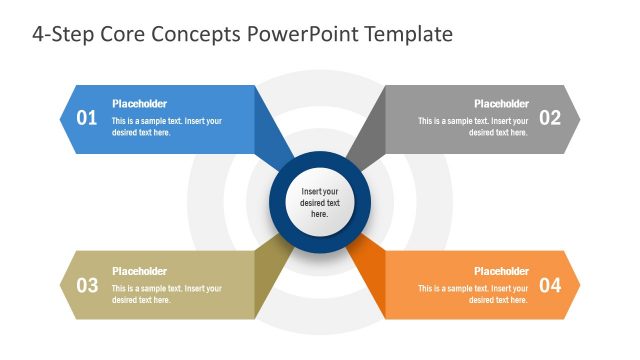
Blue Core Diagrams for PowerPoint is a presentation template that you can download to make slide designs with core diagrams. You can use the blue core diagrams for PowerPoint to help visualize a concept or idea which is based on up to four layers. The core diagrams can be used as an alternative to other visualization aids like the Onion diagrams.
Alternatively, download other creative Microsoft PPT templates for presentations, or core diagram slide templates.
What’s inside this template
Example presentation scenarios
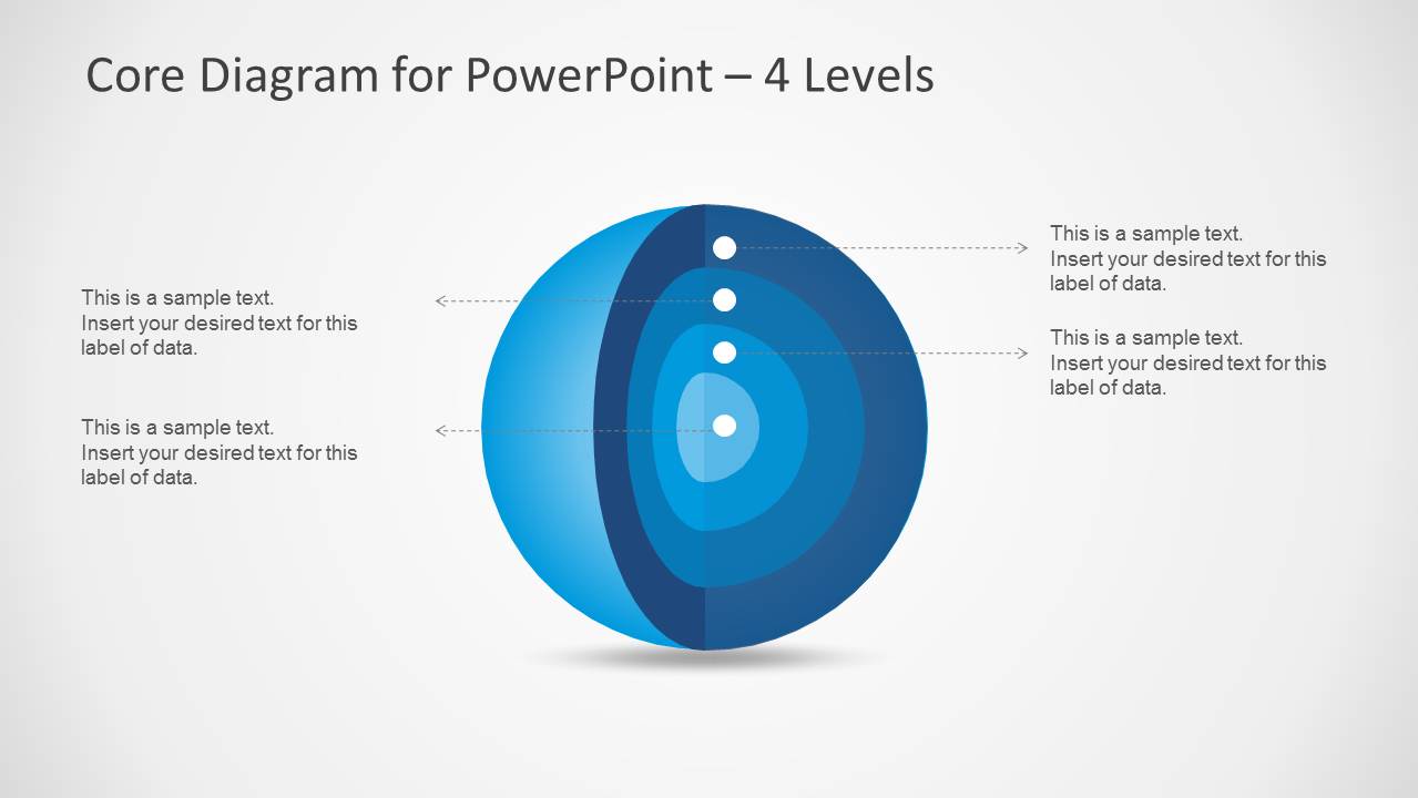
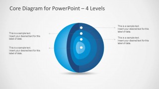
- A strategy consultant can use the 4-level core diagram to explain how a central capability is supported by processes, governance, tools, and outcomes.
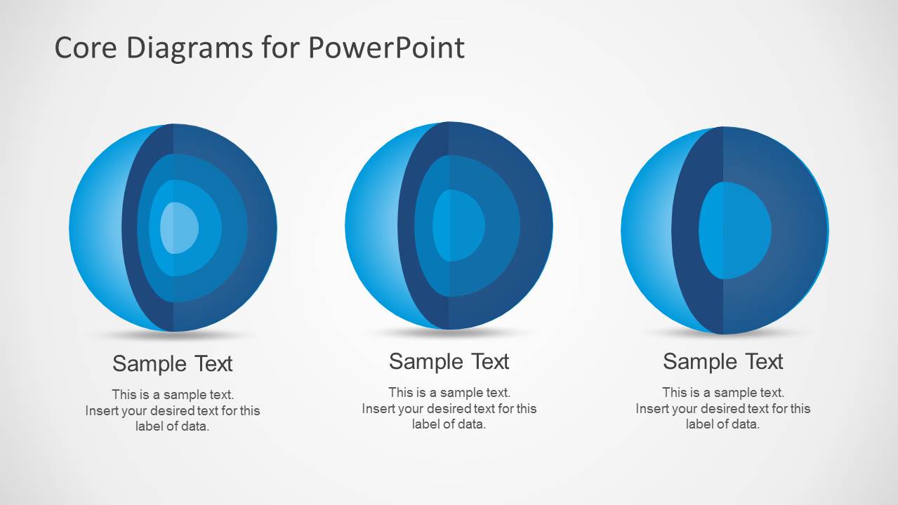
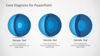
- A product manager can use the three-item comparison slide to present three platform pillars or service layers side by side before discussing one model in detail.
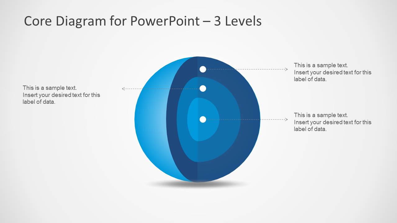
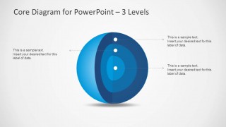
- A training facilitator can use the 3-level core diagram to teach a nested concept such as principles, practices, and behaviors with callout labels.
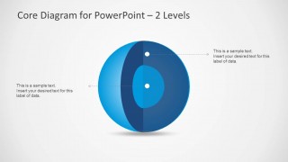
- An executive presenter can use the 2-level core diagram to simplify a message into the essential core and the external layer that supports it.
Features
- 100% editable presentation template
- Compatible with Microsoft PowerPoint
- 16:9 aspect ratio slides
- Scalable vector shapes, icons and illustrations
- AI-Ready for Microsoft Copilot and Claude
- Instant access and download
Frequently asked questions
Q: How should a presenter explain a layered idea with this template without overloading the audience?
A: Start with the center of the core diagram and name the idea that everything else depends on. Then move outward one layer at a time using the dotted callouts as spoken cues. Keep each label short, because the sphere is strongest when it explains relationships, not detailed paragraphs.
Q: Who is this template best suited for in a business presentation?
A: This template fits consultants, product leaders, trainers, and managers who need to explain a framework rather than prove a numeric result. The 2-level, 3-level, and 4-level core diagrams are especially useful when the audience must understand how strategy, capabilities, policies, or behaviors connect around a central concept.
Q: Why use a core sphere metaphor instead of a standard list or table?
A: The sphere metaphor makes hierarchy and dependency visible. A list treats every item as equal, while the core diagram shows what sits at the center and what surrounds it. The blue gradients and callout dots guide attention from inner meaning to outer support, which helps audiences remember the model.

Blue Core Diagrams for PowerPoint
4-slide PowerPoint diagram template with blue core spheres for layered concepts and onion-style models
Blue Core Diagrams for PowerPoint is a four-slide diagram template for showing layered concepts with blue 3D core sphere graphics. It includes a three-item comparison slide plus 4-level, 3-level, and 2-level core diagrams with callout labels. It is built for presenters explaining structures, priorities, or system layers in Microsoft PowerPoint.
- Category
- Diagrams
- Rating

 Loading...
- Aspect ratio
- 16:9
- Item ID
- 6166-01
- Colors
 Microsoft PowerPoint
  Microsoft Copilot
  Claude for PowerPoint
 Other formats supported
Subscribe today and get immediate
access to download our PowerPoint templates.