AQI Index Slide Template for PowerPoint
The AQI Index Slide Template for PowerPoint features a chart diagram to showcase the air quality levels based on the pollutants detected in the air. This AQI index is established by government and environment control organizations to tell about the quality of air and its impact on the health of living beings. This index is, in turn, used by health and conservation departments to foretell the long-term impacts or to start awareness campaigns about the effects of bad-quality air. Governments take crucial steps to eliminate the environment’s potentially hazardous pollutants based on the surrounding air’s AQI. We have prepared this 100% editable AQI meter and chart diagram for presenting the AQI levels according to the standards. Users can include these diagrams in their professional or educational presentations conveniently.
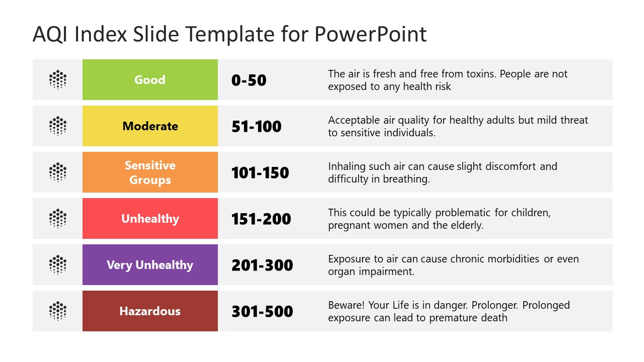
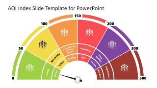
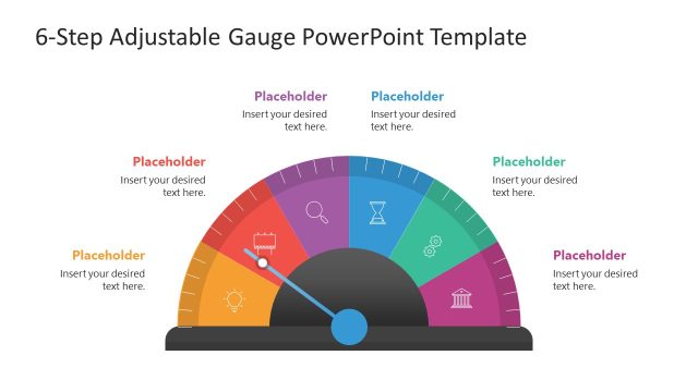
The first slide of our AQI Index Slide Template for PowerPoint is a meter diagram showing six categories using distinct colors. These colors indicate the levels of pollutants, i.e., with an increase in the severity of shade, the air quality worsens. This has the colors green (good), yellow (moderate), orange (unhealthy for sensitive groups), red (unhealthy), purple (very unhealthy), and maroon (hazardous). These levels are divided based on a specific AQI number ranging between zero to 500. A pin is also provided in the central part of this meter, which can be moved according to the level of pollution of the index value. The second slide features a table form of this AQI chart. It carries a chart diagram showing the representative colors, index values, and their meanings. Presenters can choose from both slides and include them in their awareness or scientific presentations. They can also edit the provided text boxes according to their needs. Both slides are compatible with PowerPoint versions. So, download and try it now!

