6-Option Side by Side Infographic PowerPoint Template
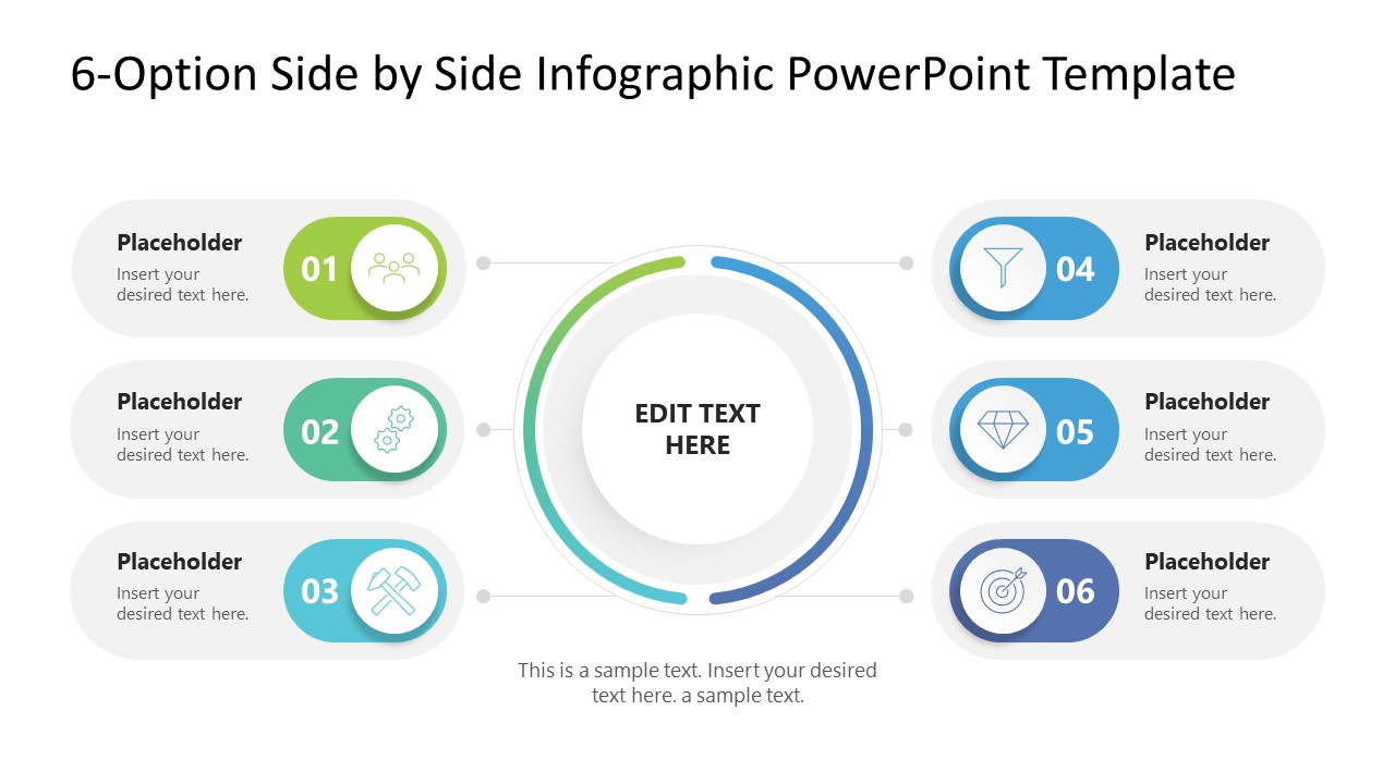
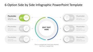
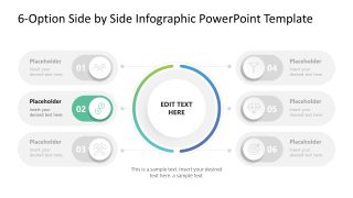
Evaluating complex scenarios requires a layout that doesn’t force your audience to jump between disconnected slides. This 6-Option Side-by-Side Infographic PPT Template solves that by using a centralized hub flanked by two symmetrical arcs. It’s a design built for balanced comparison, letting you group three variables against another three to immediately highlight differences in cost, feasibility, or performance metrics.
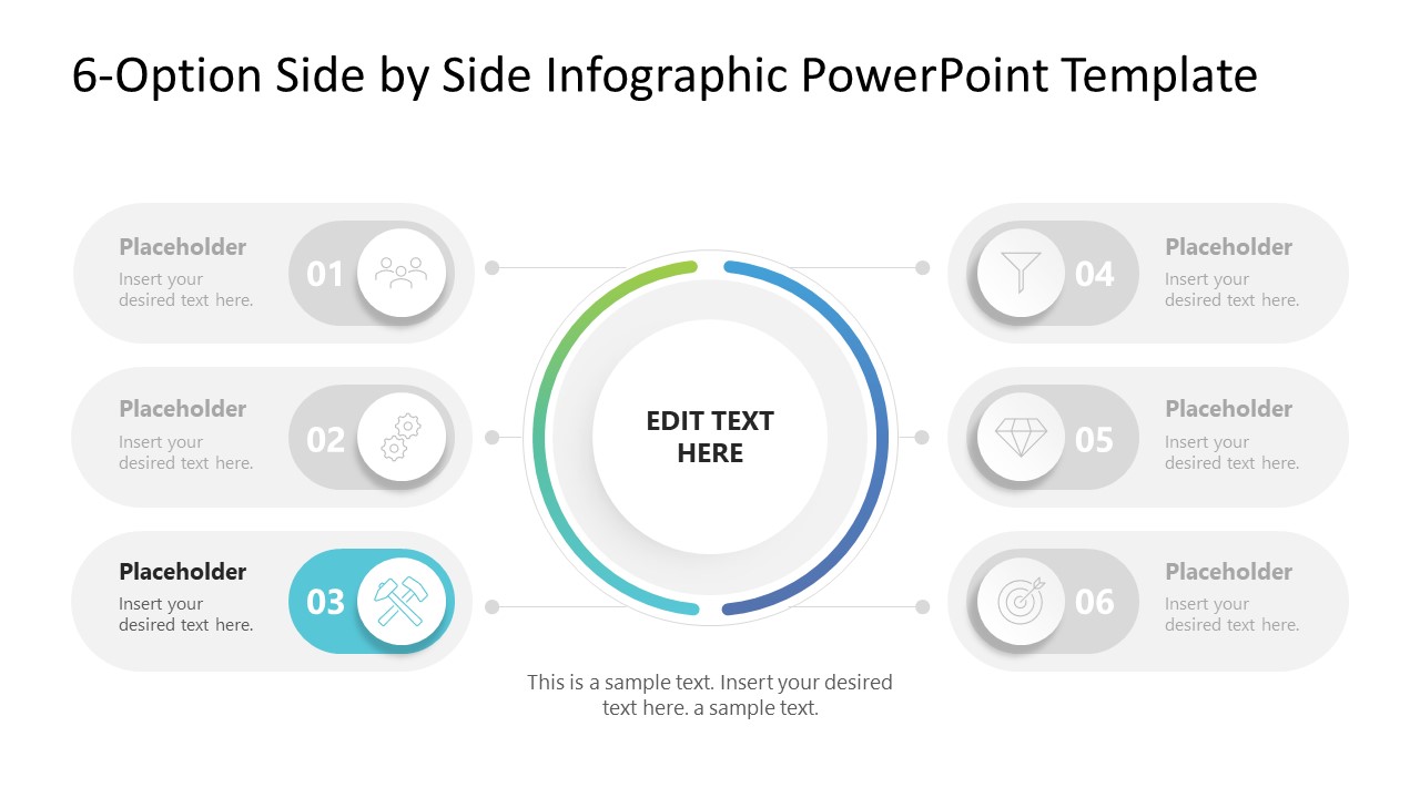
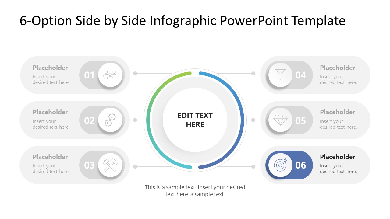
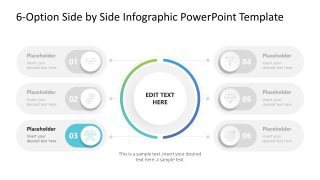
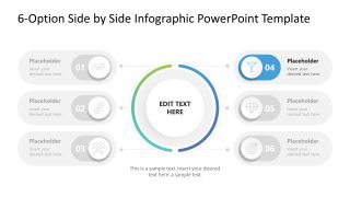
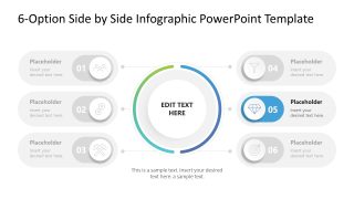
Instead of the usual “list fatigue” from standard bullet points, this infographic presentation template implements six distinct nodes, each designed as an interactive toggle. These anchor your primary data points to a core objective, creating a clear information hierarchy that keeps even high-density technical descriptions legible during executive reviews. Whether you are mapping a new system architecture or an operational workflow, this framework forces a more disciplined approach to process visualization.
- Multi-Platform Utility: Fully optimized for Microsoft PowerPoint with a 16:9 widescreen aspect ratio.
- Global Theme Syncing: Built on a master slide, allowing you to update HEX colors and typography across the entire deck in seconds.
- Visual Continuity: Includes Spotlight transition slides to move from a high-level 6-option overview into a granular, deep-dive analysis of a single variable.
- Vector-Based Graphics: Every icon and node is a fully editable vector, ensuring no loss of resolution when scaling for large-scale presentations.
Our 6-Option Side by Side Infographic PowerPoint Template is ready for immediate deployment into professional workflows, ensuring your next technical audit or project roadmap is both scannable and authoritative. Download the 6-Option Comparative Framework to align your stakeholders and finalize your implementation strategy.


You must be logged in to download this file.
DOWNLOAD- Category
- Diagrams
- Rating

 Loading...
- Size
- 16x9
- Item ID
- 235018-01
- Colors
Subscribe today and get immediate
access to download our PowerPoint templates.