5-Item Burnup Chart PowerPoint Template
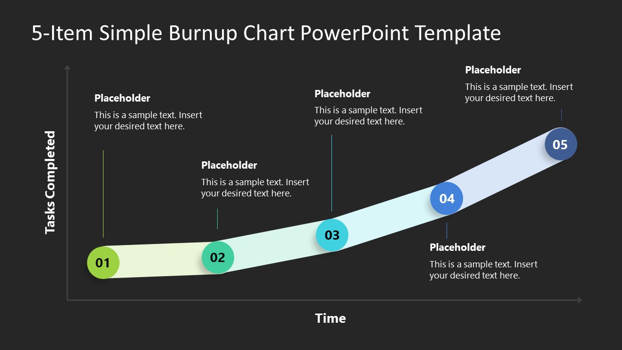
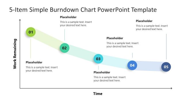
The 5-Item Burnup Chart PowerPoint Template features an editable burnup graph created using PowerPoint shapes and objects. Like the burndown charts, the burnup graphs are also used in SCRUM and agile methodology to plan and analyze the work progress. By preparing this run chart, professionals display a record of activities to monitor the completion of tasks and to predict future achievements. This graph has a rising slope format representing the completion of work. Our users can edit this slope according to their workflow and showcase the details of tasks that are completed.
This PPT template has two background color variants, i.e., white & black. Presenters can choose between either slide to use in their presentations. The template slide shows two graphical black lines showing the time along the x-axis and the work completed along the y-axis. The slope between the two axes is a thick semi-transparent line having five circular markings. Each circle has a distinct color, and the slope line’s corresponding area is also colored similarly. Users can conveniently add relevant details in the provided placeholder text area with every milestone. Likewise, they can change the time unit and the orientation of the slope.
Our 5-Item Burnup Chart PowerPoint Template is a ready-made design to demonstrate the team’s work pace in project management. In addition to representing the completion of project tasks, users can also display the events that positively impact the progress of a company or organization. Executives can visually learn about their departments’ efficiency through this burnup chart. Thus, download this simple burnup graph for your professional presentations and personalize it in a few steps!

