Building a professional slide deck has never been a purely creative exercise. It demands careful attention to the presentation structure and visual consistency, along with a precise reading of what the audience expects from the material. For most professionals, this reality translates into significant time spent on slide formatting, template navigation, content rewriting, and revision cycles that can span multiple working days.
Claude changes this dynamic. As an AI assistant built to understand context, language, and structure at a sophisticated level, Claude can handle the repetitive and time-intensive parts of presentation work, freeing professionals to direct their energy toward the arguments and insights that drive real outcomes. Whether the task is building a complete deck from scratch, populating an existing corporate template, or converting a dense block of text into a coherent visual layout, Claude for PowerPoint offers a responsive and precise tool for contemporary presentation work.
This article examines in practical terms how Claude works within a presentation workflow. It covers the range of tasks Claude can support, from slide creation and structural generation to data interpretation and diagram design. It explains why professionals working in corporate, consulting, and academic settings are incorporating Claude AI for presentations into their standard PowerPoint practice.
Why is Claude Changing Presentation Work for Good?
For years, the professional presentation process followed a pattern that changed very little: gather information, open PowerPoint, adapt a template, paste in content, manually reformat everything, and repeat the cycle after each review. The PowerPoint template constrains the design, the content clashes with the layout, and the deadline exerts constant pressure in the background.
What sets Claude apart from conventional PowerPoint features or basic automation tools is its ability to understand intent rather than execute instructions. When a presenter describes what a slide needs to accomplish, rather than specifying every formatting parameter in sequence, Claude can interpret that description and produce output that matches both the content requirements and the visual expectations. This applies whether the input is a paragraph of rough notes, a structured outline, or a dataset that needs to be converted into a chart.
For professionals working in high-stakes environments, such as executives preparing board presentations, analysts summarizing quarterly results, or consultants building client-facing decks, the ability to move quickly without sacrificing output quality is not optional. Structuring a clear narrative arc is one of the most demanding aspects of presentation preparation, and Claude provides direct, language-level support for that process. It can suggest how sections should flow, identify where an argument is underdeveloped, and help translate complex source material into language that reads with clarity on a slide.
The broader change that Claude represents is a shift from presentation software as a formatting tool to presentation software as a collaborative workspace. Rather than wrestling with the application to render an idea correctly, professionals can describe what they need and focus their attention on the substance of the work. It’s interacting with a tool rather than working around an output.
Building New Slides Using Current PPT Templates
One of the most persistent friction points in corporate presentation work is the gap between what a template offers and how it is actually used in practice. Organizations invest significant effort in building branded templates with defined color palettes, typefaces, slide masters, and layout options, and then watch those standards erode slide by slide as presenters mix styles, override grid rules, or default to whichever layout is easiest to fill in under time pressure.
Claude for PowerPoint, when accessed through its dedicated skill or MCP integration, can work directly with existing template files. Rather than generating slides in a generic default style and asking the presenter to reformat them manually, Claude reads the template’s structure and builds new content within it. New slides inherit the correct fonts, placeholder sizes, background elements, and color relationships from the source file, without requiring the presenter to apply them manually afterward.
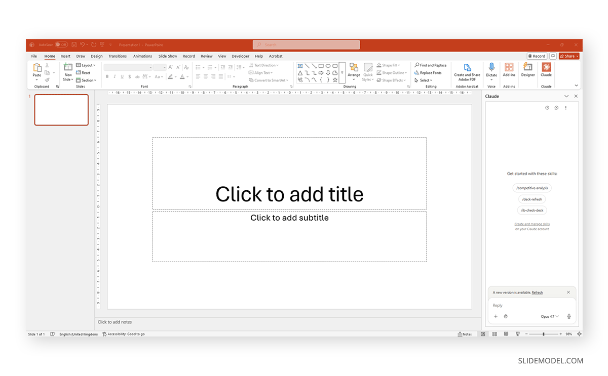
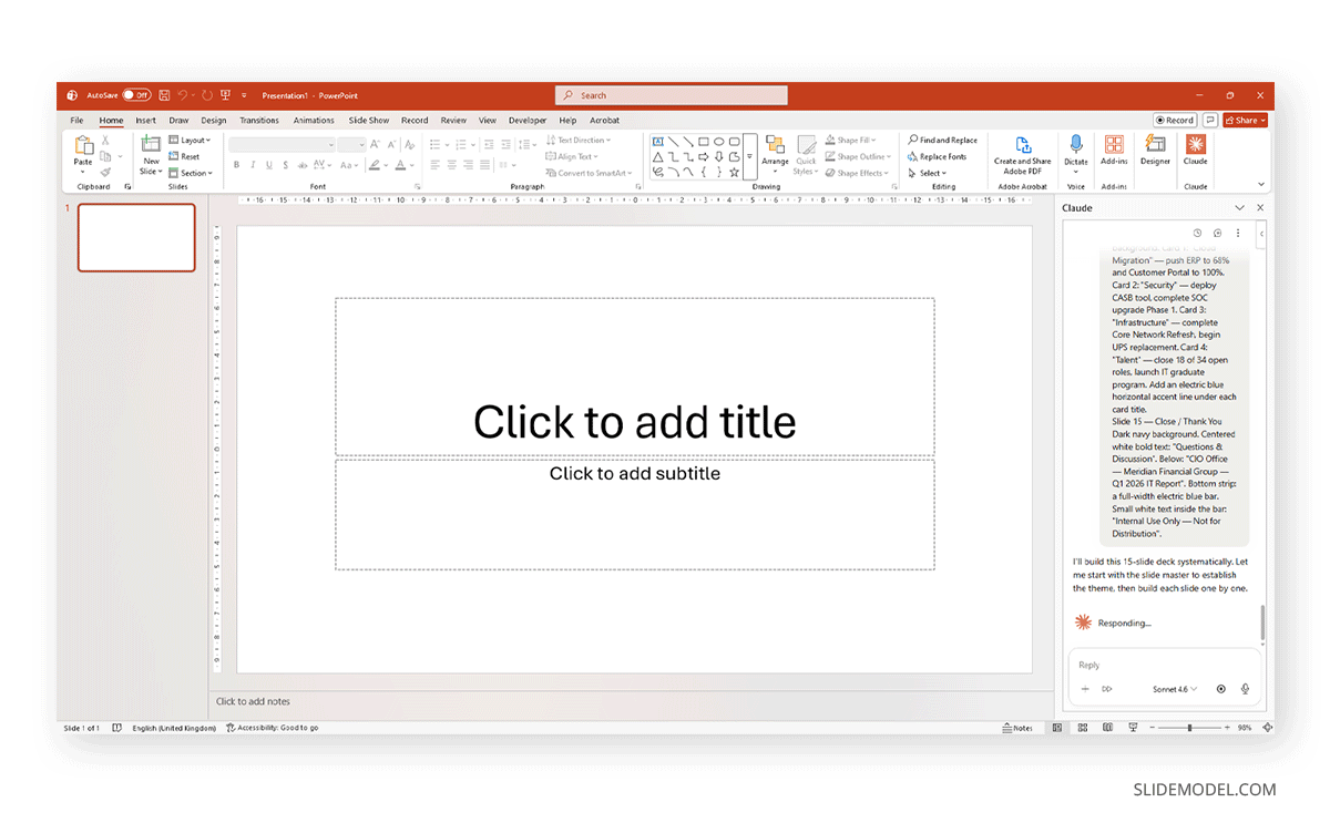
First, you need to install the Claude extension for PowerPoint. It will ask the user to log in to their Claude account and give permission to use the features. Once installed, a new icon appears on the Ribbon, and a new panel is displayed, allowing users to prompt Claude within PowerPoint.
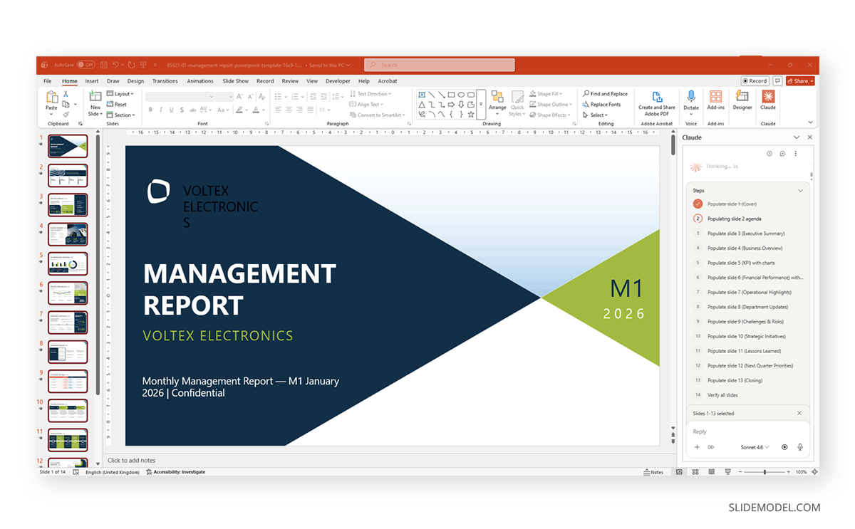
Then open an existing PowerPoint template file. Select the required slides to edit, then give Claude a prompt on what to do. In our case, we used the following prompt:
Populate this management report template for a fictional consumer electronics company called Voltex Electronics. Use M1 (January 2026) as the reporting period.

Company context: Voltex Electronics makes smartphones, wireless audio, and smart home devices. Mid-size company, ~$480M annual revenue, sold primarily through retail partners and direct-to-consumer online. Main competitors are in the mid-premium segment.

Use this data across the slides:

- Revenue M1: $38.4M (vs. $34.1M M1 last year, +12.6% YoY)
- Gross margin: 41.2%
- Units sold: 186,000 (smartphones 52%, audio 31%, smart home 17%)
- Top performing product: VX Pro Earbuds — 58,200 units, sell-through rate 94%
- NPS score: 67
- Customer acquisition cost: $28 | Customer lifetime value: $310
- Headcount: 1,240 employees | Open roles: 34
- Budget utilization: 96.4% of M1 operating budget
- Key risk: Supplier lead time increase for display components (+14 days)
- Strategic priority this quarter: Launch VX Smart Hub (smart home hub) in March

Instructions:

Populate each slide using the existing layouts and placeholders in this template. Replace all sample text. Keep the navy-and-green color scheme — do not introduce new colors. For chart slides, create native editable charts using the data above. For the timeline slide, show Q1 milestones: Jan — M1 close, Feb — VX Smart Hub production sign-off, Mar — VX Smart Hub retail launch. Keep bullet points to one line each. Do not add slides or remove slides.

Claude will start by reviewing the entire PPT template file to understand its structure within the PowerPoint Slide Master, then make the necessary changes to populate the slides.
Once the task is completed, you end up with a fully populated slide deck that may require minor fixes – such as font sizing, color, or arranging shapes. Reviewing the text is highly recommended. Keep in mind that if you work with models like Sonnet, they will consume fewer tokens but won’t deliver top-notch results. For daily work, it suffices. If your presentation creation process requires culling complex data, Opus is the model to choose. This can be configured in the prompt box for the Claude PPT Extension.
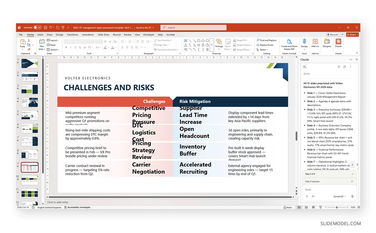
This capability is particularly valuable for client-facing work, where brand compliance functions as both a quality standard and a business requirement. When a consulting firm or marketing team needs to build a rapid response to a client request, Claude can help them build a complete deck in a fraction of the usual time while keeping the visual standards fully intact. The output looks as if it were built by someone with complete command of the template, sans minor adjustments to font color, text sizes, and arrangement of shapes, if the PPT template is too complex.
Making Pinpoint Edits to Specific Slides with Claude
Now, what if you created a presentation, shared it with your team, and some slides were flagged? The data on one chart has to be changed, or the wording on a key transition slide needs updating. The usual take on using AI tools such as ChatGPT for presentations, is to make the entire deck anew, probably stripping data or messing with the layout in the process. Each pass through that cycle multiplies the risk of losing formatting choices that were already finalized and approved.
Claude takes a more surgical approach to editing. Using the Claude PowerPoint MCP, users can direct edits to specific slides by referencing them by position, title, or content type. If the executive summary on slide two needs a new supporting paragraph, or the revenue chart on slide nine needs to reflect updated figures, Claude can address those elements in isolation while leaving the rest of the deck undisturbed.
This matters most in late-stage review cycles, where a presentation may be 90 percent complete but requires careful iteration on a handful of critical frames. At that stage, any change carries the risk of disrupting adjacent content, breaking alignment on nearby slides, or resetting a deliberately made formatting choice. By keeping edits scoped to the elements that actually need to change, Claude preserves the integrity of the work that has already been reviewed and approved.
Generating Full Deck Structures from Natural Language Descriptions in Claude
A struggle often faced by presenters researching AI tools is to extract the full potential of prompts. We created a detailed guide on useful prompts in our article on ChatGPT prompting, but Claude actually works with natural language. We can use a plain-language description to create a full slide-by-slide structure. A professional preparing a new pitch can describe the context, audience, core argument, and key supporting evidence in a few sentences, and Claude can return a structured deck outline with suggested slide types, heading text, and content direction for each frame.
For the purposes of this article, we will create a slide deck from scratch using an extremely detailed prompt and evaluate the result. The prompt is as follows:
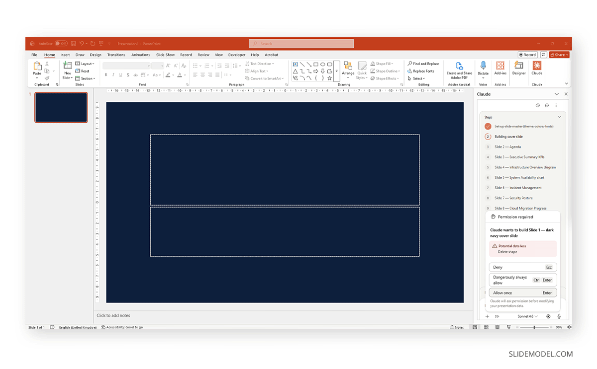
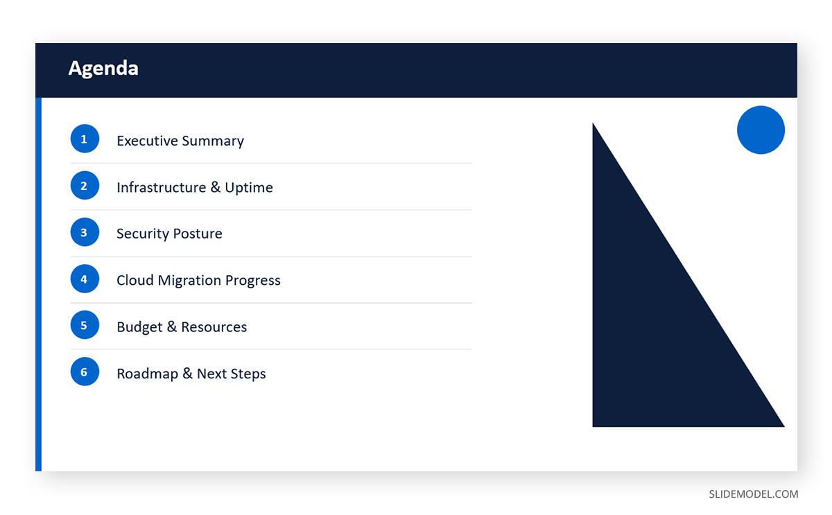
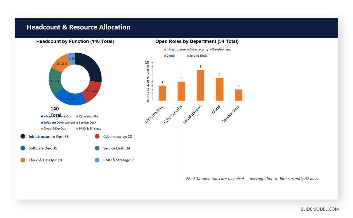
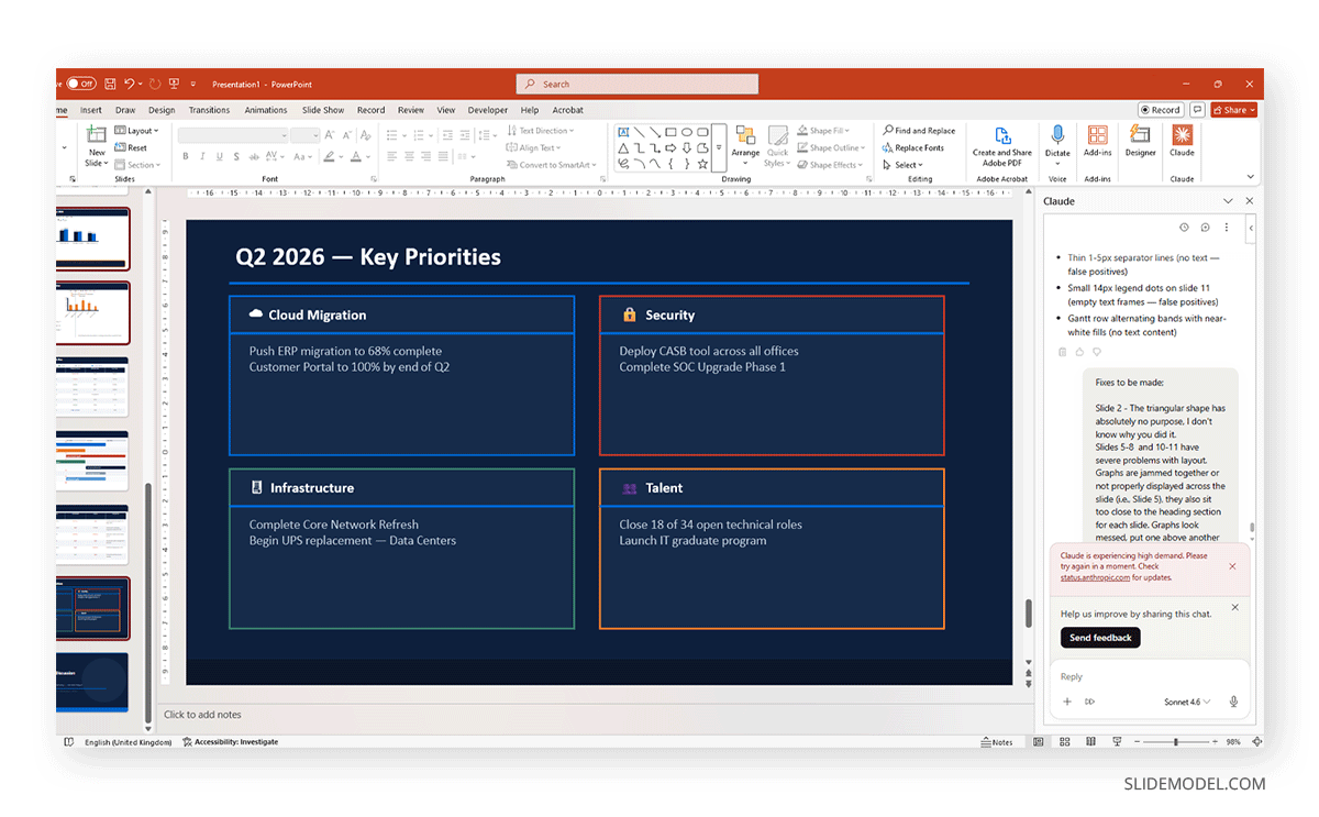
Create a complete 15-slide IT Infrastructure & Performance Report presentation from scratch. Please do not use any existing slides — build everything from scratch.

Company: Meridian Financial Group — a mid-size financial services firm with 3,200 employees across 6 offices. The IT department (140 staff) is presenting a quarterly review to executive leadership.

Period: Q1 2026 | Presenter: CIO Office

Design instructions (apply to all slides):

Use a dark navy blue (#0D1F3C) as the primary background for section dividers and title slides. Use white (#FFFFFF) as the main slide background for content slides. Use electric blue (#0066CC) as the accent color for shapes, chart bars, and headers. Use a second accent of slate green (#3A7D6B) for positive KPIs, success states, and secondary data series. Use Calibri or Arial throughout. All shapes must be geometric and flat — no 3D effects, no shadows on text. Every chart must be a native editable PowerPoint chart, not an image. Tables must use alternating row shading (light grey #F2F4F7 on alternate rows, white on others), with a bold navy header row with white text.

Build these 15 slides in order:

Slide 1 — Cover

Dark navy background. Large bold white title: "IT Infrastructure & Performance Report — Q1 2026". Subtitle in electric blue: "Meridian Financial Group | CIO Office". Bottom left corner: a horizontal bar shape in slate green. Bottom right: "Confidential" in small light grey text.

Slide 2 — Agenda

White background. Left side: a vertical electric blue rectangle as a sidebar accent. List 6 agenda sections as numbered items in large text: 1. Executive Summary, 2. Infrastructure & Uptime, 3. Security Posture, 4. Cloud Migration Progress, 5. Budget & Resources, 6. Roadmap & Next Steps. Right side: a dark navy geometric triangle shape as a decorative element.

Slide 3 — Executive Summary

White background. Create 4 large KPI stat boxes arranged in a 2x2 grid using navy-bordered rectangles:

Box 1: "99.94%" label "System Availability" sublabel "? vs 99.81% Q4 2025"

Box 2: "14 min" label "Mean Time to Resolve" sublabel "? from 22 min Q4 2025"

Box 3: "$4.2M" label "IT Spend Q1" sublabel "97.7% of budget."

Box 4: "0" label "Critical Security Incidents" sublabel "2nd consecutive quarter"

Below the grid: one sentence of executive narrative — "Q1 2026 marks the strongest infrastructure stability quarter on record, with cloud migration reaching 61% completion ahead of schedule."

Slide 4 — Infrastructure Overview

White background. Create a layered architecture diagram using flat rectangular shapes organized into 4 horizontal tiers, labeled: "End User Layer", "Application Layer", "Platform & Cloud Layer", and "Network & Data Center Layer". Each tier is a wide, rounded rectangle in a different shade (use navy, electric blue, slate green, and light grey). Inside each tier, add 3 small white text labels representing components (e.g., End User Layer: Laptops / Mobile / VDI; Application Layer: ERP / CRM / Collaboration Tools; Platform Layer: AWS Cloud / Azure AD / Kubernetes; Network Layer: SD-WAN / Firewall Cluster / Data Center A & B). Connect tiers with vertical arrow shapes.

Slide 5 — System Availability & Uptime

White background. Header: "System Availability by Platform — Q1 2026". Create a horizontal bar chart (native) showing uptime % for 6 systems: Core Banking 99.98%, Email & Collaboration 99.95%, CRM Platform 99.91%, ERP System 99.87%, VPN & Remote Access 99.76%, Legacy Reporting Suite 98.43%. Use electric blue bars. Add a red dashed reference line at 99.90% labeled "SLA Threshold". Below the chart, add a small 3-column table: System | Downtime (mins) | SLA Met? — populate with the corresponding values (Core Banking: 9 min, Yes; Email: 26 min, Yes; CRM: 40 min, Yes; ERP: 57 min, Yes; VPN: 105 min, Yes; Legacy Reporting: 739 min, No — highlight this row in light red).

Slide 6 — Incident Management

White background. Split the slide into two halves. Left half: a donut chart (native) showing incident volume by severity — P1 Critical: 3, P2 High: 18, P3 Medium: 64, P4 Low: 211. Use red for P1, orange for P2, yellow for P3, slate green for P4. Center of donut: total "296 incidents". Right half: a table with 4 rows (one per priority) and 4 columns: Priority | Volume | Avg Resolution Time | vs Q4 2025. Data: P1: 3 / 47 min / ? 31%; P2: 18 / 2.1 hrs / ? 18%; P3: 64 / 6.4 hrs / ? 9%; P4: 211 / 18.2 hrs / ? 4%. Apply alternating row shading and a navy header row.

Slide 7 — Security Posture

White background. Three sections arranged horizontally. Section 1 (left): 3 stat boxes stacked vertically — "1,847" Vulnerabilities Scanned; "23" Open (Medium or above); "100%" Patch compliance on critical CVEs. Section 2 (center): a 3x3 risk matrix table with axes "Likelihood" (Low/Med/High) vs "Impact" (Low/Med/High). Fill cells with color-coded risk level (green/yellow/red). Place 3 labeled dots inside the matrix: "Phishing Exposure" (Med likelihood, High impact), "Third-party API Risk" (Low likelihood, High impact), "Shadow IT" (High likelihood, Med impact). Section 3 (right): a vertical bar chart showing monthly phishing simulation click rates: Jan 7.2%, Feb 5.8%, Mar 4.1% — use a downward trend line in slate green.

Slide 8 — Cloud Migration Progress

White background. Title: "Cloud Migration — 61% Complete (Target: 80% by Q4 2026)". Create a large horizontal progress bar divided into segments: Completed (61%, electric blue fill), In Progress (19%, light blue fill), Not Started (20%, light grey fill). Label each segment with its percentage. Below the bar, create a table with 5 columns: Workload | Category | Status | Target Completion | % Migrated. Include 7 rows: Core Email Suite / Collaboration / Complete / Q4 2025 / 100%; HR Platform / SaaS / Complete / Q1 2026 / 100%; Data Warehouse / Analytics / In Progress / Q2 2026 / 68%; ERP System / Business App / In Progress / Q3 2026 / 41%; Core Banking / Mission Critical / Planned / Q1 2027 / 0%; Legacy Reporting / To Retire / Planned / Q2 2026 / 0%; Customer Portal / Customer Facing / In Progress / Q2 2026 / 79%. Apply alternating row shading and color-code the Status column: Complete = green text, In Progress = blue text, Planned = grey text.

Slide 9 — Budget & Spend Analysis

White background. Create a clustered bar chart (native) comparing Budget vs. Actual spend across 5 categories: Infrastructure $1.2M / $1.18M; Cybersecurity $0.9M / $0.87M; Cloud Services $0.8M / $0.91M (over budget — highlight); Software Licenses $0.7M / $0.69M; People & Training $0.6M / $0.57M. Use navy bars for Budget, electric blue bars for Actual. Below the chart, add one callout shape in amber, noting: "Cloud Services 13.8% over budget — driven by unplanned storage scaling during the ERP data migration in February."

Slide 10 — Headcount & Resource Allocation

White background. Left half: a donut chart (native) showing IT headcount by function — Infrastructure & Ops 38, Cybersecurity 22, Software Development 31, Service Desk 24, Cloud & DevOps 18, PMO & Strategy 7. Use 6 distinct colors. Center label: "140 Total". Right half: a vertical bar chart showing open roles by department — Infrastructure 4, Cybersecurity 5, Development 8, Cloud 6, Service Desk 3. Use a red reference line at 0 and orange bars. Add a small note: "26 of 34 open roles are technical — average time-to-hire currently 67 days."

Slide 11 — Technology Lifecycle & Refresh Plan

White background. Create a table with 5 columns: System | Age | Lifecycle Status | Refresh Year | Estimated Cost. Include 8 rows: Core Network Switches / 6 yrs / End of Life / 2026 / $420K; Primary Data Center UPS / 8 yrs / Critical / 2026 / $280K; VPN Appliances / 4 yrs / Active / 2027 / $190K; Storage Array A / 5 yrs / Active / 2027 / $340K; Legacy HRMS / 11 yrs / Retired / Completed / —; Firewall Cluster / 3 yrs / Active / 2028 / $210K; Collaboration Platform / 2 yrs / Active / 2029 / —; Core Banking Platform / 9 yrs / Under Review / TBD / TBD. Color-code the Lifecycle Status column: End of Life = red, Critical = amber, Active = green, Retired = grey, Under Review = blue.

Slide 12 — Project Roadmap

White background. Create a horizontal timeline (Gantt-style) using flat rectangle shapes across 4 quarters: Q1 2026 through Q4 2026. Show 7 projects as horizontal bars at different rows: ERP Cloud Migration (Q1–Q3, electric blue); Core Network Refresh (Q1–Q2, amber); Cybersecurity SOC Upgrade (Q2–Q4, red); Customer Portal Relaunch (Q1–Q2, slate green); Zero Trust Architecture Phase 1 (Q3–Q4, navy); Core Banking Assessment (Q3, grey); IT Service Management Platform Upgrade (Q2–Q3, light blue). Mark Q1 2026 with a vertical dashed line labeled "Now". Each bar should be labeled with the project name inside or alongside it.

Slide 13 — Risk Register

White background. Create a table with 5 columns: Risk | Category | Likelihood | Impact | Mitigation. Include 6 rows: Display Component Supplier Delay / Supply Chain / Medium / High / Qualify secondary supplier by May 2026; Core Banking Platform Age / Infrastructure / High / Critical / Assessment underway, migration scoped for 2027; Cloud Cost Overruns / Financial / Medium / Medium / Reserved instance purchasing in Q2; Cybersecurity Talent Gap / People / High / High / Partnership with managed SOC provider; Shadow IT Adoption / Governance / High / Medium / CASB tool deployment in Q2; Third-party API Vulnerabilities / Security / Low / High / Quarterly vendor security reviews. Color-code the Likelihood and Impact columns by severity level.

Slide 14 — Q2 2026 Priorities

Dark navy background with white text. Title: "Q2 2026 — Key Priorities". Create 4 large icon-style priority cards arranged in a 2x2 grid, each as a white-bordered rectangle on the dark background. Card 1: "Cloud Migration" — push ERP to 68% and Customer Portal to 100%. Card 2: "Security" — deploy CASB tool, complete SOC upgrade Phase 1. Card 3: "Infrastructure" — complete Core Network Refresh, begin UPS replacement. Card 4: "Talent" — close 18 of 34 open roles, launch IT graduate program. Add an electric-blue horizontal accent line beneath each card title.

Slide 15 — Close / Thank You

Dark navy background. Centered white bold text: "Questions & Discussion". Below: "CIO Office — Meridian Financial Group — Q1 2026 IT Report". Bottom strip: a full-width electric blue bar. Small white text inside the bar: "Internal Use Only — Not for Distribution".
The result? We can count on a detailed deck that will suffice in most presentation scenarios, though not as visually stunning as we can achieve with PowerPoint templates.
Before creating content, Claude may ask you to confirm if you allow the changes.
Shapes are not complexly rendered; mostly, they feel added without any rational purpose, nor do they look decorative.
In the case of graphs, there are considerable issues that even Claude aims to correct by running a self-audit on the delivered output.
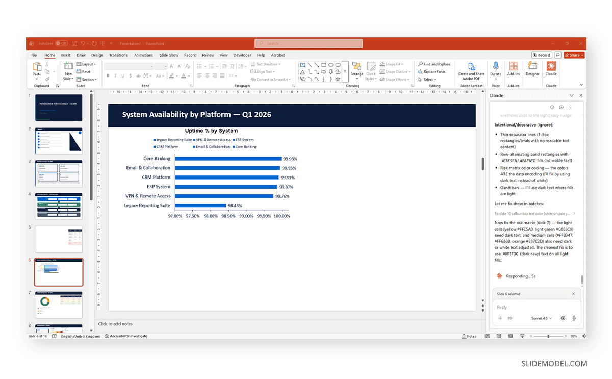
Still, issues such as poor graph placement, charts that are jammed, illegible legends, and incorrectly displayed table layouts, among others, can be found, as shown in the example below.
But if we ask Claude to correct the issue, errors like High Demand can be triggered without any possible solution other than to fix the bugs manually, without AI help.
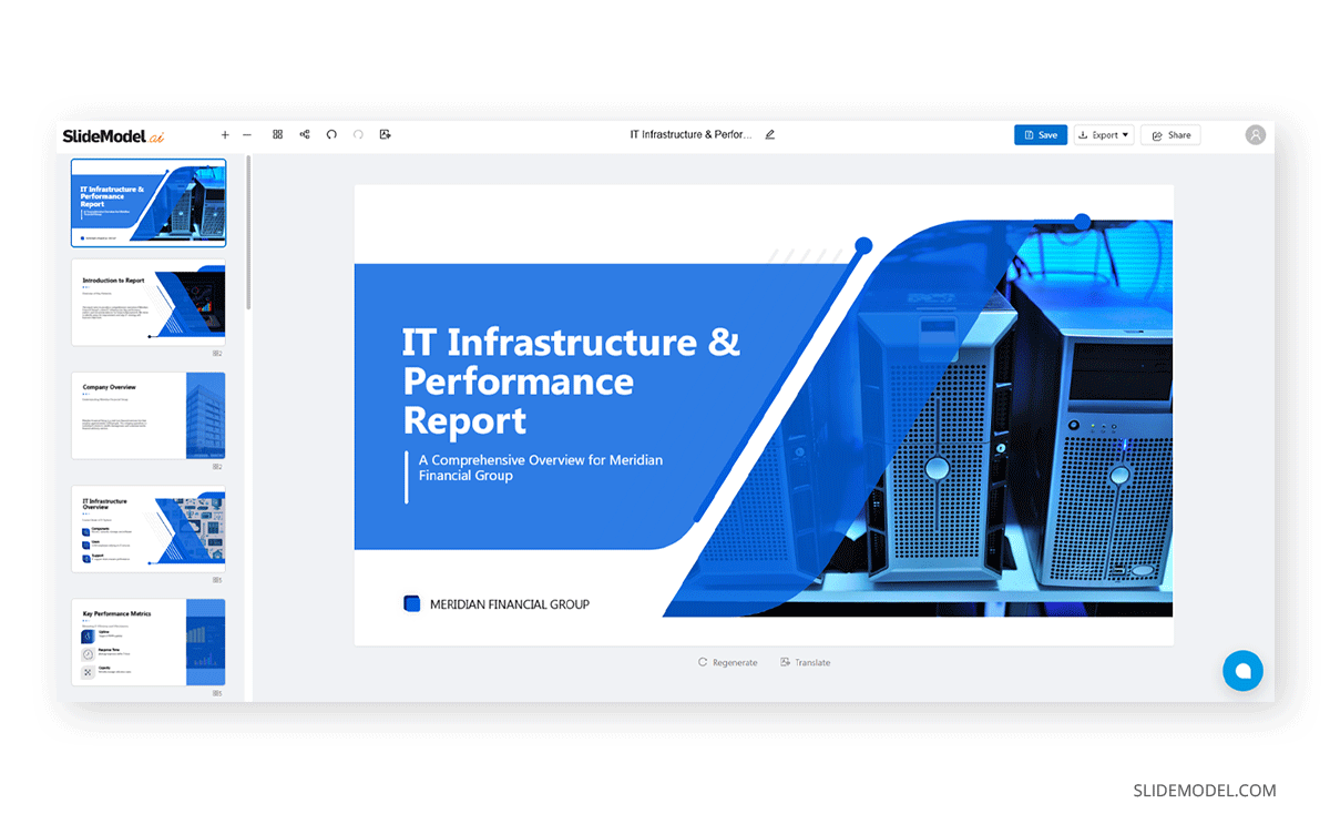
SlideModel.ai – The Alternative for AI Presentation Design
As you may all be familiar with by now, we released an AI presentation maker, SlideModel.ai, designed to create presentation decks from pre-existing templates in just minutes. Our AI presentation maker app allows users to enter a detailed prompt or upload a document, with the data used to populate the slides. The AI system will scan the information, summarize it, and adapt it to the presentation slides using the selected template. All the content is 100% editable, not just via web app, but also by downloading a fully-editable PowerPoint file or using Google Slides.
Yes, unlike Claude for presentations, it doesn’t analyze data or give you directions on where to put the content, but both tools can complement each other, as you can ask, via the Claude web, to create a prompt based on the document to use, to give SlideModel AI knowledge on what to design.
FAQs
What is the Claude PowerPoint skill?
The Claude PowerPoint skill is a specialized capability that allows Claude to work directly with .pptx files. It enables Claude to open existing presentations, read slide content and layout structure, add new slides, generate native charts, and apply changes to specific elements within the file, all while respecting the formatting rules defined in the source template.
Does Claude work with existing corporate PowerPoint templates?
Yes. Through the Claude PowerPoint MCP integration, Claude can load an existing .pptx template and generate new content within it. New slides are built using the layouts, fonts, color palettes, and placeholder structures defined in that template, making the output consistent with the established brand or client standard from the first slide to the last.
Can Claude generate PowerPoint charts from raw data?
Claude can interpret raw data, whether in table format, described verbally, or provided as a structured file, and produce native PowerPoint chart objects from it. These charts remain fully editable within PowerPoint, meaning the underlying data table and visual formatting can be adjusted after generation without replacing the chart element entirely.
What is the Claude PowerPoint MCP?
MCP stands for Model Context Protocol, a framework that allows Claude to connect with external tools and applications. The Claude PowerPoint MCP gives Claude the ability to interact with .pptx files at the file level, enabling targeted editing, slide generation, and content insertion within the actual PowerPoint environment rather than through a text-based intermediate.
Is Claude for presentations useful for academic work as well as corporate presentations?
Yes. Claude’s ability to interpret complex source material, adapt language for specific audiences, and generate structured outlines from plain-language descriptions makes it applicable to academic conference presentations, research summaries, and thesis defenses, as well as the corporate pitch decks and executive briefings for which it is most commonly discussed in professional contexts.
Final Words
The role of AI in professional presentation work is no longer speculative. Claude AI for presentations offers a concrete, well-defined set of capabilities: template-aware slide generation, targeted editing without full-deck regeneration, natural-language structural planning, visual conversion of text-based content, and raw-data interpretation for native chart creation. Each of these addresses a real, measurable bottleneck in how presentations are currently built and revised.
For organizations where presentation quality has a direct bearing on outcomes, whether those outcomes are client decisions, investment commitments, or internal alignment across teams, the case for integrating Claude for PowerPoint into the standard workflow rests on something more fundamental than technological novelty. It is a more efficient and consistent way to produce work that meets a high professional standard.